April 20, 2024
Why you should build a Tableau Public profile
August 1, 2023
How to Use ANY Tableau Public Dashboard as a Template for FREE!

Have you ever spotted a great dashboard on Tableau Public and wished you could repurpose it for your own data?
Look no further! 🌟
In this video, I'll guide you through the easy steps of using dashboards on Tableau Public as templates.
From downloading the workbook to swapping out the data and troubleshooting errors, learn how to quickly create dashboards in minutes.
Note: Ensure that you're respectful of original creators' work and provide appropriate credits or mentions when using their dashboards.
Get the data and python code to create your own mock data here - Link
Priya Padham's dashboard - Link | My dashboard - Link
November 23, 2020
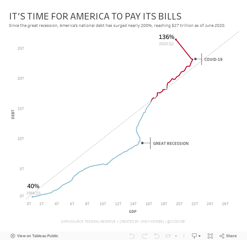
#MakeoverMonday: America Needs to Pay Its Bills

Today's Makeover Monday marked my 1,000th viz published to Tableau Public. I must say that I'm pretty proud of myself. This feels like a pretty big milestone in my career. I wonder how many hours I've spent using Tableau in my life.
Thank you for all of your support and encouragement along the way. Tableau wouldn't be anything without the Community.
Let's get to week 47. The visualization comes from Visual Capitalist.

- The bar/line combination charts work well since they are on the same scale. This also makes them easier to distinguish.
- Choosing colors that match the American flag (I'm assuming that was intentional)
- Making 2020 a slightly different shade of red
- Title is clear
- Text callouts add useful context
- Big numbers to show the most recent values
- The 2020 bars are at the quarterly level, but the remaining bars are by year. Is it the end of the year? The start of the year? That could easily lead to confusion. Keep it as a consistent time scale.
- Compare debt to GDP
- Show the debt to GDP ratio
- Show when the debt to GDP ratio exceeded 100%
- Highlight important milestones that led to the largest increases
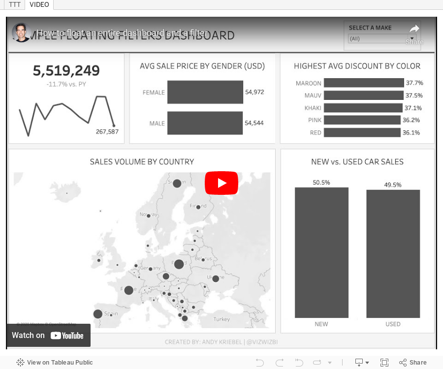
February 11, 2020
#TableauTipTuesday - How to float an entire dashboard and a filter
In this week's tip, I show you just how to accomplish this.

October 16, 2018
Tableau Public: The Heart of the Tableau Community


When Tableau Public launched back in 2010, I had no idea how much it would change Tableau the product, Tableau the Community, and me personally. The impact on how people see and understand data would not be what it is today without Tableau Public. I'm 100% convinced of that. Why?
COMMUNITY PROJECTS
Without Tableau Public there would be no Viz for Social Good. There would be no Workout Wednesday. There would be no Sports Viz Sunday. Without Tableau Public there would be far fewer people practicing data visualization and data analysis week after week through these Community projects.
Without Tableau Public there would far fewer friendships born out of a common love for data. There would be far fewer people finding the careers they love.
BUILDING A PORTFOLIO
From a Tableau perspective, Tableau Public is the new CV. The secret to hiring people that are great at Tableau is to look at their Tableau Public profiles. If someone doesn't have a Tableau Public profile, don't hire them. Those people, more often than not, don't understand the ethos of the Tableau Community. And if they aren't part of the Community, I would seriously question their skills. How can you evaluate their work if they don't have a portfolio? Simple...you can't!
Eva and I have been asking people to tell us how Makeover Monday has helped them get a job they love. Person after person has told us that their Tableau Public profile was the major differentiator for them getting the job. People have been able to DEMONSTRATE their work, live in front of those interviewing them. They've been able to prove they have the skills needed for the role. Those companies may have asked for a CV, but what really mattered to them was WHAT people have done.
Through Tableau Public, you can see the progression of someone's skills. You want to look for people that have clearly shown improvement. Without Tableau Public, how would any of these people have been able to show their progression?
DEVELOPING SKILLS
The development of these skills allows you to showcase your work. Having Tableau Public to share you work helps others see your passion and the quality of your work. It's this combination of passion and quality that distinguish high performers from others. Without Tableau Public, how would people showcase their work?
MY PERSONAL IMPACT
Tableau Public completely changed my life. If I didn't have a Tableau Public profile, I would not have gotten my job at Facebook. If I didn't have my Tableau Public profile, would Tom Brown have taken a chance on me to run The Data School? I'll never know, but I'm certain that Tableau Public exposed me to these opportunities. When I share, I expect nothing in return. When you share freely, opportunities will come to you as they have to me.
Without Tableau Public, I would not have been able to travel the world introducing people to Tableau for the first time. Tableau Public allows me to show people what is possible in Tableau. All I need to do is show them the Tableau Public gallery. People think we're all crazy for this addiction we have to Tableau. I'm perfectly ok with that because I know Tableau Public provides me an opportunity to learn every day.
That leaves me with only one thing to say...thank you Tableau Public. Here's to many more years.
February 7, 2017
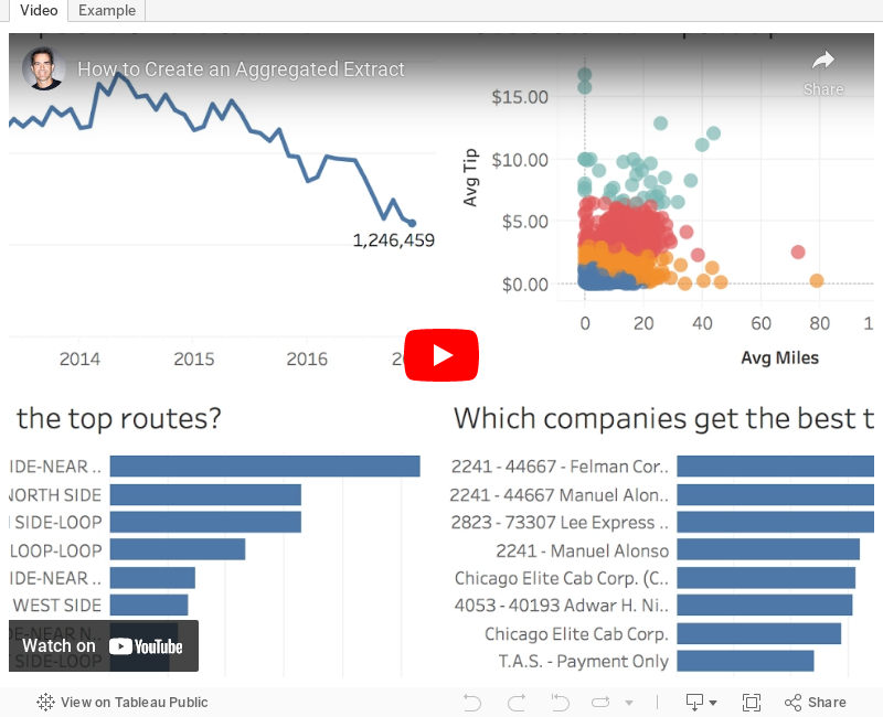
Tableau Tip Tuesday: How to Create an Aggregated Extract

Aggregated extracts are an undervalued and underused feature in Tableau.
Week 6 of #MakeoverMonday allowed us to work with 105M Chicago taxi trips from an Exasol data source. This is fantastic, until you need to publish the viz to Tableau Public which has a 15M record limit. The way to work around the 15M limit is by creating an aggregated extract, for which Tableau has created a great quick start guide here. In the video below, I show you how I created an aggregated extract with the Chicago taxi data.Keep in mind, though, that your data has to be aggregatable. For example, if you do cohort analysis, you likely won't be able to aggregate the data and maintain the cohorts.
Why aggregated extracts?
- Smaller extracts
- Better performance
- Only contains the necessary dimensions
- Makes extract refreshes faster
- Reduces resource burden on your Tableau Server
Steps for Creating an Aggregated Extract
- Hide unused dimensions
- Add extract filters (optional)
- Aggregate the data for the visible dimensions
- Create the extract
April 25, 2016
Makeover Monday: Victims of the 21st-century Slave Trade

This week for Makeover Monday we are looking at this Viz of the Day from CNBC as seen on Tableau Public. For me, this is a really poorly done viz that really doesn’t tell us anything. When I look at this and say to myself “so what?”, I can’t answer that question.

Let’s start by looking at what works well:
- The table provides a nice summary of how many countries in each region fall into each tier.
- Clicking on a region and/or tier filters the map
- Nice “About” option
Really, that’s about all I can come up with that works well. There are so many things that could be done better:
- The most major problem is that there’s no context. What is good and what is bad? Is the situation getting better or worse? Context is so critical in visualisation and this viz totally lacks context.
- The title is misleading; was that intentional? These countries aren’t necessarily trafficking the children. Yes, it’s unbelieably terrible how the children are treated, but the title needs to be more accurate.
- The bubbles in the table add no value.
- Poor color choices
- Tooltips are useless
- There are no trends
- There’s no call to action. What am I supposed to do with this information? Again, so what?
Keep in mind that Makeover Monday is NOT about criticizing the author, it’s about critiquing the visualization and trying to create a more compelling story and more interesting visualizations.
What I wanted to try to focus on this week is whether or not childhood slave trade is getting better or worse. The data set that I created contains data back to 2007. Since we have geographical data (i.e., countries), I first wanted to see if viewing the countries by their tier status as a series of small multiple maps would reveal anything.
 |
| Click on the image to interact |
Unfortunately seeing trends across multiple maps is extremely difficult. Even if I drill into a specfic region, Africa for example, it’s still really hard to see patterns.
 |
| Click on the image to interact |
Ok, so maybe filtering even further by tier status would help. Let’s first look at all tier 3 countries.
 |
| Click on the image to interact |
Maybe you now have a case for making sense of the small multiple maps, but it takes too much work to see the rate of change. Enough of the maps, clearly they won’t work for displaying change. Fortunately Tableau lets us fail fast!
An alternative to the small multiple maps would be a heat map. In this view, I placed Country in the Rows and Year in the Columns and added a filter for Region.
 |
| Click on the image to interact |
Now we’re getting somewhere. I really like this view because it shows concentrations well. At a glance I can see that there were fewer Tier 2 in 2015 than in 2007 and more contries have moved towards Tier 3. It’s also clear that there are no more Tier 1 countries in Africa.
Contrast that to Europe.
 |
| Click on the image to interact |
Nearly every country in Europe is Tier 1 or Tier 2 and have been consistently. The transition in Russia from a Tier 2 Watch List to Tier 3 pops out as well.
So far, the heat map is my favourite. In Tableau though, since it’s so easy to create lots of views, I iterated some more. Next, I created this unit chart which shows each country in each region by year, simply color-coded by their tier status.
 |
| Click on the image to interact |
I love the look of this unit chart. Notice that I intentionally made each section 5 circles wide. I did that so they’re easier to count. Two things in particular jump out to me in this view:
- The number of Tier 2 Watch List and Tier 3 countries in Africa is growing.
- Asia had an increase in Tier 2 Watch List countries early on and is not slowly progressing more countries towards Tier 2 status.
To get an even better look at whether regions are progressing, I can filter the unit chart to only Tier 2 Watch List and Tier 3 countries. Filtering the data makes my two impressions above even more evident.
 |
| Click on the image to interact |
Lastly, I wanted to look at a time series view. In this case, I need to aggregate the data up to the Region level and count the number of countries in each Tier. The rationale behind this is to simply see how regions are doing over time. Are they getting better or worse? Is the number of Tier 1 and Tier 2 countries growing or are the number of Tier 2 Watch List and Tier 3 countries increasing?
 |
| Click on the image to interact |
It makes complete sense that the time-series view would reveal patterns best. That’s exactly the best use case for a line graph. I like the clean look about this chart. It’s easy to compare within a region and tier or across regions or across tiers or across regions and tiers.
But does this give me the BEST context? Is there a better way to show how the situation has changed since 2007? Yes, by comparing each year to the first year. In this view, I’m now showing the % change in the number of countries in each region in each tier since 2007. I’m using % change because it’s more contextual than simply the change.
 |
| Click on the image to interact |
In this post, I’ve shown you many ways to iterate through the data to find a compelling story, but this doesn’t bring it all together quite yet. In order to do so, I need to combine some of these views into a dashboard. I’m going long-form again this week as there’s simply too much information that needs to be shown to be effective in a single screen.
I’ve created both desktop and mobile version with the design a bit differnent in each.
May 11, 2012
Get your Tableau Viz of the Day and get Tableau daily goodness
As of today, Tableau will be "sharing one beautiful visual story a day". How cool is that?
Subcription/follow options include:
May 3, 2012
Tableau Tip: Embedding a Dashboard in PowerPoint in 8 simple steps (Yes, you read that right!)
Yesterday I wrote about a method for embedding a presentation within a Tableau dashboard. Of course, this spawned the opposite question:
Is there a way to embed a Tableau Dashboard in a PowerPoint presentation?Good news! The answer is YES! Here’s how.
Step 1 – Install the LiveWeb PowerPoint add-in (instructions via LiveWeb)
- Download the add-in here
- Extract the contents of the zip to a folder
- Launch PowerPoint
- Click on Tools | Add-ins to bring up the add-ins window
- Click on Add to bring up the 'Add New PowerPoint Add-in' dialog box
- Navigate to the folder where the contents of the zip file was extracted and select 'LiveWeb.ppa' and click on OK.
- You might be prompted with the macro virus warning. Enable the macros. When the Add-in is properly loaded, it will display a 'X' against the add-in name.

Step 2 – Go to your Tableau dashboard (either on Tableau Public or Tableau Server) and copy the URL link for the viz.

You have two options for getting the URL for the viz.
- From the browser address
- Click on the Share button on the bottom left of the viz and copy the Email link

Step 3 – Go back to PowerPoint and click on the Web Page option on the LiveWeb add-in. A wizard will appear.
Step 4 – Enter the URL for your viz from Step 2, click Add, then click Next

Step 5 – Choose the “Yes, refresh web page automatically” option. This ensures that your viz updates live from the source (Public or Server) each time you launch the PowerPoint presentation. Click Next.

Step 6 – Choose the size and position of the viz in the slide. I prefer 100% so that the viz is as big as possible, but the default is 90%. Click Next.

Step 7 – Click Finish

You should receive the following message if you successfully embedded the web page.

Step 8 – Launch the presentation

Some notes and observations:
- The viz might be a bit slower to load than when viewed in Public or Server. This viz took about 10 seconds to load.
- It can be tricky to get the mouse pointer to show up. You’ll have to play around with it to see what I mean.
March 2, 2012
NBA Franchise Values Visualized. How much are they really worth?
Every time Sports Chart of the Day creates a chart that ranks something it looks like this:

What bothers me over and over again is that they are trying to communicate a rank, yet they rank the data low to high. Why?
In addition, they always use column charts instead of a bar charts, which forces me to turn my head sideways. Ok, one more thing. The source article is centered on the Lakers, so COTD used the Lakers colors. Cute? I think not. I’d say chart junk.
I’d go with a simple bar chart like this. Yes, it’s a bit taller, but you can at least read it without needing to go to the chiropractor afterwards.

But why stop there? There’s more data available then just franchise values. Check out this interactive viz I built with Tableau.
There are two vizzes to check out. The NBA Franchise Values viz allows you to:
- Choose the data you want to view for two charts
- Provides the ability to sort these two chart by any data point
- Creates a scatter plot that compares the two data points you chose in step 1
- Allows you to pick a data point to size the teams by in the scatter plot
The Value & Debt Rankings viz is a heat map of the rank of each team across the different data points. The article and data only provide the rank based on current value, but I was interested in the rank across all of the data points. I used the INDEX() function in Tableau to create a rank for each field, then used the Advanced calculation to specify the field to rank. Thus I can have a rank field for each data point.
While the article stresses the rise in franchise values, what they neglect to address is the heavy debt load on many teams. For example, the New Orleans Hornets are currently valued at $285M, yet they carry $299M in debt. Compare that to the Knicks and Clippers who carry no debt. Now THAT is the way to run a franchise.

February 7, 2012
Tableau Public: Pie Chart Alternatives
Yesterday I wrote about being a hypocrite and walked through several alternatives to pie charts. Today I am sharing a Tableau Public workbook that I created based on comments to the last post.
I received questions about how the different charts would look for different time periods, so I’ve added:
- A year filter
- A parameter that allows you to pick a date format (e.g., view the data by Year, Year/Month, etc.)
You can download the workbook from the viz below or here.
December 14, 2011
What does it take to survive in the English Premier League?
If you love soccer, then it’s likely that you follow the EPL. My favorite team? ARSENAL! Did you see the incredible goal by RVP Saturday against Everton? You may never see better technique and now he’s only one goal behind Thierry Henry’s team record for goals in a calendar year. Please Lord, keep RVP healthy for a full season!
And if you love soccer and you love stats, then check out Soccer by the Numbers. Chris Anderson writes many quality posts and recently he blogged about points and relegation. I wanted to take Chris’ ideas a step farther. I needed a richer dataset than what Chris was able to provide, so I downloaded the final tables (i.e., standings) from the EPL back to the 2001-02 season from ESPNSoccernet. You can download the full dataset here.
I borrowed (or is it stole?) Steve Wexler’s technique for providing instructions (hover over the EPL logo to see what I mean). There’s lots of interactivity in the viz, so first check out the instructions, then start clicking around.
Answer this: How many teams have qualified for the Champions League with a negative goal differential? Who were they? What else can you tell me about the team(s)? Post your answer in the comments.
November 28, 2011
Tableau Tip: Adding dynamic Top X labels in 9 easy steps (add Bottom X for even more goodness)
There a good chance you’ve run into this scenario before, maybe in a past life in Excel or with Tableau: You have a chart with a bunch of bars or columns or maybe a line chart, and you want the top 5 values labeled. Ideally, the chart would look something like this:

With Tableau, you can manually assign labels to these points, but wouldn’t it be better for the points that are labeled to change dynamically based on the data you have selected? There’s no easy way to do this in Tableau, but as always, there’s a workaround that’s quite simple once you implement it once or twice.
Be patient as you read your way through this; it might seem a bit complicated, but I’ll detail every step. Let’s get started.
1. Drag the Order Date dimension onto the Columns shelf, right-click on the pill and choose All Values (This changes the Order Date field from a Discrete dimension to Continuous; not a critical step, simply personal preference)

2. Drag the Sales measure onto the Rows shelf (I’ve filtered the Order Date to 2010 only, but that’s not necessary either)

3. Create a parameter, I named mine Top X, with the following properties:

NOTE: I could have chosen to always label the top 5 or top 10 values, but I want the consumers of the dashboard to be able to select the number of values they want to see labeled, thus the need for a parameter.
4. Right-click on the “Top X” parameter and choose “Create Calculated Field…” Name the field “Top X Label” and enter this formula:
IF INDEX()<=[Top X] THEN SUM([Sales]) END
I’ll explain the need to use the INDEX function in a bit.
5. Right-click on the “Top X” parameter and choose “Show Parameter Control”
6. Drag the Top X Label calculated field (from step 4) onto the Label shelf on the Marks card.

7. Here comes the trick: Right-click on the Top X Label measure and choose “Edit Table Calculation”

8. In the Table Calculation dialog box, change the Compute Using option to Advanced

9. In the Advanced window, change the Order Along settings to the Sum of Sales Descending. This will force the Top X Label field to index the values based on Sales from highest to lowest (thus the reason the calculated field compares to the INDEX() function).

That’s it! The top 5 points are now labeled. You’re chart should look like this:

You can use the Top X parameter to pick the number of values you want to label. Even if you filter the data, maybe to only show the East Region, the labels will still work properly.
But this is Tableau, so let’s take it a step farther. Maybe you need to label the top 5 and the bottom 5. There’s a neat little way to do this too.
1. Duplicate the Top X parameter and rename it Bottom Y and the show the Bottom Y parameter control
2. Duplicate the Top X Label calculated field, update it to reference the Bottom Y parameter and rename it to Bottom Y label:
IF INDEX()<=[Bottom Y] THEN SUM([Sales]) END
So now what? There’s no way to add a second label! True, but there IS a way to add a secondary axis.
3. Drag Sales onto the Rows shelf, right-click on it and choose Dual Axis

4. Remove “Measure Names” from the color shelf (we don’t need different colors since we’re using the same measure twice)

5. On the Marks card, click on the carrot on the upper-right of the card and choose Multiple Mark Types

6. Click the right arrow twice until you see “SUM(Sales) (2)”, then drag the Bottom Y Labels calculated field onto the Label shelf

7. Right-click on the Bottom Y Labels field, choose Edit Table Calculation, then repeat steps 8 & 9 above. The only difference is that the advanced table calculation should be in ascending order for the Bottom Y Labels:

You’re done! You now have an interactive chart that allows the user to pick the number of top and bottom values they want to see. Interact with it, download it and see how it works for yourself.
Finally, I would like to thank Joe Mako for his help in walking through this situation. He helped me with the formula and advanced table calculation for the Top X Label field.


