Showing posts with label skills. Show all posts
April 20, 2024
Why you should build a Tableau Public profile
advice
,
career
,
Community
,
getting started
,
how to
,
newbie
,
profile
,
skills
,
tableau
,
tableau public
,
Tableau User Group
,
tug
No comments
If I were starting now, these are the 3 reasons I would build a Tableau Public profile.
1. To build your skills
2. To develop your career
3. To be a part of a community
I covered this and a lot more in this week's Newbie TUG.
The slides are below the video. If the video doesn't start at my talk, click here.
Building a Tableau Public Profile by Andy Kriebel
May 6, 2018
Makeover Monday: Toughest Sport by Skill
ESPN
,
Makeover Monday
,
skills
,
sports
1 comment


What works well?
- The sports are ordered by the rank by default, making it easy to see how the compare to other sports.
- You can sort by any of the column headers.
- All of the definitions are provided and thoroughly explained.
- If you need to look up a value, a table works perfectly.
What could be improved?
- It needs to be easier to see the relative difference between sports.
- Comparing more than one metric at a time across two sports takes too much brain power (for me at least).
- Filtering would help make the list more digestible.
My Goals
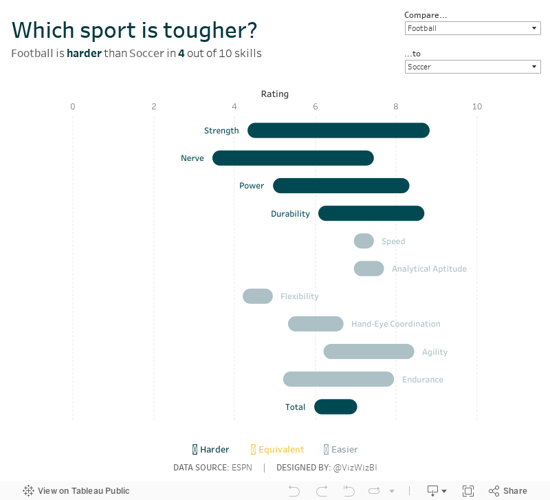
- Allow the user to compare two sports, rather than all sports at once.
- Make the difference between the sports across all of the skills easier to understand.
- Show which skill is harder/easier when comparing two sports.
April 24, 2017
Makeover Monday: Which data skills are HOT where you live?
data
,
jobs
,
Makeover Monday
,
skills
,
tableau
4 comments

What works well?
- Clear title that tells me what the viz is about
- Can easily find the top 10 job skills in any country (but there are some problems with this too).
- Keyword search in the box & whisker plot
- Overall layout is simple
What could be improved?
- What do the colors mean in the bump chart? There's no legend.
- The bump chart cuts off jobs when they aren't in the top 10, making it look like they didn't exist in the other years.
- The country filter only applies to the top chart. I didn't realize that. I think it could be more clear.
- Box & whisker plots are hard to understand for most audiences. And using one for data that is ranks doesn't make a lot of sense to me since you really can't tell how much better the top is from the bottom with ranks.
- How are the jobs organized in the bottom chart? Is there a logic to the sort?
- What's the scale of the box & whisker plot? It looks half cut off to me.
- For most people, they probably won't care how their country compares to other countries. I would think it's more important to understand which jobs are hot where you live.
- There are a LOT of missing roles in 2016 that existed in 2015 & 2014. I would remove 2016 since it's not comparable to the other years.
Much like Eva, I decide to make this a tool people could use. If someone lives in the U.S., they probably don't care which jobs are hot in Singapore. Or maybe they do care about Singapore because they want to move there. My viz is intended to help people find the hot jobs that are geographically important to them.
Click on the image for the interactive version.
Subscribe to:
Posts
(
Atom
)






