VizWiz

Launch, grow, and unlock your career in data

June 30, 2024

How to Rank & Filter the Top 5 in Tableau in Under 60 Seconds!

No comments
In this tip, you will learn how to show the rank of each team in MLB by homeruns for 24 seasons. 

We'll start by computing the RANK table calculation for each Season before filtering to only the top 5 Teams in each Season.

June 28, 2024

How to Replace a Datasource & Fields in Tableau

No comments

Need to change a datasource but don't want to rebuild the workbook? Has a field name changed? 

It can be a real pain to update each sheet in a workbook one by one. 

Conveniently, Tableau allows you to change the entire datasource with the "Replace Datasource" option.

Or, if you only need to change a field, Tableau has an option called "Replace References" that allows you to swap one field out for another all in one shot. 

In this example, I take you through the whole process. 

You could also apply this method when you simply want to swap out all existences of one field for another. 

For example, you want to change all used of Order Date to Ship Date. 

Easy peasy!

June 25, 2024

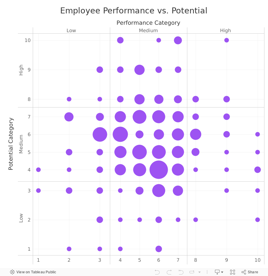
How to Create a 9-Box Matrix in Tableau

No comments

In this video, I show you how to build a 9-box matrix. 

These are commonly used in talent management and HR to map a company's workforce along two dimensions, potential and performance. 

Each of these two dimensions is split up into three categories, low, medium, and high, depending on the score. 

For each employee performance is then plotted horizontally and potential is plotted vertically. From there, we summarize the number of employees that fall within each box. 


June 20, 2024

How to Simultaneously Highlight & Deselect with a Parameter Action in Tableau

No comments
In this video, we’ll dive into an advanced technique to enhance your Tableau visualizations: simultaneously highlighting and deselecting marks using parameter actions. This is a great skill for making your dashboards more interactive and user-friendly. 

What You Will Learn:
- Highlight & Deselect Marks: Learn how to use parameter actions to highlight selected marks while deselecting others, improving the clarity and focus of your data stories.
- Dynamic Labeling: Discover how to label ONLY the selected bar, making it easier to convey specific insights without cluttering your visualizations.

Tutorial Highlights:
1. Introduction to Parameter Actions: A brief overview of what parameter actions are and why they are powerful tools in Tableau.
2. Step-by-Step Guide: Follow along as I demonstrate how to set up parameter actions to achieve the simultaneous highlight and deselect effect.
3. Labeling Techniques: Learn the trick to dynamically label only the selected mark, enhancing the readability and professionalism of your dashboard.

By the end of this tutorial, you will have the skills to create more interactive and visually appealing Tableau dashboards that can captivate and inform your audience effectively.

June 4, 2024

Find Red Flags in Your Data in ONLY 5 MINUTES with Control Charts

No comments
If you like this video, you'll love learning from me 4 hours per week in Next-Level Tableau. Join here.

Control charts are one of the best charts you can use for identifying outliers in a series of measurement. So what are they?

Control charts are used to monitor whether a process is performing consistently over time. It's basically a line graph that tracks data points collected at specific intervals, but with three key additions:

1. 𝗔𝘃𝗲𝗿𝗮𝗴𝗲 𝗹𝗶𝗻𝗲: This horizontal line represents the average performance of the process based on historical data.
2. 𝗖𝗼𝗻𝘁𝗿𝗼𝗹 𝗹𝗶𝗺𝗶𝘁𝘀: These are two additional horizontal lines, one above and one below the center line. They are typically 2-3 standard deviations from the average, but can be whatever number of standard deviations work for your situation. These limits reflect your "stable" range.
3. 𝗢𝘂𝘁𝗹𝗶𝗲𝗿 𝗶𝗱𝗲𝗻𝘁𝗶𝗳𝗶𝗰𝗮𝘁𝗶𝗼𝗻: Color-coding the outlier marks helps you more easily identify the problems.

The line chart you create will help you see if measurements fall within the control limits. 

- If they do, it suggests the process is in control. 
- If they fall outside the control limits, it indicates a potential problem that needs additional analysis.

Control charts are widely used for quality control purposes (especially in manufacturing), but they can be applied to any process where you want to track performance over time. 

Download the workbook here.