Showing posts with label standard deviation. Show all posts
June 4, 2024
Find Red Flags in Your Data in ONLY 5 MINUTES with Control Charts
analysis
,
average
,
control bands
,
control chart
,
distribution band
,
how to
,
lower control limit
,
outliers
,
reference band
,
reference line
,
standard deviation
,
tableau
,
tutorial
,
upper control limit
No comments

If you like this video, you'll love learning from me 4 hours per week in Next-Level Tableau. Join here.
Control charts are one of the best charts you can use for identifying outliers in a series of measurement. So what are they?
Control charts are used to monitor whether a process is performing consistently over time. It's basically a line graph that tracks data points collected at specific intervals, but with three key additions:
1. 𝗔𝘃𝗲𝗿𝗮𝗴𝗲 𝗹𝗶𝗻𝗲: This horizontal line represents the average performance of the process based on historical data.
2. 𝗖𝗼𝗻𝘁𝗿𝗼𝗹 𝗹𝗶𝗺𝗶𝘁𝘀: These are two additional horizontal lines, one above and one below the center line. They are typically 2-3 standard deviations from the average, but can be whatever number of standard deviations work for your situation. These limits reflect your "stable" range.
3. 𝗢𝘂𝘁𝗹𝗶𝗲𝗿 𝗶𝗱𝗲𝗻𝘁𝗶𝗳𝗶𝗰𝗮𝘁𝗶𝗼𝗻: Color-coding the outlier marks helps you more easily identify the problems.
The line chart you create will help you see if measurements fall within the control limits.
- If they do, it suggests the process is in control.
- If they fall outside the control limits, it indicates a potential problem that needs additional analysis.
Control charts are widely used for quality control purposes (especially in manufacturing), but they can be applied to any process where you want to track performance over time.
Download the workbook here.
April 13, 2021
How to Calculate a Z-Score
analysis
,
calculated field
,
color
,
comparison
,
context
,
distribution
,
how to
,
standard deviation
,
table calculation
,
tableau
,
tip
,
tutorial
,
z-score
No comments

- If a Z-score is 0, it indicates that the data point's score is identical to the mean score.
- A Z-score of 1.0 would indicate a value that is one standard deviation from the mean.
- Z-scores may be positive or negative, with a positive value indicating the score is above the mean and a negative score indicating it is below the mean.
( SUM([Profit]) - WINDOW_AVG(SUM([Profit])) )
/
WINDOW_STDEV(SUM([Profit]))
Replace the SUM([Profit]) with whichever measure you'd like to use at the aggregation that makes sense in your data.
Get the data used in the video here - https://data.world/vizwiz/car-sales-mock-data
March 9, 2021
How to Create a Control Chart
analysis
,
calculated field
,
charts
,
color
,
dashboard
,
formatting
,
graphs
,
how to
,
how to make a control chart
,
parameter
,
standard deviation
,
table calculation
,
tableau
,
tutorial
,
worksheet
No comments

- A control chart is a time series graph.
- A line across the time series that represents the mean of all of the measurements in the graph.
- Upper and lower control limits (UCL and LCL) that are displayed as a reference band across the view at a specified number of standard deviations from the mean.
- Indicators to show which measurements are "out of control".
In this video, I show you how to create a control chart that allows the user to specify the number of standard deviations at which to plot the upper and lower control limits.
April 19, 2017
Workout Wednesday: Bollinger Bands and Tableau Stock
Emma had a cheeky grin on her face today when I asked her about Workout Wednesday. I'm fairly sure she was convinced that she had something tricky up her sleeve for me because, well, we're a bit competitive.
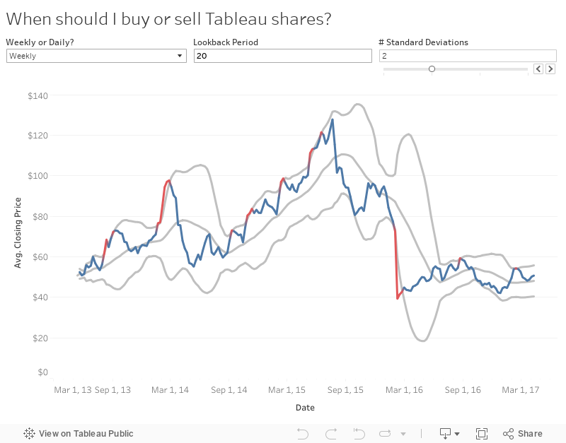
This week she challenged us to build a Bollinger Band chart based on Tableau's stock performance.
Emma threw in a couple nice nuggets in her tooltips that required a couple calcs, but nothing overly complex. The trickiest bits are the table calcs you need for the lower and upper bounds. Mostly everything else is formatting the view.
Thanks for the challenge Emma! I'll be extra mean next week because you seemed excited about that.

This week she challenged us to build a Bollinger Band chart based on Tableau's stock performance.
Fortunately for me I had already done nearly this exact chart back in 2014 as a tip here and as a video here. Heck, it was even based on Tableau's stock! How convenient is that!#WorkoutWednesday week 16 is now up: Should I buy Tableau shares? https://t.co/GOVDlm8i7H pic.twitter.com/e2yA0dNr1F— Emma Whyte (@EmmaWhyte) April 19, 2017
Emma threw in a couple nice nuggets in her tooltips that required a couple calcs, but nothing overly complex. The trickiest bits are the table calcs you need for the lower and upper bounds. Mostly everything else is formatting the view.
Thanks for the challenge Emma! I'll be extra mean next week because you seemed excited about that.
Subscribe to:
Posts
(
Atom
)






