May 26, 2024
How to Create a Barcode Chart in Tableau
May 25, 2024
How to Calculate Year over Year Change in Tableau
How to Create a Dot Strip Plot in Tableau
May 15, 2024
#MakeoverMonday 2024 Week 20 - Exporting Freedom, One Bullet at a Time

I struggled mightily with this week's #MakeoverMonday. My goals was to replicate the original visualization by Bloomberg.
I knew I need to create path to connect the US at the center to each country.
I wanted to make the US the center of the of the map.
Sounds simple, right? I made it way harder than it needed to be.- I overthought the data prep.
- I forgot how to create the paths.
- I couldn't get the math right to offset the longitude.
The coloring and labeling was straightforward for me.
Adding the US as a circle in the middle was pretty simple.
To overcome the problems I facedI looked at a previous visualization I created using paths.
- I opened the workbook and the data to see the configuration.
- I replicated that set up by adding a second set of records to the data set.
- Viewers on the livestream helped me figure out the math to offset the longitude.
The simplest way to explain the location of each country is to think of the lat/lon for the US as 0,0. Then you compare that to the lat/lon for every other country to create the offset.
I got there in the end. What do you think? Was the juice worth the squeeze?
Click the image below to access the viz.
May 3, 2024
How to Make Your Cycle Plots Actionable in Tableau

Cycle plots are a fantastic way to identify seasonality in a data set. And you can make them even more useful by adding indicators for whether they are above or below the average.
Here's how you can do that in Tableau in only 2 minutes.
Like this? You'll love Next-Level Tableau. Learn more at nextleveltableau.com.
May 1, 2024
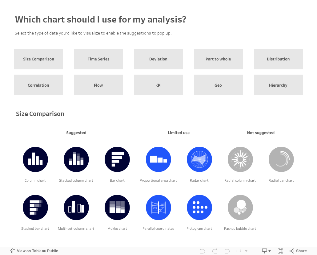
Which chart should you use for your analysis?

Over on Tableau Public, Judit Bekker create this fantastic directory of charts to help you pick the one that's most appropriate for your analysis.
Check it out below.