August 6, 2025
Tableau Tutorial for Beginners (2025)

Want to learn Tableau fast?
Start with this beginner-friendly tutorial where I'll show you how to import data, clean it, build your first interactive dashboard, and share your dashboard—all using Tableau Desktop.
📚 RESOURCES• 📂 Sample Excel file to follow along (thanks Kevin Stratvert)
• 📊 Workbook 📺 RELATED VIDEOS
• Mastering Containers
• 370 FREE Tableau Tutorials 📩 NEWSLETTER
Each week, I'll send you Tableau tips, tutorials, and strategies to design better dashboards, have more impactful, and stand out in your career: https://nlt.kit.com/ 🔽 CONNECT WITH ME
• Official website
May 15, 2024
#MakeoverMonday 2024 Week 20 - Exporting Freedom, One Bullet at a Time

I struggled mightily with this week's #MakeoverMonday. My goals was to replicate the original visualization by Bloomberg.
I knew I need to create path to connect the US at the center to each country.
I wanted to make the US the center of the of the map.
Sounds simple, right? I made it way harder than it needed to be.- I overthought the data prep.
- I forgot how to create the paths.
- I couldn't get the math right to offset the longitude.
The coloring and labeling was straightforward for me.
Adding the US as a circle in the middle was pretty simple.
To overcome the problems I facedI looked at a previous visualization I created using paths.
- I opened the workbook and the data to see the configuration.
- I replicated that set up by adding a second set of records to the data set.
- Viewers on the livestream helped me figure out the math to offset the longitude.
The simplest way to explain the location of each country is to think of the lat/lon for the US as 0,0. Then you compare that to the lat/lon for every other country to create the offset.
I got there in the end. What do you think? Was the juice worth the squeeze?
Click the image below to access the viz.
October 5, 2022
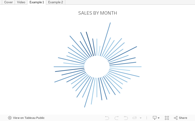
How to Create a Starburst Chart
Starburst charts, sometimes called sunburst charts or circular timelines, are one method of displaying data over time. They may look cool, but they aren't exactly easy to understand. If you are going to use them, I'd advise you to check with your audience first to ensure they understand how to read them.
In this video, I take you through how to build a single starburst as well as a series of starburst charts as small multiples or trellis chart.
All of the calculations are in the description for the video here. You can download the workbook below.
September 26, 2022
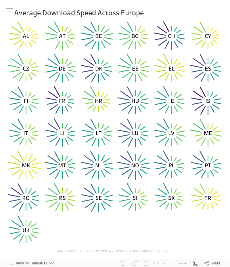
#MakeoverMonday Week 39 - Average Internet Speeds Across Europe

My goal this week was to correct my failures from last week, so I focused almost exclusively on building the starburst/sunburst chart. As promised to the viewers, I will also record a separate tip video for how to build them.
Here's the WatchMeViz and the viz is below that.
May 1, 2019
The UK's Most Popular Baby Names

Sophie's Challenge
While Tableau is an amazing tool, when you use it all the time you can fall into data-viz-auto-pilot mode. You build the same kinds of charts; you construct similar kinds of dashboards; you fall back on the same formatting styles. While familiarity with tool, and a workflow, is a good thing, it also narrows your view of what’s possible.For today’s Dashboard Week challenge, I want you to step outside your data viz comfort zones and try building a viz using Flourish. Flourish is a free tool that lets your build interactive, responsive, and embeddable vizzes and data stories, all within the browser using your own data. Flourish is focused at the communication side of data viz (more than the data exploration side), and I’d like DS13 to really think about communication in today’s challenge.
Why Flourish? I really like their wide (and ever expanding) range of templates and interactivity (transitions, stories and ‘Talkies’ to name a few); also they are based in London – so why not viz-local?
Using any part (years, geographic locations, genders) of the England and Wales baby names data sets, I want DS13 to find and communicate one specific story from this data set.
Here are the rules for today, and what I’d like to see as output:
- They must work independently.
- Everything must be finished by 5pm.
- They must use Tableau and Alteryx for the data prep and exploration.
- The final viz must be made in Flourish.
My Approach
First, I had to get some data. I decided to download the data from the ONS for 1996-2016 because it was in a relatively decent format.Next, I opened the "Plotting Competitors" example because I loved the animation. The great thing about Flourish is you can immediate use the template. All you need to do is upload your own data, assign the columns, and you're done!
February 20, 2019
Improving Upon Strava Activity Summaries: RIDE IT London Osterley Sportive
Coach Carl joined us as well, so I met him at a train station on the way and we rode the rest of the way to the start at Osterley House, an incredibly beautiful National Trust park and house. We met Luke there and headed off on our trek, stopping at two feed stops (I ate about eight pieces of cake at the second), peddling up three steep hills (they weren't that bad, but Luke hated it and threatened me), before looping back to the start and hitting the pub for a couple well deserved refreshments.
Along the way, I was thinking about how I could visualize the data. Strava does a decent job (see my ride here) and I thought I'd use that as a basis for my viz. My goals:
- Use a Mapbox map background as similar as I could to the Strava map (which is proprietary).
- Use the Strava colors (I found the hex codes in their brand guidelines and added them to my preferences file).
- Prep the data in Alteryx. There is a web data connector, but I like being able to create my own row level calculations and extract only the data I'm interested in. Plus it gives me an excuse to practice Alteryx more.
- I like how the elevation timeline, but for me it's lacking context by not including speed. I decided to keep its wide and short style while creating a dual-axis chart to overlay speed on top of the elevation.
- I included key moments as viz in tooltips. Hover over the gold ribbon (fastest speed) to see a picture of Luke and Carl speeding down the hill. That was fun! You can also see a selfie of us at the end.
- Include interactivity like Strava. Basically link the map to the chart and vice versa.
- Include speed and elevation on each point.
- Everyone loves a good BAN! FYI, Strava calculations elevation climb differently.

August 7, 2018
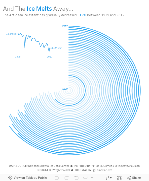
Makeover Monday: And The Ice Melts Away (as a Radial Chart)

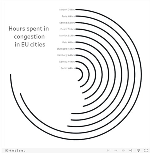
I'd never built a radial chart from scratch before, so I was excited to learn to build a second new chart type today. In Laine's tutorial, she used the Custom SQL option that's available in the Legacy data connector in Tableau for Windows. However, there's no custom sql option on a Mac, so I decided to create the data structure using Tableau Prep.
 |
| Download the Flow here |
This is a pretty straightforward workflow. You split the data into parts to create the start and end points, then union them back together, along with some cleanup along the way.
Laine provided all of the details of the table calcs and the bin needed to create the curves, so I follow her steps using the Arctic Sea Ice Extent data from Makeover Monday week 15. That worked rather perfectly!
From there it was on to the polish. I love Pablo Gomez's style, so I used this radial chart viz of his as inspiration for the overall design, and then I used the wording from Arpit Arora's Makeover Monday viz about the same topic to help frame the messaging.
November 8, 2017
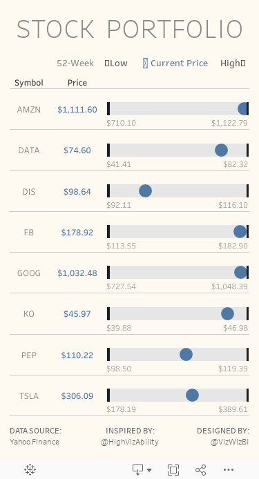
Workout Wednesday: Stock Portfolio
Here's what you need to do:
- Download the data here. You will most likely need to do a bit of data prep like pivoting, at least I needed to.
- Match the title
- Match the legend
- Match the tooltips
- The black bars represent the 52-week low and 52-week high for each stock and the text below each bar also shows these values.
- The blue dot represents the latest price.
- Size should be 375x667 to fit on a mobile device. If it doesn't display properly on my phone, then it's not right. Use Device Designer.
- Rebuild everything to look identical to mine.