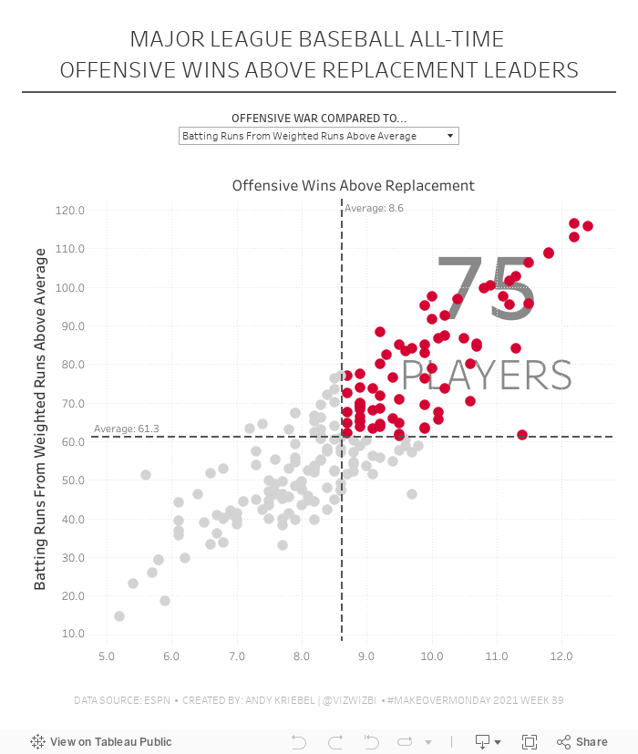
VizWiz

Launch, grow, and unlock your career in data

September 29, 2021

#MakeoverMonday 2021 Week 39 - MLB All-Time Offensive Wins Above Replacement
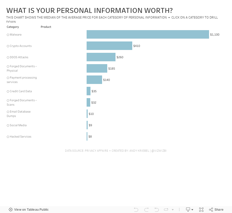
No comments
This is the final installment of Makeover Monday as a community project and I decided to go back to the very first week of Makeover Monday in 2016 to use as our viz to makeover this week. It's looking at a complicated stat in baseball called Wins Above Replacement, which is basically a measure of how good a player is that an average player that would replace him.

There are several, even more confusing stats included. I thought the easiest way to compare them would be with a scatterplot. So I made an interactive scatterplot that highlights players that are above the average of the top 200 players. 

If you watch the Watch Me Viz video (below), you'll see how I used table calcs to highlight those players and also count the number of players in that quadrant. You'll learn how to use parameters to create a dynamic scatterplot, plus some other bits along the way.

Thanks for coming along on this 300 week journey with me. I hope you have developed your skills and become better at your work. Until next time...


September 21, 2021

#MakeoverMonday 2021 Week 38 - What is your personal information worth?

No comments

Short and sweet this week. The data set is about the price of personal information on the dark web. There are three fields: Category, Product, and Price. To me, this looks like Superstore, so that's how I approached it. How can I visualize two fields that have a hierarchy?

In the video, I show you how to create a drill down with both a set action and a parameter action. Here's the video and below is the visualization.


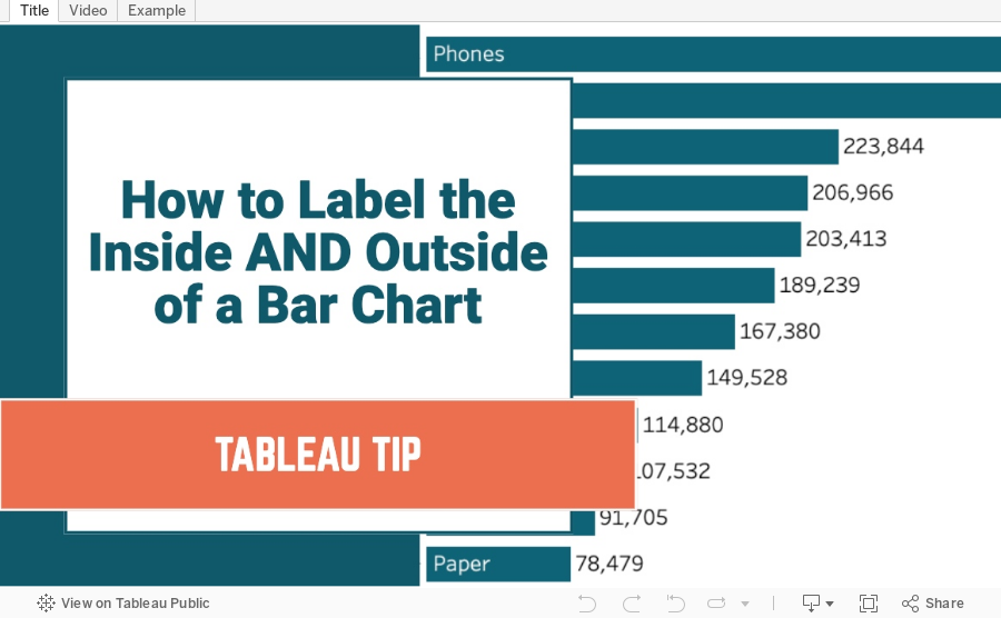
How to Label the Inside and Outside of a Bar Chart
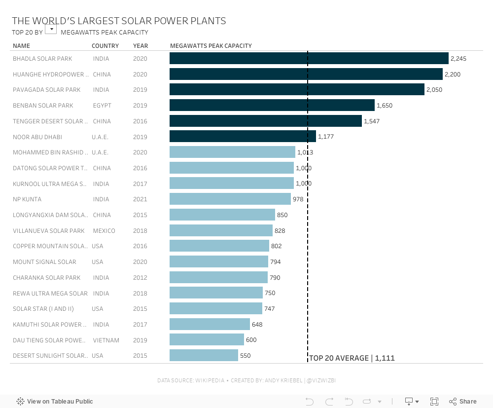
No comments
A bar chart can look really nice with a bit of formatting. In this tip, I show you how to move the header from the dimension to the inside of a bar chart while also having the value on the end of the bar chart.

September 14, 2021

#MakeoverMonday 2021 Week 37 - The World's Largest Solar Power Plants

No comments
I found this week's viz super confusing. I found it hard to track which bar went with which label, how it related to the other parts of the infographic, and ultimately all it required was a simple bar chart.

If you have a look at the video below, you'll see me create a drill down action, using a boolean table calc to color the bars, create a parameter to choose a metric, and lastly I show you how to create different number formats for a single calculation.


September 7, 2021

How to Create a Bar Chart Without an Axis

No comments

Did you know you can create a bar chart without using the rows or columns shelf? Check out this super simple tip to see how it's done.


September 6, 2021

#MakeoverMonday 2021 Week 36 - How Has American Support For Abortion Changed Since 1975?

No comments

Despite the massive setback to women's right in Texas, less Americans are anti-abortion than in 1975. Now maybe if the barbaric dinosaurs in Congress in Texas came into the 21st century, they'd finally realize women are our equals and we shouldn't control them. It's all very, very disgusting. They should be ashamed, but of course they're not. In fact, they are quite proud of what they "achieved".