July 30, 2018
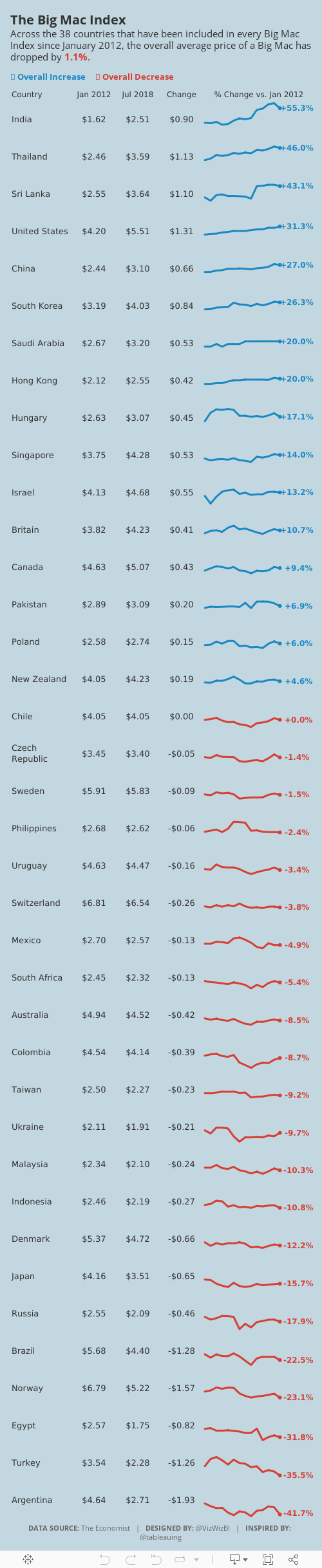
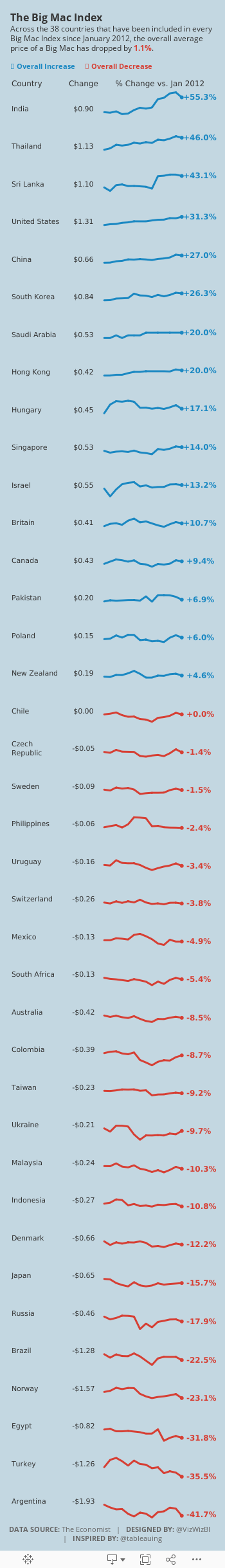
Makeover Monday: How has The Big Mac Index changed since January 2012?
big mac index
,
currency
,
economics
,
economy
,
Makeover Monday
,
pricing
,
The Economist
No comments


What works well?
- Using the footnotes to help describe the caveats in the data
- Including a reference line at zero so that it's easy to see if the country is over- or under-indexed
- Including the latest price to the right for context
- Sorting by the latest price
- Using two colors that are easy to distinguish from each other
- Subtitle explains the metrics in the viz
What could be improved?
- The timeframe is so short that it's hard to see much change at all between the data points.
- I have no idea what happened between these two points.
- There's no explanation as to why this is the selected list of countries.
- Sizing the dots for the most recent price doesn't add much value.
- The white gridlines are too strong for my liking; I find them distracting.
- I would exclude the Euro Zone since not all Euro countries are included in the viz and it's also the only aggregate included. If you look at the chart alone without reading the article, it doesn't make sense to include it.
What I did
- I created some simple sparklines. Right after I thought about it, Rodrigo Calloni posted this viz which was nearly identical to what I wanted to create. The difference for me was that I wanted to look at the change in the price of a Big Mac over time, whereas Rodrigo looked at the change vs. the US price over time.
- I used the colors from the original viz. I liked how they worked together.
- I included some numbers for context.
- I limited the data set to only countries that had been in all of the 14 most recent surveys.
- I create a simplified mobile version that removes some of the BANs in order to fit onto the width of a mobile device.
July 26, 2018
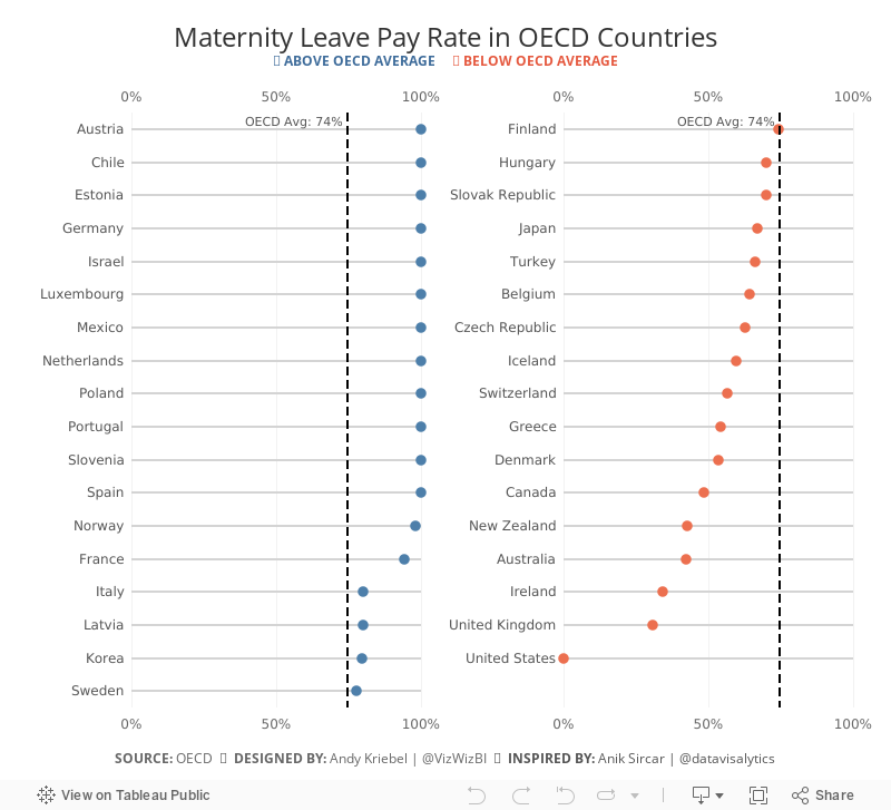
Makeover Monday: Maternity Leave Pay Rate in OECD Countries
During this week's viz review, Eva and I were providing some feedback on this viz by Anik Sircar:While we were giving the feedback, I had an idea for how I could use Anik's work as inspiration for a slightly different version of the chart. Before I get to that, here's his next version after iterating.Parental Leave in the OECD viz, #Makeovermonday W30 2018, @VizWizBI @TriMyData https://t.co/4Wx405xFMc pic.twitter.com/ubVRXWaqhD— Anik Sircar (@datavisalytics) July 23, 2018
I love the simplification of the view; it's now much easier to understand. My take on this turns his view into a more minimalist dot plot that breaks it down into two columns that conveniently are above the OECD average on the left and below on the right. Originally I had it as three columns, but Eva suggested two and it worked out perfectly.@VizWizBI and @TriMyData, thanks and really appreciate your feedback @BrightTALK viz-review . Here is a revised version of the viz as per the feedback.https://t.co/4Wx405xFMc pic.twitter.com/SYKEUgaESQ— Anik Sircar (@datavisalytics) July 26, 2018
Thanks for the inspiration Anik!

July 24, 2018
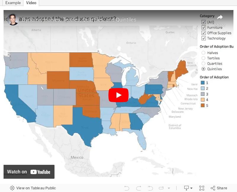
Tableau Tip Tuesday: How to group items into dynamic halves, tertiles, quartiles, and quintiles
adoption rate
,
bins
,
percentiles
,
rank
,
rank_percentile
,
table calculation
,
Tableau Tip Tuesday
No comments
This week's tip came about from a client request at The Data School last week. The customer was looking to understand how quickly different doctors adopted different medications. I worked with Alexander Fridriksson to solve this problem using table calculation.In Alexander's example, he needed to break the customers down into thirds: early adopters, the next 33% of adopters and late adopters. The beauty of this solution is that it dynamically recategorizes the doctors based on the marks in the view.
As we can't share specific client examples, this video shows you how to use the RANK_PERCENTILE table calculation to "bin" states based on their adoption date. An adoption rate in this case is the first time a product was sold in a category.
Enjoy!

July 22, 2018
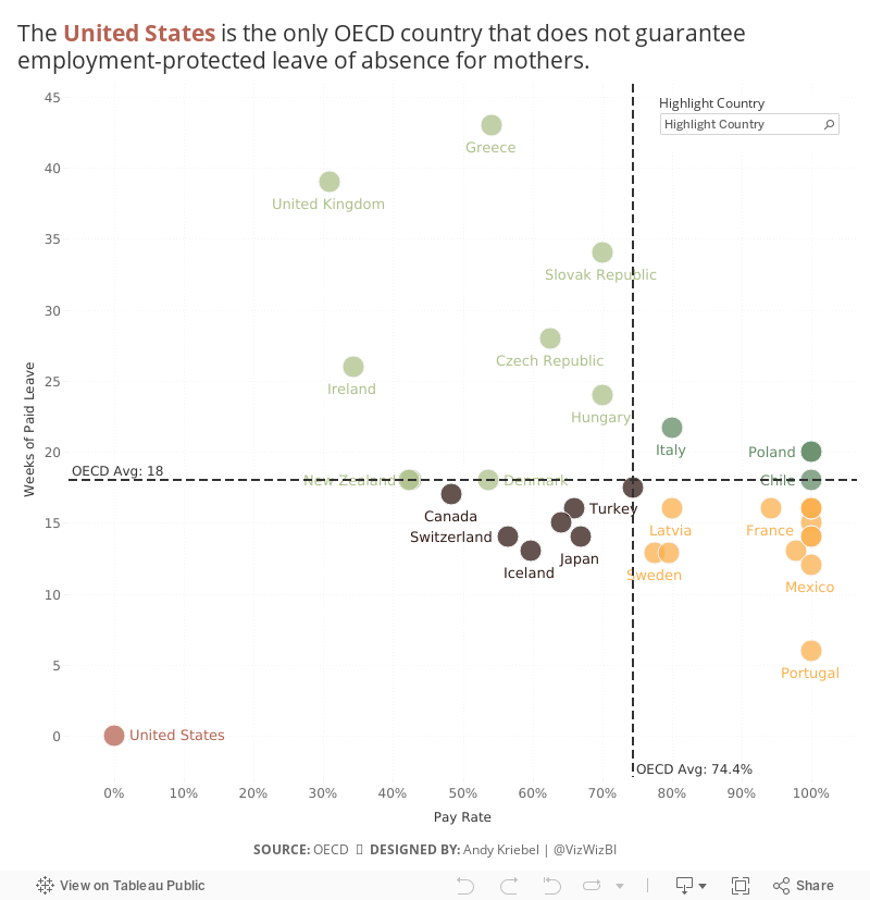
Makeover Monday: Employment-Protected Leave of Absence for Mothers

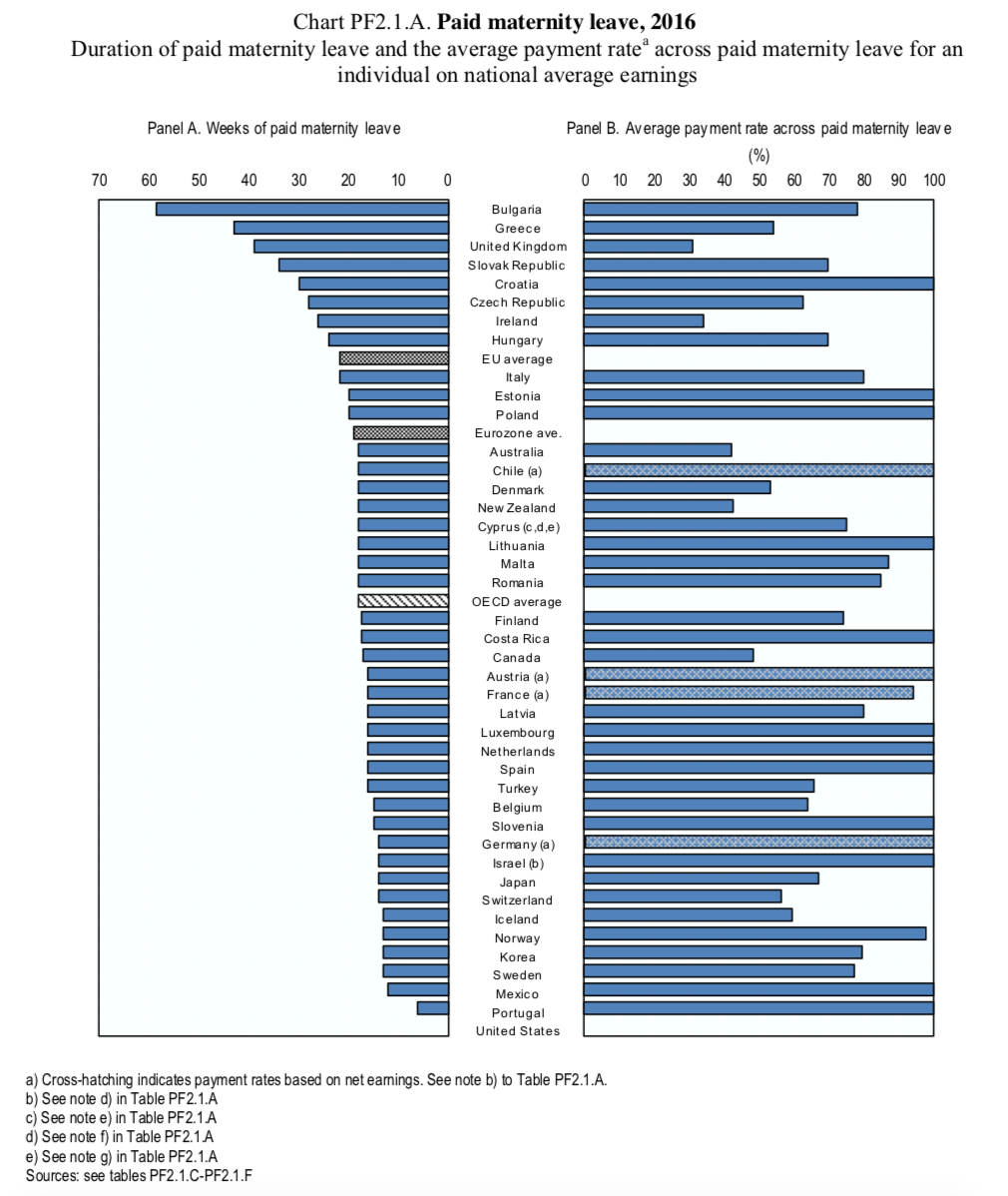
What works well?
- The countries are clearly ordered by the weeks of paid maternity leave.
- Including the three aggregations for context and giving them their own color so they stand out.
- The subtitle explains what the chart represents.
What could be improved?
- Remove all of the dark borders
- Remove "Panel A" and "Panel B" from the chart headers
- Change the title to summarize the findings in the data
- Make understanding the relationship between the two data points easier
What I did
- Removed any non-OECD countries and aggregates
- Update the OECD averages in the source data since it wasn't calculating correctly
- Converted the original diverging bar chart to a scatterplot
- Included OECD average lines for both metrics
- Color-coded each quadrant
- Highlighted the United States' horrific performance
- Include the OECD average in the tooltip for context
- Enabled the highlighter option to allow the user to pick a country of their choice
July 18, 2018
Financial Times Visual Vocabulary: Tableau Edition
alan smith
,
change over time
,
chart doctor
,
charts
,
correlation
,
deviation
,
distribution
,
financial times
,
flow
,
FT
,
magnitude
,
parts-to-whole
,
ranking
,
spatial
,
visual vocabulary
2 comments


Over the past month, I've been building all of these charts in Tableau so that everyone in the Tableau Community would have examples they could use and learn from. This has been quite the labor of love and I would like to thank the (best) team at The Information Lab for their support, reviews and feedback along the way.
There are 72 charts in total, most of which I built myself or with help of tutorials from the community. To build the violin plot, equalized cartogram, and heat map examples, I prepared the data in Alteryx and the output was shape files. The scaled cartogram was built using Tilegrams by Pitch Interactive based on this tutorial from Ken Flerlage.
While the people listed below may not have been the original creators of the charts, they are the resources I used to create the charts in my workbook.
Chart
|
Person
|
Link
|
|---|---|---|
| Diverging Stacked Bar | Steve Wexler | Data Revelations |
| Surplus/Deficit Filled Line | Jeffrey Shaffer | Data +Science |
| Violin Plot | Ben Moss | YouTube / Alteryx App |
| Sunburst Chart | Leonid Golub | Super Data Science |
| Arc Chart | Ken Flerlage | KenFlerlage.com |
| Venn Diagram | Leonid Golub | Super Data Science |
| Radar Chart | Adam McCann | Dueling Data |
| Scaled Cartogram | Ken Flerlage | KenFlerlage.com |
| Sankey Diagram | Leonid Golub | Super Data Science |
| Chord Diagram | Noah Salvaterra | DataBlick |
How to use this workbook
- Start on the Visual Vocabulary tab.
- Click on the text in any section to get to the chart types associated with that topic.
- To go back to the beginning, click on the Visual Vocabulary tab (NOTE: I'll add dashboard navigation buttons once Tableau releases that feature.)
- You should be able to swap your data out for any chart type fairly easily.
- Give credit to the creator of the chart as appropriate.
- If you want to see how that charts are built, email me and I'll we can have a chat.
Notes
- This is NOT meant to be an exhaustive list of charts that can be built with Tableau. This is based on the charts created by the Financial Times for the Visual Vocabulary.
- Actions are quite slow to respond on Tableau Public. If you download the workbook, it's much more responsive.
- There's a mobile version as well.
- Images of each set of charts can be found on Google Photos.
If you find what I've created useful, please share a link to this blog post to them. Any feedback you have is very much appreciated. Click on the gif below for the interactive version. Enjoy!
July 16, 2018
Makeover Monday: NBA Team Salaries Against the Cap
basketball
,
big numbers
,
budget
,
bullet chart
,
Makeover Monday
,
NBA
,
salaries
,
salary cap
,
variance
No comments
Shortly after I finished this week's Makeover Monday, I reached out to Eva to give her some ideas for how to approach the data, given her disdain for sports data. I told her to basically think of the data as actuals (team salaries) vs. budget (salary cap). Then it struck me, this is pretty much how I approached the Visual Profit & Loss Statement I created last summer.With that in mind, here's a second Makeover Monday from this week, a scorecard of NBA steam salaries vs. the salary cap. Click on the image below for the interactive version. From there, click or lasso any set of years and the bullet chart and BANs will update accordingly.

July 15, 2018
Makeover Monday: Historical NBA Team Salaries Against the Cap in the Salary Cap Era
basketball
,
budget
,
dot plot
,
highlight
,
level of detail
,
line chart
,
LOD
,
Makeover Monday
,
NBA
,
parameter
,
salaries
,
table calc
No comments

Let's start by reviewing the original viz from What's the Cap?:
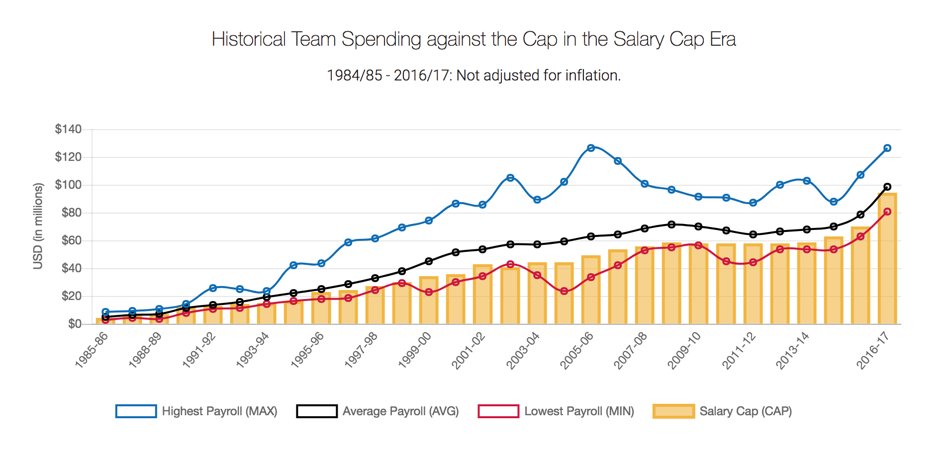
What works well?
- Title and subtitle clearly explain what the chart is about
- Good labelling of the y-axis
- Using colors that are easy to distinguish from each other
- Quick interactivity on the tooltips
- Using lines for three of the metrics works well for time series data
What could be improved?
- Over other season is labeled, which isn't hard to figure out, but it looks messy
- Season labels are on a diagonal; make them horizontal
- Make the salary cap a line as well for consistency
- The legend could use some work. Why are they boxes?
- There's no option to pick a team. What if I want to know my favorite team's salary vs. the salary cap?
What I did
- I wanted to show all teams so that they could be compared. I settled on a dot plot for each season.
- I created a calculation to get the starting year for each season so that the x-axis labels would look nicer and could be displayed horizontally.
- I made the focus on the variance to the salary cap. I had no idea so many teams were over the salary cap.
- I included a line that displays the NBA average of the variance to the cap for the team selected (via a parameter).
- Since teams have moved to other cities and changed names, I created a calculation to make them franchises.

To understand how many outliers there were, I used box plots and hid the marks behind the boxes.

The problem I saw with this, though, was that I didn't feel like I had much context for the distribution of the teams, even though that it the point of a box plot. I decided to scrap the box plot and created this version in the end.

July 9, 2018
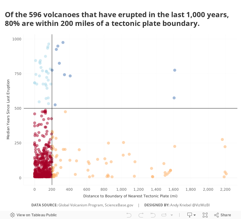
Makeover Monday: Have volcanoes nearest to a tectonic plate erupted more recently?
Alteryx
,
distance
,
eruption
,
geology
,
Makeover Monday
,
tectonic plates
,
volcano
,
workflow
No comments


What works well?
- Including a description for how to interpret the chart
- Ordering the volcanoes from front to back according to elevation above sea level
- Coloring by the number of eruptions since 1893
- Excellent tooltips
What could be improved?
- Where is sea level? Some of the volcanoes are below sea level. You can't really size by negative feet below sea level.
- There's no explanation for why some of the volcanoes have labels.
- Make it more clear where the based of the volcano starts. I assume it's at the bottom of the viz.
- Include reasoning for why 1893 is when the counting of the eruptions starts.
What I did
I started by creating an Alteryx workflow that took the volcanic eruptions data and plotted the volcanoes onto a 250 miles grid of the world.


I had to start all over, so this time I decided to look at how far each volcano was from the boundary of the nearest tectonic plate. Again, Alteryx to the rescue!

Once I had the data I needed, I created a few calculation to help me create a simple quadrant chart that clearly show that the nearer a volcano is to a boundary of a tectonic plate, the more recently it erupted. All of that totally makes sense given what we learned about geology in school.
July 1, 2018
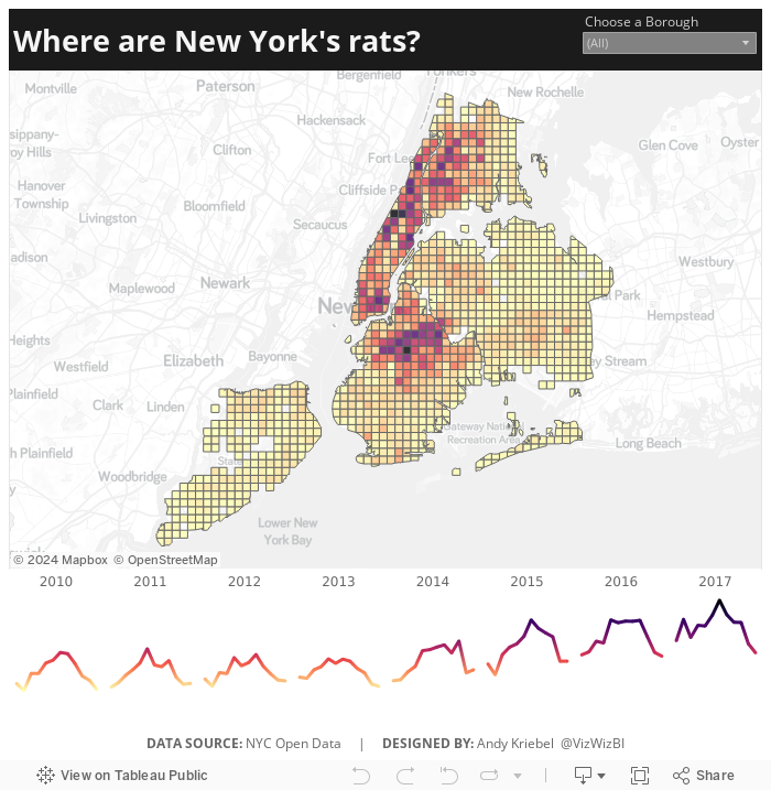
Makeover Monday: Where are New York's rats?
Alteryx
,
boroughs
,
frequency
,
heat map
,
Jowanza Joseph
,
line chart
,
Makeover Monday
,
new york city
,
open data
,
rats
,
tableau
,
tile grid map
No comments

The original article by Jowanza Joseph contains several fantastic visualization, most which look like they were created in R. For this week's makeover, we need to try to make this visualization better:

What works well?
- Simple title that tells us what the data is about and the time period
- Axes are clearly labeled
- Including light gridlines for context that aren't distracting
- Including every sighting as a dot for context; it's interesting how these show cyclical patterns
- Including an average line which confidence bands to show the overall pattern
- Excellent color choices; the purple really works well again the grey background
What could be improved?
- Include an explanation of what the line represents
- Include the data source and author's name
- Remove the word "Date" from the x-axis. That's implied by the title and the year labels.
What I did
- We were doing Alteryx spatial training this week at The Data School this week, so I wanted to do something using the locations of the rats, but not a simple dot of where each sighting occurred.
- I wanted to use Alteryx as I'm working to improve my skills in that area.
- I create a tile grid map using Alteryx for London crimes last year and wanted to do that again, as I need to practice techniques several times to reinforce them.
- Create the tile grid map so every 1/2 mile and have them cut off at a Borough's edge
- Create a simple, minimalist map and line chart in Tableau
- Use the Magma color palette as I really like how it works as a heat map
Alteryx Workflow

The workflow is pretty simple. It takes the individual sightings, converts them to spatial points, assigns them to a 1/2 mile grid based on shape files available for each borough, then I export it as a shape file.
Tableau Visualization
In Tableau, it's simply a matter of double clicking on the spatial object, adding the borough and grid ID to give it the right level of detail, adding color by number of sightings, creating a line chart, adding a borough filter, and cleaning up the tooltips.
Because all of the heavy work was done in Alteryx, it takes about 10 minutes to create the visualization in Tableau, most of that time being formatting. With that, here's my Makeover Monday week 27 about rat sightings in New York City.
Subscribe to:
Posts
(
Atom
)


