July 15, 2018
Makeover Monday: Historical NBA Team Salaries Against the Cap in the Salary Cap Era
basketball
,
budget
,
dot plot
,
highlight
,
level of detail
,
line chart
,
LOD
,
Makeover Monday
,
NBA
,
parameter
,
salaries
,
table calc
No comments

Let's start by reviewing the original viz from What's the Cap?:
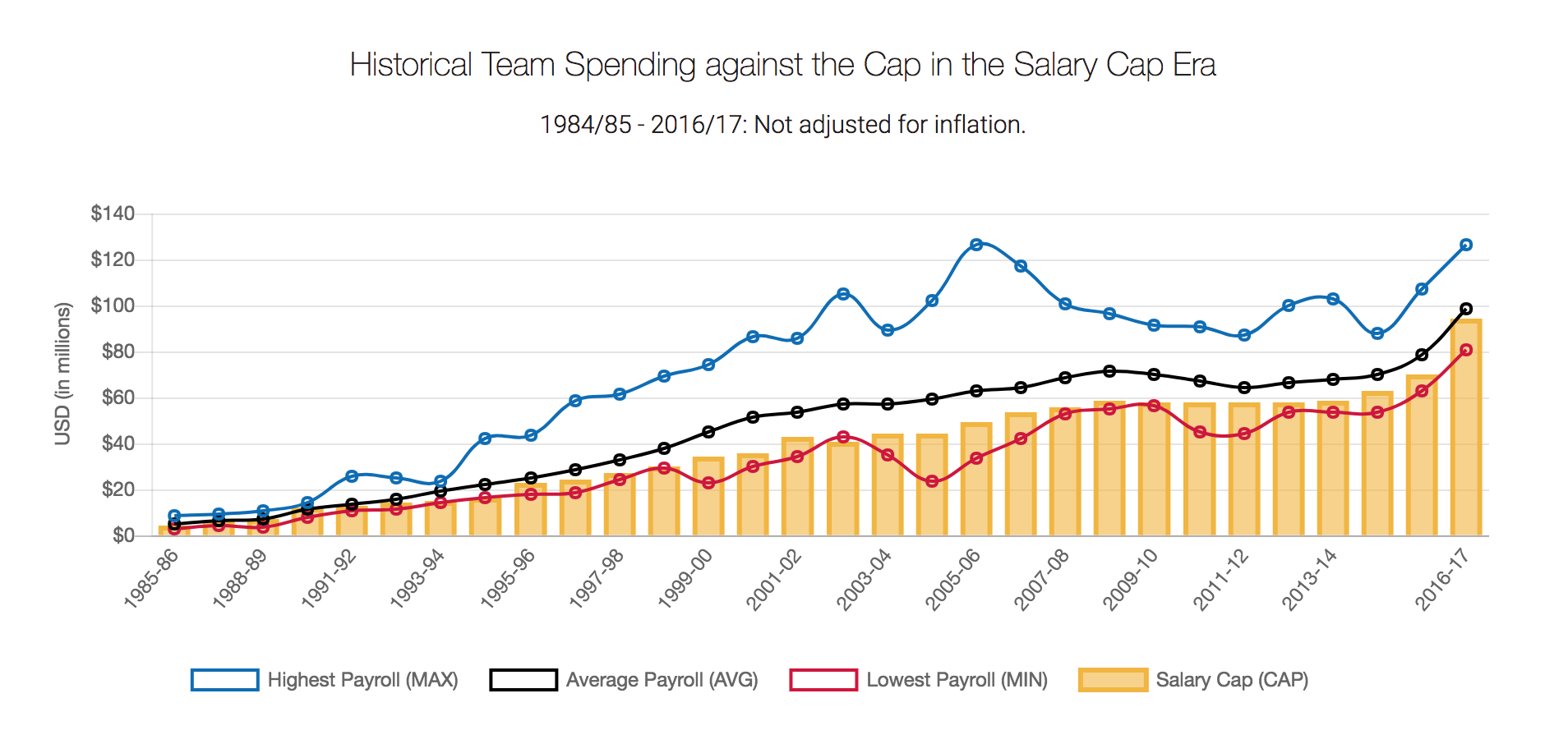
What works well?
- Title and subtitle clearly explain what the chart is about
- Good labelling of the y-axis
- Using colors that are easy to distinguish from each other
- Quick interactivity on the tooltips
- Using lines for three of the metrics works well for time series data
What could be improved?
- Over other season is labeled, which isn't hard to figure out, but it looks messy
- Season labels are on a diagonal; make them horizontal
- Make the salary cap a line as well for consistency
- The legend could use some work. Why are they boxes?
- There's no option to pick a team. What if I want to know my favorite team's salary vs. the salary cap?
What I did
- I wanted to show all teams so that they could be compared. I settled on a dot plot for each season.
- I created a calculation to get the starting year for each season so that the x-axis labels would look nicer and could be displayed horizontally.
- I made the focus on the variance to the salary cap. I had no idea so many teams were over the salary cap.
- I included a line that displays the NBA average of the variance to the cap for the team selected (via a parameter).
- Since teams have moved to other cities and changed names, I created a calculation to make them franchises.

To understand how many outliers there were, I used box plots and hid the marks behind the boxes.

The problem I saw with this, though, was that I didn't feel like I had much context for the distribution of the teams, even though that it the point of a box plot. I decided to scrap the box plot and created this version in the end.

Subscribe to:
Post Comments
(
Atom
)


No comments
Post a Comment