October 31, 2014
Facebook Jeopardy: Accordion Views
#data14
,
accordion
,
actions
,
cascade
,
dashboard
,
expand
,
facebook
,
hack
,
jeopardy
,
tableau customer conference
,
TCC14
,
tricks
5 comments
Alex, I'll take No Assembly Required for $300 please. The answer is:
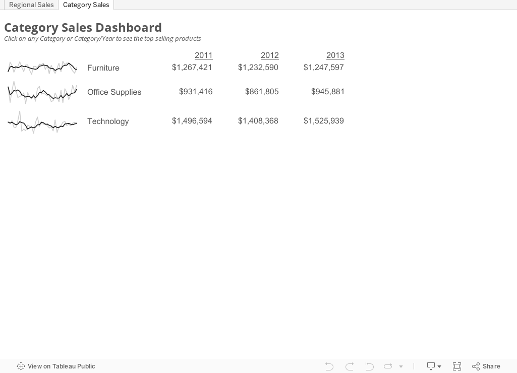
Give it a whirl in the viz below. Click on the Regional Sales tab to see how it doesn't work, then click on the Category Sales tab to see the accordion views in action.
 Download the Tableau workbook here.
I wish I could expand a section in-lineWe all get frustrated with the inability to scroll synchronously across multiple worksheets on a dashboard in Tableau. At #DATA14, I showed how I address this problem by creating accordion views.
Here's the demo of the hack from #DATA14 (the hack starts at 20:22 if it doesn't start there automatically):
Give it a whirl in the viz below. Click on the Regional Sales tab to see how it doesn't work, then click on the Category Sales tab to see the accordion views in action.
Join and/or Support our Tableau #Movember Team
 |
| Matt Francis - Our #Movember Team Leader |
This Movember, along with Matt Francis and several others, I will be raising vital funds and awareness for men’s health, and I want you to join my team.
The goal is to get the Tableau community together behind this cause, spark the conversation about mens health, raise money, have some fun and look damn good in a mustache. Look at Dan for example!!
 |
| Dan Murray - Many moons ago |
The Movember Foundation is the leading global organization committed to changing the face of men's health. They achieve this by challenging men to grow mustaches during Movember (the month formerly known as November) to spark conversation and raise funds for prostate cancer, testicular cancer and mental health problems.
I'm passionate about this cause because too many men are dying unnecessarily from prostate cancer. In 2014, more than 233,000 men will be diagnosed with prostate cancer.
The Movember Foundation is working tirelessly with an urgent goal in mind: accelerating breakthroughs in prostate cancer research that will benefit patients and their families. Movember is achieving this with the formation of the largest, global alliance of prostate cancer researchers and clinical specialists, who are tackling the toughest prostate cancer challenges.
Signing up to my team and taking part in Movember will ensure you make a real impact to the men and their families affected by this disease. It would be simple to just sit back and do nothing, but it would be admirable to sign up and do something significant.
Mo Bros, sign up to grow a moustache for 30 days, and Mo Sistas, sign up to support the men in your lives. Join my team today and help change the face of men’s health:
Team Page: http://moteam.co/tableau-mo-bros-sistas
Personal Page: http://mobro.co/andykriebel
For some additional inspiration, check out this great viz that Matt made last year to help raise awareness:

October 30, 2014
The Hubspot Writers Guide - Stop with all of the excuses!
advice
,
blogging
,
Corey Edison
,
guide
,
hubspot
,
Shannon Johnson
,
slideshare
,
tips
,
writing
2 comments
I don't remember how I ended up on Hubspot's email list, but I'm certainly glad I did. Just about every week I receive an email from them with content that interests me. Today, I received a link to this great guide written by Corey Eridon and fantastically designed and edited by Shannon Johnson:
Given that I love writing, yet I often struggle with how to communicate clearly, I downloaded the guide and read through it. I was blown away by the fantastic advice and wanted to pay it forward to you all. If you write a blog, a book or have any interesting in writing at all, you should read this.
Enjoy!
October 29, 2014
Plot.ly - A simple interface for creating great looking charts in d3
arsenal
,
d3
,
English Premier League
,
EPL
,
matt sundquist
,
parallel coordinates
,
plotly
,
standings
,
table
No comments
Yesterday I had the pleasure of meeting Matt Sundquist, Co-Founder and COO of plot.ly. Plotly is a really interesting new data viz product that allows you to quickly build charts directly in your browser. It's built on top of d3, so it has tons of styling capabilities. If you're looking to build charts with d3, but don't want to do much, if any, coding, then you should definitely check it out. They have a free version.
What is Plotly? The folks at import.io have a great summary:
Plotly doesn't currently support things like filtering and parameters yet, but for a first pass through, I really like it and will definitely be using it more often going forward. So, here's my first plot.ly viz (be sure to hover over dots to see their awesome interactivity):
What is Plotly? The folks at import.io have a great summary:
Plotly is a young graphing and analytics startup, which makes it easy to analyze and visualize data together. Using Plot.ly, users can import data from anywhere, then make and share online graphs using Python, MATLAB, R, Excel, Julia, and their web app. Users can also share work and collaborate on projects.
The Plotly API enables users to analyze and visualize data in one place, and forms an important step in building the infrastructure for data science to be further democratized. Their goal is to be an awesome platform for collaboratively analyzing data and making graphs.From the Plotly website, in the workspace area (think of this as a worksheet in Tableau):
Easily make graphs with your data in the workspace. Import data from Google Drive or upload Excel or text files. You can apply fits, stats, and functions to your data.
Every element of a Plotly graph is customizable. Change the colors, annotate, write LaTeX, toggle graph ticks, and much more. It's up to you!The best way to get familiar with any new product is to start using it. Since I had just publish a parallel coordinates plot in Tableau yesterday, I thought I would use the same dataset and see how long it takes to build something similar in Plotly. I was pleasantly surprised by the simplicity and intuitiveness of the interface. It took me about 30 minutes to build this view, but a lot of that time was spent tweaking the settings to get them just right, which I'm perfectly ok with given the very detailed control I have over the final display.
Plotly doesn't currently support things like filtering and parameters yet, but for a first pass through, I really like it and will definitely be using it more often going forward. So, here's my first plot.ly viz (be sure to hover over dots to see their awesome interactivity):
October 28, 2014
My first experience with import.io and Tableau
Alex Gimson
,
arsenal
,
English Premier League
,
EPL
,
import.io
,
interactive
,
Jewel Loree
,
soccer
,
tableau
3 comments
Remember when you first found Tableau and realized you would never use Excel to create charts again? Well, I had a similar eureka moment last Thursday when I sat in on a great webinar by import.io hosted by Alex Gimson - Build Grow Scale: Getting started with import.io. The difference here is that I will no longer need to copy/paste from webpages; import.io will do all of the work for me!!
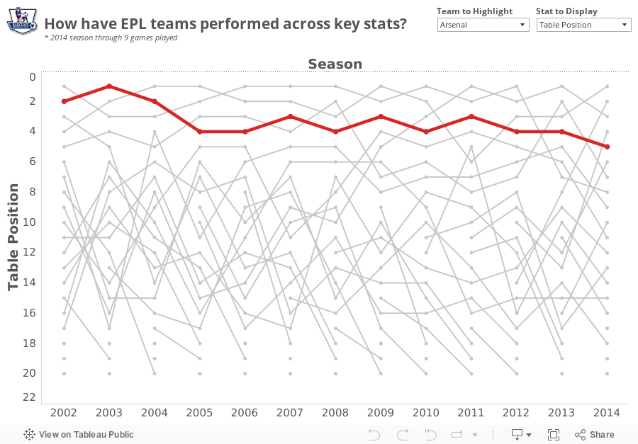
During the webinar, Alex revealed that he was a huge Arsenal fan (as am I), and I wanted to find a simple project to become more familiar with the tool. My basic idea was:

Download the Tableau workbook here.
During the webinar, Alex revealed that he was a huge Arsenal fan (as am I), and I wanted to find a simple project to become more familiar with the tool. My basic idea was:
- Use the import.io Extractor to download the Premier League table from ESPNFC for every season since 2002
- Create a visualization in Tableau
- Allow the people interacting with the viz to highlight their favorite team
- Make Alex happy!
During the webinar, Alex went through a simple Extractor example. Here's a screenshot of the extractor that I built (click on the image to make it larger):
Get the import.io dataset here. Overall, the process was super simple. All I had to do was paste the URL in the box on the left, then add a URL for each season. From there, I clicked on the Download button on the upper right to download it into Excel. I did a bit of cleanup in Excel to make it Tableau-ready. Download the Excel data here.
Before import.io, this would be a painful process of navigating to each webpage, copying the table, pasting it in Excel and repeating for each season. Using import.io, I completed the whole process, including cleaning up the data, in under 5 minutes. The import.io portion of the process took about 2 minutes.
From there, I built this simple viz in Tableau. It took about 30 minutes to build this in Tableau, but I had already sketched out on paper what I wanted to create. I waited until match week 9 completed to publish this viz because I wanted to test how easy it is to refresh the data in the Extractor. It was super simple!
I would highly recommend using import.io. I'm going to continue to look to use it whenever I need to crawl webpages for data.
Download the Tableau workbook here.
October 27, 2014
Monday Makeover: The odds of dying from select causes in the USA
Peter Gilks of Paint By Numbers sent me this viz last week for a Monday Makeover.
 At first, I thought Peter was trolling me, because this is just so, so bad. My initial thoughts:

- Why is there an "any cause" box? We're all going to die so of course the ratio is 1:1.
- There are two causes with 1 in 7 odds, yet the boxes are different sizes.
- Americans have a 1in 28 chance of dying from Chronic lower respiratory disease, yet that box isn't 1/4 the size of the 1 in 7 boxes.
It only gets worse from there. I would have made this much simpler with a bar chart. Yes, it's boring, but it's more effective.
October 24, 2014
Tableau Tip: Blending data sets that have different max dates
Fun little problem at work today. Imagine you have four data sources that all have a Date field in common, but they all land in your database at different times. You want a view of the data for the latest date that they all have in common.
Here's a sample of data the represents the situation:


Inside Tableau, these are four different data sources. I blend them all together onto a single worksheet like this:

What I desire is to only show the data for the latest date that all four data sources have in common, 10/17/2014 in this example. While there might be a more efficient way to perform these calculations, I want to share the approach that I took to solve the problem.
First, I created a calculated field in each data source to get the max date. Note that I've set the table calculation to calculate along Date.

I then added each of these calculations to the view to make sure I was getting the results I wanted.

Sweet! This is exactly what I was hoping for. Next I need to determine which one of these four dates is the minimum and then return the date from that data source. This is the calc I created and it's kinda messy, but it works. Note this I set the calc to compute along Date.

This calc returns 10/17/2014, which is exactly what I was expecting. One more step. I need to create a calculated field to use as a filter in my view so that I only see one row.

I add this to the Filters shelf, set the Compute using to Date and choose True. That's it!

If anyone knows a more efficient way to do this, I'm all ears! Download the workbook here.
Here's a sample of data the represents the situation:
Inside Tableau, these are four different data sources. I blend them all together onto a single worksheet like this:
First, I created a calculated field in each data source to get the max date. Note that I've set the table calculation to calculate along Date.
I then added each of these calculations to the view to make sure I was getting the results I wanted.
Sweet! This is exactly what I was hoping for. Next I need to determine which one of these four dates is the minimum and then return the date from that data source. This is the calc I created and it's kinda messy, but it works. Note this I set the calc to compute along Date.
I add this to the Filters shelf, set the Compute using to Date and choose True. That's it!
If anyone knows a more efficient way to do this, I'm all ears! Download the workbook here.
October 23, 2014
Facebook Jeopardy: My extract has been failing for the last 3 days and I just noticed
#data14
,
extract
,
facebook
,
hack
,
jeopardy
,
monitor
,
refresh
,
tableau customer conference
,
Tableau Server
No comments
Alex, I'll take Tipping The Scale for $200 please. The answer is:
While we cannot share the code for this (it's built on our internal code stack anyway), the idea and the implementation is quite simple. A couple weeks ago, I was at Tableau HQ and did a deeper dive into this for them; here's to hoping they add this into Server as a standard feature.
My extract has been failing for the last 3 days and I just noticed.Anyone that uses Tableau Server can benefit from this hack. Our admin team created this awesome tool that monitors the extract refreshes on Server and sends us notifications once extracts complete or fail. Imagine a life where you have trigger kicking off your extracts and you have a service that monitors your extracts; that's what we have and it freaking awesome!
While we cannot share the code for this (it's built on our internal code stack anyway), the idea and the implementation is quite simple. A couple weeks ago, I was at Tableau HQ and did a deeper dive into this for them; here's to hoping they add this into Server as a standard feature.
Here's the demo of the hack from #DATA14 (the hack starts at 10:22 if it doesn't start there automatically):
October 20, 2014
Monday Makeover: Causes of Death in the USA
bubble map
,
CNBC
,
color
,
color blind
,
death
,
filled maps
,
John Schoen
,
Makeover Monday
,
packed bubbles
,
rank
,
United States
,
USA
7 comments
Today, Tableau's Viz of the Day team chose this visualization from John Schoen of CNBC. Click on the image to go to the interactive version.

One of my frustrations with Viz of the Day, as I've noted on both of my appearances on the Tableau Wannabe Podcast, is that I suspect people look at these as examples of visualizations done well, even though that's not the true intent. Yes, I'm saying that anecdotally, but I base this off of a few conversations I've had with people about it.
In today's viz, there are an abundance of issues. Here are a few:
 In my one hour, I attempted to address all of the issues I pointed out above.
One of my frustrations with Viz of the Day, as I've noted on both of my appearances on the Tableau Wannabe Podcast, is that I suspect people look at these as examples of visualizations done well, even though that's not the true intent. Yes, I'm saying that anecdotally, but I base this off of a few conversations I've had with people about it.
In today's viz, there are an abundance of issues. Here are a few:
- The filled map makes it impossible to see the smaller states. In fact, it's nearly impossible to trigger the action when hovering over Rhode Island. Filled maps can easily skew the data towards the larger states, so a bubble map is preferred.
- The temperature diverging color palette for the map is not color-blind friendly.
- The colors on the map and on the packaged bubbles are too similar. Green on the map means a low rate, while green on the bubbles means cancer.
- The stacked bar chart in the middle adds no value. When you hover over a state, the packed bubbles changes, so what value is the stacked bar chart adding.
- Packed bubbles are a very poor way to communicate ranking. A sorted bar chart is better.
Given these problems, I decided to give it a quick makeover today. I stayed within my one hour time limit that I generally set for these makeovers, so I realize there is probably more I could have done.
- I changed the map to a bubble map. Now it's easier to see all states because I've also sized the states by the number of deaths for additional context.
- I'm using a blue-red color palette consistently throughout to represent the death rate.
- I removed the individual colors for the diseases and colored them by the death rate instead.
- I killed the stacked bar chart. I also included an action from the bar chart to the map (in addition to the existing map to bar chart action).
- I changed the packed bubbles to a ranked bar chart.
Simple changes that take very little time can often make for a much more pleasing visualization.
What else would you have done? Download the workbook here and give it a shot.
October 17, 2014
Facebook Jeopardy: Create a Single Sheet Waterfall Chart in Tableau
Alex, I'll take No Assembly Required for $200 please. The answer is:
Here's the demo of the hack from #DATA14 (the hack starts at 17:14 if it doesn't start there automatically):
The final viz looks like this:

Download the Tableau workbook here.
I want to build a waterfall chart, but it's taking 9 minutes for my 37 sheet dashboard to render.Waterfall charts are a great way to show system or process flow, but the typical method to do this in Tableau requires you to create lots of sheets and then strategically place them on a dashboard. Jonathan Wehrer on our team created a way to shape his data using the scaffolding technique that Joe Mako talks about often to come up with a method for viewing an entire waterfall chart in a single worksheet.
Here's the demo of the hack from #DATA14 (the hack starts at 17:14 if it doesn't start there automatically):
The final viz looks like this:
October 15, 2014
Tableau Wannabe Podcast: Episode 10 - Viz of the Day, Arsenal & Willard Brinton
arsenal
,
emily kund
,
matt francis
,
podcast
,
tableau
,
viz of the day
,
wannabe
,
willard brinton
No comments
Thank you Matt Francis and Emily Kund for inviting me back to the amazing Tableau Wannabe Podcast! You can download the podcast on iTunes and on SoundCloud or listen to it below. I learned a ton from their feedback!
This week, Matt, Emily and I:
This week, Matt, Emily and I:
- Reviewed the Maharashtra Election dashboard from Viz of the Day
- Conducted a live discussion and made updates to my Arsenal Injury Crisis viz
- Discussed Andy Cotgreave's amazing talk from #DATA14 - 100 Years of Visualization Best Practices—It's Time to Stop Making the Same Mistakes
October 14, 2014
Facebook Jeopardy: Maintain Context by Creating Pop-up Charts in Tableau
#data14
,
action
,
dashboard
,
facebook
,
hack
,
jeopardy
,
pop-up
,
tableau
,
tableau customer conference
2 comments
Alex, I'll take No Assembly Required for $100 please. The answer is:
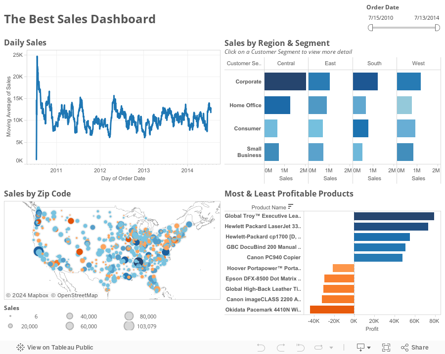
Give it a whirl in the viz below. Click on a Customer Segment on the upper right chart and see the pop-up in action.
 Download the Tableau workbook here.
I like drilling down, but I hate losing context by switching tabs.One of our internal dashboarding tools is really good at pop-up charts, so Rob Koste on our team came up with this nifty trick for creating pop-up charts in Tableau. In the end, it's pretty simple:
- Create a dashboard
- Create a worksheet that you want to "pop-up"
- Add this worksheet to the dashboard as a floating object
- Create an action to trigger this worksheet to display. The action should exclude all value in order to hide the sheet when the action is deselected.
Here's the demo of the hack from #DATA14 (the hack starts at 14:32 if it doesn't start there automatically):
Give it a whirl in the viz below. Click on a Customer Segment on the upper right chart and see the pop-up in action.
October 13, 2014
Makeover Monday: Arsenal's Injury Crisis - A Story
arsenal
,
English Premier League
,
EPL
,
ESPN
,
injuries
,
Makeover Monday
,
story points
,
tableau
8 comments
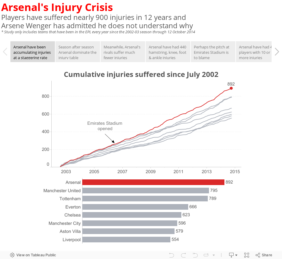
ESPNFC recently published an article providing some details about Arsenal's nearly 900 injuries since the start of the 2002-2003 English Premier League season. Last year, Arsenal crossed the 100 injury mark, suffering 111 injuries in total. This year they are picking up where they left off, with 26 so far this season. In particular, Arsenal continues to be without Theo Walcott and has suffered major, long-term injuries to key players like Aaron Ramsey, Mathieu Debuchy and, most recently, Mesut Ozil.
I found this story fascinating because it finally put numbers to Arsenal's perceived injury crisis. They do indeed suffer way more injuries than any other EPL team. But what bothered me about the ESPN story was that they basically just listed off a few key facts (quoted from ESPN):
 Download the Tableau workbook used to create this story here.
I found this story fascinating because it finally put numbers to Arsenal's perceived injury crisis. They do indeed suffer way more injuries than any other EPL team. But what bothered me about the ESPN story was that they basically just listed off a few key facts (quoted from ESPN):
- Arsenal players have sustained 889 injuries since August 2002, according to a report by PhysioRoom.com.
- The Gunners' 889 injuries over the 12-year period compare to 792 for Manchester United, 620 for Chelsea and 551 for Liverpool.
- Abou Diaby, who has recently returned to fitness, has endured 40 separate injuries, according to the study, while Theo Walcott, who is currently recovering from a serious knee problem, features 42 times.
- PhysioRoom.com claims 120 of the injuries were of the hamstring variety while six anterior cruciate ligament (ACL) have been suffered.
These all seems like interesting stats, but they're missing something incredibly critical...context.
Without comparing Arsenal to their rivals, how do I know how bad their injury crisis really is? If they're suffering injuries at the same rate as their rivals, then maybe there isn't a crisis after all. But if their rate of injury is higher, then perhaps there is more to the story. Have Arsenal players always been injury-prone or have they increased since they moved to the Emirates Stadium with its rock hard surface?
I set out to understand more by downloading the injury reports from PhysioRoom.com for all teams that have participated in every year of the EPL since 2002-03 (plus a few others that are not included in my final story below). You can download the data in Excel format here.
So in a sense, today's makeover is not a makeover of a chart or dashboard; it's a makeover that takes a text-based story and adds charts and graphs to tell a more meaningful story.
October 10, 2014
Flowing with Tableau - The Tableau Wannabe Podcast Hangout with Joe Mako
Today, the wonderful hosts of the Tableau Wannabe Podcast, Matt Francis and Emily Kund, welcomed world famous Tableau legend Joe Mako for a live podcast. If you missed the session, you can watch it below. The session starts around the 2:05 mark.
October 7, 2014
Triggering Extract Refreshes in Tableau
At #DATA14, Bryan Brandow demoed the "Trigger" service that he built for our needs at Facebook. Basically, it's a snippet of python code that listens for data to lands in a database. Once Trigger "hears" that data has landed, it kicks off a Tableau extract refresh. Get all of the details on his blog by clicking this image.

Here's the video of Bryan presenting the Trigger Service at #DATA14 (start the video at 7:05 if it doesn't start there automatically):
Subscribe to:
Posts
(
Atom
)


