August 29, 2022
#MakeoverMonday 2022 Week 35 - The World's Biggest Military Spenders

Makeover Monday is back! Every Monday I'll be running a #WatchMeViz and every Wednesday, Eva will be running #VizReview. Subscribe to my YouTube channel for reminders of the latest events.
https://youtube.com/andykriebel
This week was a makeover of a visualization by Visual Capitalist about the top 10 military spenders. During Watch Me Viz, I iterated through 15 different charts before settling on a bump chart. If you want to learn about sets, parameters, table calculations, containers and more, watch the video below.
Below the video you can see my viz, or click here. Enjoy! If you need clarifications on anything, please comment on the video here.
April 12, 2021
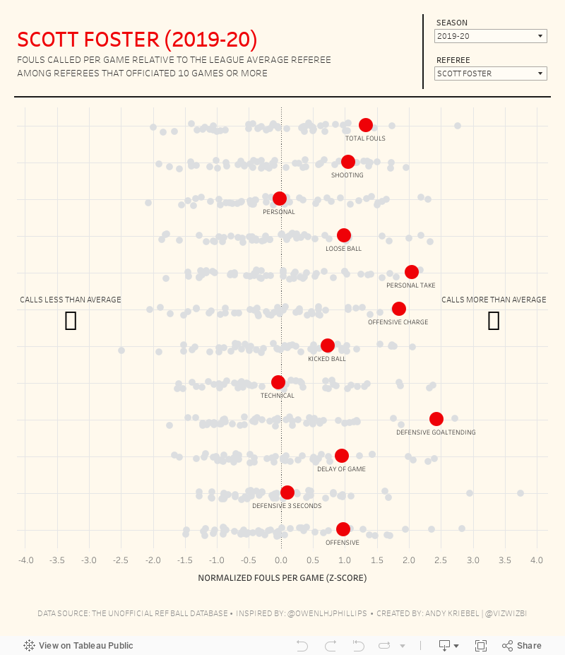
#MakeoverMonday 2021 Week 15 - Fouls Called by NBA Referees
The original viz for this week was so good that I struggled to come up with something different. In the end, I wanted to learn by recreating the original. Check out #WatchMeViz and interact with the viz below.

April 5, 2021
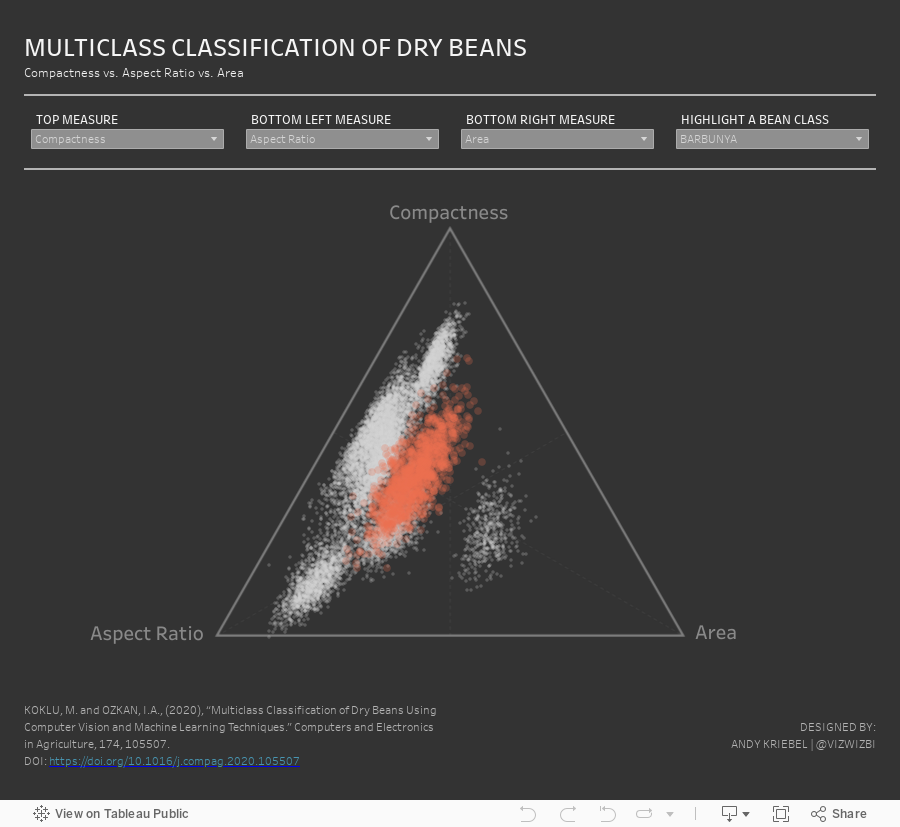
#MakeoverMonday 2021 Week 14 - Multiclass Classification of Dry Beans

March 23, 2021
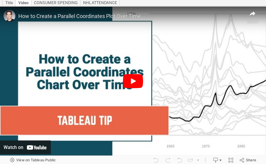
How to Create a Parallel Coordinates Plot Over Time

March 22, 2021
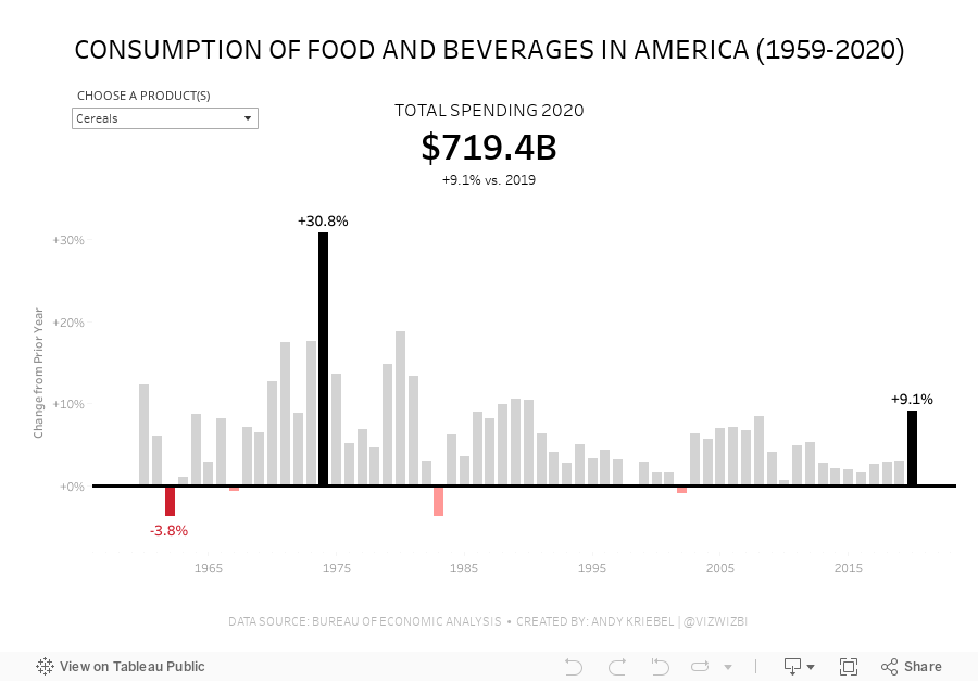
#MakeoverMonday Week 12 - How much do Americans spend on cereals?
Viz 1 - Year over Year Change in Consumption of Food and Beverages in America

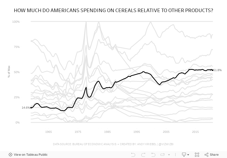
Viz 2 - Parallel Coordinates - How much do Americans spend on cereals relative to other products?

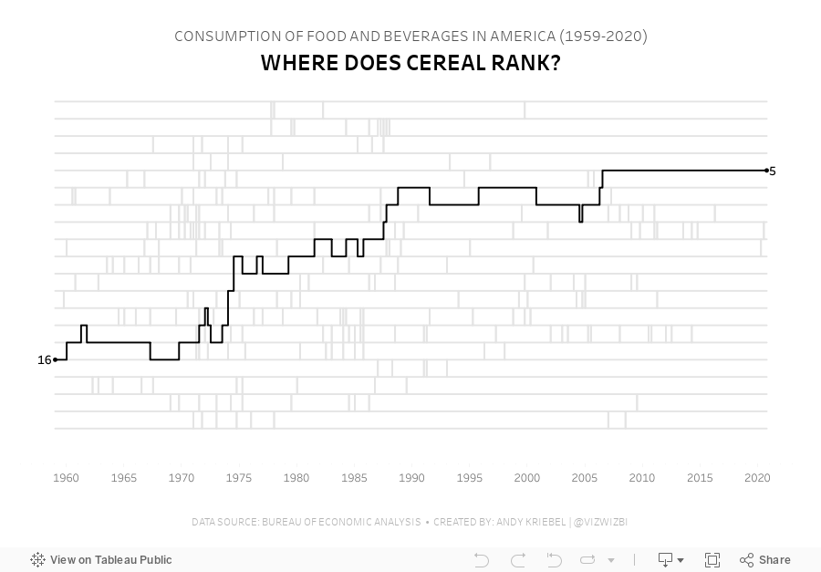
Viz 3 - Bump Chart - #MakeoverMonday 2021 Week 12 - How Does Cereal Rank in American Food Spending?

February 8, 2021
#MakeoverMonday Week 6: Why Are Women Perceived to Be Unequal to Men?

Wow! What a fun #WatchMeViz that was! I iterated through 16 charts and then when the idea solidified, there was some great conversation and feedback on the chat to help me get to the end. I find survey responses quite difficult to visualize, so instead of getting frustrated, I thought about all of the ways I can compare data to see if anything would work.
Most importantly, thank you to all of your on the live chat. It makes a huge difference to me and I love getting your feedback and questions along the way. You make me better. You can find the final visualization below the video.

July 9, 2019
#TableauTipTuesday: How to Create a Parallel Coordinates Plot
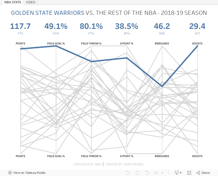
What is a parallel coordinates plot? Here's the definition from The Data Visualisation Catalogue:
This type of visualisation is used for plotting multivariate, numerical data. Parallel Coordinates Plots are ideal for comparing many variables together and seeing the relationships between them. In a Parallel Coordinates Plot, each variable is given its own axis and all the axes are placed in parallel to each other. Each axis can have a different scale, as each variable works off a different unit of measurement, or all the axes can be normalised to keep all the scales uniform. Values are plotted as a series of lines that connected across all the axes.
This workbook uses data from the NBA Stats website. You can get the data by downloading the workbook and unzipping it.
Enjoy!

October 29, 2014
Plot.ly - A simple interface for creating great looking charts in d3
What is Plotly? The folks at import.io have a great summary:
Plotly is a young graphing and analytics startup, which makes it easy to analyze and visualize data together. Using Plot.ly, users can import data from anywhere, then make and share online graphs using Python, MATLAB, R, Excel, Julia, and their web app. Users can also share work and collaborate on projects.
The Plotly API enables users to analyze and visualize data in one place, and forms an important step in building the infrastructure for data science to be further democratized. Their goal is to be an awesome platform for collaboratively analyzing data and making graphs.From the Plotly website, in the workspace area (think of this as a worksheet in Tableau):
Easily make graphs with your data in the workspace. Import data from Google Drive or upload Excel or text files. You can apply fits, stats, and functions to your data.
Every element of a Plotly graph is customizable. Change the colors, annotate, write LaTeX, toggle graph ticks, and much more. It's up to you!The best way to get familiar with any new product is to start using it. Since I had just publish a parallel coordinates plot in Tableau yesterday, I thought I would use the same dataset and see how long it takes to build something similar in Plotly. I was pleasantly surprised by the simplicity and intuitiveness of the interface. It took me about 30 minutes to build this view, but a lot of that time was spent tweaking the settings to get them just right, which I'm perfectly ok with given the very detailed control I have over the final display.
Plotly doesn't currently support things like filtering and parameters yet, but for a first pass through, I really like it and will definitely be using it more often going forward. So, here's my first plot.ly viz (be sure to hover over dots to see their awesome interactivity):






