October 1, 2020
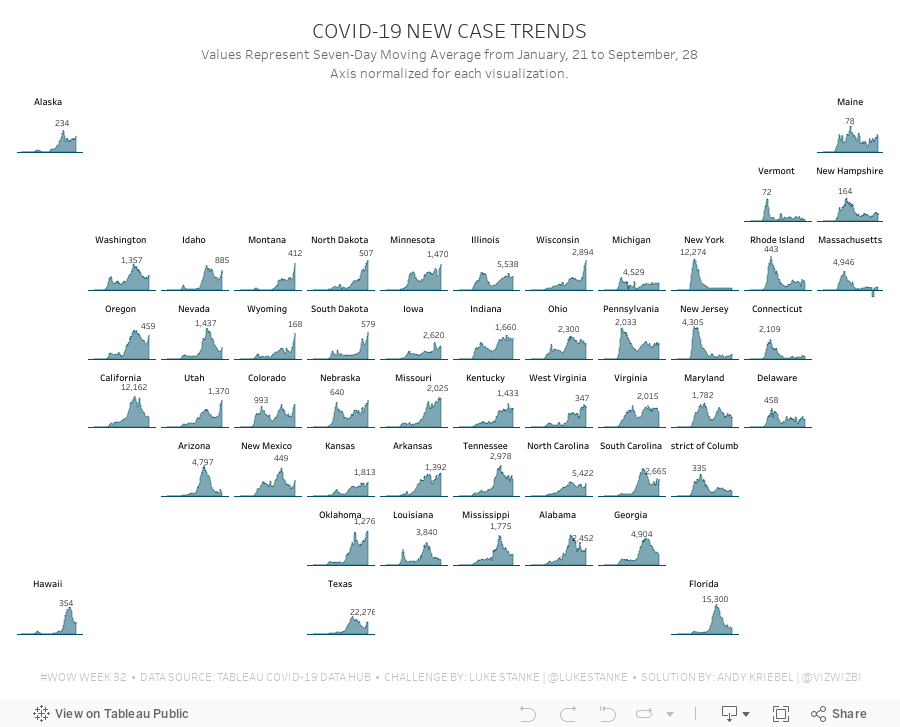
#WorkoutWednesday 2020 Week 32: COVID-19 New Case Trends

As I continue to catch up on Workout Wednesday challenges I've missed, I'm picking and choosing those that looking interesting at first glance (and that I think are doable in a short amount of time). Week 32 was one I knew I could get done quickly since it was very similar to 2017 week 7. Actually, since the columns and rows were provided to use already via a CASE statement, the trellis part of the exercise required no calculations and no work.
The toughest part was normalizing the calculation within each State. The key here is to think about each State individually, find the highest value, and then compare all of the other dates to that value. I did this by putting each State and date into a row, creating a calculation to get the largest value, then computing the necessary ratio. Once I had that, it was simple to turn it into a chart.
To get the State names in the middle of each chart, think about how you can count half of the day in each chart. Then take that value and add it to the first date and you'll get a single date that's halfway across the date range. This solution will be flexible for any new data that would be included.
Some difference between mine and Luke's
- I didn't filter the dates; I decided to use the entire data set, but keep in mind that I did this several weeks after Luke posted the challenge.
- I created a mobile version as well.
And with that, here's my completed #WorkoutWednesday for week 32 2020.
July 9, 2019
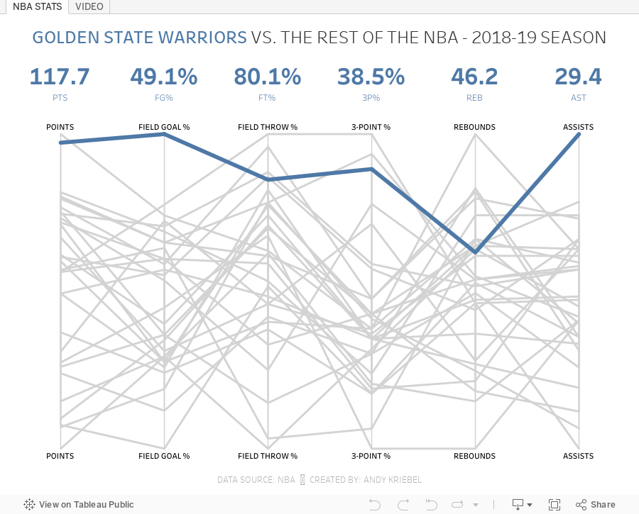
#TableauTipTuesday: How to Create a Parallel Coordinates Plot
What is a parallel coordinates plot? Here's the definition from The Data Visualisation Catalogue:
This type of visualisation is used for plotting multivariate, numerical data. Parallel Coordinates Plots are ideal for comparing many variables together and seeing the relationships between them. In a Parallel Coordinates Plot, each variable is given its own axis and all the axes are placed in parallel to each other. Each axis can have a different scale, as each variable works off a different unit of measurement, or all the axes can be normalised to keep all the scales uniform. Values are plotted as a series of lines that connected across all the axes.
This workbook uses data from the NBA Stats website. You can get the data by downloading the workbook and unzipping it.
Enjoy!

March 1, 2011
What’s the best measure of a team’s HR ranking? Three alternative measures.
Joe Mako posted the following comment about my post on all-time HR rankings: “What about consideration for the year? Seems to me that comparing the total number of home runs of teams that have been around for a over 100 years to teams that have been around for just a few dozen years does not seem useful. Is there data that tracks the number of home runs by team per year? If so maybe the data could be normalized, or viewed differently.”
Three measures that are likely a better indicator include HR/Game, HR/Year, and HR/Win. Colorado now comes in at #1 in all three categories, with Arizona in the top 3 in all three of these categories. The Yankees, Giants, Cubs and Braves are all much, much farther down the list now. Remember, normalizing the data can very often be your friend, unless of course you want to intentionally skew the data.


