July 9, 2019
#TableauTipTuesday: How to Create a Parallel Coordinates Plot
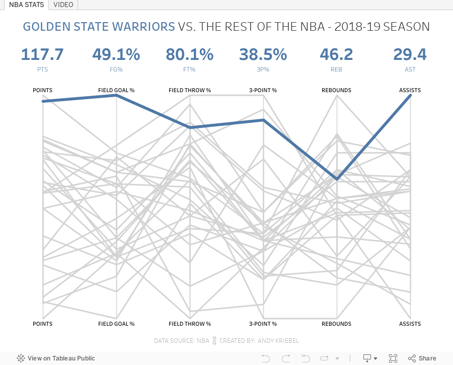
In this week's tip, I show you how to create a parallel coordinates plot. If you want some additional practice, this chart type was used in Workout Wednesday 2019 Week 49.What is a parallel coordinates plot? Here's the definition from The Data Visualisation Catalogue:
This type of visualisation is used for plotting multivariate, numerical data. Parallel Coordinates Plots are ideal for comparing many variables together and seeing the relationships between them. In a Parallel Coordinates Plot, each variable is given its own axis and all the axes are placed in parallel to each other. Each axis can have a different scale, as each variable works off a different unit of measurement, or all the axes can be normalised to keep all the scales uniform. Values are plotted as a series of lines that connected across all the axes.
This workbook uses data from the NBA Stats website. You can get the data by downloading the workbook and unzipping it.
Enjoy!

Subscribe to:
Post Comments
(
Atom
)


No comments
Post a Comment