April 30, 2018
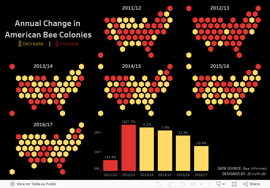
Makeover Monday: Annual Change in American Bee Colonies
bees
,
change
,
filled maps
,
hex map
,
Makeover Monday
,
tooltip
,
United States
2 comments


What works well?
- When you hover over a state, the value is indicated on the color legend.
- Informative tooltips
- Good filtering capabilities to customize the view
- Very responsive tooltips
- Displaying the states and territories outside the continental US separately
What could be improved?
- A diverging color scale is typically used to indicate positive and negative values. In this case, all values are positive.
- If you do want to use a diverging palette, the colors should merge at the median.
- A filled map makes smaller state difficult to compare to larger states.
- There's no sense of the change over time. Are colonies increasing or decreasing?
My Goals
- Create small multiple maps that show each year
- Make the story about the change, rather than the specific values
- Use highlight actions to make it easy to see a state across all maps
- Incorporate the total annual loss into the tooltip
April 23, 2018
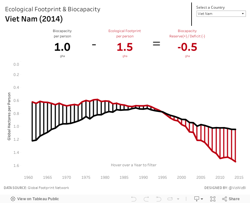
Makeover Monday: Biocapacity vs. Ecological Footprint
biocapacity
,
earth day
,
ecology
,
environment
,
global footprint network
,
Makeover Monday
No comments

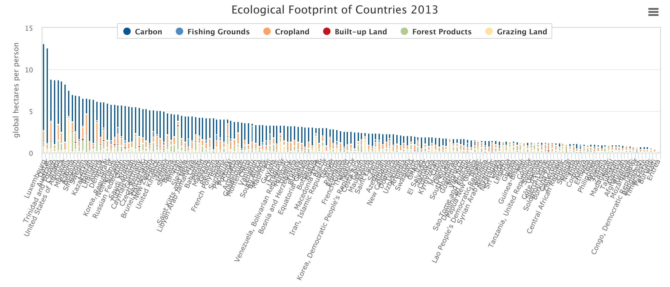
What works well?
- Simple title
- Nice framing of the legend
- Clicking on categories to add/remove them from the view
- Super responsive tooltips
What could be improved?
- Everything is very compact making it impossible to read
- Rotate the chart and make it tall vs. wide
- Reduce the number of categories to reduce the number of colors
- Provide a total option
For my viz, I wanted to recreate what was in the tooltip of one of their maps. I didn't have much time so I had to get it done quickly and I really like the BANs and how coloring between the lines helps emphasize the difference.
April 16, 2018
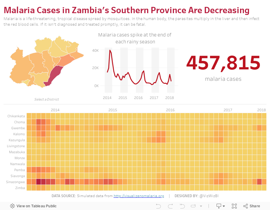
Makeover Monday: The Seasonality of Confirmed Malaria Cases in Zambia Southern Province
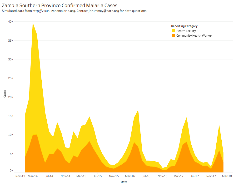
What works well?
- The colors are distinct from each other.
- The seasonality is very evident.
- The title is simple and tells us what theviz is about.
What could be improved?
- Are the colors stacked or is one behind the other?
- The overall decline is harder to see than necessary.
- What happened at the spikes? Adding some annotations would be helpful.
- Why is the data split between health facilities and health workers?
My Goals
- Can I show the overall decline more effectively?
- What does the viz look like when I combine the health facilities and health workers?
- Are there colors that will work more effectively?
- How can I make the seasonality more evident?
With those goals in mind, here is my Makeover Monday week 16. If this looks somewhat familiar, I created a very similar viz with a very similar data set for Makeover Monday week 34 2016.
April 12, 2018
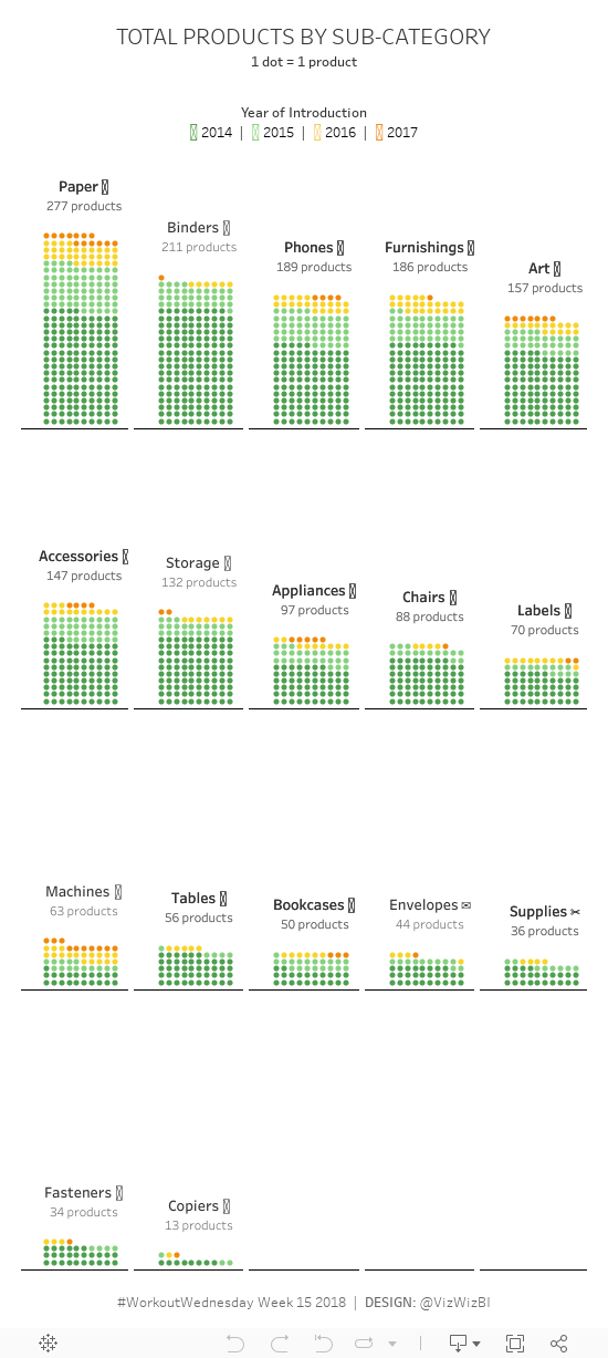
Workout Wednesday Part 2: Total Products by Sub-Category
Ok, part 2 of this week's challenge, the Jedi version, really sucked (requirements here). It took me FOREVER! I used table calcs for all of the calculations and getting them just right took a really long time and a lot of experimenting. Surely Tableau can make this easier for us.Some thoughts:
- Getting the subcategories to layout correctly in a trellis plot was easy.
- Getting the labels above each grid was easy.
- Getting 10 dots across each pane was easy.
- Getting the stacking of the dots in rows was a pain!
- Luke has an evil side.
But I absolutely loved the challenge. I'm really enjoying these! My advice for everyone is to keep at it until you get it. Even if you're stuck, don't cheat and download the solution. That doesn't help your learning. If it's too hard, then consider skipping it; it might not be the right level for you yet. You can always come back and do it later.
April 11, 2018
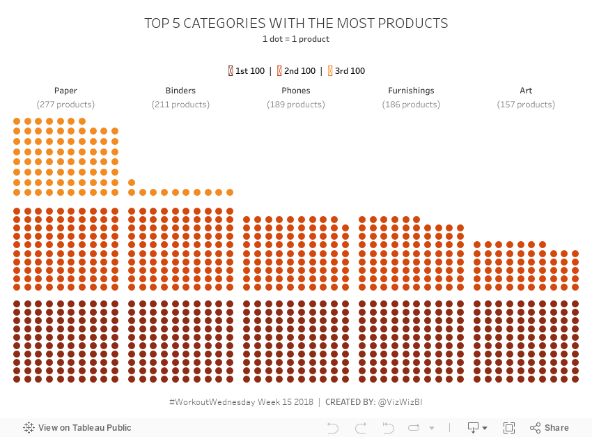
Workout Wednesday Part 1: Top 5 Subcategories with the Most Products
Luke is back and he has posted two challenges this week. First, create a pictogram of the top 5 subcategories that have sold the most products. They should be represented in 100 dot sections and colored depending on the section they are in. Get the requirements here.There were two requires that I didn't need to use to make it work:
- Set the minimum and maximum values on the columns axis (x-axis) to -3 and 12, respectively.
- Set the minimum and maximum values on the rows axis (y-axis) to -1 and 32, respectively.
I'm not sure what the purpose of these would be, but I suspect it's some sort of spacing. I didn't need them, so I ignored these requirements. Here's my version and now I'll get to work on part 2.
April 9, 2018
Makeover Monday: Arctic Sea Ice is Disappearing Fastest in Summer Months
arctic sea ice
,
change
,
climate change
,
environment
,
global warming
,
line chart
,
Makeover Monday
,
melting
No comments
So when I found this visualization by the National Snow & Ice Data Center, it seemed an appropriate topic for Makeover Monday. One of the most fun elements of this data set is that it includes only two columns: date and sea ice extent.

What works well?
- Without even trying, it tells a compelling story.
- The interactivity is fabulous. I really like being able to simply click on an item on the legend to have it added or removed as a highlighted line.
- Including the 1981-2010 median along with the IQR and IDR provides great context.
- Defaulting the view to show 2012 (the previously worst year for arctic ice) to 2018 helps show how 2018 is looking to surpass 2012 (in a bad way) by a lot.
- Subtitle explains what sea ice extent means
- Good use of simple colors
- Great example of using highlighting for context
What could be improved?
- The x-axis could be simpler by only showing the month names and removing the word "Date" from the axis title.
- Make the title more impactful
My Goals
- First, I wanted to rebuild the original and see if I could make it any better. I couldn't.
- Second, build a spiral diagram that shows the months around the outside, but this only worked well when it was animated.
- Finally, I settled on a different take on the metric that swaps the months and year on the original. That is, put the year on the x-axis and month on each line. This gave me only 12 lines which looked less busy and helped me see patterns for each month.
- Next, I included a line that is the average of each year (black line).
- I then decided to look at how each year of each month changed compared to 1979. I went with a percent change because I think that provides more context.
- Lastly, I included a highlighter for the months and included some BANs of the actual values for comparison.
Click on the image for the interactive version.
April 4, 2018
Workout Wednesday: Frequency Matrix
frequency
,
heatmap
,
level of detail
,
matrix
,
purchase frequency
,
table calculation
,
Workout Wednesday
No comments
This week Ann Jackson stepped in to provide everyone the challenge. I think she's been seeking some revenge and she sure dished it out. Find all of the requirements here.Easiest Parts
- Use sub-categories (HINT: Since it's a frequency matrix, there's a trick here.)
- Dashboard size is 1000 x 900; tiled; 1 sheet
- Distinctly count the number of orders that have purchases from both sub-categories
- Sort the categories from highest to lowest frequency
- White out when the sub-category matches and include the number of orders
- Match formatting & tooltips – special emphasis on tooltip verbiage
Hardest Parts
- Calculate the average sales per order for each sub-category
- Identify in the tooltip the highest average spend per sub-category (see Phones & Tables)
- If it’s the highest average spend for both sub-categories, identify with a dot in the square
I messed around with the average sales per order calc for quite a while. I have every number the same except for a couple in paper and binders. I have had a look at Ann's solution and I think mine is more accurate, so I'm sticking with it. :-)
Excellent challenge this week! Give it a try, but give it a REAL try before looking at someone's solution; you will absolutely learn more. Click on the image for my interactive version.
April 1, 2018
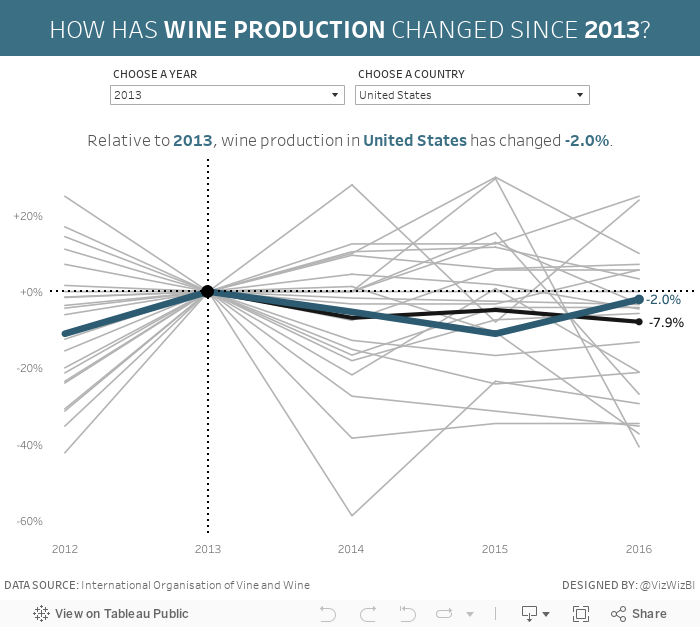
Makeover Monday: World Wine Production
alcohol consumption
,
change
,
difference
,
highlight
,
line chart
,
Makeover Monday
,
parameter
,
wine
6 comments

What works well?
- It's a simple line chart, which makes it easy to understand.
- The red line stands out well against the white background without being too bright.
- The units on the axis are labeled.
- The title tells is what the line represents.
What could be improved?
- The subtitle could be moved to a caption below the image.
- The axis has a strange scale. Why does it start at 180?
- Adding the drop lines makes it look like the length of those lines is important, but if you compare the length of the lines, then that could be misleading due to the axis starting at 180. I'd remove those lines.
- The year labels are diagonal.
- Each year doesn't need a label.
- Why doesn't the source document contain data for all of the years?
My Goals
- It's Easter and I have basically no time to work on this, so do something quick.
- Mimic what we created for Workout Wednesday week 33.
- Focus on the relative change from a chosen period instead of the absolute change. For me, this is more meaningful if you want to see how much a country has changed and it normalizes all of the countries.
That's it. All done!
Subscribe to:
Posts
(
Atom
)


