Showing posts with label healthcare. Show all posts
February 6, 2019
Hospital Closures in Rural America
Today is my first time participating in Lindsay Betzendahl's great collaboration project #ProjectHealthViz. She first told me about back at TC and I told her I would participate when time permitted. So here I am, participating for the first time.
The data set Lindsay posted was about hospital closures in rural parts of America. My mind immediately went to poverty in the South (I wasn't too far off), access to medical care, and the cost of healthcare.
After exploring the data and getting feedback from Lindsay, I settled on a simple story that answers few simple questions:

The data set Lindsay posted was about hospital closures in rural parts of America. My mind immediately went to poverty in the South (I wasn't too far off), access to medical care, and the cost of healthcare.
After exploring the data and getting feedback from Lindsay, I settled on a simple story that answers few simple questions:
- How many hospitals have closed?
- How many beds are no longer available?
- How many people are impacted (I added data from the US Census)?
- How many hospital bed days have been lost?
In the end, this is a pretty simple viz that I hope communicates the message well. In my opinion, access to healthcare should be a right, not a privilege. Click on the image for the interactive version.
April 16, 2018
Makeover Monday: The Seasonality of Confirmed Malaria Cases in Zambia Southern Province
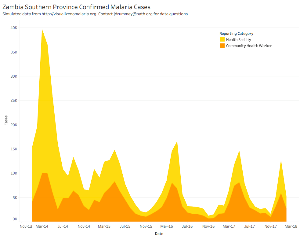
What works well?
- The colors are distinct from each other.
- The seasonality is very evident.
- The title is simple and tells us what theviz is about.
What could be improved?
- Are the colors stacked or is one behind the other?
- The overall decline is harder to see than necessary.
- What happened at the spikes? Adding some annotations would be helpful.
- Why is the data split between health facilities and health workers?
My Goals
- Can I show the overall decline more effectively?
- What does the viz look like when I combine the health facilities and health workers?
- Are there colors that will work more effectively?
- How can I make the seasonality more evident?
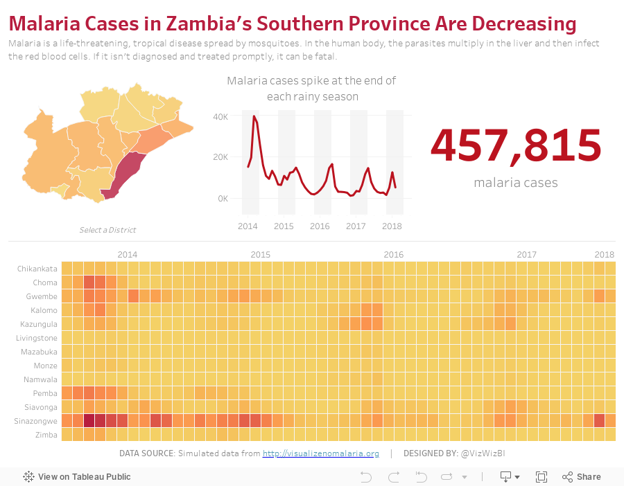
With those goals in mind, here is my Makeover Monday week 16. If this looks somewhat familiar, I created a very similar viz with a very similar data set for Makeover Monday week 34 2016.
Subscribe to:
Posts
(
Atom
)






