November 30, 2016
How Many Times Have Teams Been to the World Series?

Yesterday I wrote about how much I liked a World Series viz created by Business Insider. One of my favourite ways to learn Tableau, and one I highly recommend to everyone, is to reproduce work that inspires me.
What was most fun about creating this viz is that it’s built completely with ASCII squares. Yes, I use a measure for the axis, but the measure is merely a placeholder. I learned a lot creating this viz this way; basically you can easily create a unit chart without having to densify the data by using a simple calculation that trims the ASCII squares instead. I also included bar charts in tooltips.
Download the workbook to see how I did it. In the meantime, here’s my take on the frequency of teams appearing in the World Series.
November 29, 2016
86 Tips in 45 Minutes | Our Presentation from DATA16

Our goal going into the session was to see if we could get to 50 tips in 50 minutes. Right before we started, we decided to let our wonderful judges and the audience count the tips. Why? Because Jeff and I have been using Tableau for a long time and sometimes we do things that come second nature to us that others didn't know.
This was BY FAR the most fun presentation I've ever given or been a part of. Thanks Jeff for being a great partner!!
If you'd like to follow along, you can download the workbook of my tips here.
My advice, pause the video along the way and try to reproduce the things I do using the starter workbook. Have fun!
November 28, 2016
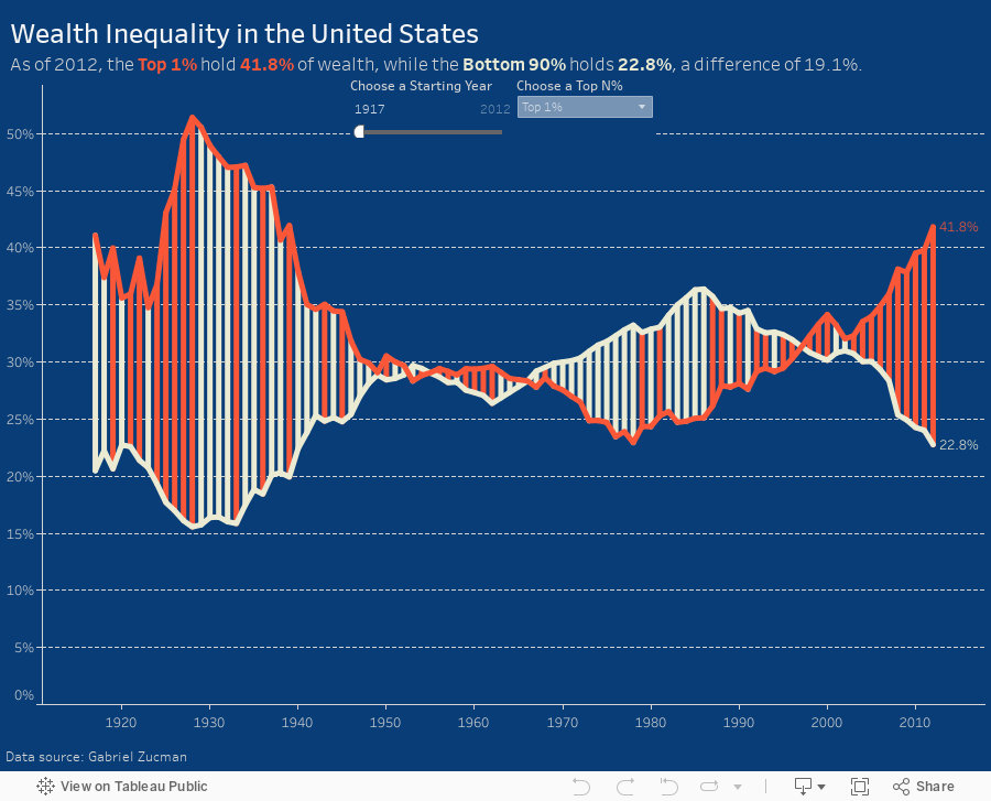
Makeover Monday: Patterns of Change in Wealth Inequality

Different take on this week's #makeovermonday - used path analysis technique I learned from @eagereyes at #data16https://t.co/jFV8zyA8uQ pic.twitter.com/AMRTmPMQxo
— Matt Hoover (@Matt_Hoov) November 28, 2016
A connected scatterplot is great for visualising paired time series data. In this case, the pair is the bottom 90% vs. the top N% as picked by the user. The line is colored by the difference between the bottom 90% and the top N%. I added dots on the ends of the lines to make the start and end easier to find.
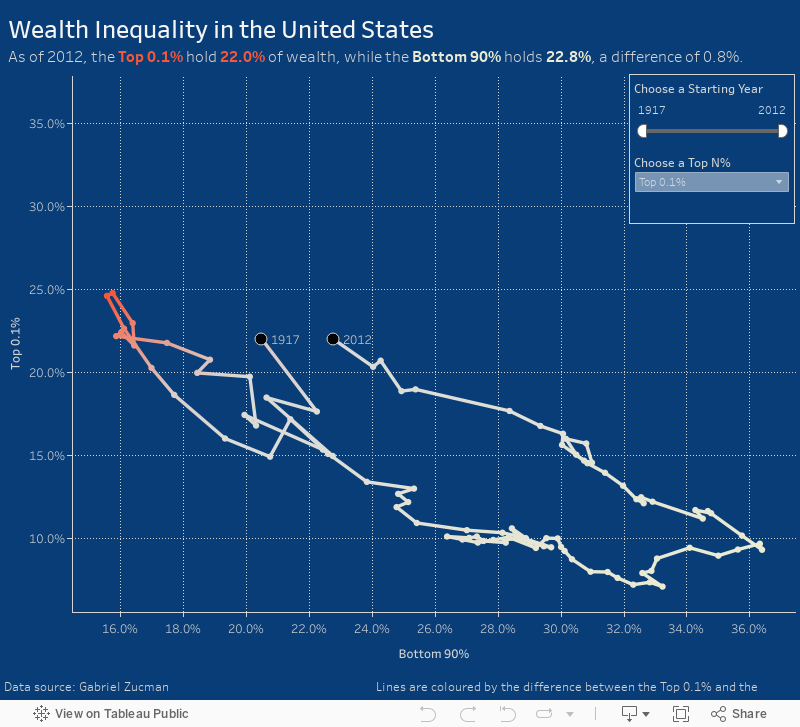
Makeover Monday: Wealth Inequality in the United States


What works well?
- Line chart is an appropriate chart choice as we're comparing two values over time
- Title is clear and simple
- Good sourcing and footnotes
- Tells a simple story effectively
- Only one axis is needed
- Title is a bit misleading as the values aren't actually equivalent
- Color choices imply democrat vs. republican
- Feels like there's a bit of extra visual clutter
- Difference could be accentuated more
This week, I again recorded all of my work along the way. In 45 minutes, I created 175 images. But this doesn't include parameters, filters and all the work done inside the dashboard, otherwise it would probably be twice as many.

You'll see in my final version that I put a lot of focus on the difference between the lines. I also used a parameter so the user can pick their own comparison. I also have a dynamic subtitle that updates based on the values picked in the parameter.
November 24, 2016
From London to New York in 500 miles | My New York City Marathon Training Visualized
Like most runners, I love my running data! My watch syncs to Tom Tom, Runkeeper, Strava and Nike+. Why all of them? Well, why not? Naturally, I wanted to see how my training went. Was it effective? How'd I do in my long runs? How often did I run? What was my average pace? The questions are endless.
I'm also in the middle of testing a new Web Data Connector for Strava that brings back A TON of information about each run. Mix all of this together and you get a dashboard of my marathon training.
Click on the image for the interactive version (it's too wide for my blog). Once you're there, you can click on any activity and see the map update with the route of each run. The activity will also be highlighted across all of the charts.
And yes, I got the data from Strava yet I'm using Runkeeper colors. I simply like their colors better. Enjoy!

November 23, 2016
Makeover Monday Goes to the Sydney Tableau User Group

Very, very early this morning, I had the pleasure of speaking to the first Sydney Tableau User Group. My good friend Fi Gordon asked me to join them to talk about Makeover Monday, how I approach makeovers, why I do them, examples of work I’ve done, and the encourage people to get involved.
It was bit of a different atmosphere as I couldn’t hear or see anyone. Fi, being the genius she is, was messaging me on Twitter throughout to keep me updated.
Without further ado, here’s my presentation. Enjoy!
November 22, 2016
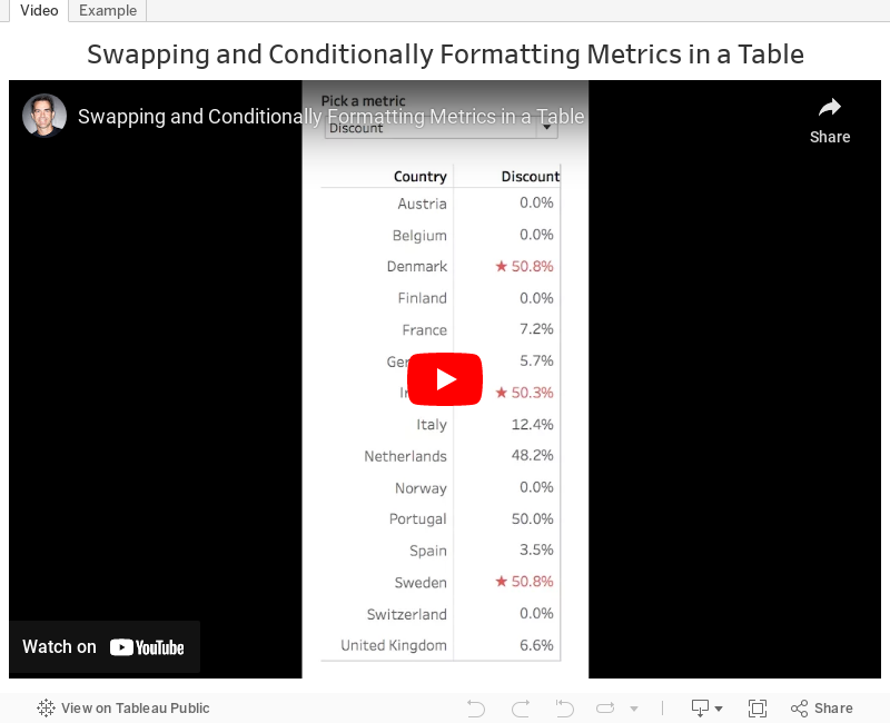
Tableau Tip Tuesday: How to Swap Metrics in a Single Table and Conditionally Format the Values

November 21, 2016
Makeover Monday: Wildlife Strikes in the USA

Let's start with Kelly Martin's incredible airplane/wildlife collisions dashboard:

What works well?
- To put it simple, everything works well here. Kelly has a very intentional design style.
- Minimal use of color
- Great use of whitespace
- Excellent annotations
- Great use of icons
- Nice instructions
- Good interactivity
- Remove the size legend and indicate that through text
As for the advanced logging, Tableau Research asked this week that we enable a setting on Tableau that creates an image every time you do something on a worksheet. I had no idea what this would result in, but in exactly 60 minutes, I created 396 images. That's a lot of squiggles! Here's a gif of my iterations:

For my makeover, I wanted to implement a visualisation technique I learned from Tableau's Michele Tessari at #Data16 in his session "Artful Data: The Balance of Art and Analysis". My goal was to show the number of strikes by weekday and month, but also to show the values for each state.
Another fun week of playing with data. Here's my take on this data set:
November 19, 2016
The United States Electoral College | A Genius Representation of the People

This turned out to be a fantastic civic learning experience for me. And exploring the data with Tableau helped me understand how it all works. I know a lot of people, particularly those I work with in the U.K., that are confused by this election and how the popular candidate didn't win. To aid in this understanding, I've created this story points visualisation to explain how the electoral college works, how electoral votes are allocated, and how the election would have turned out if the electoral college was based strictly on population.

November 14, 2016
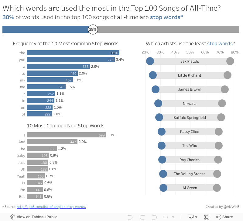
Makeover Monday: The Words of the Top 100 Songs of All-Time


What works well?
- Simple title
- Good references
- Treemaps are generally a poor choice for showing the distribution of the words
- Way too many colors
- It's impossible to make any sense of the words and see any patterns
November 7, 2016
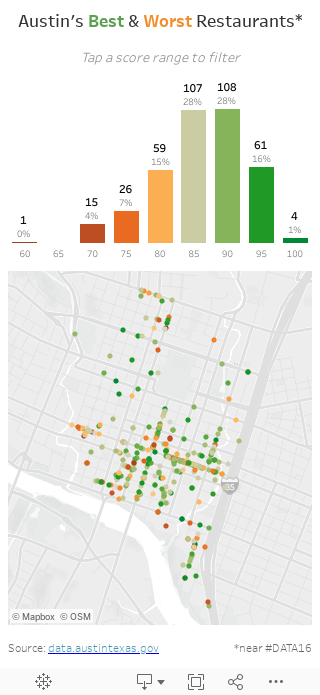
Makeover Monday: Austin Restaurant Inspections


As you drill into the viz you get more and more detail, like this:


What works well?
- Super intuitive interface; everyone know how to drill in on a map
- Simple instructions
- Nice grouping of restaurants with a counter
- Nice use of symbols to represent a specific restaurant
- Good use of colors
- Takes too long to drill in. When I played with it, they could easily show more specific restaurants at once and not shown so many groups.
- I have no idea how many restaurants are good or bad.
November 2, 2016
Makeagain Monday: Highlighting the Changes in Satisfaction with EU Transport


What would I change?
- The red/green color scale might be tough for color blind folks.
- I'm confused by the colors on the ends of the bar because those don't represent the same thing as the color of the middle bar.
- There are too many controls for me at the top. Might this be better as a static image with a singular story? Pablo chose to make it interactive, which is perfectly fine. I simply might choose to do different. Neither is better.
- There are a LOTS of cities in this. I would show the top and bottom 10 for simplicity. Again, personal preference.
November 1, 2016
Makeagain Monday: Popping the Bubbles of the Scottish Index of Multiple Deprivation

The purpose isn't to pick on anyone. I use this as a teaching method. How can I take an existing visualisation and show I would improve and simplify it step-by-step. I only detail what I think doesn't work about the visualisation.
This week we looked at the Scottish Index of Multiple Deprivation and Pablo Gomez create this visualisation (click on it for the interactive version):

What doesn't work?
- Packed bubbles are basically impossible to compare
- What does the size and color of the bubbles mean?
- Do the colors coordinate with the scatter plots? (The answer is no, but I didn't know that until I downloaded the workbook.)
- What do the scatterplots add? They all basically look the same.
- The massive image on the right takes up like 25% of the space. What does the flag mean?


