November 28, 2016
Makeover Monday: Patterns of Change in Wealth Inequality

Different take on this week's #makeovermonday - used path analysis technique I learned from @eagereyes at #data16https://t.co/jFV8zyA8uQ pic.twitter.com/AMRTmPMQxo
— Matt Hoover (@Matt_Hoov) November 28, 2016
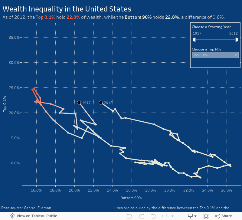
A connected scatterplot is great for visualising paired time series data. In this case, the pair is the bottom 90% vs. the top N% as picked by the user. The line is colored by the difference between the bottom 90% and the top N%. I added dots on the ends of the lines to make the start and end easier to find.
Subscribe to:
Post Comments
(
Atom
)


No comments
Post a Comment