August 30, 2017
Workout Wednesday: Average Latitude of Solar Eclipses by Century
You might think I'm taking the easy way out this week for Workout Wednesday, but I found building last week's Makeover Monday chart not as straightforward as I thought so I figured I'd share the fun with you.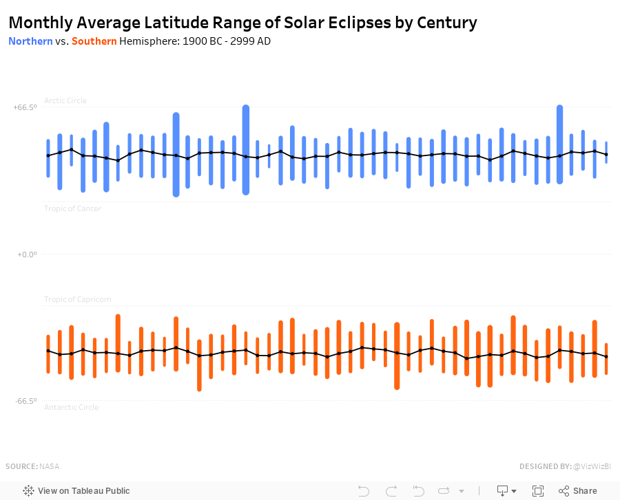
Requirements:
- Must be one sheet (except the footer)
- Must match my y-axis scale and format
- Must match my reference lines
- Match the blue and orange for the northern and southern hemispheres
- Match the title and subtitle
- Be sure to include the footer
- X-axis represents the centuries
- Century 3000 AD is excluded
- Black line is the average latitude across the centuries
- For each century and hemisphere, each "bar" spans from the max to the min average latitude by month, century and hemisphere.
- The bar width represents the difference between the max and min.
- Match the nice rounded ends on the "bars"
- Match the tooltips
Good luck! Remember to tweet a picture and link to your solution and tag @EmmaWhyte and @VizWizBI.
August 29, 2017
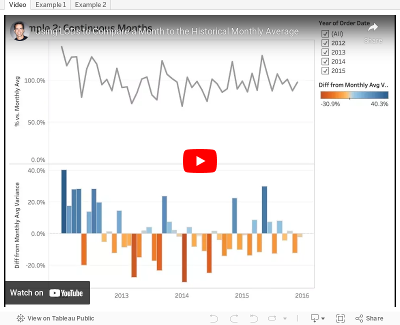
Tableau Tip Tuesday: Using LODs to Compare a Month to the Historical Monthly Average
August 28, 2017
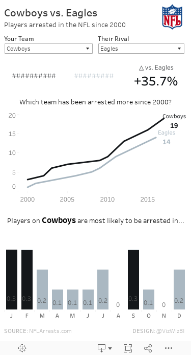
Makeover Monday: Player Arrests in the NFL since 2000
arrests
,
crime
,
Makeover Monday
,
nfl
,
violence
No comments

Let's have a quick look at the original viz.

What works well?
- Really nice interactivity
- Fast and slick filtering options
- Sorting the teams from worst to best
- Allowing the user to customize the view
- Showing the top 5 in three categories
- Expand button allows you to quickly see a bigger chart
- Option to click on a team and quickly drill into that team
What could be improved?
- The Hide All and Show All buttons are unnecessary.
- Too many colors
- Tooltips aren't very useful
- Comparisons are more difficult than they need to be
My Goals
- Allow for comparisons between teams
- Make the patterns more obvious
- Reduce the complexity of the view
- Choose simple chart types
- Show BANs to summarize the data
- Make a mobile-friendly view
With those goals in mind, here's my Makeover Monday week 35. Enjoy!
August 23, 2017
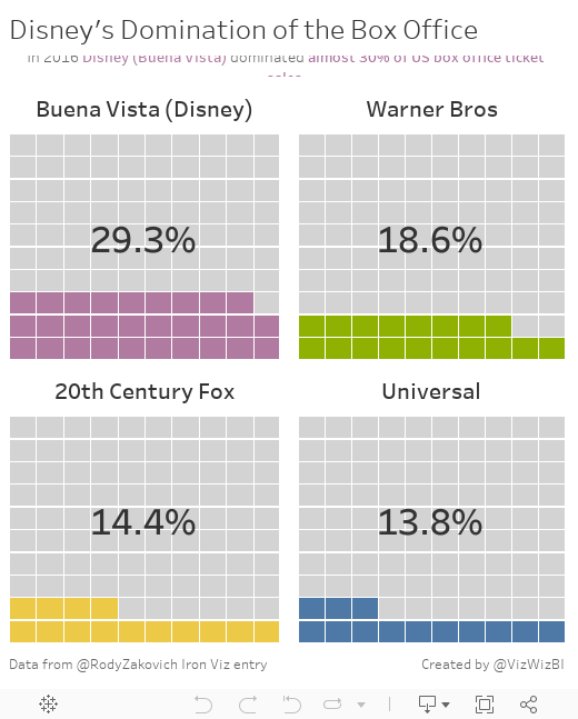
Workout Wednesday: The Waffles of Disney's Domination
The waffle chart bit was pretty straight forward. The trickiest part for me was the calculation to get the % of total.
Fun one! Give it a go!
August 22, 2017
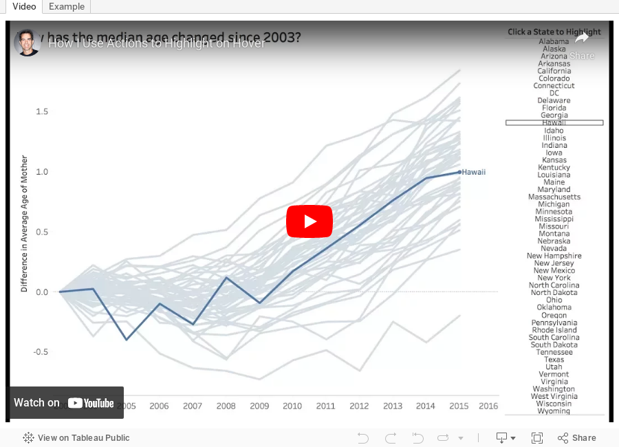
Tableau Tip Tuesday: Using Actions to Highlight on Hover

We recommended that Sarah include a highlight action so that the user can click on a State on the right and highlight the corresponding line on the bottom right. Sarah commented that she wasn't sure how to do this and Eva volunteered me (as she does) to make a video.
This week's tip will show you how to use highlight actions to hover over a State and highlight it in the line chart. I also show how to include a label on the end of the line. Enjoy!
August 21, 2017
Makeover Monday: The Monthly Latitude Range of Solar Eclipses by Century
This week we looked at this viz of thousands of years of solar eclipses:

What works well?
- Fantastic interactivity and drill down capabilities
- Showing the paths of each eclipse along with the partial eclipse breadth
- Coloring each eclipse type
- Leveraging Google Maps so the user can customize the map to their preference
- Good explanations above and below the chart
What could be improved?
- Remove the labels on each line to declutter the map
- Avoid a repeating map
- Include a more impactful title
My Goals
- Explore the data to find some interesting analysis per Eva's request
- Build lots of views to see what pops
- Simplify the view to reduce complexity and clutter
- Compare northern to southern hemisphere
- Use colors that are clearly distinguishable
As I mentioned, I really struggled. I built lots of view and probably hit undo 200 times. I didn't like anything. I sent a few complaining messages to Eva and she essentially told me to suck it up. Tough love indeed!
Finally, I decide to create a calculation to aggregate by century and then created an LOD to return the max and min latitude in any given month within the century. By any given month, I don't mean month/year, I mean month. So what is the average of all Januarys, Februarys, etc. and then what is the max of those values. I then compared that to max to the min to determine the range.
I don't love it, but I'm done. I've struggled enough.
August 16, 2017
Workout Wednesday: How has your home price changed?
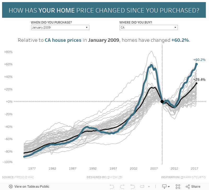
First, you can find the housing index data here. You will need to do some minor data prep. Curtis has some hints in his post if you get stuck.
REQUIREMENTS:
- The data is displayed as the monthly percent change in the house price index based on the date chosen above the chart.
- The State selected must be highlighted in the greenish color (#3B6F84).
- The US average must be highlighted in black.
- The most recent value should be shown on the end of the selected State and the US average.
- All States must be in the view. All States that are NOT selected should be thin and grey.
- Include a reference line for the month selected and include a dot at that point.
- Match all of my titles and formatting. Note that the chart title is dynamic.
- Match my axes.
- Match the footer (except replace my name with yours).
- Be sure to tag Curtis (@Harris7Curtis) so he gets credit when you publish it to Twitter.
Good luck!!
August 15, 2017
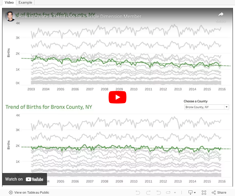
Tableau Tip Tuesday: How to Create a Trend Line for a Single Dimension Member
Enjoy!
August 13, 2017
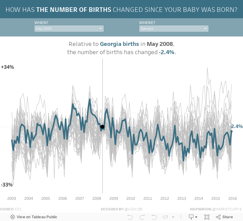
Makeover Monday: How Has the Number of Births Changed Since Your Baby Was Born?
baby
,
birth
,
Curtis Harris
,
highlight
,
imitation
,
Makeover Monday
,
parameter
,
United States
2 comments
If this data set and viz look familiar, it's because I highlighted it a few weeks ago on DataVizDoneRight and it was also the source for Workout Wednesday Week 31.
What works well?
- Incredible interactivity
- Amazing storytelling as your scroll down the page
- Great use of minimal colors for highlighting
- Great use of context
- Nice example of stepped lines
- Including a link to the source
- Good placement of the filters at the top to encourage the user to use them first
- Including event icons which update the viz based on the year you're viewing
- Great annotations
What could be improved?
- Could use a more impactful title
This is such an amazing viz and a pretty interesting data set. I'm curious to see what else the Makeover Monday community can come up with.
My Viz
I also recently highlighted a viz by Curtis Harris (my review / his viz) that I have been wanting to try to recreate. While this data set isn't the same, it's the technique and design by Curtis that I wanted to mimic. Thanks Curtis for the inspiration!
With that, here's my Makeover Monday week 33, in which I look at the number of babies born by State since your baby was born.
August 9, 2017
Workout Wednesday: Continuous Dates are Tricky
calculation
,
continuous
,
dates
,
forums
,
Jonathan Drummey
,
level of detail
,
month day
,
running total
,
Workout Wednesday
4 comments

Her requirements are pretty straightforward. I was able to get everything quickly with the exception of the month labels on the x-axis.
FIRST ATTEMPT
To do the line chart, I created a Day of Year calc and plotted that on the x-axis. Notice this results in the day number on the scale.
SECOND ATTEMPT
To format the scale, I first changed the number format to mmm to give me month abbreviations. That gets me close, but some months are missing and the months are labeled at the middle of the month whereas Emma's are labeled at the start of the month.
THIRD ATTEMPT
I sent Emma a message with a few questions, basically because I was stuck. All she said was:You'll have to re-think the date you have on the x-axis so you can also colour by year.
What does that even mean? I'm beginning to get a sense for the sort of torture I put people through. Ok, so I somehow need to get my x-axis to act like a date, yet still be able to show every day for each year in the view. I also need it to only be month and day. Hmmm: Hey Google, can you help?
Yes indeed! I searched for "tableau month and day of year" and the second search result took me to the Forums which had exactly the question I was asking. The brilliant Jonathan Drummey came up with this formula:
DATE(DATEADD('day',DATEPART('day',[Date]),DATEADD('month',DATEPART('month',[Date])-1,#1903-12-31#)))
Sweet! All I needed to do was swap out [Date] for [Order Date] and I was good to go. Now I have the exact result I needed.
Awesome challenge! I love learning something new! Here's my final product.
August 7, 2017
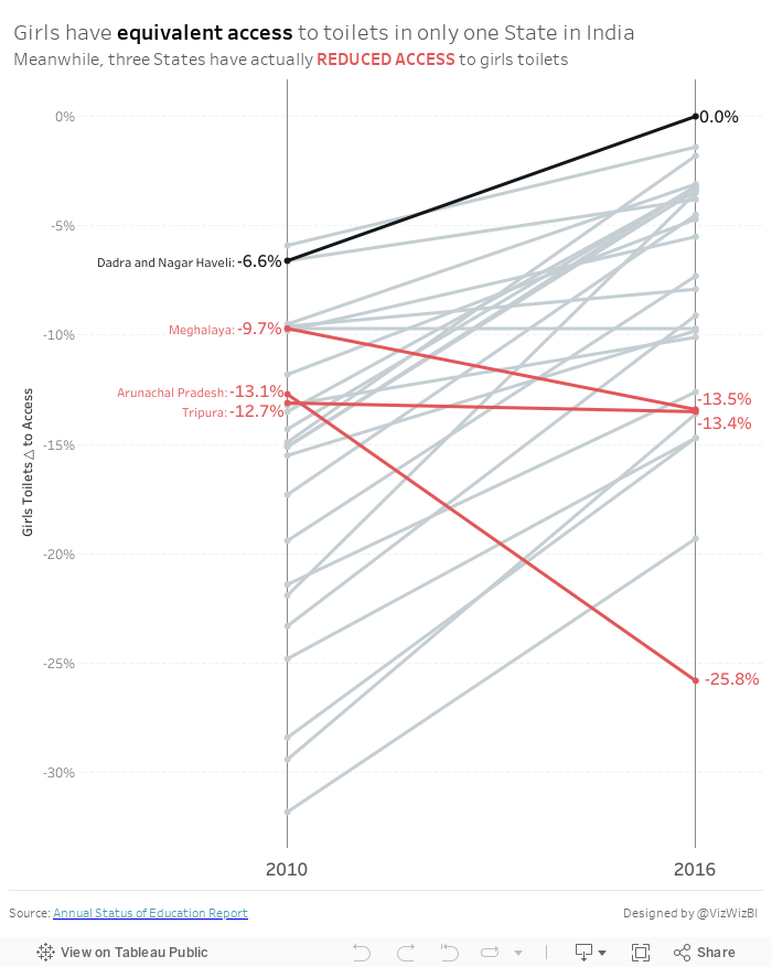
Makeover Monday: How has access to toilets changed for girls in India?
change
,
highlight
,
India
,
LOD
,
Makeover Monday
,
sanitation
,
slope graph
,
toilets
No comments
Let's have a look at the original:

What works well?
- The filled map helps you easily identify which States fall into which categories.
- The colors work well together.
What could be improved?
- The title doesn't make sense. What does access over sanitation mean?
- Sanitation is spelled wrong in the title.
- The legend is cut off.
- Making comparisons across the maps is nearly impossible.
- Making comparisons across years IS impossible.
- There's a lack of explanation as to what the data means.
- There's a lack of insight.
- Labelling each State makes the maps look very cluttered.
- There's no call to action.
My Goals
- Provide insight as to which States have gotten better
- Use a more meaningful metric rather than separating the two metrics
- Simplify and declutter the visualisation
- Highlight what's important
- Emphasize the inequality of access to toilets for girls
With those goals in mind, here's my Makeover Monday week 32.
Subscribe to:
Posts
(
Atom
)


