December 31, 2016
2016 | VizWiz Year in Review

This has been a pretty epic year for me both for this blog and for “work”. This year, I made an effort to blog more, record videos of tips to help grow the Tableau Community and share as much as I possibly could. Some notable stats and facts I’ve been tracking:
- Three cohorts and 24 consultants passed through the Data School
- Wrote 175 blog posts on this site, 25 more than my previous best year (2015)
- Started the Tableau Tip Tuesday video series and published 45 videos to my YouTube channel
- Published 22 blog posts for the Data School, up from 9 in 2015
- Wrote 18 blog posts for Data Viz Done Right, down from 54 in 2015
- Presenting 86 Tips in 50 Minutes alongside Jeffrey Shaffer at the Tableau Conference
- Completed 52 weeks of the #MakeoverMonday project with Andy Cotgreave
- Honourable Mention - Best Data Viz Project (Makeover Monday) | Kantar Information is Beautiful Awards
I started this blog in August 2009 as a way for me to record what I learned. As I observe more and more readers, I'm inspired me to write more, to share more, to help more. Thank you for reading!
Here are the most popular VizWiz posts in 2016:
- 12 Books Every Great Data Analyst Should Read
- Tableau Tip Tuesday: How to Create Diverging Bar Charts
- Tableau Tip Tuesday: How to Display KPIs Next to Bars
- Fix It Friday: Ten Alternatives Methods for Presenting Alcohol Consumption in OECD Countries
- Tableau Tip Tuesday: How to Create Small Multiple Line Charts
- Tableau Tip Tuesday: 12 Use Cases for Parameters
- Tableau Tip Tuesday: Layout Tips for Long Form Dashboards
- Makeover Monday: Travel Agents Are a Relic of the Past and Hotels Could Be Next
- Tableau Tip Tuesday: How to Create Monthly Radar Charts
- Tableau Tip: How To Create a 100 Mark Unit Chart inside of a Tooltip
So what’s in store for 2017? Well, much of the same and a bit more.
- Makeover Monday will continue and I’ll be teaming up with Eva Murray in 2017.
- Given that you clearly like tips, I will continue Tableau Tip Tuesday, hopefully every week, but I know I won’t have time to do a video every week. I promise to create as many as I can.
- To help those that participated in Makeover Monday in 2016 take their development to the next level, I’ll be teaming up with Emma Whyte for Workout Wednesday. Basically, we’ll trade Data School Gym challenges with each other every Wednesday through the year. You can take the challenge yourself and try to rebuild our challenges each week.
- I want to post on Data Viz Done Right more often. Ideally, I’ll post every Thursday at a minimum.
Happy New Year to everyone in the Tableau and data visualisation communities! You’ve made 2016 an amazing year and I look forward to seeing what 2017 brings.
December 26, 2016
Makeover Monday: How Much Has the Cost of Christmas Dinner Really Risen?

Well, this is it! 52 weeks of Makeover Monday under our belts. Thank you for an incredible year and for participating in this amazing project.
In case you missed it, Makeover Monday will continue in 2017. Eva Murray and I have big plans in store for everyone. If you ever have questions, comments or feedback, give us a tweet.
Ok, so onto week 52. The BBC published an article early in December about the cost of Christmas dinner in the UK with this blaring headline:
Christmas dinner costs 'rise 14%'
Inside the article were these basic charts:


Fortunately, Andy C was able to locate the data on BBC Github. Let’s review the charts.
What works well?
- A line chart is a good choice for showing change over time.
- The line chart uses about a 3x2 ratio which doesn’t distort the shape too much given the axis is zoomed in.
- The bar charts work fine for comparing the two years.
What doesn’t work well?
- The line chart has smoothed curves, which lead you to believe there were changes throughout the year, but the data is only at the yearly level. This could be misleading.
- What food are included? The data on Github doesn’t match the data in the chart? How are we to know what they consider to be the Christmas foods?
- There’s no logical sort to the bar chart. It’s neither sorted by 2015 nor 2016. I can’t make out how it’s sorted.
- The bar chart doesn’t include all foods they have data for, so why did they only show these foods? Are these the foods that comprise the line chart? We have no way of knowing.
- Were the Christmas themed colors in the bar chart intentional? If so, I get why they did it, but it won’t work for their colour-blind readers.
- The title of the bar chart indicates it’s about the price change, but they make the reader do the change maths in their head. Why not just show the change?
- Why are they comparing 2016 to 2015 and not a different year? That seems a bit shortsighted and sensationalist to me.
For my version, I thought it was important to:
- Indicate when the peak price occurred
- Show the entire time period to get a better sense for the rate of change
- Indicate whether the 2016 price has increased or decreased compared to 2006
- Sort the products by the 2016 price
- Show the rate of change and the latest price
- Optimise the view for mobile
Given these ideas above, here is my last Makeover Monday for 2016. I’m looking forward to continuing this project with Eva in 2017.
December 18, 2016
Makeover Monday: Historical Performance of the Washington Metro

Two weeks to go in one of the best projects I’ve ever been a part of. In fact, Andy Cotgreave and I are hosting a Twitter chat on Monday at 4pm GMT. Get all of the details here and join us in discussing the impact this amazing project has had on all of us.
For week 51, we’re looking at the Washington DC Metro Scorecard. This is basically a KPI dashboard of quality and safety for the Metro. Let’s have a look at their scorecard:


What works well?
- Nearly laid out and organized
- Thumbs up and down give the status at a glance
- Despite the rings, it’s visually appealing and draws you in
What could be improved?
- While the rings make the comparison to goal easy, they wouldn’t work if something has to go past a full circle of the ring.
- Inconsistent colors
- No sense for performance over time
- Can’t see all of the metrics in a single view; scrolling is generally a problem with KPI dashboards
- You can’t tell how far each metric is from the target
They didn’t make all of the data available for us to use in the makeover. For example, there is no data available for the entire people and assets section. So what you’ll see this week from everyone will be nine of the metrics. For my makeover, I wanted to create small multiples of each metric over time. I liked their blue and red colors, so I used similar colors. I also wanted this to look more like a newspaper, so I went with the American Typewriter font. Lastly, if you look at this on a phone, you’ll see it a long, scrolling dashboard. I really like how this turned out.
December 16, 2016
How have humans grown in the last 100 years?

This morning I was catching up on my backlog on feedly and read the two amazing blog post by Rody Zakovich and Alexander Mou about creating a Sigmoid curves. I have never created a chart like this before and I love the visual appearance so I thought I’d give it a go.
I went back to my Data School Gym challenge from a few months ago because I knew it was simply comparing one point in time to another like Alexander covers in his blog. In this case, I was looking at the change in human height by country from 1896 to 1996. Alex’s blog is so well written and easy to follow. All I had to do was essentially copy/paste his calculations and I was off.
I’m asked very often how to get better at Tableau. For me, there’s no better way than practicing. And when you think you’ve practiced enough, practice more. You will never ever know everything. Just keep learning, like I’ve done this morning. With that, here’s my first Sigmoid curve.
December 13, 2016
Tableau Tip Tuesday: How to Create Ranked Dot Plots

In this week’s tip, I show you how I built my Makeover Monday week 50 visualisation. I’m not exactly certain what you would call this chart type, so I’ll call it dot plot. The biggest different is that I use a Gantt bar that the dots then sit on top of. I learned quite a bit building this and I hope you will too.
December 12, 2016
Makeover Monday: Where are America's Best Drivers?
For week 50 of Makeover Monday, we reviewed a series of three maps from USA Today:

What works well?
- Grouping the States into sets of 10
- Gradual color scaling with black being the most negative
- Calling out the smaller States separately
- Labelling is clear and prominent
- Good color choices
- Simple title
What could be improved?
- A filled map doesn’t add much value since there aren’t any apparently regional trend. Just because you have States, that doesn’t mean you MUST have a map.
- They have three separate maps, which makes it hard to compare them.
- Could have a more impactful title
- For me, it’s counterintuitive to have 1 as the worst and 51 as the best.
- It’s a very negative message. Wouldn’t something a bit more positive be better during the holiday season?
I found myself iterating A LOT this week. Starting with filled maps, then hex maps, then dot plots, then a series of dot plots. Here’s a GIF of my process:

For my view, I’ve included all of the metrics in a single view, allowed the user to sort by the value they are most interested in, and also reversed the axis, so the best is on the left. I liked their color palette, so I’ve re-used that. My titles also update dynamically based on the metric selected since the purpose of the view changes.
December 6, 2016
Tableau Tip Tuesday: How to Create Barcode Charts

In this week’s Tableau Tip Tuesday, I show you how to create barcode charts. I’ve used these charts several times recently:
I also have another video with five use cases for strip plots. I use the term strip plot interchangeably with barcode chart. The difference in this video is that I show you two methods for creating them and the visual differences between the two methods.
December 5, 2016
A History of the North London Derby in the Premier League
I really liked the learnings that I got last Friday from Rhiannon Fox and the cricket viz I ended up creating. It got me to thinking about other data that I could use with a similar visual display to continue practicing what I learned. Arsenal was preparing to play London rival West Ham on Saturday while I was watching my son skateboarding, so I thought I’d create something comparing Arsenal with their biggest rival, Tottenham Hotspur.
I was able to quickly get all of the results from Wikipedia, which I then imported into Google Sheets and then connected to Tableau. I showed a couple of iterations to Gwilym this morning at the Data School to get his feedback and we agreed that displaying goal difference was the most effective display. In addition, I added dots to indicate the winner. The goal difference display helped show the ebbs and flows of the rivalry way better than showing the goals scored by each team in each match as a diverging bar chart.
Click on the image for the interactive version. Does this display work for you? What might you do differently? Leave a comment and let me know or, better yet, download the workbook, iterate on my design and leave a comment with a link to your version. Enjoy!

December 4, 2016
Makeover Monday: The Global Flow of People

The chord diagram that is the subject of Makeover Monday week 49 was selected due to a conversation I had on Twitter with a few people last week. Andy Kirk then suggested we use it for Makeover Monday, so here we are. As I mentioned on Twitter, I have yet to see a chord diagram that I think is easy to read. Perhaps it’s me, but in general, I find them overly complex and confusing. The chart in question is about the global flow of people.

What works well?
- Design captures your attention and encourages you to interact
- Design clearly portrays a flow
- Nice drill in to the country level when you click on a region
- Good use of size to indicate the number of people moving between regions and countries
- Really fast interactivity
What doesn’t work well?
- For me, it’s way too busy; I don’t like how there are lines going all over the place
- You can’t see any trends, but maybe that was an intentional choice
- Some of the colors are too similar like East Asia, Southeast Asia and Oceania
- There’s no order to the regions, not even alphabetical, so why are they in the order they are?
- It’s extremely difficult to compare different arcs, e.g., which region to region movement is 2nd most?
For my version, I wanted to keep it very simple. The question I’m trying to answer is which regions have the highest movement or between or within regions? I chose to present it as a simple heat map and to only focus on the region to region flow. I felt including the countries overcomplicated the visual.
December 3, 2016
Celebrating 114 Years of the Bermuda Cup Match
Friday at the Data School, we had Rhiannon Fox in to run a workshop about her design process and how the Data School can apply that to their work. If Rhiannon’s name is familiar, it’s because we used her great Bermuda population growth infographic for week 30 of Makeover Monday.
We like to expose the team to multiple viewpoints throughout their training. Not every process resonates with every person, so providing them broad opinions helps them find their own way and their own process. Personally, I really enjoyed the workshop with Rhiannon as it opened my eyes to a whole new way of researching ideas and getting inspiration.
As a bit of context, the first day of every Data School cohort starts with me teaching them about data viz best practices, making choices, and critiquing visualisations. We use a lot of A2 paper and crayons! Then, about a month into their training, we have Caroline Beavon come in run a workshop. Caroline’s workshop is based more on infographics and storytelling as she comes from a journalism background. Her workshop builds upon mine. Rhiannon’s then builds upon Caroline’s, however, her approach is more from a graphic designer’s perspective.
I‘ve learned a ton from both of them, but don’t want to give away all of their secret sauce. Contact either or both of them if you’d like to hire them to run a workshop for you. Both of the workshops are absolutely amazing!
In Rhiannon’s workshop, I ended up missing out on a lot of the sketching parts due to meetings and the team presented some really amazing drawings they did for their project. The hardest part was NOT using Tableau to explore the data. In fact, the data exploration is done through the drawings themselves. Since I was not able to catch up, I cheated and used Tableau. Here’s what I built in about an hour or so. Click on the image for the interactive version.

December 1, 2016
Makeagain Monday: Share of Wealth vs. Immigrant Population
Makeover Monday participant Will Chen created this chart for week 48 that compares the share of wealth of different groups to the immigrant population. If you’re not following Will, you should. He’s been creating videos of his Makeover Monday process.
Instantly, I saw a more compelling story and decided to take his viz and iterate. In just a few steps, I changed his viz into a story about the how the change in wealth of the top 0.5% seems to trend along with the percentage of immigrants in the U.S.

Correlation does not mean causation, however, it does lead me to think…will President-elect Trump’s stance on immigration lead to less wealth for him and his peers? I guess we’ll find out in a few years. The Tableau version is embedded below.
November 30, 2016
How Many Times Have Teams Been to the World Series?

Yesterday I wrote about how much I liked a World Series viz created by Business Insider. One of my favourite ways to learn Tableau, and one I highly recommend to everyone, is to reproduce work that inspires me.
What was most fun about creating this viz is that it’s built completely with ASCII squares. Yes, I use a measure for the axis, but the measure is merely a placeholder. I learned a lot creating this viz this way; basically you can easily create a unit chart without having to densify the data by using a simple calculation that trims the ASCII squares instead. I also included bar charts in tooltips.
Download the workbook to see how I did it. In the meantime, here’s my take on the frequency of teams appearing in the World Series.
November 29, 2016
86 Tips in 45 Minutes | Our Presentation from DATA16

Our goal going into the session was to see if we could get to 50 tips in 50 minutes. Right before we started, we decided to let our wonderful judges and the audience count the tips. Why? Because Jeff and I have been using Tableau for a long time and sometimes we do things that come second nature to us that others didn't know.
This was BY FAR the most fun presentation I've ever given or been a part of. Thanks Jeff for being a great partner!!
If you'd like to follow along, you can download the workbook of my tips here.
My advice, pause the video along the way and try to reproduce the things I do using the starter workbook. Have fun!
November 28, 2016
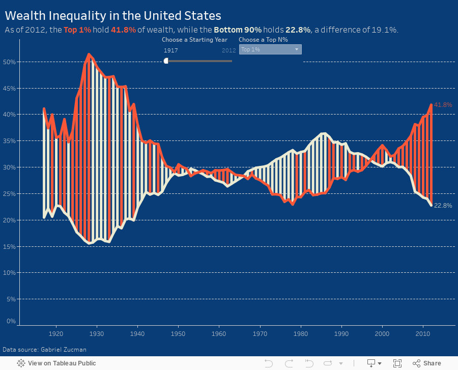
Makeover Monday: Patterns of Change in Wealth Inequality

Different take on this week's #makeovermonday - used path analysis technique I learned from @eagereyes at #data16https://t.co/jFV8zyA8uQ pic.twitter.com/AMRTmPMQxo
— Matt Hoover (@Matt_Hoov) November 28, 2016
A connected scatterplot is great for visualising paired time series data. In this case, the pair is the bottom 90% vs. the top N% as picked by the user. The line is colored by the difference between the bottom 90% and the top N%. I added dots on the ends of the lines to make the start and end easier to find.
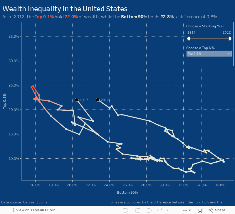
Makeover Monday: Wealth Inequality in the United States


What works well?
- Line chart is an appropriate chart choice as we're comparing two values over time
- Title is clear and simple
- Good sourcing and footnotes
- Tells a simple story effectively
- Only one axis is needed
- Title is a bit misleading as the values aren't actually equivalent
- Color choices imply democrat vs. republican
- Feels like there's a bit of extra visual clutter
- Difference could be accentuated more
This week, I again recorded all of my work along the way. In 45 minutes, I created 175 images. But this doesn't include parameters, filters and all the work done inside the dashboard, otherwise it would probably be twice as many.

You'll see in my final version that I put a lot of focus on the difference between the lines. I also used a parameter so the user can pick their own comparison. I also have a dynamic subtitle that updates based on the values picked in the parameter.
November 24, 2016
From London to New York in 500 miles | My New York City Marathon Training Visualized
Like most runners, I love my running data! My watch syncs to Tom Tom, Runkeeper, Strava and Nike+. Why all of them? Well, why not? Naturally, I wanted to see how my training went. Was it effective? How'd I do in my long runs? How often did I run? What was my average pace? The questions are endless.
I'm also in the middle of testing a new Web Data Connector for Strava that brings back A TON of information about each run. Mix all of this together and you get a dashboard of my marathon training.
Click on the image for the interactive version (it's too wide for my blog). Once you're there, you can click on any activity and see the map update with the route of each run. The activity will also be highlighted across all of the charts.
And yes, I got the data from Strava yet I'm using Runkeeper colors. I simply like their colors better. Enjoy!

November 23, 2016
Makeover Monday Goes to the Sydney Tableau User Group

Very, very early this morning, I had the pleasure of speaking to the first Sydney Tableau User Group. My good friend Fi Gordon asked me to join them to talk about Makeover Monday, how I approach makeovers, why I do them, examples of work I’ve done, and the encourage people to get involved.
It was bit of a different atmosphere as I couldn’t hear or see anyone. Fi, being the genius she is, was messaging me on Twitter throughout to keep me updated.
Without further ado, here’s my presentation. Enjoy!
November 22, 2016
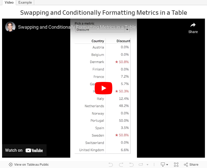
Tableau Tip Tuesday: How to Swap Metrics in a Single Table and Conditionally Format the Values

November 21, 2016
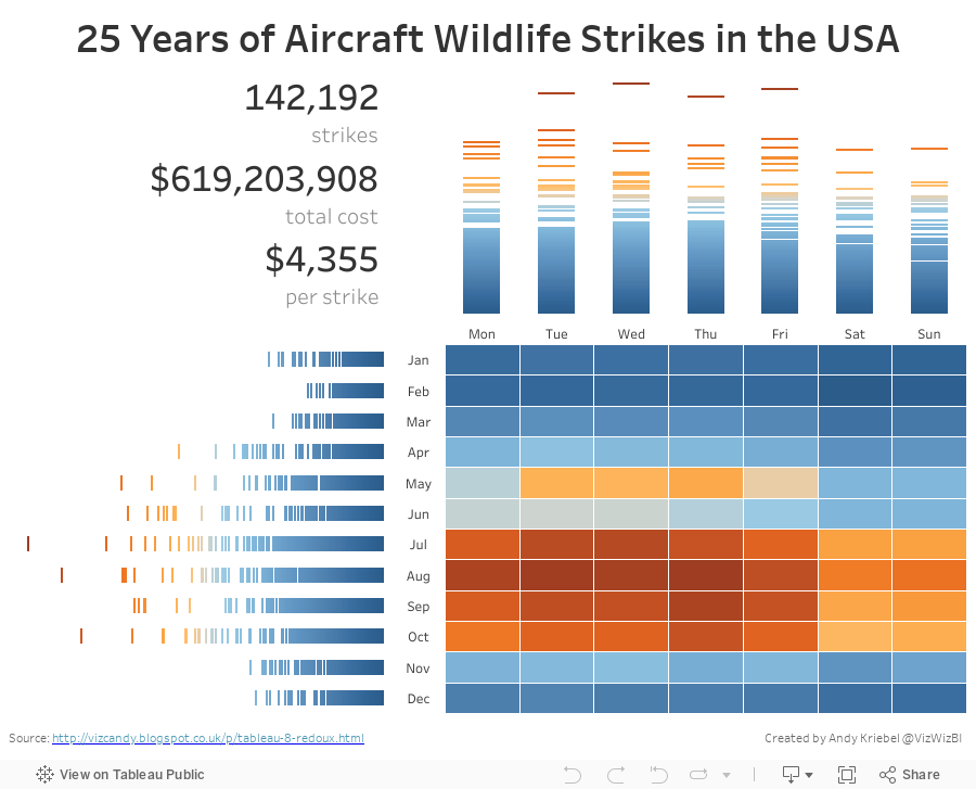
Makeover Monday: Wildlife Strikes in the USA

Let's start with Kelly Martin's incredible airplane/wildlife collisions dashboard:

What works well?
- To put it simple, everything works well here. Kelly has a very intentional design style.
- Minimal use of color
- Great use of whitespace
- Excellent annotations
- Great use of icons
- Nice instructions
- Good interactivity
- Remove the size legend and indicate that through text
As for the advanced logging, Tableau Research asked this week that we enable a setting on Tableau that creates an image every time you do something on a worksheet. I had no idea what this would result in, but in exactly 60 minutes, I created 396 images. That's a lot of squiggles! Here's a gif of my iterations:

For my makeover, I wanted to implement a visualisation technique I learned from Tableau's Michele Tessari at #Data16 in his session "Artful Data: The Balance of Art and Analysis". My goal was to show the number of strikes by weekday and month, but also to show the values for each state.
Another fun week of playing with data. Here's my take on this data set:
November 19, 2016
The United States Electoral College | A Genius Representation of the People

This turned out to be a fantastic civic learning experience for me. And exploring the data with Tableau helped me understand how it all works. I know a lot of people, particularly those I work with in the U.K., that are confused by this election and how the popular candidate didn't win. To aid in this understanding, I've created this story points visualisation to explain how the electoral college works, how electoral votes are allocated, and how the election would have turned out if the electoral college was based strictly on population.

November 14, 2016
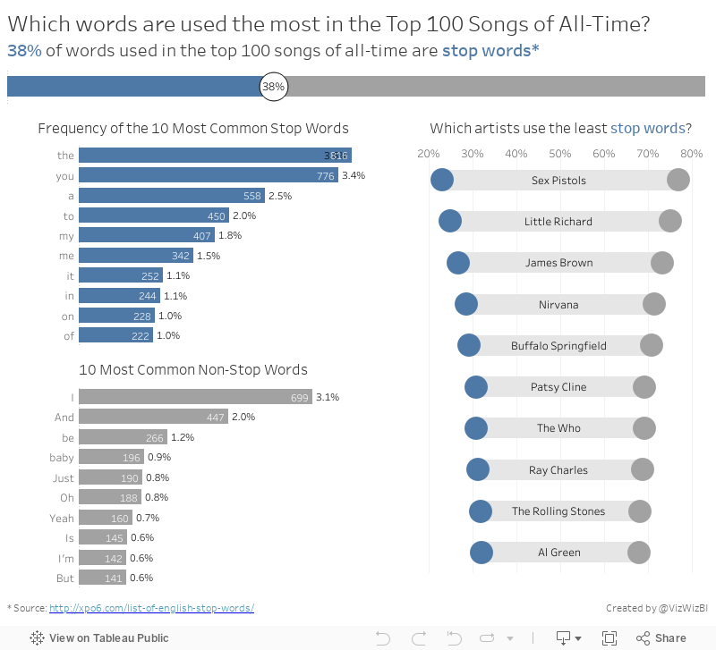
Makeover Monday: The Words of the Top 100 Songs of All-Time


What works well?
- Simple title
- Good references
- Treemaps are generally a poor choice for showing the distribution of the words
- Way too many colors
- It's impossible to make any sense of the words and see any patterns
November 7, 2016
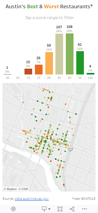
Makeover Monday: Austin Restaurant Inspections


As you drill into the viz you get more and more detail, like this:


What works well?
- Super intuitive interface; everyone know how to drill in on a map
- Simple instructions
- Nice grouping of restaurants with a counter
- Nice use of symbols to represent a specific restaurant
- Good use of colors
- Takes too long to drill in. When I played with it, they could easily show more specific restaurants at once and not shown so many groups.
- I have no idea how many restaurants are good or bad.
November 2, 2016
Makeagain Monday: Highlighting the Changes in Satisfaction with EU Transport


What would I change?
- The red/green color scale might be tough for color blind folks.
- I'm confused by the colors on the ends of the bar because those don't represent the same thing as the color of the middle bar.
- There are too many controls for me at the top. Might this be better as a static image with a singular story? Pablo chose to make it interactive, which is perfectly fine. I simply might choose to do different. Neither is better.
- There are a LOTS of cities in this. I would show the top and bottom 10 for simplicity. Again, personal preference.
November 1, 2016
Makeagain Monday: Popping the Bubbles of the Scottish Index of Multiple Deprivation

The purpose isn't to pick on anyone. I use this as a teaching method. How can I take an existing visualisation and show I would improve and simplify it step-by-step. I only detail what I think doesn't work about the visualisation.
This week we looked at the Scottish Index of Multiple Deprivation and Pablo Gomez create this visualisation (click on it for the interactive version):

What doesn't work?
- Packed bubbles are basically impossible to compare
- What does the size and color of the bubbles mean?
- Do the colors coordinate with the scatter plots? (The answer is no, but I didn't know that until I downloaded the workbook.)
- What do the scatterplots add? They all basically look the same.
- The massive image on the right takes up like 25% of the space. What does the flag mean?


