Showing posts with label makeagain. Show all posts
December 8, 2017
Looks vs. Personality - A Tableau Remake
dot plot
,
looks
,
makeagain
,
personality
,
remake
,
YouGov
No comments
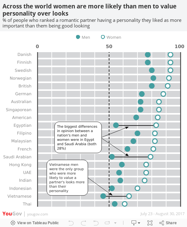
Yesterday I wrote about a great viz from YouGov and in that post I wrote about some of the things I wanted to see improved in the viz. As a way for me to learn, I decided to try to rebuild the viz in Tableau, mostly because I knew it wouldn't be straightforward, and also to address some of the areas for improvement. There were quite a few tricks I had to mix together to make it work and I learned a ton along the way.
If you ever need a great way to learn, find a viz you like and rebuild it. You won't regret it.

If you ever need a great way to learn, find a viz you like and rebuild it. You won't regret it.
December 1, 2016
Makeagain Monday: Share of Wealth vs. Immigrant Population
Donald Trump
,
immigration
,
makeagain
,
Makeover Monday
,
United States
,
wealth
,
Will Chen
No comments
Makeover Monday participant Will Chen created this chart for week 48 that compares the share of wealth of different groups to the immigrant population. If you’re not following Will, you should. He’s been creating videos of his Makeover Monday process.
Instantly, I saw a more compelling story and decided to take his viz and iterate. In just a few steps, I changed his viz into a story about the how the change in wealth of the top 0.5% seems to trend along with the percentage of immigrants in the U.S.

Correlation does not mean causation, however, it does lead me to think…will President-elect Trump’s stance on immigration lead to less wealth for him and his peers? I guess we’ll find out in a few years. The Tableau version is embedded below.
November 2, 2016
Makeagain Monday: Highlighting the Changes in Satisfaction with EU Transport


What would I change?
- The red/green color scale might be tough for color blind folks.
- I'm confused by the colors on the ends of the bar because those don't represent the same thing as the color of the middle bar.
- There are too many controls for me at the top. Might this be better as a static image with a singular story? Pablo chose to make it interactive, which is perfectly fine. I simply might choose to do different. Neither is better.
- There are a LOTS of cities in this. I would show the top and bottom 10 for simplicity. Again, personal preference.
Here's my step-by-step makeagain of this visualisation. Click on the gif for the interactive version.
November 1, 2016
Makeagain Monday: Popping the Bubbles of the Scottish Index of Multiple Deprivation
cluster
,
gantt
,
makeagain
,
Makeover Monday
,
Pablo Gomez
,
packed bubbles
,
Scotland
,
SIMD
4 comments

The purpose isn't to pick on anyone. I use this as a teaching method. How can I take an existing visualisation and show I would improve and simplify it step-by-step. I only detail what I think doesn't work about the visualisation.
This week we looked at the Scottish Index of Multiple Deprivation and Pablo Gomez create this visualisation (click on it for the interactive version):

What doesn't work?
- Packed bubbles are basically impossible to compare
- What does the size and color of the bubbles mean?
- Do the colors coordinate with the scatter plots? (The answer is no, but I didn't know that until I downloaded the workbook.)
- What do the scatterplots add? They all basically look the same.
- The massive image on the right takes up like 25% of the space. What does the flag mean?
With that, here's my step-by-step makeover as a gif. Click on the gif for my version on Tableau Public.

Subscribe to:
Posts
(
Atom
)


