January 29, 2015
Emergency Makeover: Vaccination Rates at California Elementary Schools
bar chart
,
California
,
critical
,
dashboard
,
elementary
,
emergency
,
interactive
,
makeover
,
map
,
school
,
tableau
,
vaccine
,
viz of the day
1 comment
I'm growing more and more frustrated with the visualizations that are picked for Tableau's Viz of the Day. Why? Because I know from asking people that they assume Viz of the Day represents examples of best practices because Tableau promotes them. And I'm noticing more and more that there are fundamental visualization best practices being broken.
Consider this Viz of the Day from January 28, 2015.
What is incredibly ironic is that I saw this literally minutes after having talked about color blindness in a data viz class I was teaching. In the room was a colleague of mine, who is red-green color blind. I showed it to him and said "What do you see?" to which he responded "A bunch of brown dots."
I ran the map through the Vischeck color blindness simulator and low and behold, this is what you get:

Now can you understand why I'm getting so upset? Who picks VotD after all? Why aren't best practices part of the criteria? Does anyone know the criteria? Is there a criteria?
I downloaded the workbook and made a few simple adjustments to it. Here's my version after about 15 minutes of TLC. I focused on color, sorting, tooltips and filtering.
Don't get me wrong; It's a huge honor to get chosen for VotD. I know I get excited every time one of my vizzes is chosen. But what I really want, and I think there are lots of other people with me, is for VotD to be an amazing gallery that everyone recognizes as the most outstanding work done with Tableau. Work that's designed well. Work that's visually appealing. Work that follows best practices. Work you'd want to emulate.
With the visibility that the Viz of the Day gallery has, am I asking for too much? If I am, please tell me. Explain to me why I'm off base. If you're in agreement with me, let your voice be heard.
Consider this Viz of the Day from January 28, 2015.
What is incredibly ironic is that I saw this literally minutes after having talked about color blindness in a data viz class I was teaching. In the room was a colleague of mine, who is red-green color blind. I showed it to him and said "What do you see?" to which he responded "A bunch of brown dots."
I ran the map through the Vischeck color blindness simulator and low and behold, this is what you get:

Now can you understand why I'm getting so upset? Who picks VotD after all? Why aren't best practices part of the criteria? Does anyone know the criteria? Is there a criteria?
I downloaded the workbook and made a few simple adjustments to it. Here's my version after about 15 minutes of TLC. I focused on color, sorting, tooltips and filtering.
Don't get me wrong; It's a huge honor to get chosen for VotD. I know I get excited every time one of my vizzes is chosen. But what I really want, and I think there are lots of other people with me, is for VotD to be an amazing gallery that everyone recognizes as the most outstanding work done with Tableau. Work that's designed well. Work that's visually appealing. Work that follows best practices. Work you'd want to emulate.
With the visibility that the Viz of the Day gallery has, am I asking for too much? If I am, please tell me. Explain to me why I'm off base. If you're in agreement with me, let your voice be heard.
January 27, 2015
Tableau Tip Tuesday: Using a Set to Create a Relative Date Filter
One of the most fun experiences I get to have when I run Tableau training classes is when a student comes up with a solution to a problem on their own. Last week I was in Austin teaching a 2-day Tableau Combo class to the Facebook team there and a student was asking about relative date filters. His problem was pretty common:
Here's a video of the problem and the solution, which uses a combination of a set and a parameter. The detailed steps are below the video.
- His data is not as of today.
- When he uses a relative date filter, he doesn't get the expected number of days in the view.
Here's a video of the problem and the solution, which uses a combination of a set and a parameter. The detailed steps are below the video.
January 26, 2015
Makeover Monday: Facebook's Global Economic Impact
3D
,
bar chart
,
Deloitte
,
donut chart
,
facebook
,
interactive
,
Makeover Monday
,
pie chart
,
tableau
1 comment
Last week on Facebook, I saw a link to this report by Deloitte. From what I can gather, Facebook commissioned Deloitte to estimate Facebook's impact on the economy. Read the report for more details.
In the report, the first graphic that Deloitte shows was this donut chart that explodes into three slanted pie charts:
Some of the most striking problems:
In this version, I attempted to address the concerns I outlined above by basically changing everything to bar charts and rearranging the view. Does this work better? Note that I added some interactivity as well.
In the report, the first graphic that Deloitte shows was this donut chart that explodes into three slanted pie charts:
Some of the most striking problems:
- Using a donut chart to represent parts-to-whole is a bad idea. Read this post by Steve Wexler for a good explanation on why you shouldn't use donut charts.
- There's an implicit hierarchy from the ecosystem to the breakdown of each ecosystem, yet this view goes in the opposite direction by having the regional breakdown above the totals.
- The pie charts, while not 3D are slanted, which distorts their proportions.
- Pie charts are not the best way to compare proportions.
- The title is super small. Looking at this as a stand-alone graphic, it's difficult to understand what the purpose of the graphic is in the first place.
I recreated the data in Excel (get it here) and created this dashboard in Tableau (get the workbook here).
In this version, I attempted to address the concerns I outlined above by basically changing everything to bar charts and rearranging the view. Does this work better? Note that I added some interactivity as well.
January 22, 2015
Core Values and Culture: The Tableau Community DNA
I read this post from Ethos3 about their company core values and culture. As I was reading through them, I thought this matched nearly exactly with the values and culture of the Tableau Community. I've made some minor tweaks to their values to be more in line with the Tableau Community.
- Focus On Yourself First: If you develop yourself, then everything will change around you.
- Pursue Growth And Learning: Always continue to learn and grow. Read as many books and create as many visualizations as possible.
- Do More: Never settle for mediocrity.
- Develop A Magnificent Obsession for Everything and Everyone: Be passionate about everything and everyone you touch.
- Do The Ordinary Extraordinarily Well: Create WOW experiences by doing ordinary things in ways no one will ever expect.
- Be Humble: Understand that there’s always someone who can do what you do better, faster and cheaper.
- Live Uniquely: Be yourself. Find your authentic voice. Share your voice.
- Commit: As Yoda would say, "Do or do not. There is no try." No wishing or trying allowed. Period. Commit to every task.
- Embrace and Drive Change: Look for opportunities to change and improve yourself, your company, and the Community.
- Empower Others: The Pledge of Allegiance starts with “I” and ends with “We.” You can’t do everything by yourself.
What do you think? I know these values are pretty much what got me where I am today. How about you?
January 21, 2015
Tableau Tip Tuesday: How to Create Slopegraphs
This is the first of what will hopefully become a weekly series (or thereabouts) of Tableau video tips. These will primarily be video-based tips from blog posts I had previously written. Today's tip shows you how to create two different types of slopegraphs in Tableau.
Download the workbook used to create this video here.
Related posts:
Download the workbook used to create this video here.
Related posts:
January 14, 2015
January 13, 2015
Makeover Monday: Cristiano Ronaldo is the Most Popular Athlete in the World and it isn't Even Close
bar chart
,
basket
,
Cork Gaines
,
cricket
,
facebook
,
football
,
likes
,
Makeover Monday
,
soccer
,
sports
,
story points
,
tableau
,
tennis
,
track & field
No comments
I had a choice to make this evening, catch up on my backlog of Makeover Monday posts or work on my performance review. Given that I enjoy writing about Tableau more than writing my performance review, allow me to present a second Makeover Monday of the day today. In this post, I take a look at this chart from Cork Gaines of Business Insider:
I've reviewed a lot of Cork's charts and this one makes many of the same mistakes as his past charts:
You can download the data here and the workbook here.
I've reviewed a lot of Cork's charts and this one makes many of the same mistakes as his past charts:
- It's incredibly annoying to have to turn my head sideways to read the chart.
- The chart is in ascending order, yet the story emphasizes the descending order.
- The colors aren't distinct enough from each other for me. For example, the colors for Track & Field and Cricket and too similar.
- The chart, on it's own, doesn't capture the entire story that's in the article.
With these problems in mind, I went to the Facebook page for each athlete and noted their likes. I then decided to use Tableau's Story Points feature. As Tableau says "Story Points gives the author the ability to present a narrative. As part of that narrative, the author can highlight certain insights and provide additional context."
You can download the data here and the workbook here.
January 12, 2015
Makeover Monday: Which SEC Schools Have Most Alums in the NFL?
bar chart
,
college
,
football
,
Makeover Monday
,
Saturday Down South
,
SDS
,
SEC
,
shapes
,
table
,
tableau
No comments
Last week, Saturday Down South posted this table, which shows the number of players over the last decade from each SEC college football team that played in the NFL. Current stars are noted.
Simple enough, yet so annoying that they aren't sorted in descending order, though it is true that an alphabetical sort is faster for finding a team. Magnitude is also more difficult than necessary to understand in a table.
With a few simple clicks, I created this interactive version in Tableau.
On my version, the bars are ranked and I included the % of total SEC players in the NFL for each team to give the numbers more context.
You can download the data here and the workbook here.
January 11, 2015
What If Premier League Standings Were Based on Points per Goal?
Aston Villa
,
English Premier League
,
football
,
goals
,
highlight
,
interactive
,
points
,
points per goal
,
Premier League
,
rank
,
scatter plot
,
slopegraph
,
soccer
,
standings
,
table
,
tableau
No comments
This week on the Football Ramble podcast (listen here), they talked about a very strange stat they have been observing this Premier League season:


From there, I wanted to understand the difference between Villa's actual place in the EPL table and their place in the fictitious points per goal table. For this view, I created a slopegraph, which I first wrote about creating in Tableau here.
If you're unfamiliar with slopegraphs, Andrew Wheeler summarizes them well in his paper "A Critique of Slopegraphs":
So far in the 2014-15 season, Aston Villa has the highest points per goal of any Premier League team in the last 10 seasons.This was quite intriguing to me, so this morning while I was enjoying a cup of coffee at Tully's I went to ESPNFC.com and downloaded the standings for the last 10 years. I added two columns to this dataset, which you can download here.
- Points per Goal (PPG)
- PPG Position (i.e., a rank of each team based on PPG)
I turned to Tableau to do a quick analysis. My first way of looking at the data was as a scatter plot. I wanted to see just how much of an outlier Aston Villa has been this season.


From there, I wanted to understand the difference between Villa's actual place in the EPL table and their place in the fictitious points per goal table. For this view, I created a slopegraph, which I first wrote about creating in Tableau here.
If you're unfamiliar with slopegraphs, Andrew Wheeler summarizes them well in his paper "A Critique of Slopegraphs":
Slopegraphs show values for two numeric variables by line segments for each observation by connecting points on two parallel axes. They are frequently recommended for visualizing the changes in ranked data (Bertin, 2011; Tufte, 2001).I put all of the pieces together in this simple dashboard, which you can download here. Do you notice anything else interesting or unusual?
January 10, 2015
Tableau Tip: One Parameter; Unlimited Number Formats
calculated field
,
Joe Mako
,
labels
,
number format
,
parameter
,
tableau
,
tips
,
tricks
13 comments
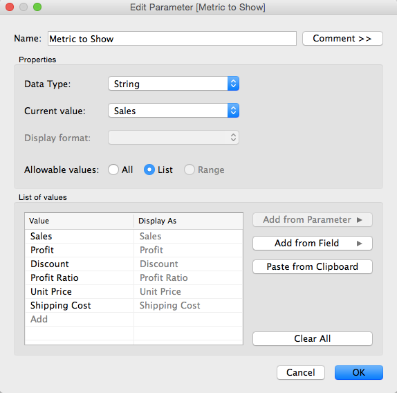
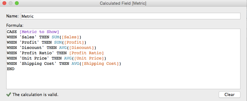
As a follow up to yesterday's blog post about "One Metric; Two Number Formats", Tableau Zen Master Joe Mako left a suggestion that I'm going to write about today that utilizes the Labels shelf. This method allows you to have as many different number formats as you desire, whereas my previous post only allowed two (and frankly, its use case it pretty limited).
Step 1: Create a parameter that is a list of metrics.
Step 2: Create a calculated field that returns the value of the metric selected.
Step 1: Create a parameter that is a list of metrics.

Step 2: Create a calculated field that returns the value of the metric selected.

January 9, 2015
Tableau Tip: One Metric; Two Number Formats
Here's the scenario:
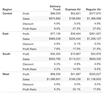
- You have four metrics you want a user to be able to choose from.
- Two of them are in number format (Sales & Profit) and two are in percentage format (Discount & Profit Ratio).
- You want the data, when displayed, to accurately reflect the formatting of the metric selected
- You only want to use a single metric.
To start, consider the above scenario by starting with this table:

January 5, 2015
Makeover Monday: Top 20 Industries Hiring Big Data Experience
bar chart
,
big data
,
hiring
,
infogr.am
,
Jeffrey Schaffer
,
jobs
,
Makeover Monday
,
pie chart
,
rank
No comments
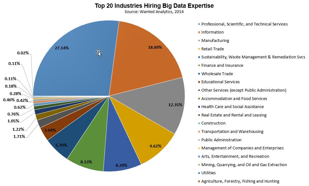
Friend of mine, friend of the blog and genuine good guy Jeffrey Shaffer sent me a link to this Tweet for today's Makeover Monday:
What a mess! Some quick thoughts:
The changes I've made:
What a mess! Some quick thoughts:
- It's a pie chart
- Way too many slices
- Doesn't start at 12 o'clock
- Too much precision on the numbers
- Too many colors (see #2 above)
- The category names are too long
I quickly threw this into infogr.am and change it to a bar chart of the top 5.
The changes I've made:
- Changed the chart type to a bar chart
- Displayed the top 5 and then everything else is grouped together and ranked last
- One decimal place on the numbers is plenty; no decimals would work fine too
- Colored "All Other" differently so that it would be more noticeable that it's not a single item
- Shortened the category names
If infogr.am allowed it, I would also remove the column divider line and remove the axis.
Subscribe to:
Posts
(
Atom
)


