Showing posts with label slopegraph. Show all posts
January 21, 2015
Tableau Tip Tuesday: How to Create Slopegraphs
slope graph
,
slopegraph
,
tableau
,
tips
,
video
1 comment
This is the first of what will hopefully become a weekly series (or thereabouts) of Tableau video tips. These will primarily be video-based tips from blog posts I had previously written. Today's tip shows you how to create two different types of slopegraphs in Tableau.
Download the workbook used to create this video here.
Related posts:
Download the workbook used to create this video here.
Related posts:
January 11, 2015
What If Premier League Standings Were Based on Points per Goal?
Aston Villa
,
English Premier League
,
football
,
goals
,
highlight
,
interactive
,
points
,
points per goal
,
Premier League
,
rank
,
scatter plot
,
slopegraph
,
soccer
,
standings
,
table
,
tableau
No comments
This week on the Football Ramble podcast (listen here), they talked about a very strange stat they have been observing this Premier League season:


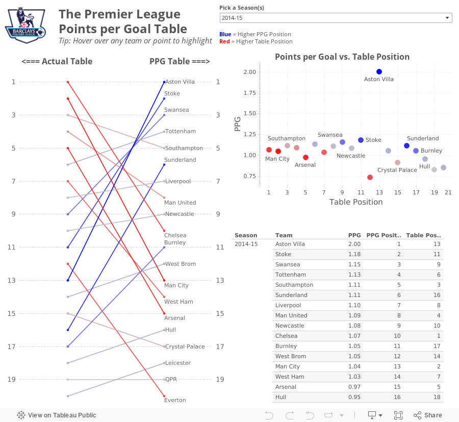
From there, I wanted to understand the difference between Villa's actual place in the EPL table and their place in the fictitious points per goal table. For this view, I created a slopegraph, which I first wrote about creating in Tableau here.
If you're unfamiliar with slopegraphs, Andrew Wheeler summarizes them well in his paper "A Critique of Slopegraphs":
So far in the 2014-15 season, Aston Villa has the highest points per goal of any Premier League team in the last 10 seasons.This was quite intriguing to me, so this morning while I was enjoying a cup of coffee at Tully's I went to ESPNFC.com and downloaded the standings for the last 10 years. I added two columns to this dataset, which you can download here.
- Points per Goal (PPG)
- PPG Position (i.e., a rank of each team based on PPG)
I turned to Tableau to do a quick analysis. My first way of looking at the data was as a scatter plot. I wanted to see just how much of an outlier Aston Villa has been this season.
From there, I wanted to understand the difference between Villa's actual place in the EPL table and their place in the fictitious points per goal table. For this view, I created a slopegraph, which I first wrote about creating in Tableau here.
If you're unfamiliar with slopegraphs, Andrew Wheeler summarizes them well in his paper "A Critique of Slopegraphs":
Slopegraphs show values for two numeric variables by line segments for each observation by connecting points on two parallel axes. They are frequently recommended for visualizing the changes in ranked data (Bertin, 2011; Tufte, 2001).I put all of the pieces together in this simple dashboard, which you can download here. Do you notice anything else interesting or unusual?
January 16, 2013
The one chart that shows how the sale of Robin van Persie impacted the fortunes two clubs
arsenal
,
Arsene Wenger
,
change
,
English Premier League
,
EPL
,
football
,
Manchester United
,
Robin Van Persie
,
slopegraph
,
soccer
,
year over year
No comments
Super Sunday has come and passed along with yet another abject Arsenal performance. I attended the game with about 100 of my fellow Bay Area Gooners at Maggie McGarry’s in San Francisco. This is THE place to watch Arsenal.
We were pumped for the game, only to be let down nine minutes into a game by a stupid foul and the subsequent sending off of Laurent Koscielny. Why wasn’t the BFG Per Mertsacker playing in the first place? That’s another rant for another time.
Several Gooners at Maggie’s were talking about Arsenal’s lack of ability to dominate the final third of the pitch, which got me daydreaming back to the days of Robin van Persie. Arsene Wenger sold RVP to Manchester United over the summer, literally telling Sir Alex Ferguson that he was handing him the title. Of course, RVP has continued scoring like the 3rd best striker in the World. I think our manager has lost the plot.
I pulled some data down from the Barclay’s Premier League website to see how teams were performing through 21 fixtures this year compared to last. I created this:
 Tufte introduced slopegraphs in his book The Visual Display of Quantitative Information. This type of chart is useful because is helps quickly highlight:
We were pumped for the game, only to be let down nine minutes into a game by a stupid foul and the subsequent sending off of Laurent Koscielny. Why wasn’t the BFG Per Mertsacker playing in the first place? That’s another rant for another time.
Several Gooners at Maggie’s were talking about Arsenal’s lack of ability to dominate the final third of the pitch, which got me daydreaming back to the days of Robin van Persie. Arsene Wenger sold RVP to Manchester United over the summer, literally telling Sir Alex Ferguson that he was handing him the title. Of course, RVP has continued scoring like the 3rd best striker in the World. I think our manager has lost the plot.
I pulled some data down from the Barclay’s Premier League website to see how teams were performing through 21 fixtures this year compared to last. I created this:
- The order of the clubs
- The specific number of points accumulated by each team in each year
- The slope reveals the change over time and each club’s rate of change compares easily to other teams
- There’s almost zero non-data ink. I say almost because I used red to highlight Arsenal.
- Manchester United have opened on the rest of the league this year and that they were in 2nd place last year.
- The gap between Man U and Arsenal is HUGE this season, which is surely directly correlated the RVP’s transfer.
- Everton and West Brom have had much stronger starts to the season. Don’t be shocked if Everton snatches the last Champions League spot. It sure doesn’t look like Arsenal has the heart to do it.
- Newcastle sucks this year!
- Most importantly, we’re only 5 points behind Spurs, whereas we were 10 points behind at this point last year. If we’re not going to make the Champions League, we could take a bit on consolation in finishing ahead of Spurs.
Subscribe to:
Posts
(
Atom
)






