July 21, 2019
#MakeoverMonday: Arsenal Player Stats 2018-19

Here's the original viz:
 |
| SOURCE: transfermarkt.co.uk |
WHAT WORKS WELL?
- A table is a simple way to display stats that serve the purpose of looking up values. That seems to be what the designer had in mind here. This viz isn't for comparing players.
- Being able to sort by the headers
- Including an image of the player; this helps those that are already familiar with them.
- Including links to the player's profile
- Other than this being used to look up information, what purpose does it server? It merely a list of facts.
- There's no context for the numbers. How does a player rank amongst the team?
- It's visually unappealing.
- I can't find definitions for some of the stats. For example, what does "In Squad" mean? No clue!

August 9, 2018
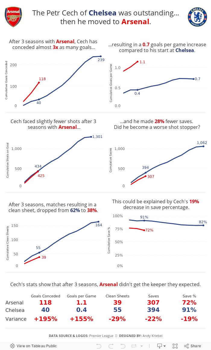
The Petr Cech of Chelsea was outstanding...then he moved to Arsenal
In an Arsenalesque sense of optimism, Arsene Wenger thought bringing in a great goalkeeper would solve their defensive woes. Many fans, however, knew that the real problems were in front of the goalkeeper. Without a solid defense, a goalkeeper cannot be effective.
This led me to thinking about how Cech's first three seasons compared to his first three seasons with Chelsea, when he was widely considered one of the best goalkeepers in the World. The data shows that Arsenal more or less ruined him. Or did Chelsea's stellar defense make him better than he really is?

June 5, 2017
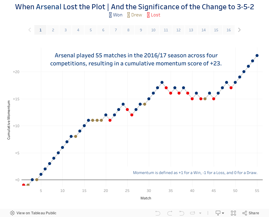
When Arsenal Lost the Plot...and the Significance of the Change to 3-5-2
So I sat down last night and cranked out this viz and story about Arsenal's 2016/17 campaign, including the up, the downs and the inevitable contract extension for Arsene Wenger.
Enjoy!
December 5, 2016
A History of the North London Derby in the Premier League
I really liked the learnings that I got last Friday from Rhiannon Fox and the cricket viz I ended up creating. It got me to thinking about other data that I could use with a similar visual display to continue practicing what I learned. Arsenal was preparing to play London rival West Ham on Saturday while I was watching my son skateboarding, so I thought I’d create something comparing Arsenal with their biggest rival, Tottenham Hotspur.
I was able to quickly get all of the results from Wikipedia, which I then imported into Google Sheets and then connected to Tableau. I showed a couple of iterations to Gwilym this morning at the Data School to get his feedback and we agreed that displaying goal difference was the most effective display. In addition, I added dots to indicate the winner. The goal difference display helped show the ebbs and flows of the rivalry way better than showing the goals scored by each team in each match as a diverging bar chart.
Click on the image for the interactive version. Does this display work for you? What might you do differently? Leave a comment and let me know or, better yet, download the workbook, iterate on my design and leave a comment with a link to your version. Enjoy!

March 9, 2015
Makeover Monday: Alexis Sanchez Shows Angel Di Maria How to Shine

This is the aforementioned bar chart:

At the initial glance you might think there’s not much wrong with this, but there is one major problem - the bars are not synchronously scaled. Look at the Di Maria side. Since when is 8 assists 75% of 37 shots? See what I mean?
I’ve created two alternative versions of the same infographic that are scaled proportionately. This first version is basically identical to the original other than the bars are scaled correctly.

There are times when I find look at the bars next to each other, but going in opposite directions, harder to compare than they need to be, so I created this second version to take care of that. In this version, I show the bars above/below each other to make the bars much easier to compare.

Now that’s better! Remember folks, scale your axes properly! Which version do you prefer? Why?
I build these in Tableau, so if you’d like to have a crack at your own version, you can download the workbook here (requires Tableau 9).
February 16, 2015
Makeover Monday: How Does Francis Coquelin's 14/15 Season Compare to Alex Song's 11/12 Season at Arsenal?
That decision left Arsenal very thin at the back to start the 14/15 season. Fast forward a few months and injuries, as they always do, hit Arsenal hard. They were forced to recall Francis Coquelin from a loan spell at Charlton.

As the saying goes, he's been like a new signing. In his previous spells with the first team, he failed to establish himself, but this time around, he grabbed hold of the opportunity and surely now Coquelin is the first name on the manager's team sheet.
Late last week, I ran across this article from HITC Sport. In it, Dan Coombs says "Coquelin has shown already that he is playing defensively at an equal or higher level than Song's final season at the club." Dan then provided this simple table:

This table is perfectly fine. It's a table and it provides a great way to look up the data. In the end, the point of the story is to show how effectively Coquelin is playing compared to Song. I created this infographic in Keynote with the hope that it is more interesting, more engaging and makes comparisons easier.

December 17, 2014
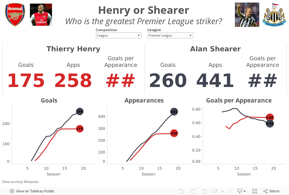
Henry or Shearer? Who is the greatest Premier League Striker?
In a tribute to The King, the Premier League created this great compilation video.
Henry's retirement led to the inevitable debate of who is the greatest Premier League striker ever? Most people agree that Thierry Henry and Alan Shearer are in a class by themselves. The great thing about sport is that it leads to lots of opinions and great debates. There are Henry camps and there are Shearer camps.
I gathered their career data from wikipedia (here and here) and combined them into a single spreadsheet here. I built this quick viz in Tableau to allow you to answer the question for yourself. Download the workbook here.
October 29, 2014
Plot.ly - A simple interface for creating great looking charts in d3
What is Plotly? The folks at import.io have a great summary:
Plotly is a young graphing and analytics startup, which makes it easy to analyze and visualize data together. Using Plot.ly, users can import data from anywhere, then make and share online graphs using Python, MATLAB, R, Excel, Julia, and their web app. Users can also share work and collaborate on projects.
The Plotly API enables users to analyze and visualize data in one place, and forms an important step in building the infrastructure for data science to be further democratized. Their goal is to be an awesome platform for collaboratively analyzing data and making graphs.From the Plotly website, in the workspace area (think of this as a worksheet in Tableau):
Easily make graphs with your data in the workspace. Import data from Google Drive or upload Excel or text files. You can apply fits, stats, and functions to your data.
Every element of a Plotly graph is customizable. Change the colors, annotate, write LaTeX, toggle graph ticks, and much more. It's up to you!The best way to get familiar with any new product is to start using it. Since I had just publish a parallel coordinates plot in Tableau yesterday, I thought I would use the same dataset and see how long it takes to build something similar in Plotly. I was pleasantly surprised by the simplicity and intuitiveness of the interface. It took me about 30 minutes to build this view, but a lot of that time was spent tweaking the settings to get them just right, which I'm perfectly ok with given the very detailed control I have over the final display.
Plotly doesn't currently support things like filtering and parameters yet, but for a first pass through, I really like it and will definitely be using it more often going forward. So, here's my first plot.ly viz (be sure to hover over dots to see their awesome interactivity):
October 28, 2014
My first experience with import.io and Tableau
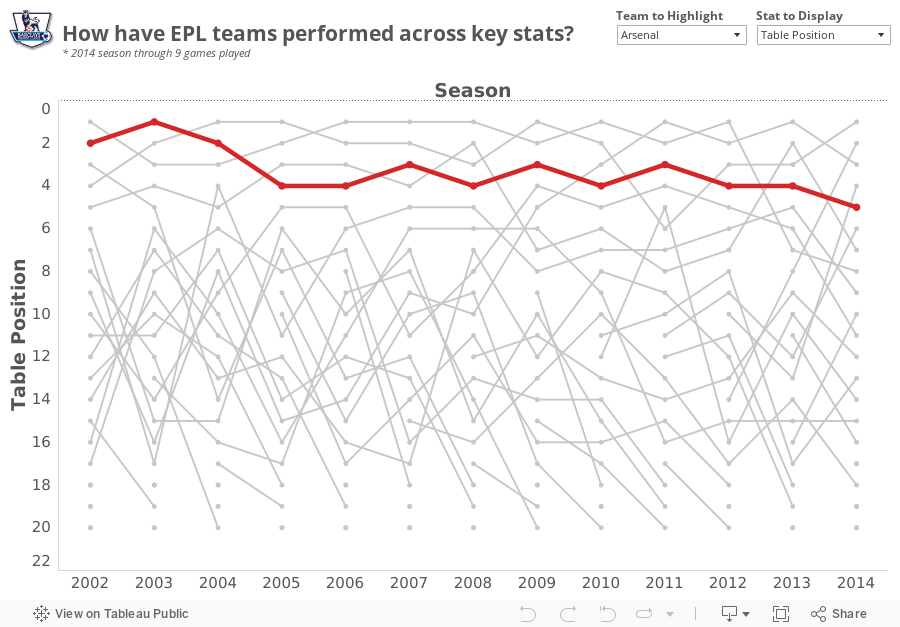
During the webinar, Alex revealed that he was a huge Arsenal fan (as am I), and I wanted to find a simple project to become more familiar with the tool. My basic idea was:
- Use the import.io Extractor to download the Premier League table from ESPNFC for every season since 2002
- Create a visualization in Tableau
- Allow the people interacting with the viz to highlight their favorite team
- Make Alex happy!

Download the Tableau workbook here.
October 15, 2014
Tableau Wannabe Podcast: Episode 10 - Viz of the Day, Arsenal & Willard Brinton
This week, Matt, Emily and I:
- Reviewed the Maharashtra Election dashboard from Viz of the Day
- Conducted a live discussion and made updates to my Arsenal Injury Crisis viz
- Discussed Andy Cotgreave's amazing talk from #DATA14 - 100 Years of Visualization Best Practices—It's Time to Stop Making the Same Mistakes
October 13, 2014
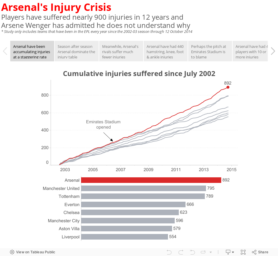
Makeover Monday: Arsenal's Injury Crisis - A Story
I found this story fascinating because it finally put numbers to Arsenal's perceived injury crisis. They do indeed suffer way more injuries than any other EPL team. But what bothered me about the ESPN story was that they basically just listed off a few key facts (quoted from ESPN):
- Arsenal players have sustained 889 injuries since August 2002, according to a report by PhysioRoom.com.
- The Gunners' 889 injuries over the 12-year period compare to 792 for Manchester United, 620 for Chelsea and 551 for Liverpool.
- Abou Diaby, who has recently returned to fitness, has endured 40 separate injuries, according to the study, while Theo Walcott, who is currently recovering from a serious knee problem, features 42 times.
- PhysioRoom.com claims 120 of the injuries were of the hamstring variety while six anterior cruciate ligament (ACL) have been suffered.
Without comparing Arsenal to their rivals, how do I know how bad their injury crisis really is? If they're suffering injuries at the same rate as their rivals, then maybe there isn't a crisis after all. But if their rate of injury is higher, then perhaps there is more to the story. Have Arsenal players always been injury-prone or have they increased since they moved to the Emirates Stadium with its rock hard surface?
I set out to understand more by downloading the injury reports from PhysioRoom.com for all teams that have participated in every year of the EPL since 2002-03 (plus a few others that are not included in my final story below). You can download the data in Excel format here.
September 13, 2013
When Arsenal stole Mesut Ozil from Real Madrid, they got a player nearly as good as Xavi and Iniesta combined
Fact: Across all competitions, Ozil is nearly as good as Xavi and Iniesta COMBINED, merely 0.01 goals + assists per game behind the combined pair. Get your head wrapped around that.
When Arsenal surprised everyone by actually spending some money on transfer deadline day with the club-record signing of Mesut Ozil for $67M, many of the pundits (1) were in shock that Madrid sold him and (2) thought Arsenal had secured THE BEST central midfielder in the world.
Turning to the data, you can easily make such an argument. Using the viz below, you can compare Ozil to many of the other top central midfielders in the World.
- Despite having played fewer seasons than nearly all of the players on this list, Ozil is the leader in total assists, leader in goals + assists per game, and the runaway leader in assists per game across all competitions.
- Xavi and Iniesta may get all of the plaudits, but they are well down the list of goals + assists per game across all competitions, coming in at 10th and 13th respectively. They are far behind Ozil and just behind Santi Cazorla. This has to bode well for Arsenal.
- Ozil has been the clear leader in assists across all competitions for the past four years. meanwhile Xavi's production has steadily dropped, with a dramatic drop off in the 2009/10 season.
- Ozil consistently performs better for country than club and on the international stage, his performance vs. his peers is even more staggering.
- Barca need to get Cesc on the field more often.
- Frank Lampard, despite playing for the Evil Empire in Chelsea, was astonishingly consistent and dominant from 2003/04 through 2009/10. Frank performs better than Gerrard on the international stage when looking at averages per game, yet you would think, based on what you hear in the press, that Gerrard's performances far exceed those of Lampard. The data shows otherwise. I suppose that's why they call them pundits and not experts.
- Manchester United are desperate for an attaching midfielder to complement Michael Carrick.

May 8, 2013
Was Theo Walcott’s performance for Arsenal driven by motivation for a new contract?
With two matches to go in the EPL season, Arsenal is in a battle for a Champions League spot with Chelsea and Tottenham and Theo Walcott is leading scorer. He started out the season in great form, then suddenly tapered off immediately after he signed a new deal with the club.
In Arsenal’s last two matches, Theo has scored two great goals very early on in the game, at the 2’ mark against the champions Manchester United and 20 seconds into the most recent game against relegated QPR. Theo is back in form.
I was interested to see how Theo has impacted Arsenal’s overall performance. Use the viz below to see how Arsenal performs when Theo does or does not play (Arsenal have a higher winning % when he doesn’t play, though in a small sample size) and when he does or does not score (their winning % increases by 20% when he plays and scores vs. when he plays and doesn’t score).
In other words, Arsenal need Theo to play and score.

January 16, 2013
The one chart that shows how the sale of Robin van Persie impacted the fortunes two clubs
We were pumped for the game, only to be let down nine minutes into a game by a stupid foul and the subsequent sending off of Laurent Koscielny. Why wasn’t the BFG Per Mertsacker playing in the first place? That’s another rant for another time.
Several Gooners at Maggie’s were talking about Arsenal’s lack of ability to dominate the final third of the pitch, which got me daydreaming back to the days of Robin van Persie. Arsene Wenger sold RVP to Manchester United over the summer, literally telling Sir Alex Ferguson that he was handing him the title. Of course, RVP has continued scoring like the 3rd best striker in the World. I think our manager has lost the plot.
I pulled some data down from the Barclay’s Premier League website to see how teams were performing through 21 fixtures this year compared to last. I created this:

- The order of the clubs
- The specific number of points accumulated by each team in each year
- The slope reveals the change over time and each club’s rate of change compares easily to other teams
- There’s almost zero non-data ink. I say almost because I used red to highlight Arsenal.
- Manchester United have opened on the rest of the league this year and that they were in 2nd place last year.
- The gap between Man U and Arsenal is HUGE this season, which is surely directly correlated the RVP’s transfer.
- Everton and West Brom have had much stronger starts to the season. Don’t be shocked if Everton snatches the last Champions League spot. It sure doesn’t look like Arsenal has the heart to do it.
- Newcastle sucks this year!
- Most importantly, we’re only 5 points behind Spurs, whereas we were 10 points behind at this point last year. If we’re not going to make the Champions League, we could take a bit on consolation in finishing ahead of Spurs.
April 16, 2012
When did Arsenal’s season really turn around?
As we approach kickoff of the Arsenal vs. Wigan game this afternoon, I thought I’d take a quick look back at the Gunners’ season and when the data says the season may have turned around.
It’s well documented that Arsenal got off to one of the club’s worst starts ever, but gradually they have come back and are currently in third place. With five games remaining, their magic number over Spurs and Newcastle stands at 11 and 8 over Chelsea.
“Magic number” is a phrase we use in the States, particularly with baseball, “to indicate how close a front-running team is to clinching a season title (or third place and a Champions League automatic qualifying spot in Arsenal’s case). It represents the total of additional wins by the front-running team or additional losses (or any combination thereof) by the rival team after which it is mathematically impossible for the rival team to capture the title in the remaining games.”
Many people point to the goal below by Bacary Sagna when Arsenal were down 0-2 against Spurs on 26-Feb as the turning point in the season. (Pardon the poor quality; it’s all I could find on YouTube.) I must say that I love the way Sagna took the goal, followed the ball into the goal, picked it up, ran it to half field and all but said “I’m sick of this!” The entire attitude of the team seemed to shift on this one goal. I get the chills every time I watch it.

Again, I have no doubt about the attitude shift at this single moment, particularly after back-to-back poor results against AC Milan (Champions League) and Sunderland (FA Cup). But looking at the data for the EPL only, one particular match stands out as the turnaround point..the 7-1 thrashing of Blackburn, whom Arsenal somehow managed to lose to during their early season swoon.
Below you will see four chart, all which highlight this 7-1 game.
- Points Trend – the upward trend of full-point matches clearly starts with the Blackburn match
- Points vs. Possible – Here, you want to see a flat green line, which indicates full points are taken from the match. Look at that long run of results that starts with the Blackburn match.
- Table position – What an ugly start to the season! There was a recovery for a few weeks 1/3 of the way into the season, but another string of poor results began with the 0-1 loss to Manchester City. But the run of results beginning with the Blackburn match, combined with a significant dip in form by Spurs, has pole vaulted the Gunners into 3rd place.
- Score vs. Result – This is a simple scatterplot. The darker the bubble, the more results for that score. Excluding the 2-8 drubbing at the hands of Manchester Units, Arsenal have lost every match, bar a 0-2 defeat by only one goals. This indicates that they have been in every match, but haven’t been able to score late to turn the result around. But look at our wins, the scores have been tremendous with a but more than a 4-1 average score.

Touch wood that Arsenal will hold on to third place, and please, please, please RVP, sign a new contract!
January 16, 2012
Arsenal continues to stumble. Have they become too dependent on Van Persie? The stats don’t lie!
Another weekend has passed by and another totally lackluster effort from my beloved Gunners. I knew they were in deep, deep trouble when they scored so early in the game and of course it was Robin Van Persie with another classy finish. This makes three games I can think of where Arsenal scored really early and couldn’t hold on. Surely there were other occasions as well.
Miraculously someone other than RVP scored later in the game (Theo Walcott), but when the final whistle blew and there were few chances created, I began to ponder what could happen if RVP gets hurt (some might say when instead of if). Arsenal’s dependency on RVP has been staggering this season.
I created the viz below based on club and squad stats from ESPN Soccernet for EPL games.
Here’s how I designed it and what I’ve observed:
- Anything in red = Robin Van Persie
- The dotted lines represent the averages over the 11 seasons
- There’s no stat that measures effort, desire or heart. Thankfully, I guess, or the Gunners would be at the bottom of that table. They play so gutlessly at times!
- The primary team stats are shown on the upper left for the last 11 EPL campaigns. This provides a nice little recipe for what you need to do to ensure you tumble right down the table and out of the Champions League qualification spots.
Fewer Goals For + More Goals Against = Lower Goal Differential = Fewer Points per Game = More Losses = Tumble Down the Table = No Champions League!
In other words, if you can’t score and you can’t defend, you won’t win. Seems pretty simple to me. - Arsenal is 21 games into the 2011-12 season and only one player has more than five goals. All other years had at least four, with the exception of 2003-04, but Thierry Henry had an exceptional season, scoring 30 goals or 41.1% of the teams’ goals.
Click on a year and you’ll be taken to another page that list the stats for they players that scored five or more goals that season. - I charted scoring rate (goals per game) vs. % of total team goals. This give us a way to measure a player’s total scoring importance to the team. Guess who the outlier is at the way upper-right. Hover over any point for more details.
- The bottom three charts show the number of goals, % of team goals and scoring rate for the top scorer for each season. Again, hover over any bar for more details.
As I had thought, RVP is scoring a never before seen percentage of the team goals (45%). What more proof could Wenger need that he must bring in some reinforcements?
You might say that Arsenal depended heavily on TH14 during their glory years as well, but he had a much better supporting cast, as evidenced by the number of players with five or more goals. Plus Henry was nearly always fit, while RVP has proven to be very brittle over his tenure.
You can also look at GAA during those same years. Arsenal was truly a “team” back then, now…not so much!
What Arsenal needs to do to turn things around is pretty simple: score more goals and defend better. Personally, I don’t think the backline is as bad as it appears. I blame the outside midfielders for lack of effort and not tracking back to support the defense. If they’re going to be that lazy, they better at least score some goals.
What Arsenal needs is another consistent goal scoring threat. While I love Henry, I don’t think he’s the answer, especially since he’s only on loan. A long-term solution is needed. I fear without another formidable striker, the Gunners could easily finish outside the, gulp, top 8!
December 14, 2011
What does it take to survive in the English Premier League?
If you love soccer, then it’s likely that you follow the EPL. My favorite team? ARSENAL! Did you see the incredible goal by RVP Saturday against Everton? You may never see better technique and now he’s only one goal behind Thierry Henry’s team record for goals in a calendar year. Please Lord, keep RVP healthy for a full season!
And if you love soccer and you love stats, then check out Soccer by the Numbers. Chris Anderson writes many quality posts and recently he blogged about points and relegation. I wanted to take Chris’ ideas a step farther. I needed a richer dataset than what Chris was able to provide, so I downloaded the final tables (i.e., standings) from the EPL back to the 2001-02 season from ESPNSoccernet. You can download the full dataset here.
I borrowed (or is it stole?) Steve Wexler’s technique for providing instructions (hover over the EPL logo to see what I mean). There’s lots of interactivity in the viz, so first check out the instructions, then start clicking around.
Answer this: How many teams have qualified for the Champions League with a negative goal differential? Who were they? What else can you tell me about the team(s)? Post your answer in the comments.
March 27, 2011
Creating vs. Finishing – A Follow-up to OnFooty for the Premier League
On Football has quickly become one of my favorite blogs to follow (Twitter) and one of the most interesting posts of late was an analysis of “finishing” in Major League Soccer. OnFooty analyzed conversation rate vs. the number of shots for each team over the total season. Typically conversion rate is calculated as goals/shots on target, but OnFooty has a terrific case for using shots in lieu of shots on target.
In conclusion, Sarah said “The upper right quadrant (teams that are above average at both creating and finishing) contains the MLS Cup Finalists and the number one seeds for each conference.
This quickly led me to the Premier League and interestingly enough, the same analysis holds true through 30 rounds (29 for some teams) this season. The top four teams are all in the upper-right quadrant.
If you follow English football, you might note these things as well:
- Tottenham needs to improve their finishing if they want to secure a returns spot into the Champions League qualification round (for the 4th place finisher)
- Blackpool (one of the most exciting teams to watch) score at a terrific rate, but since they’re in 15th place in the table, they obviously need to work on their defense (their philosophy is to outscore their opponents since they know they can’t stop them
- Wigan has the worst conversion rate and sits last in the table…enough said
Play with the view below. Choose your vertical and horizontal axis, check out the different tabs. What do you see?
I’m compelled to look historically to see if this theory holds true season after season…maybe one day when I have more time on my hands (I’m busy tallying stats for my daughter’s soccer team).
February 17, 2011
Three stats that matter and one that does not

Triangles, squares & corners: Geometry at its finest and possibly the greatest result ever
No one thought it could be done, but the mighty Barca have fallen! On to the Camp Nou in 20 days.






