July 21, 2019
#MakeoverMonday: Arsenal Player Stats 2018-19

Here's the original viz:
 |
| SOURCE: transfermarkt.co.uk |
WHAT WORKS WELL?
- A table is a simple way to display stats that serve the purpose of looking up values. That seems to be what the designer had in mind here. This viz isn't for comparing players.
- Being able to sort by the headers
- Including an image of the player; this helps those that are already familiar with them.
- Including links to the player's profile
- Other than this being used to look up information, what purpose does it server? It merely a list of facts.
- There's no context for the numbers. How does a player rank amongst the team?
- It's visually unappealing.
- I can't find definitions for some of the stats. For example, what does "In Squad" mean? No clue!

May 16, 2019
The History of English Football Champions: 1888-2018

Given that this requires animation, I knew I needed a tool that supported this and I turned to Flourish. The data has to be structured in a very specific way, so I downloaded the data from Wikipedia, imported it into Alteryx for a bit of a massage, and spit it back out in the format Flourish required.1889 ➡️ 2̶0̶1̶8̶ 2019— Squawka Football (@Squawka) May 13, 2019
Watch the race to become the most successful club in English top-flight history unfold before you. Now updated. pic.twitter.com/4IprWQ16ZT
And voila! An animated viz of the history of English football champions from 1888-2018. Very little effort required + great animation = win!
August 9, 2018
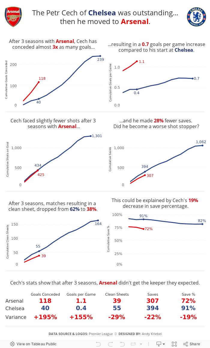
The Petr Cech of Chelsea was outstanding...then he moved to Arsenal
In an Arsenalesque sense of optimism, Arsene Wenger thought bringing in a great goalkeeper would solve their defensive woes. Many fans, however, knew that the real problems were in front of the goalkeeper. Without a solid defense, a goalkeeper cannot be effective.
This led me to thinking about how Cech's first three seasons compared to his first three seasons with Chelsea, when he was widely considered one of the best goalkeepers in the World. The data shows that Arsenal more or less ruined him. Or did Chelsea's stellar defense make him better than he really is?

History of the Premier League Table
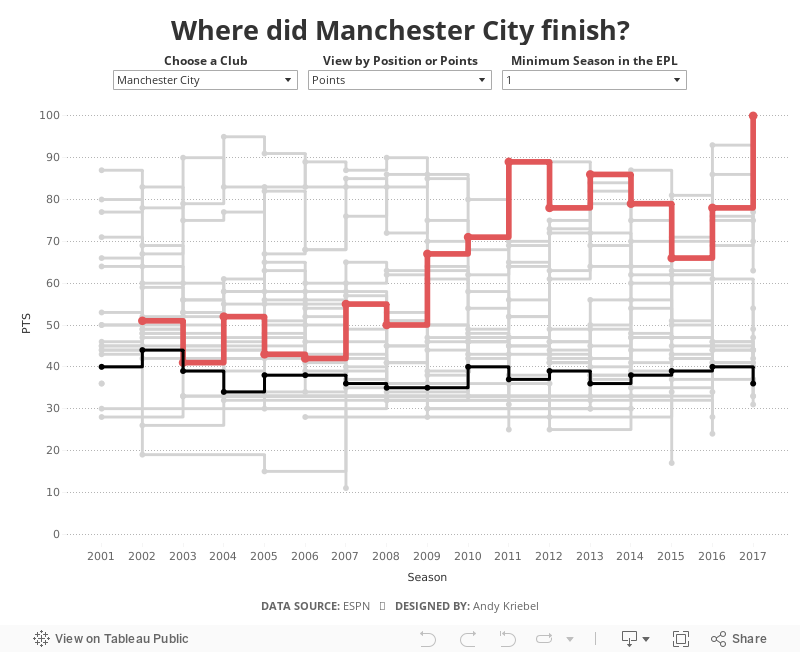
When I originally created this, I had to use table calcs to get the stepped lines to work, which can get complicated and is very time consuming. Now with stepped lines, it merely a matter of changing the lines type.
I decided to add in a couple of user options:
- Which team do you want to highlight?
- How do you want to compare the teams? By total points for the season of the final position in the table?
- Not all teams have been in the EPL for all 17 years, so I provided an option to filter down to just the teams that have been in the EPL for the user specified number of years.

May 21, 2018
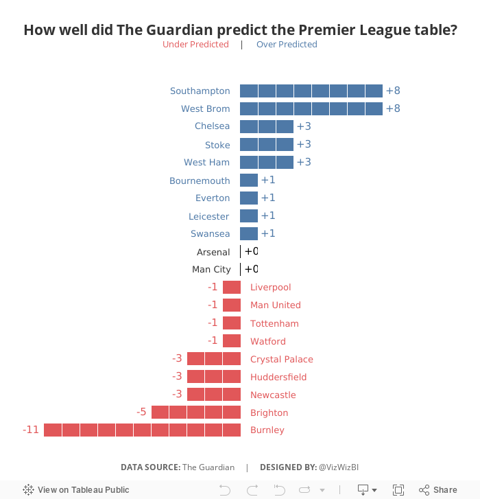
Makeover Monday: How well did The Guardian predict the Premier League table?


What works well?
- Sorting the teams by prediction makes sense since this is an evaluation of their performance against their prediction.
- Including the logos so people can find their favorite team
- Including the numbers for the table position so that the reader doesn't have to count as they go
- Shading every other row helps break up the view
What could be improved?
- If you don't know the team logos, it can be hard to track a team across the table.
- It's hard to see which team did better and worse than expected.
- There's no scale for how "well" The Guardian predicted the table.
My Goals
- Focus on the difference between the predicted and actual results
- Try to create some sort of unit chart (I didn't have time to figure out the calcs, so I cheated with distribution bands)
- Make it easier to see if team finished above or below the predictions
- Finish in under an hour because we did MM live at the Data School and had to present to Eva at the end of the hour
June 5, 2017
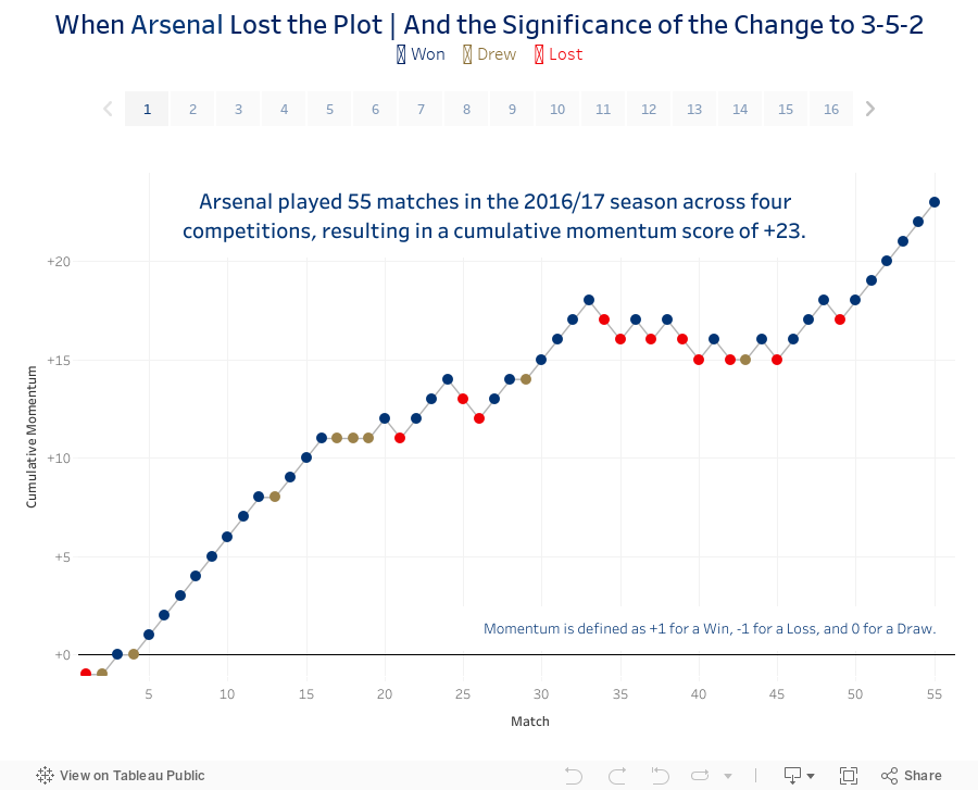
When Arsenal Lost the Plot...and the Significance of the Change to 3-5-2
So I sat down last night and cranked out this viz and story about Arsenal's 2016/17 campaign, including the up, the downs and the inevitable contract extension for Arsene Wenger.
Enjoy!
December 24, 2015
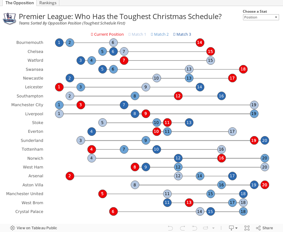
Premier League: Who Has the Toughest Christmas Schedule?

Using the viz below, you can see that, based on the average position of their opponents, Bournemouth has the toughest run followed by Chelsea. Leicester has the 6th toughest run, while Arsenal have the 5th easiest. This provides hope that Arsenal can finish the festive season on top of the Premier League.
I've added a parameter on the upper right to allow you to view by opposition points as well. In this view, Bournemouth and Chelsea still have the two toughest schedules, but the teams with the easiest schedules shifts a bit.
On the 2nd tab, I've added a bit of an exploratory view. Pick a metric and see the team rankings.
#COYG!
April 20, 2015
Makeover Monday: Chelsea Are the Worst-Behaved Team in the Premier League When It Comes to Showing Respect to Referees

As I was scouring the various reports, I didn’t see anyone actually create a viz on the subject. The best I found was this table from The Daily Mail:

A table is great for ranking and looking things up, but terrible for doing any sort of analysis. I downloaded the FPL table into Excel (here) and combined it with the BPL standings as of the same date.
In the viz below, I’m using Chelsea as the baseline for comparison, because the story that interested me was how much worse does Chelsea behave compared to the other teams. For example, if you hover over Liverpool, you will see that Chelsea is 14% worse with its respect for referees.
I then added a second tab that allows you to explore the data on your own. Pick a FPL stat, a BPL stat and you can compare and contrast. The question I wanted to answer here was “Is there a relationship between FPL and BPL stats?” I can’t find any interesting relationships, but maybe you can.
April 12, 2015
English Football Stadium Tracker

Today, I set out to see some football stadiums. I mapped a route that took me from Wimbledon, past three iconic football stadiums.
 |
| Craven Cottage - home of Fulham FC |
 |
| Loftus Road - home of QPR FC |
 |
| Stamford Bridge - home of Chelsea FC |
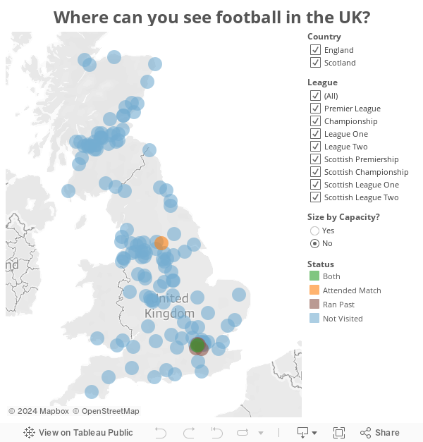
And yes, I know I titled this post "English" and Scotland is not part of England, but UK football stadium tracker doesn't resonate as well with me.
February 16, 2015
Makeover Monday: How Does Francis Coquelin's 14/15 Season Compare to Alex Song's 11/12 Season at Arsenal?
That decision left Arsenal very thin at the back to start the 14/15 season. Fast forward a few months and injuries, as they always do, hit Arsenal hard. They were forced to recall Francis Coquelin from a loan spell at Charlton.

As the saying goes, he's been like a new signing. In his previous spells with the first team, he failed to establish himself, but this time around, he grabbed hold of the opportunity and surely now Coquelin is the first name on the manager's team sheet.
Late last week, I ran across this article from HITC Sport. In it, Dan Coombs says "Coquelin has shown already that he is playing defensively at an equal or higher level than Song's final season at the club." Dan then provided this simple table:

This table is perfectly fine. It's a table and it provides a great way to look up the data. In the end, the point of the story is to show how effectively Coquelin is playing compared to Song. I created this infographic in Keynote with the hope that it is more interesting, more engaging and makes comparisons easier.

January 11, 2015
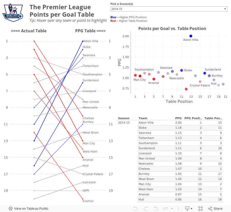
What If Premier League Standings Were Based on Points per Goal?
So far in the 2014-15 season, Aston Villa has the highest points per goal of any Premier League team in the last 10 seasons.This was quite intriguing to me, so this morning while I was enjoying a cup of coffee at Tully's I went to ESPNFC.com and downloaded the standings for the last 10 years. I added two columns to this dataset, which you can download here.
- Points per Goal (PPG)
- PPG Position (i.e., a rank of each team based on PPG)


From there, I wanted to understand the difference between Villa's actual place in the EPL table and their place in the fictitious points per goal table. For this view, I created a slopegraph, which I first wrote about creating in Tableau here.
If you're unfamiliar with slopegraphs, Andrew Wheeler summarizes them well in his paper "A Critique of Slopegraphs":
Slopegraphs show values for two numeric variables by line segments for each observation by connecting points on two parallel axes. They are frequently recommended for visualizing the changes in ranked data (Bertin, 2011; Tufte, 2001).I put all of the pieces together in this simple dashboard, which you can download here. Do you notice anything else interesting or unusual?
December 17, 2014
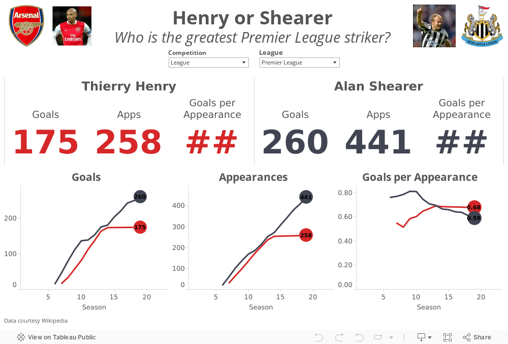
Henry or Shearer? Who is the greatest Premier League Striker?
In a tribute to The King, the Premier League created this great compilation video.
Henry's retirement led to the inevitable debate of who is the greatest Premier League striker ever? Most people agree that Thierry Henry and Alan Shearer are in a class by themselves. The great thing about sport is that it leads to lots of opinions and great debates. There are Henry camps and there are Shearer camps.
I gathered their career data from wikipedia (here and here) and combined them into a single spreadsheet here. I built this quick viz in Tableau to allow you to answer the question for yourself. Download the workbook here.
October 29, 2014
Plot.ly - A simple interface for creating great looking charts in d3
What is Plotly? The folks at import.io have a great summary:
Plotly is a young graphing and analytics startup, which makes it easy to analyze and visualize data together. Using Plot.ly, users can import data from anywhere, then make and share online graphs using Python, MATLAB, R, Excel, Julia, and their web app. Users can also share work and collaborate on projects.
The Plotly API enables users to analyze and visualize data in one place, and forms an important step in building the infrastructure for data science to be further democratized. Their goal is to be an awesome platform for collaboratively analyzing data and making graphs.From the Plotly website, in the workspace area (think of this as a worksheet in Tableau):
Easily make graphs with your data in the workspace. Import data from Google Drive or upload Excel or text files. You can apply fits, stats, and functions to your data.
Every element of a Plotly graph is customizable. Change the colors, annotate, write LaTeX, toggle graph ticks, and much more. It's up to you!The best way to get familiar with any new product is to start using it. Since I had just publish a parallel coordinates plot in Tableau yesterday, I thought I would use the same dataset and see how long it takes to build something similar in Plotly. I was pleasantly surprised by the simplicity and intuitiveness of the interface. It took me about 30 minutes to build this view, but a lot of that time was spent tweaking the settings to get them just right, which I'm perfectly ok with given the very detailed control I have over the final display.
Plotly doesn't currently support things like filtering and parameters yet, but for a first pass through, I really like it and will definitely be using it more often going forward. So, here's my first plot.ly viz (be sure to hover over dots to see their awesome interactivity):
October 28, 2014
My first experience with import.io and Tableau
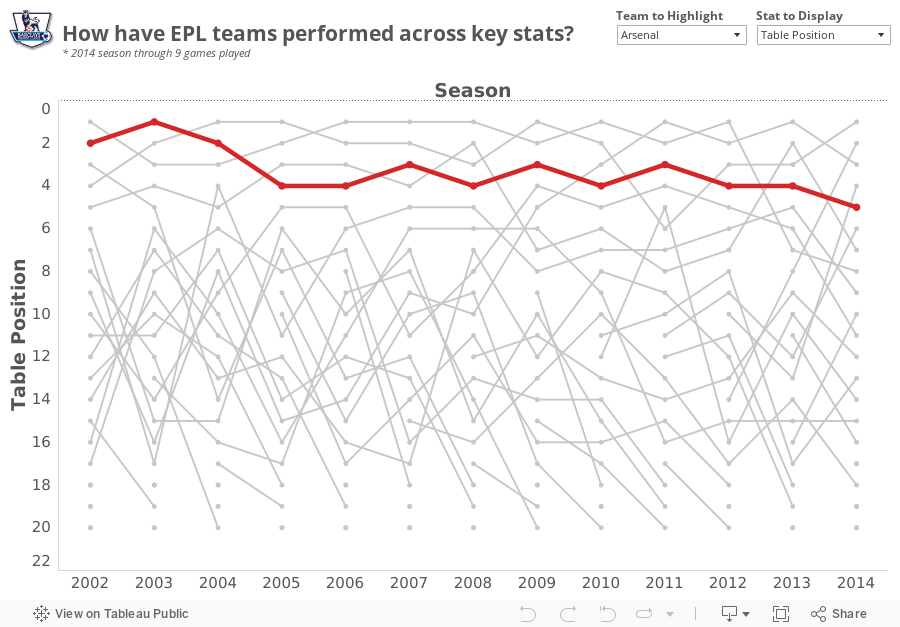
During the webinar, Alex revealed that he was a huge Arsenal fan (as am I), and I wanted to find a simple project to become more familiar with the tool. My basic idea was:
- Use the import.io Extractor to download the Premier League table from ESPNFC for every season since 2002
- Create a visualization in Tableau
- Allow the people interacting with the viz to highlight their favorite team
- Make Alex happy!

Download the Tableau workbook here.
October 13, 2014
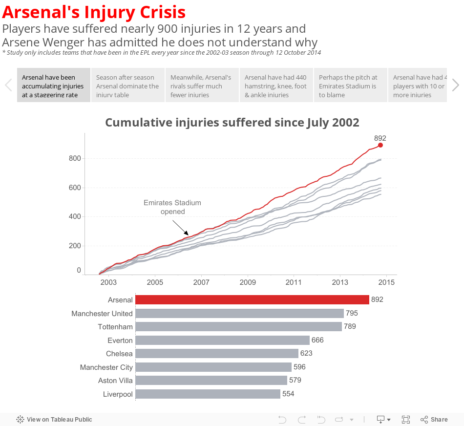
Makeover Monday: Arsenal's Injury Crisis - A Story
I found this story fascinating because it finally put numbers to Arsenal's perceived injury crisis. They do indeed suffer way more injuries than any other EPL team. But what bothered me about the ESPN story was that they basically just listed off a few key facts (quoted from ESPN):
- Arsenal players have sustained 889 injuries since August 2002, according to a report by PhysioRoom.com.
- The Gunners' 889 injuries over the 12-year period compare to 792 for Manchester United, 620 for Chelsea and 551 for Liverpool.
- Abou Diaby, who has recently returned to fitness, has endured 40 separate injuries, according to the study, while Theo Walcott, who is currently recovering from a serious knee problem, features 42 times.
- PhysioRoom.com claims 120 of the injuries were of the hamstring variety while six anterior cruciate ligament (ACL) have been suffered.
Without comparing Arsenal to their rivals, how do I know how bad their injury crisis really is? If they're suffering injuries at the same rate as their rivals, then maybe there isn't a crisis after all. But if their rate of injury is higher, then perhaps there is more to the story. Have Arsenal players always been injury-prone or have they increased since they moved to the Emirates Stadium with its rock hard surface?
I set out to understand more by downloading the injury reports from PhysioRoom.com for all teams that have participated in every year of the EPL since 2002-03 (plus a few others that are not included in my final story below). You can download the data in Excel format here.
September 13, 2013
When Arsenal stole Mesut Ozil from Real Madrid, they got a player nearly as good as Xavi and Iniesta combined
Fact: Across all competitions, Ozil is nearly as good as Xavi and Iniesta COMBINED, merely 0.01 goals + assists per game behind the combined pair. Get your head wrapped around that.
When Arsenal surprised everyone by actually spending some money on transfer deadline day with the club-record signing of Mesut Ozil for $67M, many of the pundits (1) were in shock that Madrid sold him and (2) thought Arsenal had secured THE BEST central midfielder in the world.
Turning to the data, you can easily make such an argument. Using the viz below, you can compare Ozil to many of the other top central midfielders in the World.
- Despite having played fewer seasons than nearly all of the players on this list, Ozil is the leader in total assists, leader in goals + assists per game, and the runaway leader in assists per game across all competitions.
- Xavi and Iniesta may get all of the plaudits, but they are well down the list of goals + assists per game across all competitions, coming in at 10th and 13th respectively. They are far behind Ozil and just behind Santi Cazorla. This has to bode well for Arsenal.
- Ozil has been the clear leader in assists across all competitions for the past four years. meanwhile Xavi's production has steadily dropped, with a dramatic drop off in the 2009/10 season.
- Ozil consistently performs better for country than club and on the international stage, his performance vs. his peers is even more staggering.
- Barca need to get Cesc on the field more often.
- Frank Lampard, despite playing for the Evil Empire in Chelsea, was astonishingly consistent and dominant from 2003/04 through 2009/10. Frank performs better than Gerrard on the international stage when looking at averages per game, yet you would think, based on what you hear in the press, that Gerrard's performances far exceed those of Lampard. The data shows otherwise. I suppose that's why they call them pundits and not experts.
- Manchester United are desperate for an attaching midfielder to complement Michael Carrick.

May 8, 2013
Was Theo Walcott’s performance for Arsenal driven by motivation for a new contract?
With two matches to go in the EPL season, Arsenal is in a battle for a Champions League spot with Chelsea and Tottenham and Theo Walcott is leading scorer. He started out the season in great form, then suddenly tapered off immediately after he signed a new deal with the club.
In Arsenal’s last two matches, Theo has scored two great goals very early on in the game, at the 2’ mark against the champions Manchester United and 20 seconds into the most recent game against relegated QPR. Theo is back in form.
I was interested to see how Theo has impacted Arsenal’s overall performance. Use the viz below to see how Arsenal performs when Theo does or does not play (Arsenal have a higher winning % when he doesn’t play, though in a small sample size) and when he does or does not score (their winning % increases by 20% when he plays and scores vs. when he plays and doesn’t score).
In other words, Arsenal need Theo to play and score.

January 16, 2013
The one chart that shows how the sale of Robin van Persie impacted the fortunes two clubs
We were pumped for the game, only to be let down nine minutes into a game by a stupid foul and the subsequent sending off of Laurent Koscielny. Why wasn’t the BFG Per Mertsacker playing in the first place? That’s another rant for another time.
Several Gooners at Maggie’s were talking about Arsenal’s lack of ability to dominate the final third of the pitch, which got me daydreaming back to the days of Robin van Persie. Arsene Wenger sold RVP to Manchester United over the summer, literally telling Sir Alex Ferguson that he was handing him the title. Of course, RVP has continued scoring like the 3rd best striker in the World. I think our manager has lost the plot.
I pulled some data down from the Barclay’s Premier League website to see how teams were performing through 21 fixtures this year compared to last. I created this:

- The order of the clubs
- The specific number of points accumulated by each team in each year
- The slope reveals the change over time and each club’s rate of change compares easily to other teams
- There’s almost zero non-data ink. I say almost because I used red to highlight Arsenal.
- Manchester United have opened on the rest of the league this year and that they were in 2nd place last year.
- The gap between Man U and Arsenal is HUGE this season, which is surely directly correlated the RVP’s transfer.
- Everton and West Brom have had much stronger starts to the season. Don’t be shocked if Everton snatches the last Champions League spot. It sure doesn’t look like Arsenal has the heart to do it.
- Newcastle sucks this year!
- Most importantly, we’re only 5 points behind Spurs, whereas we were 10 points behind at this point last year. If we’re not going to make the Champions League, we could take a bit on consolation in finishing ahead of Spurs.
April 16, 2012
When did Arsenal’s season really turn around?
As we approach kickoff of the Arsenal vs. Wigan game this afternoon, I thought I’d take a quick look back at the Gunners’ season and when the data says the season may have turned around.
It’s well documented that Arsenal got off to one of the club’s worst starts ever, but gradually they have come back and are currently in third place. With five games remaining, their magic number over Spurs and Newcastle stands at 11 and 8 over Chelsea.
“Magic number” is a phrase we use in the States, particularly with baseball, “to indicate how close a front-running team is to clinching a season title (or third place and a Champions League automatic qualifying spot in Arsenal’s case). It represents the total of additional wins by the front-running team or additional losses (or any combination thereof) by the rival team after which it is mathematically impossible for the rival team to capture the title in the remaining games.”
Many people point to the goal below by Bacary Sagna when Arsenal were down 0-2 against Spurs on 26-Feb as the turning point in the season. (Pardon the poor quality; it’s all I could find on YouTube.) I must say that I love the way Sagna took the goal, followed the ball into the goal, picked it up, ran it to half field and all but said “I’m sick of this!” The entire attitude of the team seemed to shift on this one goal. I get the chills every time I watch it.

Again, I have no doubt about the attitude shift at this single moment, particularly after back-to-back poor results against AC Milan (Champions League) and Sunderland (FA Cup). But looking at the data for the EPL only, one particular match stands out as the turnaround point..the 7-1 thrashing of Blackburn, whom Arsenal somehow managed to lose to during their early season swoon.
Below you will see four chart, all which highlight this 7-1 game.
- Points Trend – the upward trend of full-point matches clearly starts with the Blackburn match
- Points vs. Possible – Here, you want to see a flat green line, which indicates full points are taken from the match. Look at that long run of results that starts with the Blackburn match.
- Table position – What an ugly start to the season! There was a recovery for a few weeks 1/3 of the way into the season, but another string of poor results began with the 0-1 loss to Manchester City. But the run of results beginning with the Blackburn match, combined with a significant dip in form by Spurs, has pole vaulted the Gunners into 3rd place.
- Score vs. Result – This is a simple scatterplot. The darker the bubble, the more results for that score. Excluding the 2-8 drubbing at the hands of Manchester Units, Arsenal have lost every match, bar a 0-2 defeat by only one goals. This indicates that they have been in every match, but haven’t been able to score late to turn the result around. But look at our wins, the scores have been tremendous with a but more than a 4-1 average score.

Touch wood that Arsenal will hold on to third place, and please, please, please RVP, sign a new contract!
December 24, 2011
Heat Map: Manchester Derby Results Since 1907
The Soccer by the Numbers blog continues to provide me great inspiration. After Manchester City destroyed Manchester United 6-1 on October 23rd (at ManU), they blogged about the results and provided a bit of statistical analysis. City has long been the “noisy neighbors” to United, but they now are doing their best to buy a title, rather than grow their own talent. Soccer by the Numbers posed this fundamental question:
We now know that the outcome of the match was truly unusual. But how unusual?
They created the table below, which is a frequency distribution of scored lines since 1907 of matches at Manchester United. To use the chart you simply identify the score line by going across City’s scores then down ManU’s scores. So the 6-1 scoreline has occurred 2.99% of the time since 1907. Clearly this was an unusual result.

But I think this table could be improved. I made these changes:
- Changed the numbers to percentages and rounded to one decimal. Two decimals is unnecessary precision.
- Removed most of the gridlines so that the lines separate the data from the categories
- Formatted the results as a heat map. I chose a red-white two-color scheme since Red is ManU’s color. This makes the largest percentage of result very obvious. For example, you can now easily see, without having to scan across all of the data points, that 1-1 is the most common score line…boring result!
- Formatted the totals as a second heat map. I chose a brown-white scheme for these. The totals show you the % of the total goals scored for each time. ManU has scored one or two goals 64.2% of the time while City has scored one or two goals 58.2% of the time.

Which format do you like best? Does one make the story easier to interpret than the other?






