Showing posts with label stepped lines. Show all posts
May 3, 2021
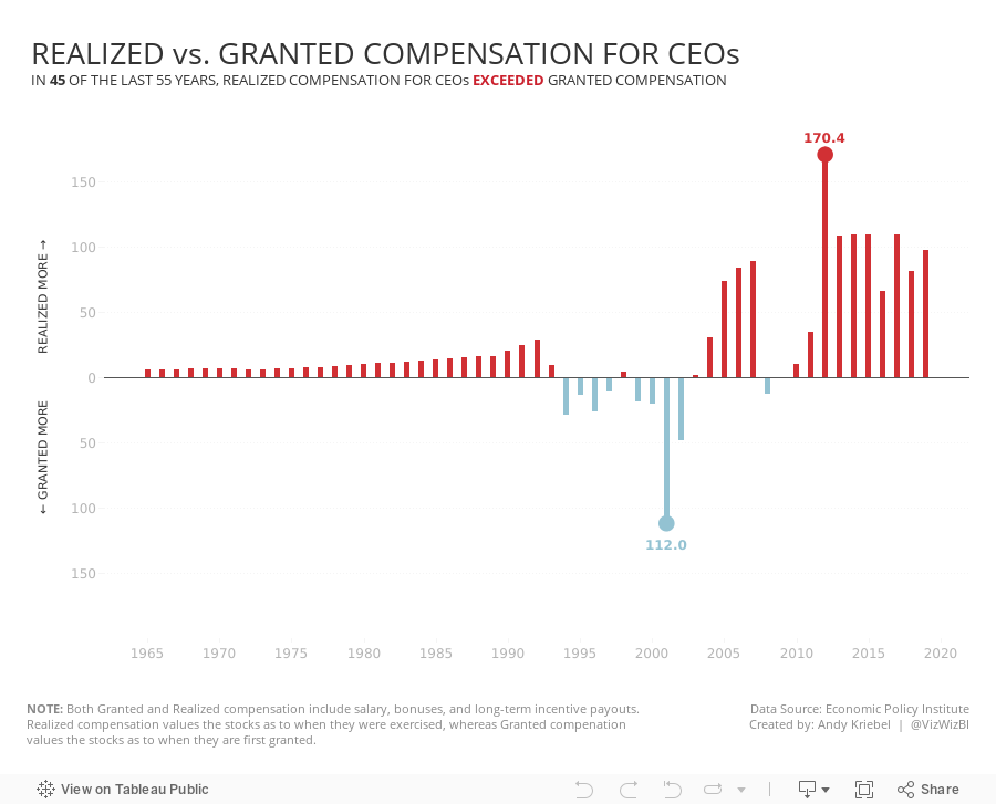
#MakeoverMonday 2021 Week 18 - Realized vs. Granted Compensation for CEOs
analysis
,
bar chart
,
circle timeline
,
comet
,
connected scatterplot
,
dashboard
,
gantt
,
heatmap
,
line chart
,
Makeover Monday
,
reference line
,
slope graph
,
stepped lines
,
tableau
,
variance
,
WatchMeViz
No comments

Charts created:
- Line Chart
- Stepped Lines
- Variance to baseline
- Win/Loss chart
- Comet Chart
- Gantt Chart
- Bar chart w/ reference line
- Connected scatter plot
- Slope Graph
- Circle Timeline
- Heatmap
- Data Set - https://data.world/makeovermonday/2021w18
- Chart chooser - https://datavizproject.com/
August 9, 2018
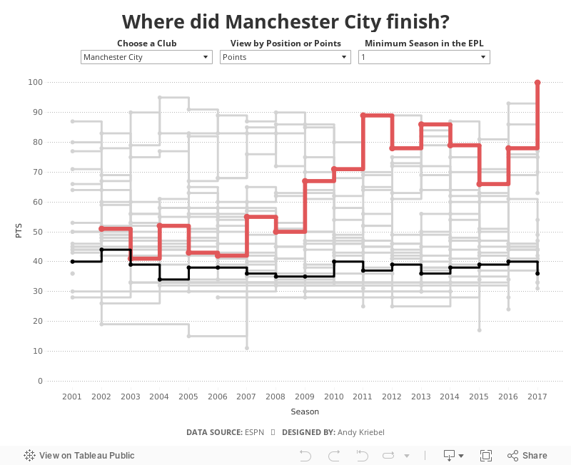
History of the Premier League Table
england
,
English Premier League
,
ESPN
,
football
,
highlight
,
line chart
,
rank
,
soccer
,
stepped lines
No comments
The 2018-19 Premier League season kicks off tomorrow night with an enticing match between Manchester United and Leicester City. This reminded me about a viz I had created at the end of the last season as a way of practicing stepped lines in Tableau.
When I originally created this, I had to use table calcs to get the stepped lines to work, which can get complicated and is very time consuming. Now with stepped lines, it merely a matter of changing the lines type.
I decided to add in a couple of user options:

When I originally created this, I had to use table calcs to get the stepped lines to work, which can get complicated and is very time consuming. Now with stepped lines, it merely a matter of changing the lines type.
I decided to add in a couple of user options:
- Which team do you want to highlight?
- How do you want to compare the teams? By total points for the season of the final position in the table?
- Not all teams have been in the EPL for all 17 years, so I provided an option to filter down to just the teams that have been in the EPL for the user specified number of years.
And here's the viz for you to explore. Enjoy!
June 18, 2018
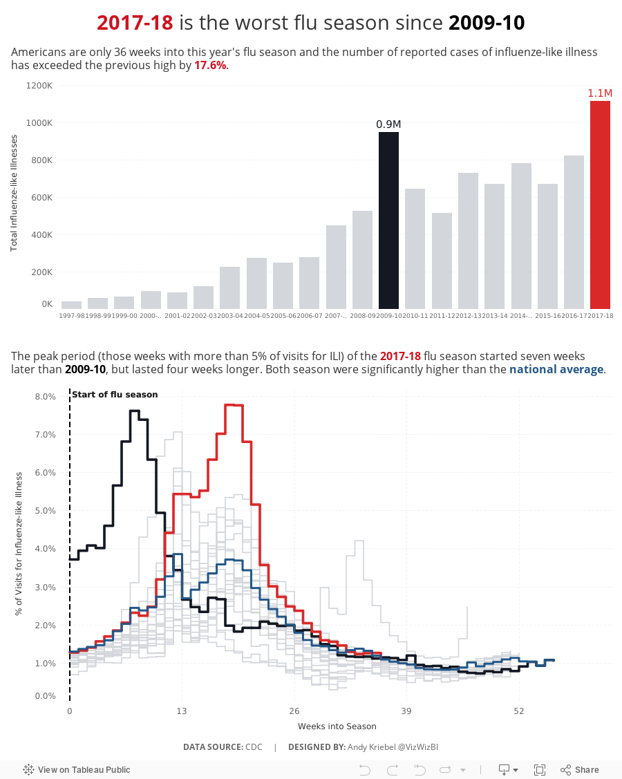
Makeover Monday: U.S. Influenza Surveillance Report
flu
,
highlight
,
influenza
,
Makeover Monday
,
stepped lines
,
United States
,
USA
No comments

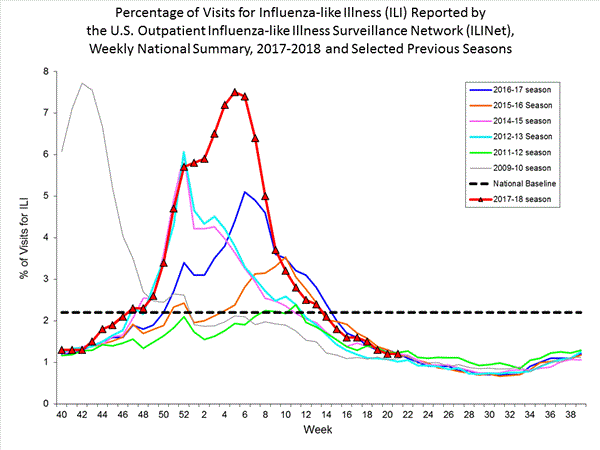
What works well?
- Clearly marking the x-axis so that it's evident that the weeks don't start at the beginning of the year
- Including the national baseline for context
- Chart dimensions scaled properly
- Using red for the most recent season so that it stands out more
What could be improved?
- The colors are too bright and are competing for attention.
- The symbols on the 2017-18 line are unnecessary.
- The start of the 2009-10 season is wrong, according to the data that can be downloaded.
- The national baseline should be weekly, not flat across the time period.
What I did
- I liked the idea behind the original chart, so I kept that but made it look nicer and more focused.
- I included a summary to set the context for the line chart.
- I included the national average by week for context.
- Use a stepped chart to make the weekly change easier to see.
- Focus the lines on the two outlier periods.

February 11, 2018
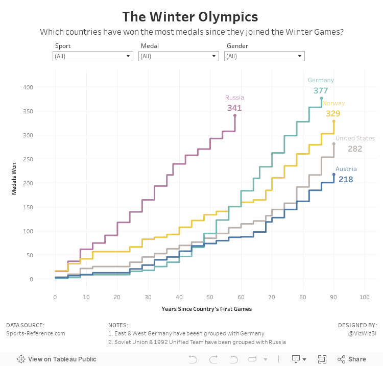
Makeover Monday: The Winter Olympics

What works well?
- Simple title and subtitle
- Noting when he combined countries
- Simple filtering
- Nice small multiples design
- Including summaries under each country name
- Sorting the countries from most medals to least
- Including blocks for each medal won
What could be improved?
- Right-align the filter titles so they are next to the filter itself.
- I'd prefer the gold medals at the bottom and bronze on top.
- Provide an option to look at the top N countries so that you can see it one screen.
- The x-axis doesn't make sense. If it's supposed to represent a year, why does it start at zero and end at 25?
What did I do?
- Focused the visualisation on the cumulative medals won by the top 5 countries based on the filters; I did this by creating stepped lines based on Rody's tutorial.
- Made the x-axis represent the number of years since a country first participated in the games; this makes comparing the cumulative medals easier. In other words, it's easier to see which country won medals the fastest.
- Place the filter titles above each filter
- Moved the notes to the bottom, out of the way
- Simplified the tooltips
Thanks Rody! You're a good sport!
January 24, 2018
Makeover Monday: How far have the turkey vultures flown?
Inspired by Mike Cisneros' viz this week, I thought I would look at the cumulative distance each turkey vulture traveled. And, as a bonus, I wanted to use stepped lines, which are not yet available in Tableau. Fortunately, Rody Zakovich has written a great, easy to follow tutorial.
In addition to the stepped lines, I wanted to be able to compare all the birds on the same baseline. I created a calculation for quarters since each bird was tagged and then calculated the running total of the distance along the quarters. Standardizing the data this way helps me to see which bird flew the farthest (Leo) and which bird has flown to longest (Irma, which really means Irma has been tagged the longest).
Lastly, I sent the viz to Eva for some feedback and she suggested swapping the axes so that distance was on the X and time on the Y. This definitely makes more sense since distance is the independent variable.
Fun learning exercise and Rody's blog really makes creating stepped lines so, so much easier.
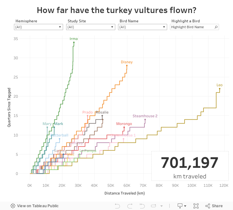
August 2, 2017
Workout Wednesday: The Timing of Baby Making
WARNING: This weeks workout won't be as easy as it may look. If you're anything like me, by the end you'll be saying stepped lines can't come into Tableau soon enough! It's good practice to know how to actually make this chart without that feature though. Anyone know when stepped lines are actually coming BTW?
This data set first caught my eye a few weeks ago and I highlighted it on my Data Viz Done Right site. Your task this week it to more or less replicate the stepped line chart in Tableau as I've done. Here are the requirements:
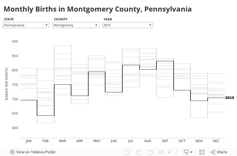

This data set first caught my eye a few weeks ago and I highlighted it on my Data Viz Done Right site. Your task this week it to more or less replicate the stepped line chart in Tableau as I've done. Here are the requirements:
- Create the stepped line chart (HINT: I didn't do this only with lines).
- Match the dynamically updating title. It changed when you pick a single county vs. all counties.
- Each stepped line represents a year.
- Allow the user to pick a year to highlight in black. All others should be grey.
- Match my tooltip (easy peasy).
- Label only the end of the line that is highlighted.
- Match my axis lines.
- Match the month formatting.
- Final dashboard should be 800x500 and should be all tiled (no floating elements)
- Optional: Match my font throughout (Avenir)
If I missed anything, let me know and I'll update the requirements. This will likely be a fiddly little beast. Download the data here. Leave a comment when you finish and/or tag @VizWizBI and @EmmaWhyte on Twitter with a picture and a link.
Good luck!
Subscribe to:
Posts
(
Atom
)


