June 18, 2018
Makeover Monday: U.S. Influenza Surveillance Report
flu
,
highlight
,
influenza
,
Makeover Monday
,
stepped lines
,
United States
,
USA
No comments

What works well?
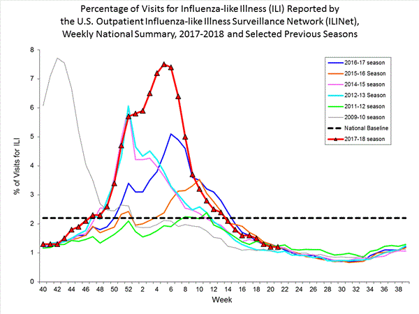
- Clearly marking the x-axis so that it's evident that the weeks don't start at the beginning of the year
- Including the national baseline for context
- Chart dimensions scaled properly
- Using red for the most recent season so that it stands out more
What could be improved?
- The colors are too bright and are competing for attention.
- The symbols on the 2017-18 line are unnecessary.
- The start of the 2009-10 season is wrong, according to the data that can be downloaded.
- The national baseline should be weekly, not flat across the time period.
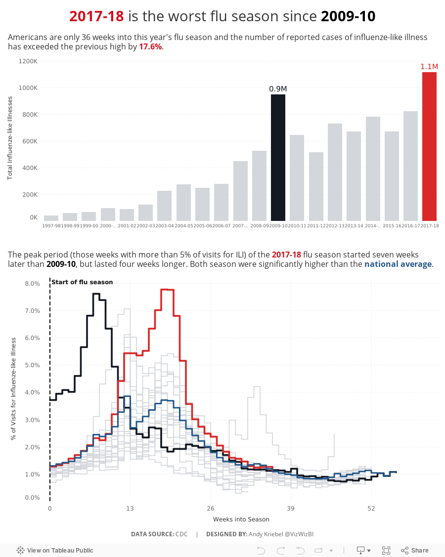
What I did
- I liked the idea behind the original chart, so I kept that but made it look nicer and more focused.
- I included a summary to set the context for the line chart.
- I included the national average by week for context.
- Use a stepped chart to make the weekly change easier to see.
- Focus the lines on the two outlier periods.

Subscribe to:
Post Comments
(
Atom
)


No comments
Post a Comment