January 31, 2023
How to Calculate Day over Day Change Excluding Weekends

In a previous tip, I showed you how to calculate day over day change and build 3 KPI cards.
However, this does not cover the case when you need to ignore weekends. In this #Tableau tip, I show you how to calculate daily change excluding the weekends.
You can copy/paste the calculations from below the video. Enjoy and good luck!

Calculations
- Latest Day
{MAX([Order Date])} - Weekday for Latest Day
DATEPART('weekday',[1. Latest Day]) - Sales for Latest Day
INT([Order Date]=[1. Latest Day])*[Sales] - Previous Day
IF [2. Weekday for Latest Day]=2
THEN [1. Latest Day]-3
ELSE [1. Latest Day]-1
END - Sales for Previous Day
INT([Order Date]=[4. Previous Day])*[Sales] - DoD Change
SUM([3. Sales for Latest Day])-SUM([5. Sales for Previous Day]) - DoD Change %
[6. DoD Change]/SUM([5. Sales for Previous Day]) - Positive Change
[7. DoD Change %]>0
January 30, 2023
#MakeoverMonday 2023 Week 5 - Where can you find a cheap slice of pizza in New York City?

- Prepare the data: calculations, joins, spatial intersections, and more
- Create maps: hexbin maps, map layers, spatial joins, using maps as shapes
- Create line charts and heat maps that are simple and effective (don't overcomplicate things)
- Build a dashboard using layout containers
January 24, 2023
How to Select a Date Range with a Set Action

January 19, 2023
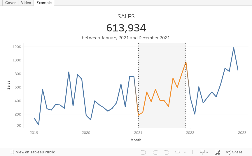
How to Calculate Day Over Day Change
In this tip, I going to show you how to build 3 different KPI cards for measuring day over day change. In just a few steps, I’ll show you how to calculate:
- Sales for the most recent day
- Sales for the previous day
- Difference in sales between those two dates
- Percent difference in sales between those two dates
I'll then show you how to create these 3 different methods for displaying the KPIs so that you can create those that are most useful for your audience.

RESOURCES
- Data - https://data.world/vizwiz/sample-car-sales
- Month over Month Change - https://www.youtube.com/watch?v=ViD3vclgNv8
- Year over Year Change - https://www.youtube.com/watch?v=YuxYr4_l2ww

January 9, 2023
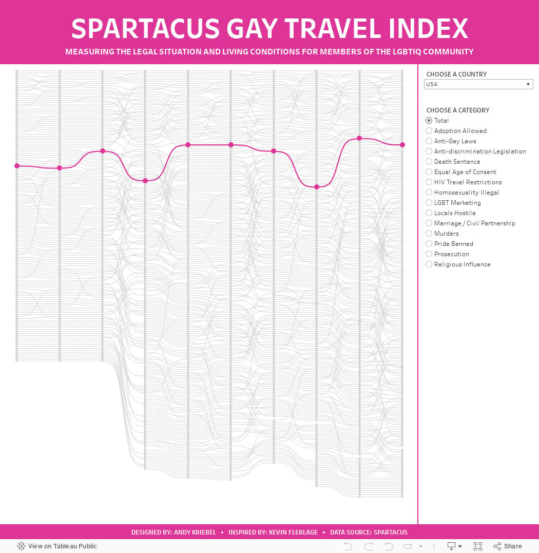
#MakeoverMonday 2023 Week 2 - The Spartacus Gay Travel Index

I found the subject of this week's data set on the Instagram account of The Map Zone. It's a simple map of what's called the "Gay Travel Index".
The annually updated SPARTACUS Gay Travel Index informs travellers about the situation of lesbians, gays, bisexuals and transgender (LGBT) in a total of 202 countries and regions. The US-Index provides information about each of the 50 federal states of the US.
The index attempts at finding a balance between measuring the rights of the local LGBT community and considering the demands of queer holidaymakers. Our aim is to monitor the safety of queer people in each country and also increase the awareness on grievances.
When I saw that the data was a ranking over time, I thought I'd give a curvy bump chart a try. I used this blog by Kevin Flerlage. He makes it super simple to follow along. During WatchMeViz, I showed how to use one of Kevin's visualizations from an old Makeover Monday as a template. I showed how to take the data we had for this week, transform it to the write shape needed for the template, then how to swap out the data source with the new one we created.
Honestly, when I swapped out the data sources, I was convinced that I would have messed things up along the way, but alas, I didn't and I was basically done. I spent time formatting, adding in more categories, and a bit more. Check out the viz below or here and follow along with Watch Me Viz to see how to build one yourself here.
January 6, 2023
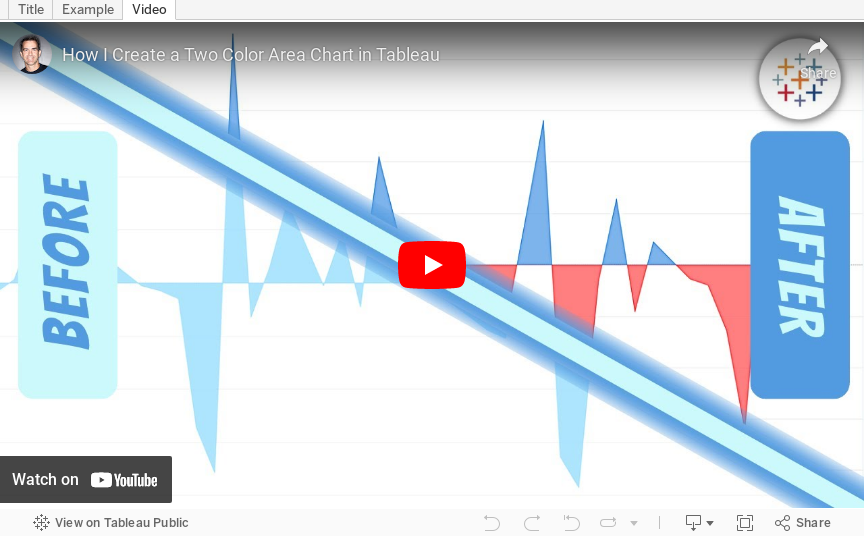
How to Create a Two Color Area Chart in Tableau
In this week's Watch Me Viz, I showed the problem this tip helps solve. An area chart in Tableau only allows a single color. Like this…
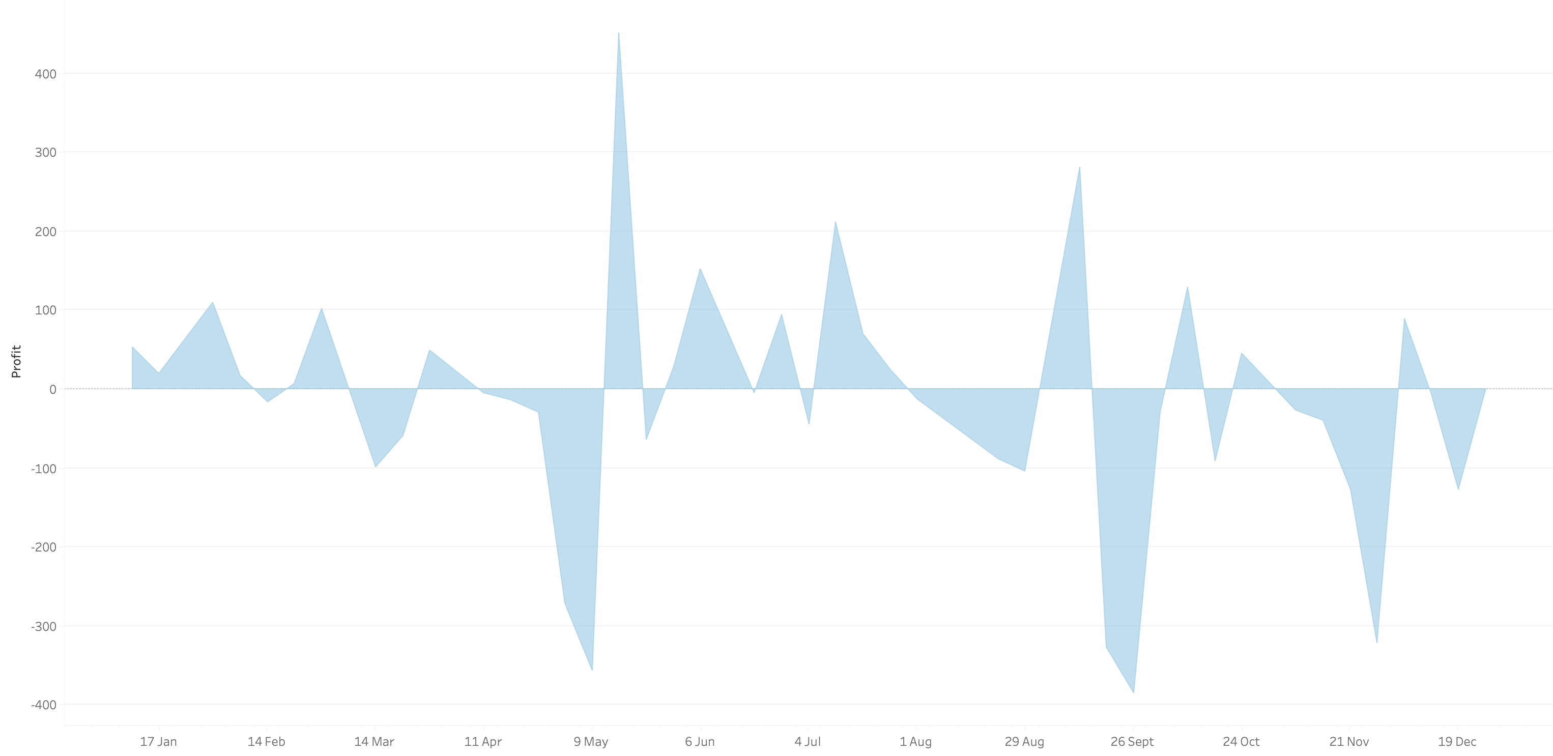
What we want is an area chart like this with two colors.
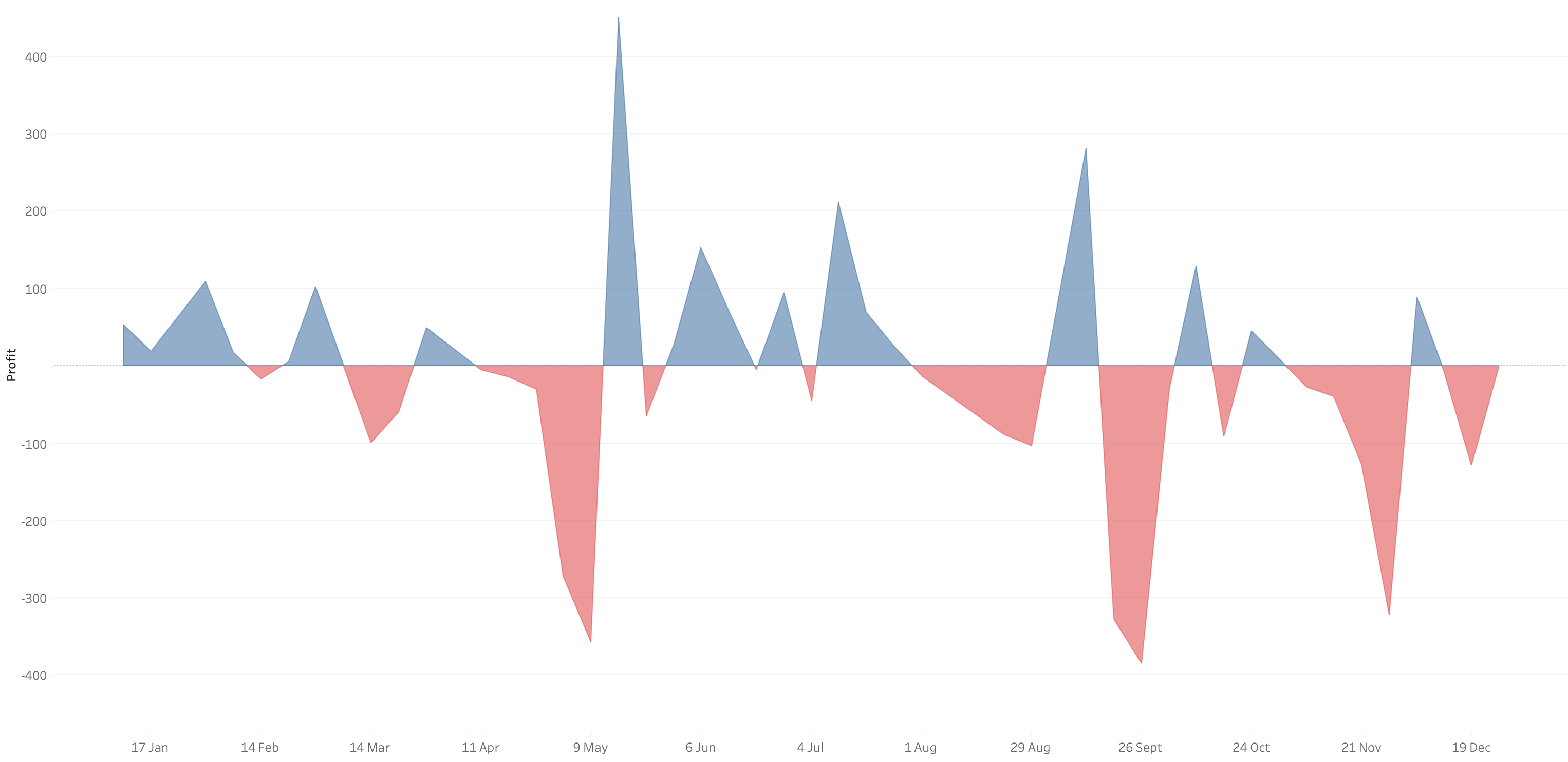
In 9 simple steps, I’ll show you how to build it. Follow along with the video. The 9 steps are listed at the bottom of this post.
STEPS
1. Create the area chart
2. Show what happens when you add a profit to color - you only get one color
3. Duplicate the measure
4. Fix the axes
1. Top axis starts at 0
2. Bottom axis ends at 0
5. Choose a color for each area chart
6. Format the axes to get rid of 0
7. Add reference lines to scale the charts relative to each other
1. WINDOW_MAX(ABS(SUM([Profit])))
8. Duplicate for the negative reference line
9. Formatting
January 3, 2023
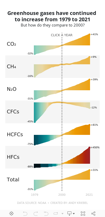
#MakeoverMonday 2023 Week 1 - The Change in Greenhouse Gases in the Atmosphere

2023 is here and #MakeoverMonday will be here the entire you to help you continue to learn and improve. Come on the journey with us each week. Build your portfolio. Showcase your skills. You just might get that job you've been seeking. It's happened, a lot, by participating every week.
For week 1, we were analyzing greenhouse gases in the atmosphere from 1979-2021. The original visualization is quite simple.

We have CO2 and total gases on the left axis and the variance to 1990 on the right. Overall, the chart is pretty easy to read, with the exception of knowing that the red line is always compared to the 1990 value. That definitely needs to be more clear. It's also missing a title, so without the website it is posted on, you wouldn't necessarily know what it's about.
For my viz, I started by reproducing the original, but it doesn't look as good because the data we have starts at 1979. So you miss the big upward curve. From there, I focused primarily on making good looking sparklines that show comparisons with a parameter action. I also showed how to create an "area chart" with multiple colors. I'm going to create a tip video for it; I like how it turned out.
Here's the livestream and below is the visualization for you to interact with. The viz does not render properly on Tableau Public, but hopefully you get the idea.
I hope you continue to join me throughout the year so that we can learn together.
Have a wonderful 2023!