January 22, 2025
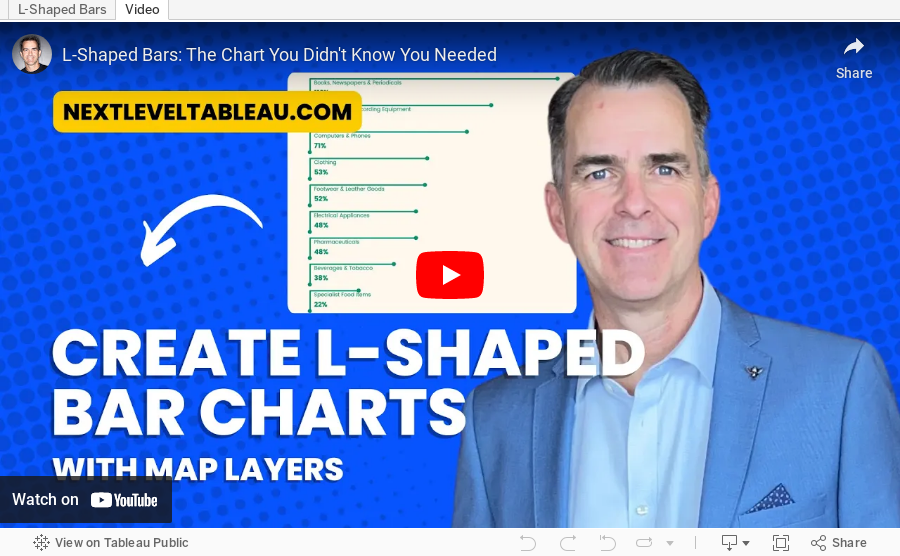
L-Shaped Bars: The Chart You Didn't Know You Needed

May 25, 2024
How to Calculate Year over Year Change in Tableau
May 3, 2024
How to Make Your Cycle Plots Actionable in Tableau

Cycle plots are a fantastic way to identify seasonality in a data set. And you can make them even more useful by adding indicators for whether they are above or below the average.
Here's how you can do that in Tableau in only 2 minutes.
Like this? You'll love Next-Level Tableau. Learn more at nextleveltableau.com.
April 9, 2024
How to Create a Floating Bar Chart in Tableau
A floating bar chart is similar to a Gantt chart, except it shows the range of two data points instead of two dates.
March 5, 2024
11 Steps to Create KPIs & Sparklines in the Same Sheet in Tableau

Want to cut the number of sheets you need in your KPI dashboard in half? These 11 simple steps will get much closer.
Steal the calcs to speed up your work.
P.S. If you like tips like this, remember to follow me on LinkedIn so you're notified about everyting I post. Content curated just for you, 3 times daily.
August 8, 2023
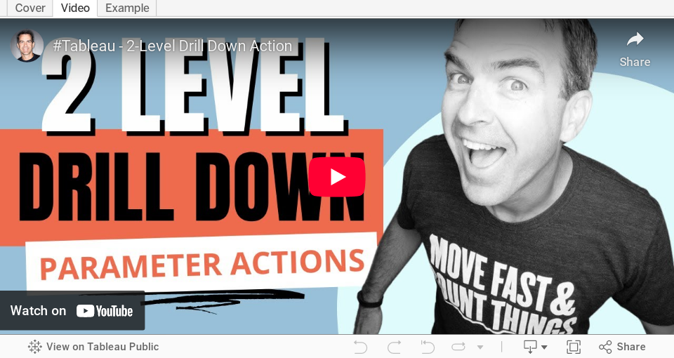
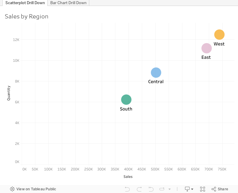
How to Master the 3-Level Drill Down in Tableau (with Dynamic Zone Visibility)

Welcome to my guide on mastering the 3-Level Drill Down in Tableau!
In this tutorial, I show you step-by-step how to make the most of using dynamic zone visibility to create this functionality. We'll go through both scatter plot drill downs from Region → State → Postal code and then replicate that as a bar chart.
You can easily make this a map drill down by changing the chart type. That's it!
🔍 What you'll learn in this video:
1. The basics of drill down functionality in Tableau
2. Hands-on demonstrations, tips, and best practices
3. How to interact with the data
💡 Why is this important?
Drill down capabilities allow analysts to explore data from a broad overview down to granular details. By mastering the 3-level drill down, you can uncover hidden patterns, insights, and trends that might be overlooked in higher-level analyses.
📌 Prerequisites:
A basic understanding of Tableau's interface and primary functions will be helpful, but beginners will be able to follow along as well!
If you are following along, be sure to pause the video along the way as you repeat the steps.
August 7, 2023
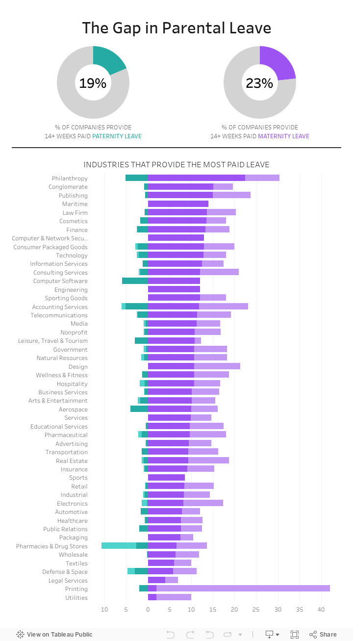
#MakeoverMonday Week 32 - The Gap in Parental Leave

The gap in parental leave is extremely wide across all industries in America.
How do only 23% of women get 14+ weeks of maternity leave? Why isn't progress being made to help dads take a more active role?
Check out the livestream recording and interactive viz below.
June 12, 2023
#MakeoverMonday 2023 Week 24 - Cereal and the Green Revolution: Yields vs. Land Use

At the global level, how has crop production changed over the last fifty years?
In this Watch Me Viz live stream, I analyzed how the yield and land use of producing cereal has changed over the last 50 years.
I really liked the original visualization, so I rebuilt it in Tableau. I learned how to use dynamic zone visibility, layout containers, and more. Check it out.
Resources:
1. Data - https://data.world/makeovermonday/2023w24
2. Final Dashboard - https://tabsoft.co/3P3Sdl3
===============
Watch Me Viz is a weekly live stream where I help people become better at #Tableau, #PowerBI and data analysis. I show how I take an existing visualization, critique it, analyze the data, and build several visualizations all the while looking for a "better" visualization than the original.
If you are considering participating in Makeover Monday, you can get started by downloading data sets from the Makeover Monday website. I promise you'll become better at data analysis and data visualization by practicing every week.
Data sets - https://www.makeovermonday.co.uk/data/
===============
LEARN FROM ME
Join my newsletter. Sign up at andykriebel.com.
ARE YOU INTERVIEWING FOR A NEW JOB?
Contact me for more information about how I can help you prepare for that big interview.
===============
CONNECT WITH ME
More Watch Me Viz - https://bit.ly/WatchMeViz2023
March 1, 2023
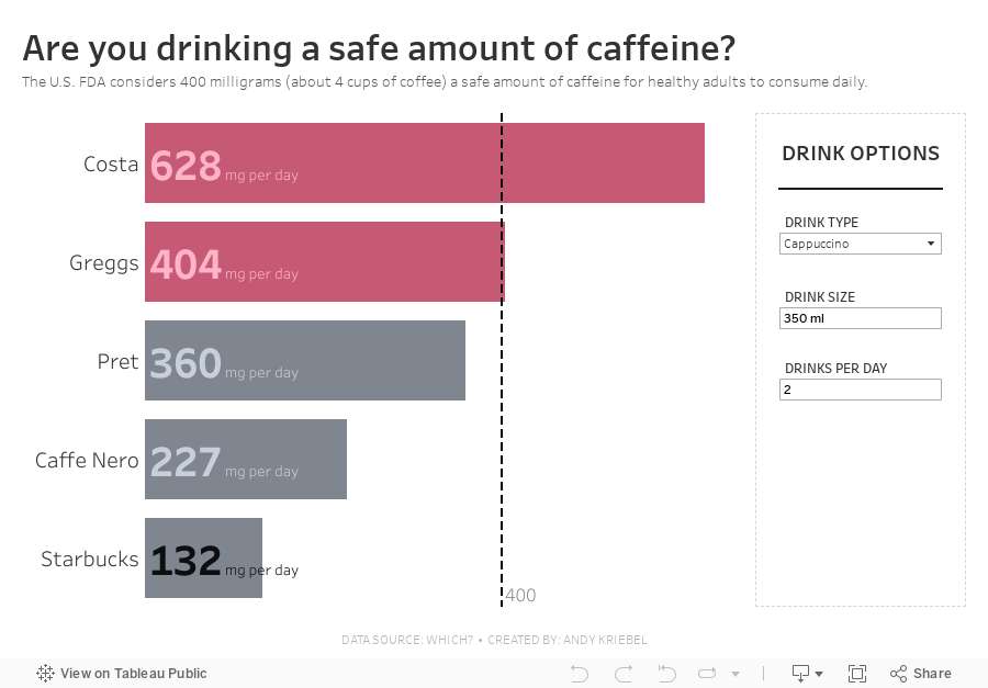
#MakeoverMonday 2023 Week 9 - Are you drinking a safe amount of caffeine?


January 31, 2023
How to Calculate Day over Day Change Excluding Weekends

In a previous tip, I showed you how to calculate day over day change and build 3 KPI cards.
However, this does not cover the case when you need to ignore weekends. In this #Tableau tip, I show you how to calculate daily change excluding the weekends.
You can copy/paste the calculations from below the video. Enjoy and good luck!
Calculations
- Latest Day
{MAX([Order Date])} - Weekday for Latest Day
DATEPART('weekday',[1. Latest Day]) - Sales for Latest Day
INT([Order Date]=[1. Latest Day])*[Sales] - Previous Day
IF [2. Weekday for Latest Day]=2
THEN [1. Latest Day]-3
ELSE [1. Latest Day]-1
END - Sales for Previous Day
INT([Order Date]=[4. Previous Day])*[Sales] - DoD Change
SUM([3. Sales for Latest Day])-SUM([5. Sales for Previous Day]) - DoD Change %
[6. DoD Change]/SUM([5. Sales for Previous Day]) - Positive Change
[7. DoD Change %]>0
January 6, 2023
How to Create a Two Color Area Chart in Tableau
In this week's Watch Me Viz, I showed the problem this tip helps solve. An area chart in Tableau only allows a single color. Like this…
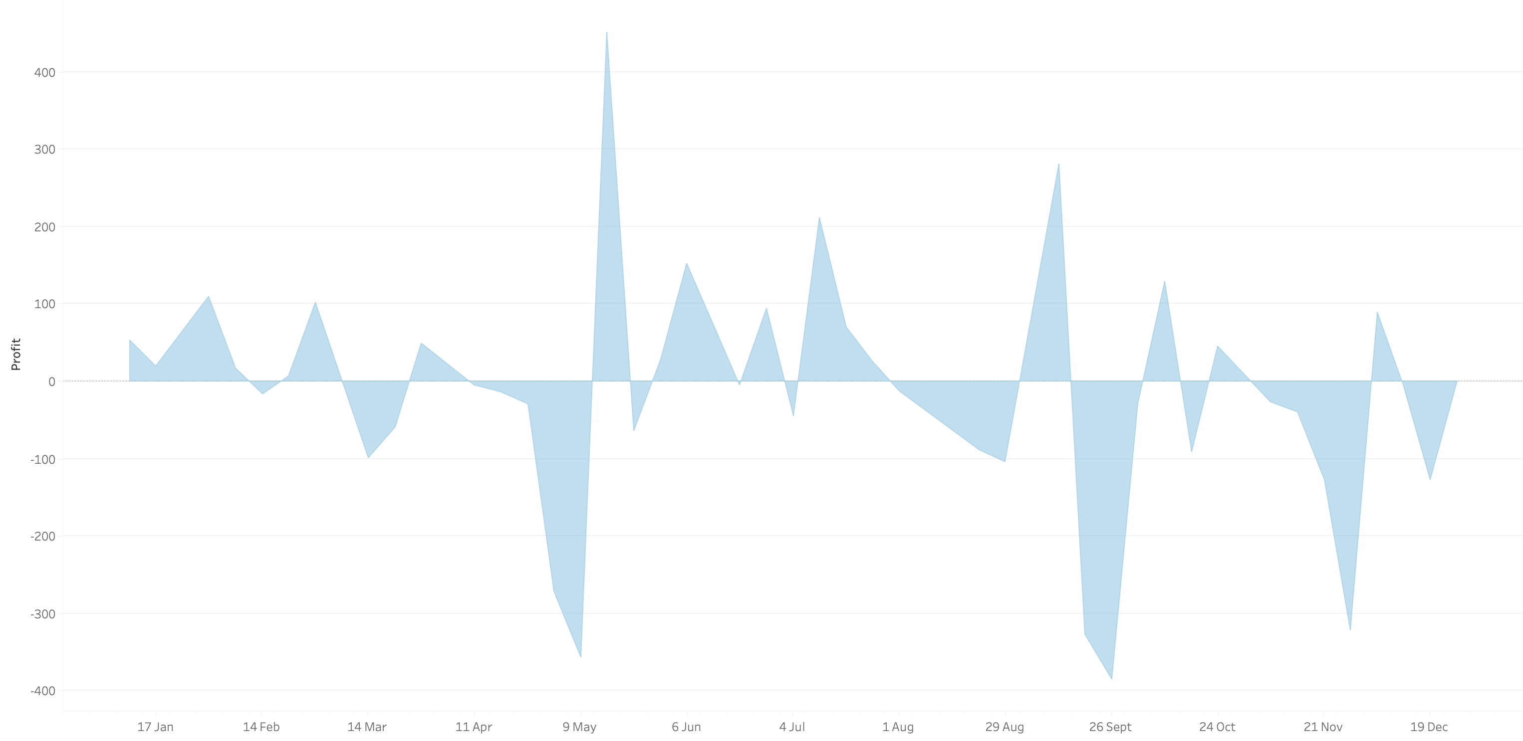
What we want is an area chart like this with two colors.
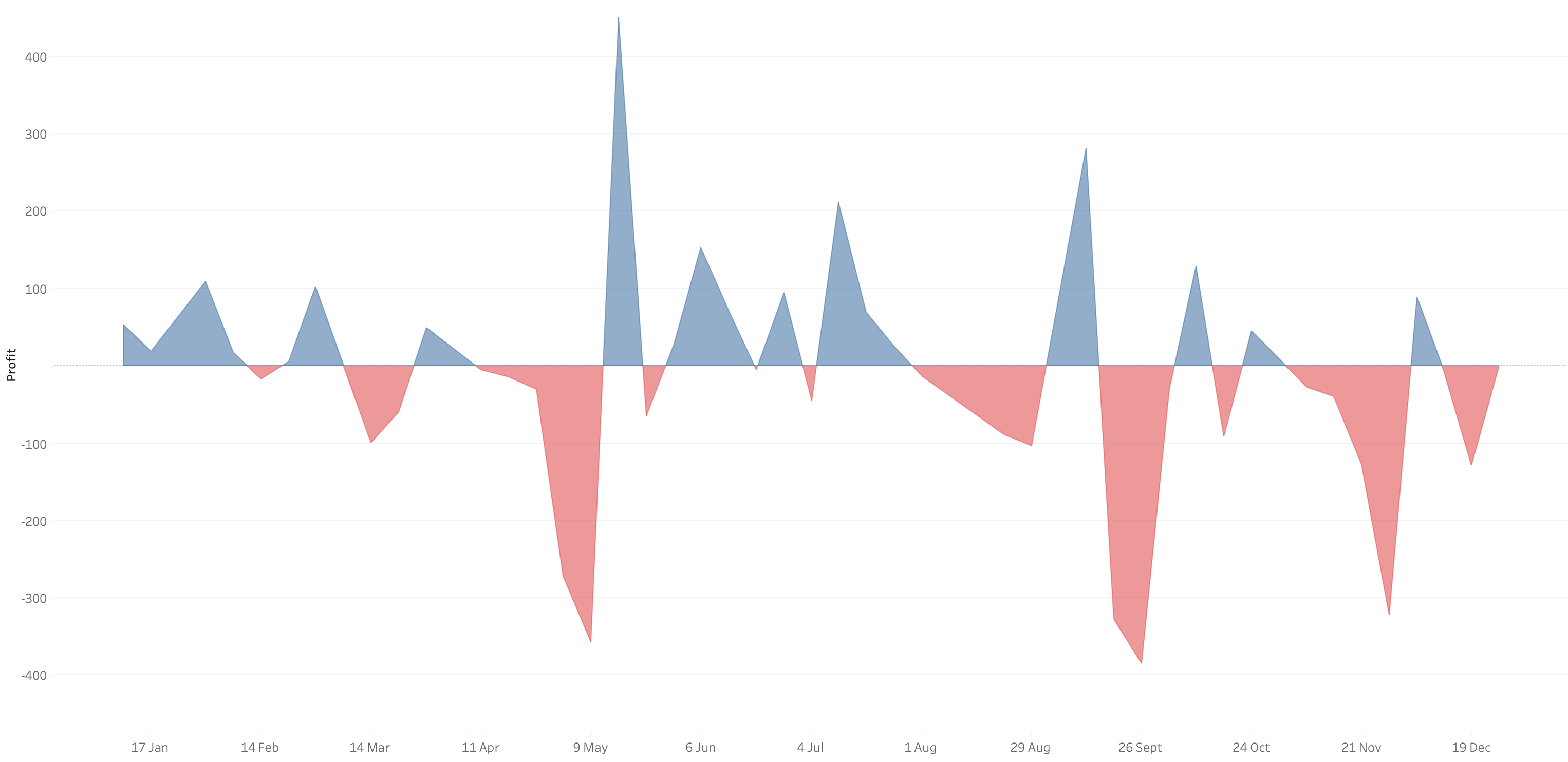
In 9 simple steps, I’ll show you how to build it. Follow along with the video. The 9 steps are listed at the bottom of this post.
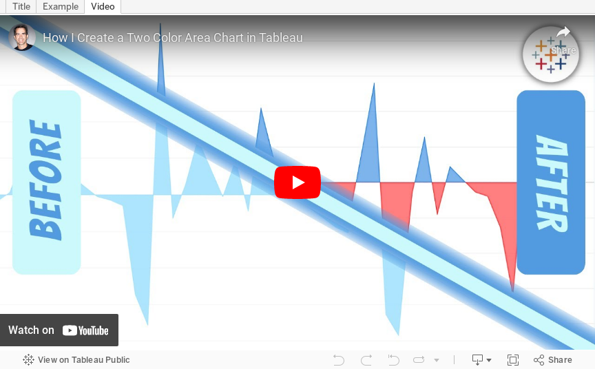
STEPS
1. Create the area chart
2. Show what happens when you add a profit to color - you only get one color
3. Duplicate the measure
4. Fix the axes
1. Top axis starts at 0
2. Bottom axis ends at 0
5. Choose a color for each area chart
6. Format the axes to get rid of 0
7. Add reference lines to scale the charts relative to each other
1. WINDOW_MAX(ABS(SUM([Profit])))
8. Duplicate for the negative reference line
9. Formatting
December 22, 2022
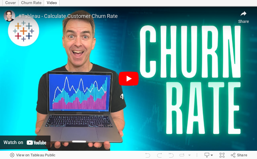
How to Calculate Customer Churn Rate in Tableau

In this tip, I’m show you how to calculate the 3-month and 6-month churn rate in Tableau. To calculate churn rate, all you need to do is:
1. Create 4 calculations
2. Follow the 8 simple steps to build the view
Customer churn rate is the % of customers that you’re losing in a predetermined time period. Churn rate is bad because if you don’t know how many customers are leaving, then you won’t know the impact on your revenue and you would be able to make changes to reduce churn.
November 22, 2022
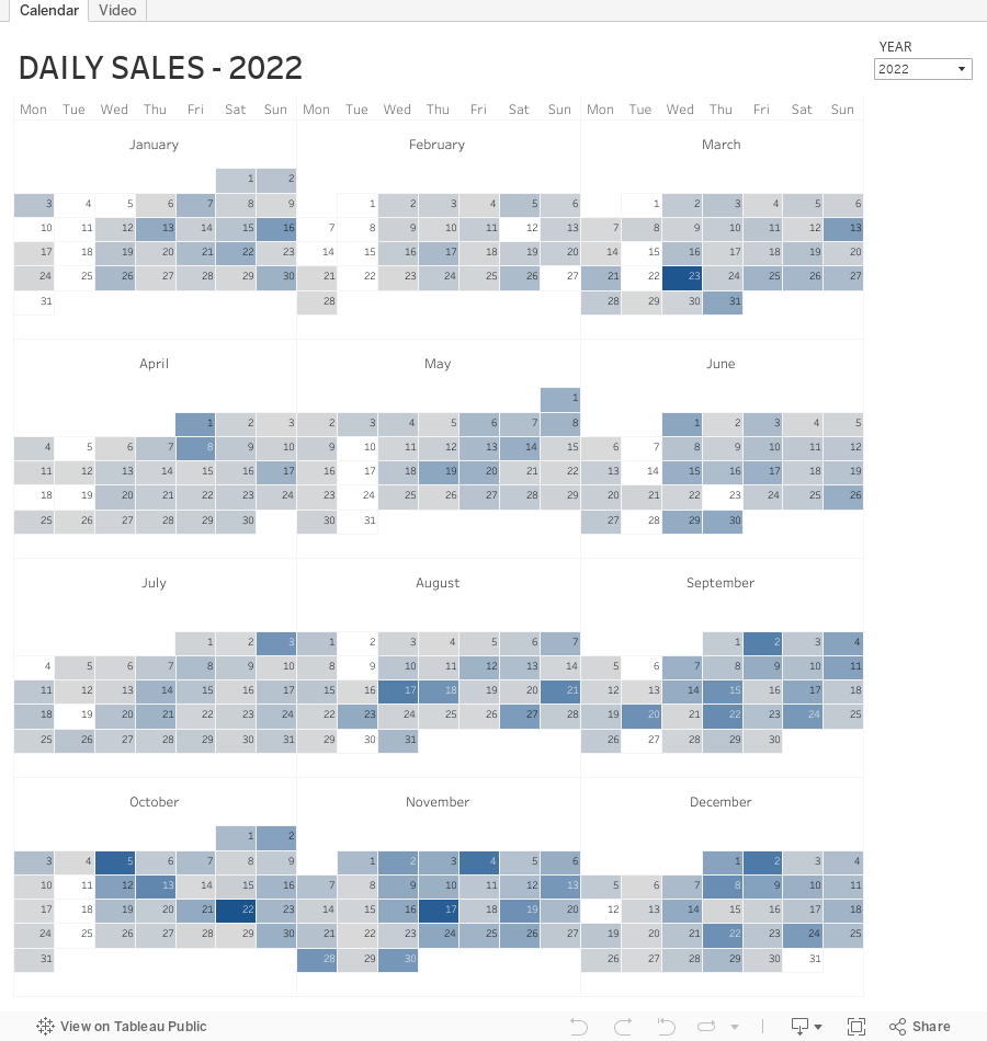
How to Create a Full Year Calendar Heatmap in Tableau

Calendar heatmaps are a great way to visualize time-series data over an entire calendar year. Individual days are shaded on a light-to-dark gradient based on a measure that has been added to the visualization.
Creating a heatmap for a single month in Tableau is pretty straightforward. It gets a bit more complicated when you want to view an entire year at once. In this tip, I going to show you, step-by-step, how to create a full year calendar heatmap in Tableau. The workbook is below this video to download.
#MakeoverMonday Week 47 - Worldwide Railroad Infrastructure Quality Rankings

- Recreating the original bar chart
- How to create a bump chart
- How to use a diverging color palette and alias country names
- How to create a ranked dot plot
- How to use parameter actions to sort the view
- How to use a filter action to remove the highlighting
October 25, 2022
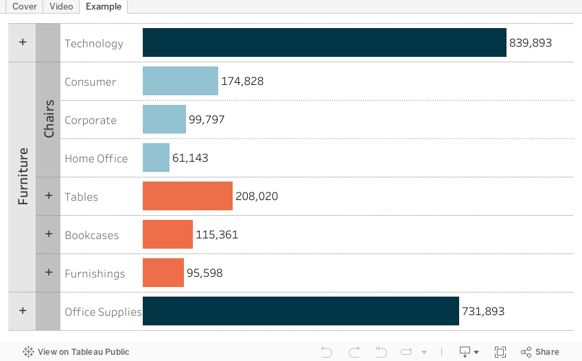
How to Create a 3 Level Drill Down in Tableau
I've showed you in several videos and WatchMeViz live streams how to create a 2 level drill down. And naturally the follow up question is always, how can I go one level deeper? This tip has exactly what you're looking for. I show you how to create a 3 level drill down in Tableau.
This example shows you how to drill down from Category to Sub-Category to Segment. All you need to do for your situation is replace the dimensions I'm using with yours. This will work with any combination of 3 dimensions.
Check out the interactive version below the video.
This type is inspired by this example from Lindsey Poulter - https://public.tableau.com/app/profile/lindsey.poulter8872/viz/SetActionDrilldown/ChooseaMetric
September 12, 2022
#MakeoverMonday 2022 Week 37 - Berkshire Hathaway Holdings

During Watch Me Viz, I covered set actions, parameter actions, highlighting, boolean calculations, table calculation, dashboard layout, and I failed at a starburst chart (I couldn't get the years to sort properly; I'll post it when I figure it out).
Enjoy! Check out the viz below the video.
September 7, 2022
The Fundamentals of Logical Functions - IF THEN vs. Case
In this video, I got through several examples of when to use an IIF, IF THEN, or CASE statement in Tableau. I also cover their best use cases, when you have to use one vs. another, and general rules of thumb.
While this is demonstrated in Tableau, it's application to nearly all tools that use logical statements.
September 2, 2022
5 Most Common Date Functions in Tableau
In this tip, I take you through the 5 most common date functions in Tableau:
- DATEPART
- DATENAME
- DATETRUNC
- DATEADD
- DATEDIFF
By the end of this video you will understand when to use them to meet your use case. Click here for the cheat sheet I created for these date calculations.
August 29, 2022
#MakeoverMonday 2022 Week 35 - The World's Biggest Military Spenders

Makeover Monday is back! Every Monday I'll be running a #WatchMeViz and every Wednesday, Eva will be running #VizReview. Subscribe to my YouTube channel for reminders of the latest events.
https://youtube.com/andykriebel
This week was a makeover of a visualization by Visual Capitalist about the top 10 military spenders. During Watch Me Viz, I iterated through 15 different charts before settling on a bump chart. If you want to learn about sets, parameters, table calculations, containers and more, watch the video below.
Below the video you can see my viz, or click here. Enjoy! If you need clarifications on anything, please comment on the video here.
August 23, 2022
How to Create a Two-Level Drill Down in Tableau
There are tons of ways to create a single level drill down, but if you’re having issues creating a second drill down, this video is a guaranteed way to help you fix this problem.
Additional video - Single Level Drill Down