October 3, 2023
Master Dynamic Zone Visibility in Tableau: Yearly to Monthly Calendar Drill Down

Welcome to this comprehensive tutorial on creating a Yearly to Monthly Calendar Drill Down using Dynamic Zone Visibility in Tableau.
📌 What You Will Learn
In this video, you'll discover how to use Tableau's Dynamic Zone Visibility feature to effortlessly switch between yearly and monthly calendar views. If you've been looking to add more flexibility and dynamism to your Tableau dashboards, this tutorial is designed for you.🔑 Key Takeaways
- Understand the concept of Dynamic Zone Visibility- Set up a yearly calendar view in Tableau
- Implement drill-down functionalities to transition to a monthly calendar view
- Practical tips and tricks for optimizing your Tableau dashboards
🔗 Additional Resources
- Data- Workbook
September 26, 2023
Dynamic Drill-Down from Monthly to Daily Data Using Set Actions

Unlock the power of Tableau's Set Actions to enhance your data visualizations!
In this in-depth tutorial, I'll walk you through a step-by-step guide on how to create an interactive chart that allows users to drill down from monthly to daily data by simply clicking on a month.
Ideal for analysts, business intelligence professionals, and anyone who wants to level up their Tableau skills.
What You'll Learn:
- How to set up Set Actions in Tableau
- Create interactive charts for effective data exploration
- Best practices for visualizing monthly and daily data
Who This is For:
- Data Analysts
- Business Intelligence Professionals
- Tableau Beginners and Enthusiasts
Prerequisites:
- Basic understanding of Tableau Desktop
Resources:
- Download the sample workbook: https://public.tableau.com/app/profile/andy.kriebel/viz/MonthtoDayDrillDown/Sheet1
- Data: https://data.world/vizwiz/sample-soda-sales
- Tableau official documentation on Set Actions: https://help.tableau.com/current/pro/desktop/en-us/actions_sets.htm
August 29, 2023
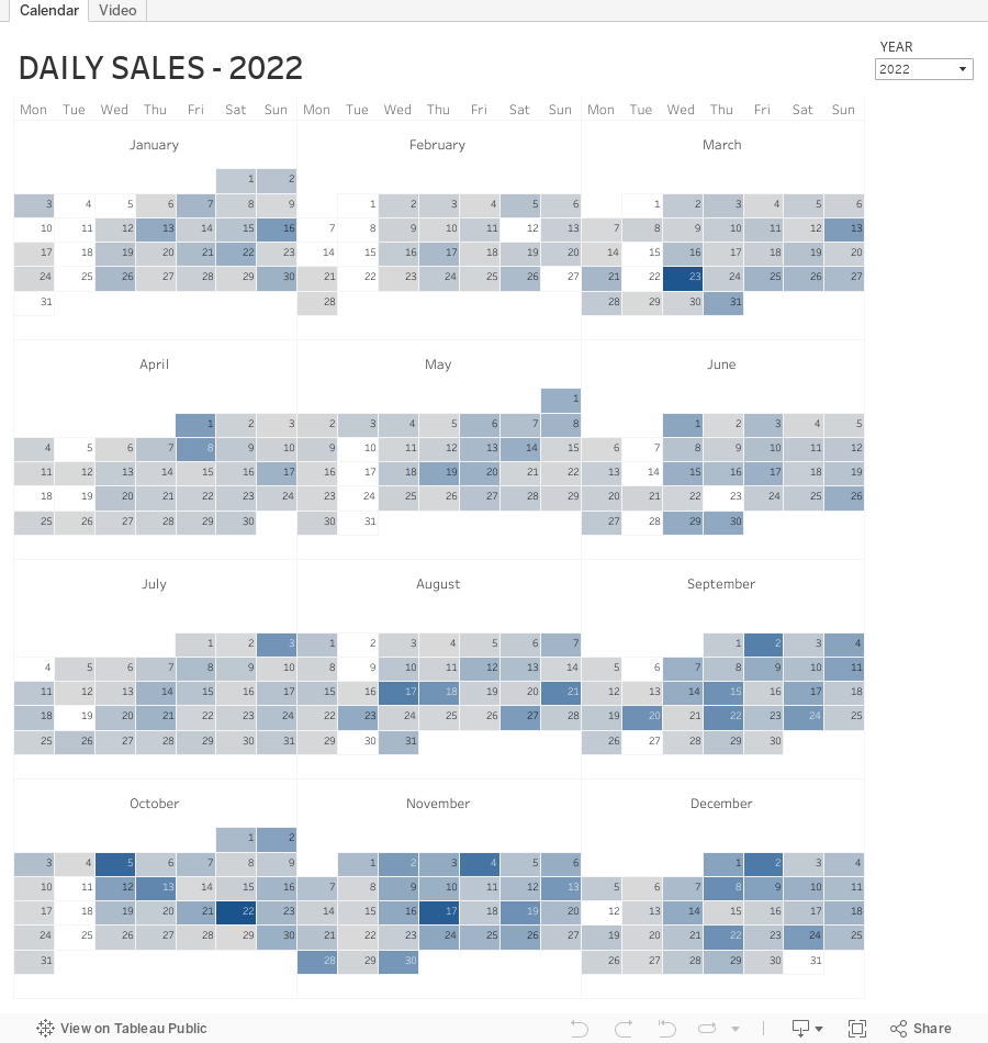
How to Compare YTD, QTD, MTD, WTD & Daily Sales in Tableau

November 22, 2022
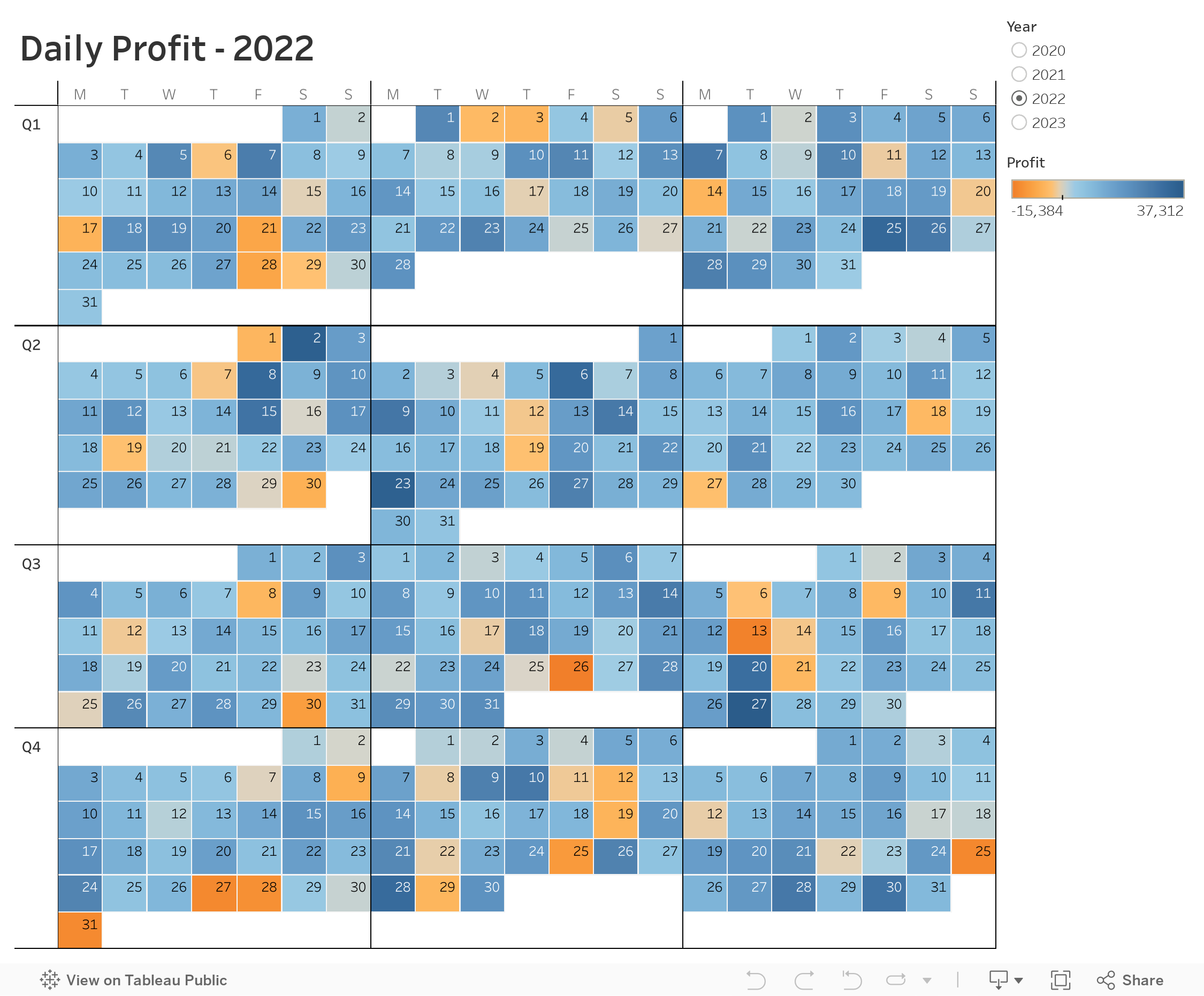
How to Create a Full Year Calendar Heatmap in Tableau

Calendar heatmaps are a great way to visualize time-series data over an entire calendar year. Individual days are shaded on a light-to-dark gradient based on a measure that has been added to the visualization.
Creating a heatmap for a single month in Tableau is pretty straightforward. It gets a bit more complicated when you want to view an entire year at once. In this tip, I going to show you, step-by-step, how to create a full year calendar heatmap in Tableau. The workbook is below this video to download.
April 12, 2022
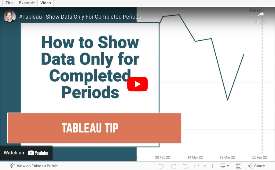
How to Show Data for Only Completed Periods