June 27, 2023
Blue vs. Green - What does it mean?

When I first started using #Tableau, I assumed that blue meant dimensions and green meant measures. They don’t.
Blue means Discrete
Green means Continuous
It took me a couple of years to get my head around this most foundational concept in Tableau.
Dimensions and measures are merely a way that Tableau organizes the data.
And if you only take away one thing from this video, this is it:
- Blue things GROUP your data
- Green things COUNT your data
- Dimensions SPLIT up the view
- Measures FILL the view
November 22, 2022
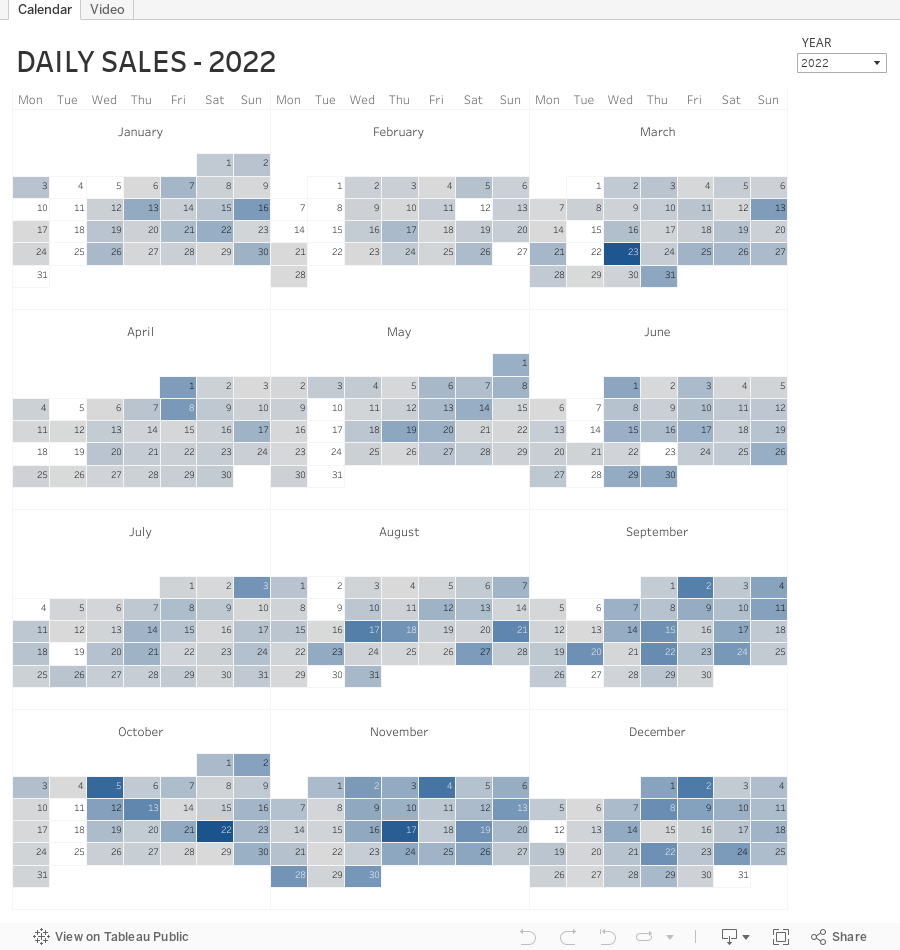
How to Create a Full Year Calendar Heatmap in Tableau

Calendar heatmaps are a great way to visualize time-series data over an entire calendar year. Individual days are shaded on a light-to-dark gradient based on a measure that has been added to the visualization.
Creating a heatmap for a single month in Tableau is pretty straightforward. It gets a bit more complicated when you want to view an entire year at once. In this tip, I going to show you, step-by-step, how to create a full year calendar heatmap in Tableau. The workbook is below this video to download.
October 24, 2022
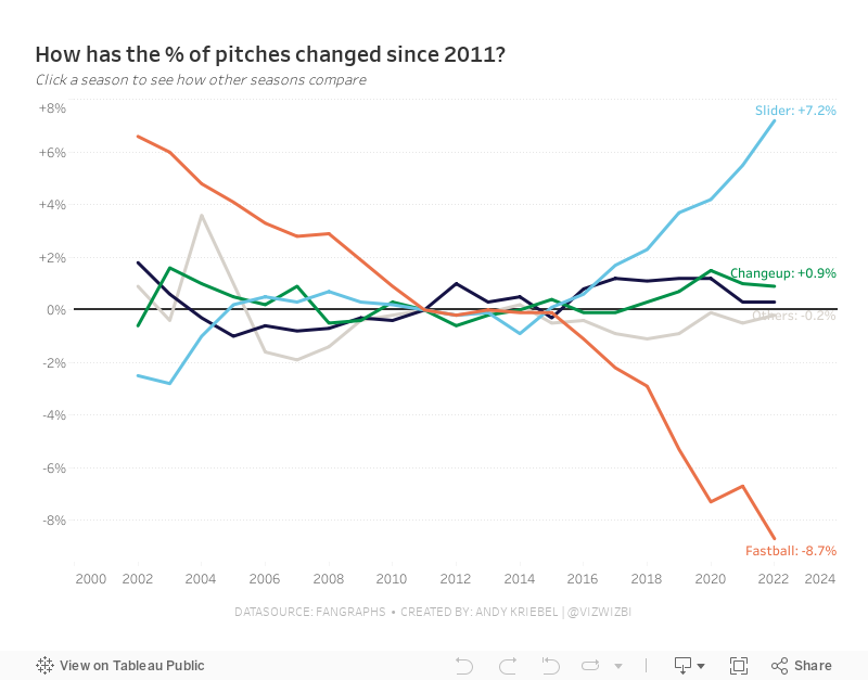
#MakeoverMonday Week 43 - How have Major League Baseball Pitch Types Changed?

This week's data set was pretty simple. We had 21 baseball seasons and a column for each pitch type. Pivoting the metrics made it much easier to work with for me as I could then split the view by pitch type.
During #WatchMeViz (below), I create a trellis view, showed how to create groups, sets, set actions, sparklines, LODs, custom number formatting, creating a mobile view, and more.
Thank you for tuning in. Here's the video and below is my visualization.
October 17, 2022
#MakeoverMonday 2022 Week 42 - Food & Drug Administration Inspections in America

Having looked at the original visualization this week (here), it was pretty clear to me that the creators desired to create a KPI style dashboard. In a way it's good that I picked up on it that way. However, it wasn't designed particularly uclarly well to communicate most efficiently.
I decided during Watch Me Viz that I would stick with their idea of a KPI dashboard, but design it in a way that I thought would be easier to understand.
As per normal, it took way too long to faff about with the formatting. I made a couple of small changes after I finished the live stream. Click on the image below the video to check it out. Leave a comment on the video on YouTube if you have any questions. (Comments aren't appearing on the blog for some reason).
Have a wonderful week!
April 5, 2022
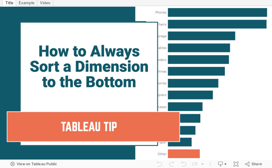
How to Always Sort a Dimension to the Bottom of a Chart
August 23, 2016
Tableau Tip Tuesday: How to Use Dynamic Grouping & Filtering for Competitor Analytics

In this week’s tip, I show you how to compare your company to your competitors, but only for products that you both sell. In other words, you only want to compare products where in which you both compete.
January 31, 2014
A map is better than a table: When is it best to buy gas in the USA?
If you want to find the cheapest gas in your area, you should check out GasBuddy. A couple of days ago on their blog they published a simple study they did that includes a table for the best times to buy gas by state. This table is great for looking up your individual state, but it’s impossible to see any patterns in the data.
I recreated the data in Excel and opened it up in Tableau. The first thing I noticed is that the data seemed too sporadic for me, so I took the liberty of grouping the data into four buckets: Early week, mid-week, late-week and the weekend. In less than 5 minutes, I had this map.
Now it’s much easier to see that in the majority of the US, you’re going to find the cheapest gas on the weekend. It’s much tougher to discern that from their table. Click on the color legend or the table to highlight.

May 2, 2013
Tableau Tip: Creating a primary group from a secondary data source
Mike Roberts, our Tableau consultant from InterWorks was helping one of our users last week and sent along a great tip for creating a field in your PRIMARY data source with a field in your SECONDARY data source.
Step 1: Add ‘Helper’ sheet and drag desired field from your PRIMARY source on to the ROWS shelf.

Step 2: Add matching field from SECONDARY data source and nest it next to the existing field on the ROWS shelf.

Step 3: Right-click the SECONDARY field on the ROWS shelf and select ‘Create Primary Group’.


NOTE: make sure you check the Include ‘Other’ check box
Step 4: Verify the group is now in your PRIMARY data source.
That’s it! You no longer need to blend or use the SECONDARY SOURCE field.
There is one gotcha to be aware of: If a record is added to the dimension you’re grouping in the primary data source, a new person in this example, you will have to regenerate the group or the new person will automatically get put into the “Other” group. Creating a primary group does not dynamically update.






