September 26, 2024
Stop Chart Disasters NOW With This Crucial Method

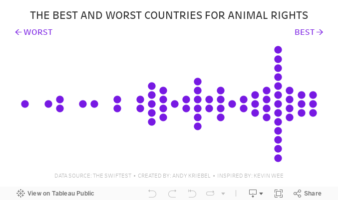
February 26, 2024
How I Create a Beeswarm Chart in Tableau

Beeswarm charts a one method of showing distributions in a data set. I show you how to create one in this #MakeoverMonday livestream.
Download the workbook | Download the data
June 27, 2023
Blue vs. Green - What does it mean?

When I first started using #Tableau, I assumed that blue meant dimensions and green meant measures. They don’t.
Blue means Discrete
Green means Continuous
It took me a couple of years to get my head around this most foundational concept in Tableau.
Dimensions and measures are merely a way that Tableau organizes the data.
And if you only take away one thing from this video, this is it:
- Blue things GROUP your data
- Green things COUNT your data
- Dimensions SPLIT up the view
- Measures FILL the view
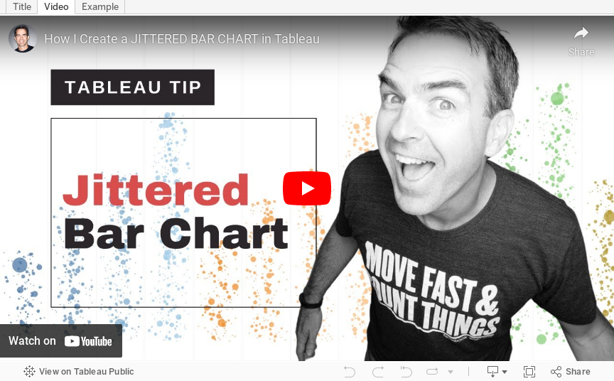
April 11, 2023
How to Create a Jittered Bar Chart in Tableau

Are you tired of the same old boring bar charts? Add some flair to your data visualization with a jittered bar chart! See more of your data without losing scope of the overall.
To create one, simply add a random amount of noise to the x-axis and y-axis of your bar chart. This will add more granularity to your data, prevent overlapping and give your chart a unique look. Try it out and impress your colleagues with your data viz skills!
Here’s a video to help you create your own.