August 29, 2022
#MakeoverMonday 2022 Week 35 - The World's Biggest Military Spenders

Makeover Monday is back! Every Monday I'll be running a #WatchMeViz and every Wednesday, Eva will be running #VizReview. Subscribe to my YouTube channel for reminders of the latest events.
https://youtube.com/andykriebel
This week was a makeover of a visualization by Visual Capitalist about the top 10 military spenders. During Watch Me Viz, I iterated through 15 different charts before settling on a bump chart. If you want to learn about sets, parameters, table calculations, containers and more, watch the video below.
Below the video you can see my viz, or click here. Enjoy! If you need clarifications on anything, please comment on the video here.
August 26, 2022
Workout Wednesday - New York City Tableau User Group Recap

Talk about pressure! I was given a 30 minute slot to see how many Workout Wednesday's I could complete. I was pretty confident I could finish 4, given I had already pre-selected the challenges I thought were easiest.
But...those pesky tooltips!
And the heckler in the audience (ahem Ann Jackson).
So how'd I do? I got the WOW2020 Week 32 100% complete, week 28 about 95% complete (the tooltips), and week 21 about 95% complete. It love trying to solve problems and build vizzes live.
If you missed it, here's the recording from the TUG. My part starts at 38:55. Farther down, you'll find each of the workouts in their completed state.


August 23, 2022
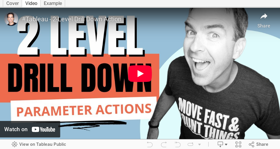
How to Create a Two-Level Drill Down in Tableau
There are tons of ways to create a single level drill down, but if you’re having issues creating a second drill down, this video is a guaranteed way to help you fix this problem.
Additional video - Single Level Drill Down
August 17, 2022
Analyzing Seasonality with Cycle Plots
August 11, 2022
10 Methods for Displaying Variance with Bar Charts
Using variance as a measure in bar charts helps you:
- Add context - You can answer the question “compared to what?”
- Make decisions - You can answer the question "what should we do next?"
- Alert you to areas that need focus
In this video, I show you 10 ways to add variance to bar charts. Get the workbook here.
August 4, 2022
ATTR - The Most Confusing Aggregation in Tableau
- What an attribute is
- Why the attribute aggregation exists
- Examples that show how it works
- The difference between ATTR and other aggregations like MIN & MAX
- How Tableau write the ATTR aggregation as a formula
- How to ensure you're not misleading your audience
- How to work around the pesky *


