December 25, 2012
Is Mark Sanchez as bad as Sports Chart of the Day says he is? Here’s some context.
After week 14 of the NFL season, Cork Gaines more or less blamed the poor performance of the NY Jets on Mark Sanchez, saying:
Last night, Mark Sanchez turned the ball over five times, continuing a disturbing trend over the past two seasons. He now has a league-leading 24 turnovers this season (17 int, 7 fumbles lost) and 50 over the last two seasons combined. In his first two seasons, Sanchez turned the ball over just 37 times.
Corked followed this up by publishing this chart on Business Insider’s Sports Chart of the Day.

I thought “Wow, Sanchez really is terrible!” But I’m an Eagles fan, and we know terrible football. This got me thinking about Michael Vick. He was absolutely HORRIBLE turning the ball over the first few weeks of the season before he got a concussion and hasn’t played since.
In Cork’s chart, Vick is at #11, but he’s only played a full season in the NFL once. So far in 2012, Vick has 19 turnovers in 9 games, for a turnover rate of 2.1 per game. This puts Vick at #2 on the turnover rate ranking ahead of, you guessed it, Mark Sanchez.
What this should tell you, as it did to me, is that Cork’s chart isn’t normalized. Sanchez has played more games that Vick at a slightly lower turnover rate, so of course he’s going to have more turnovers.
I decided to look into this farther and gathered data through week 15 from Pro-Football-Reference.com and built this viz. (Download the data here.) BTW, if you ever need pro football data, this is by far the easiest place on the internet to find what you’re looking for.

I started with turnovers, as Cork did, and if you sort by Turnovers on the right, you see that Sanchez is now third on the list, granted he was benched for week 15.
Change the sort to Turnovers per Game and Sanchez is now sixth. Rex Grossman is first in turnover rate. No wonder he hasn’t played this year.
It was important to me to also look at win percentage to see how turnovers might correlate to winning. Change the sort to Win % and you can clearly see that those QBs at the top (the best winning percentages) have very low turnover rates, Andrew Luck being the exception, but he has seven game winning drives this year, which is a crazy number.
You can explore the relationship between turnovers and win % a bit deeper on the 2nd tab (Win % vs. Turnovers).
I chose to use a lollipop chart for these first three views. I could have chosen a dot plot, but I wanted to emphasize both the end point and the length of the bar, but I didn’t want to clutter the chart too much with a bar chart.
I then wanted to see how who has improved or regressed from last year. We do have one game less, so take that into consideration. This view confirms that Sanchez is worse this year from a turnovers perspective: 28 in 2011 in 16 games and 29 in 2012 in 14 games. Not good Mark!
For this view, I chose to use a bar chart for 2012 with 2011 as reference line. But it’s not really a reference line. It’s a dual axis chart with 2011 as a Gantt bar. For me, this view works because it gives me a quick comparison between the last two seasons.
I finish the viz off with a dot plot comparing fumbles and interceptions, each of which you can sort by on the right. Ryan Fitzpatrick threw 39 interceptions last year…39! That’s really hard to do.
I chose a dot plot for this view because I wanted an uncluttered view of two measures on the same chart, and I was only concerned about their relationship to each other, not their length.
There’s an immensely larger number of analyses you can perform on this data set. I’d be curious to see if anyone can find any hidden relationships. Give it a shot and post a comment if you find something useful.
December 14, 2012
A map that says it all - States with stricter gun control laws have fewer deaths from gun-related violence
From the Washington Post. Enough said. Let the political posturing begin.

VizWiz Contest: Electric City has been eaten by pies and donuts. Save it!
Tufte says “Pie charts are bad and that the only thing worse than one pie chart is lots of them.” Well, I think pies inside donuts and lots of them is even worse.
In the spirit of thrashing incredibly crappy visualization, I thought I’d run a data viz contest. The goal is simple – redesign this visualization from the Guardian.

Download the data here. I have transcribed the numbers exactly from the Guardian’s “viz”, so don’t shoot the messenger if the numbers don’t seem to quite add up to 100% in some cases.
I hate rules, but it seems like this contest probably needs a few.
- Deadline: December 31, 2012 @ 11:59pm ET (assuming we all make it past December 21st)
- Email me your submission or a link to it here.
- One entry per person. Send me more than one and I’ll ignore your entries.
- I don’t care what tool you use. It’s your choice. Draw it on paper if that’s your preference. Using Tableau will NOT give you an advantage over others.
- Judging is based solely on my personal opinion of your design. If you’ve been following this blog, then you probably have a good feel for what I like, and maybe more importantly what I don’t like.
- The winner will receive an embroidered Facebook zip up hoodie. Retail value $750. Facebook swag is priceless so I may be over exaggerating a bit.
- The winner will be announced sometime in the first two weeks of January.
Good luck! Hopefully this doesn’t turn out to be a disaster (and don’t complain if you don’t win).
December 4, 2012
Did you miss the Facebook session at TCC12? Watch it here.
Namit Raisurana delivered an incredible presentation at TCC12 in San Diego. I may be biased as a Facebook employee, however, his session was, without a shadow of a doubt, THE BEST customer presentation I’ve seen in the three conferences I’ve attended.
Watch the full presentation below. Enjoy!
Video streaming by Ustream
November 20, 2012
Wanted: BI Engineer, Visualization & Reporting @ Facebook
If you attended the Facebook session at the Tableau Customer Conference in San Diego, you heard that we’re looking for great people to join our BI team. The job description is listed below or you can view it on Facebook.
This role is on the same team that I work on within IT and I cannot emphasize enough how happy I am that I decided to leave Coke to go to work at Facebook. I’m privileged to work with the smartest, most creative and most productive people in the world. I’m pushed every day to be better than I’ve ever been.
We expect every candidate to be #1 or #2 in what they do. We only hire the sharpest and brightest, but you also must fit in culturally. If you think you’d make a great fit, then apply via the link at the bottom and enter my name when asked if you know anyone that works at Facebook. This alerts me that someone I know applied.
BI Engineer, Visualization & Reporting
Do you like working with big data? Do you want to use data to influence product decisions for products being used by over one billion people every day? If yes, we want to talk to you. We’re looking for analytics engineering leaders to work on our Business Intelligence Team with a passion for social media to help drive informed business decisions for Facebook.
In this role, you will work with some of the brightest minds in the industry, and you'll get an opportunity to solve some of the most challenging business problems on the web and mobile Internet, at a scale that few companies can match. You will enjoy working with one of the richest data sets in the world, cutting edge technology, and the ability to see your insights turned into real products on a regular basis.
The perfect candidate will have a background in computer science or a related technical field, will have experience with business intelligence tools (Tableau experience is preferred), will have experience working with large data stores, and will have some experience writing SQL. You must be scrappy, focused on results, a self-starter, and have demonstrated success in using analytics to drive the understanding, progression, and user engagement of a product.
This is a full time position based in our office in Menlo Park.
Responsibilities
- Manage reporting/dashboard plans for a product or a group of products
- Interface with engineers, product managers and product analysts to understand data, reporting and analytical needs
- Drive sessions with business users to translate requirements and needs of various businesses
- Design, develop, test, launch new reports and dashboards into production
- Help analyze, visualize, and provide analytics on massive amounts of data captured daily to build reporting solutions to support various company initiatives
- Work closely with BI and business colleagues to improve operations through the appropriate use of BI platforms and information collected through dashboards and reports
- Explore and recommend emerging technologies and techniques to support/enhance BI landscape components
- Integrate external reporting solutions with internal applications
- Build rich and dynamic dashboards using out-of-box features, customizations, and visualizations
- Automate solutions where appropriate
- Participate in peer design and certification reviews
- Participate in the creation and support of BI development standards and best practices
- Provide support to reports and dashboards running in production
- Conduct training sessions
Requirements
- Bachelor’s in Computer Science, Mathematics, Business, Business Administration, or closely-related, or foreign equivalent
- 4+ years experience in the reporting and data visualization space
- Expert level skills in building custom reports and dashboards with BI tools, with preference given to candidates with Tableau experience
- Expert level ability to analyze data to identify deliverables, gaps and inconsistencies
- Excellent communication skills including the ability to identify and communicate data driven insights
- Ability to write efficient SQL statements
- Skill in Oracle RDBMS (SQL/PLSQL), MySQL, and OLAP a plus
November 13, 2012
Need to waste space with a poor chart design? Go to Nielsen for advice.
Nielsen has done some really poor work in the past, but this time they may have outdone themselves. There are times, many of them, that I wonder what Nielsen is thinking. I hate donut charts even more than pie charts and donuts inside donuts are an even more profound mistake.
Here’s a chart from their Q3 2012 Consumer Confidence Report.

The report includes some additional facts about change from Q2 2012 (except for North America which they only provide vs. Q3 2011 for some inexplicable reason). That gives us two interesting and simple data points: (1) current sentiment and (2) change from previous.
I would represent the data as a bar chart colored by % change, with a reference line for Global.

My version makes it much easier to do a few things:
- Compare relative differences between regions (bars work better than slices or donuts)
- Quickly see which regions are improving, which regions are declining, and the magnitude of the change (via color)
- Compare the regions to the global average
I was considering having another bar for the Global average, but decided to use the reference line because it makes the comparisons significantly simpler and my interpretation from Nielsen’s charts was that you should be comparing to the Global average.
Also, their title is misleading. They make a blanket statement that “Recessionary Sentiment Grew”, yet it didn’t grow everywhere. I can only assume that they’re referring to the global average. My title makes it more clear.
For as long as I’m in this line of work, I will hold out hope that Nielsen will incorporate more best practices into their work. Until that time, I will continue to leave them comments and suggestions.
November 2, 2012
My top 10 tips for navigating your way through TCC12
Get ready for the analytics conference of the year. If you haven’t been before, you’re in for the best conference you will have ever attended, guaranteed.
Below are my top 10 tips, based on having spoken and attended at the conference twice and based on the questions I’ve received.
If you have any other questions, feel free to reach me via Facebook, Twitter, LinkedIn, about.me, or email.
1. Plan to have a great time. The parties are incredible! The keynotes, networking, session, etc. will leave you energized and ready to take on the world.
2. What should I wear?
People wear whatever they wear to work. Some will have suits, some will be in shorts and flip flops. I'll be going casual - t-shirt and jeans, that’s the Facebook way. I would likely be heckled by our team if I dressed up, plus I gave away all of my dress clothes the day I left Coke.
3. Download the iPhone or Andriod conference app.
Search for TCC To Go. This will allow you to search for sessions, connect with others, etc. There’s an option to save sessions to a calendar, but I haven’t been able to locate the calendar.
4. Which sessions should I attend?
It all depends on what you want to get out of it. I tend to do a mix of customer sessions and learning.
If you go to a customer session and the speaker/session sucks, walk out and go to something else. I guarantee there will be multiple things you want to go to during every breakout session.
Get to the sessions early! They WILL fill up.
5. I feel overwhelmed with all of the sessions. What’s the best way to navigate through it all?
You will get a think binder of all of the sessions at check-in. Get two different colored highlighters and highlight you’re top two sessions for each breakout.
Get a head start by print the session booklet. Get it here.
6. Be sure to attend the session “Like! Facebook’s Tableau Deployment & HackBook Tips” by our very own Namit Raisurana.
This session will describe why Tableau was selected to put analytics in the hands of every data user so they no longer were reliant on developers to serve up reports and analysis.
You’ll find out what’s been done to accelerate adoption that, in the short time it’s been deployed, has led to a massive user adoption.
Facebook’s rigorous needs have also led to pushing the boundaries of Tableau. We’ll share some of the most impactful efforts that have set a new standard for what it means to be a data-driven organization. Namit will also be giving a live demonstration.
We have a couple of additional surprises in store. I ask that you reserve seats in the first row for Facebookers.
7. Take advantage to connect with lots of folks.
You’ll find that the attendees come from a very diverse set of industries. Talk to people that are NOT from your own organization between sessions.
Don’t be shy! Mingle at the parties. Bring business cards to exchange…lots of them.
People are typically willing to show off their work. If you’re talking to someone who seems to have done some cool work, they may be willing to share so ask. The worst they can say is no.
8. Connect via social networks.
Facebook – Join the TCC12 event group and "Like" us at http://facebook.com/tableausw.
Twitter – Stay updated and share your own tweets using hashtag #tcc12.
LinkedIn – Virtually connect with other attendees in the TCC event group.
TCC Online Community – Get a head start meeting new Tableau pals by introducing yourself to other attendees in the TCC Community Group.
9. Don’t miss the keynotes! They’re sure to be great (though there was one stinker last year).
Christian Chabot - CEO and Co-founder, Tableau Software
Chris Stolte - CDO and Co-founder, Tableau Software
Malcolm Gladwell – Author
John Medina - Developmental Molecular Biologist, Author
Larry Gonick – Author
Steve Johnson – Author
10. Meet the Tableau Zen Masters – Wednesday at 4:30 in Community Alley
Come meet the very first class of Tableau Zen Masters; Tableau's most elite and celebrated users. Who are they? You’ll have to wait and see. I’m anxious to find out!
November 1, 2012
Tableau Tip: Passing filters in a URL (to create a dynamic report in PowerPoint)
This process can actually have a much broader use if you customize the URL to include filters. Let’s look at an example.
Assume you’ve created this sales dashboard.

- Create a separate dashboard for each region. Terrible idea! Way too many charts to maintain.
- Add user level security. This is easy to do with Tableau Server, but there are lots of companies that can’t afford Tableau Server. So that option could be out the window.
- Create filtered URLs and embed those in the PowerPoint via the instructions from Monday.
The link for the image for the whole dashboard is https://[YourTableauServerURL]/views/OneMinuteDashboard/OneMinuteDashboard.png. And the resulting image looks like this:

If you want a page for the Central team, you simply add ?Region=Central to the end of the URL if you are using Tableau Server. The URL now looks like this:
https://[YourTableauServerURL]/views/OneMinuteDashboard/OneMinuteDashboard.png&Region=Central

Notice how the Region is filtered to Central. You could embed this into PowerPoint, then duplicate the PowerPoint file and change to image to the East, etc.

You can include as many filters as you want by adding an ampersand (&) then whatever else you want to filter. The filter has to be in the format filter_name=value.
If I want a page for each Order Priority for Central, then all I do is add &Order Priority=Critical to the URL. Then replace this with High, then Medium, etc. In this example, the URL would now look like this:
https:/[YourTableauServerURL]/views/OneMinuteDashboard/OneMinuteDashboard&Region=Central&Order%20Priority=Critical
And the resulting image looks like this:

Do you need to show the quick filters using this technique? No, but for me it makes the image more clear to the reader to do so. You could remove the quick filters and have the title update based on the filters. That would look good.
Finally, if you want to include multiple selections from a filter, perhaps Critical and High, then you simply add ,High to the URL.
https://[YourTableauServerURL]/views/OneMinuteDashboard/OneMinuteDashboard.png?Region=Central&Order%20Priority=Critical,High
The image now looks like this:

The filtering options are pretty endless. All you need to remember is the format for adding a filter to a URL:
?filter_name=valueI’ve created a PowerPoint with a page for each region here.
October 31, 2012
Has you wife accused you of putting on a few pounds? Find the exercises that are right for you.
Earlier this week, my wife was having a conversation on Facebook about our move to California when she suddenly said “he has gained weight from the cafeteria.”
She’s was being funny. If you ever meet her, you’ll know what an angel she is quite quickly, especially for putting up with me.
Unfortunately she’s not exactly wrong. I pretended to be offended of course.
Many of us are familiar with the “freshman 15” from college. At Facebook, there’s the “Facebook 15”. Same idea. I can use the unbelievably tasty, free food and unlimited snacks as an excuse (moderation is a challenge), but I really haven’t gained much weight, maybe five pounds.
I exercise, not often enough however. I decided that I needed some help, so I build this viz to help me find the right activities for me.

October 29, 2012
Tableau Tip: Embedding a dynamically updating image from Tableau Server into PowerPoint (Windows only)
A common question I get, and I’m sure you do too, is “How can I get my Tableau Dashboard into a PowerPoint presentation?” This question has a couple of solutions.
- If you want a “live” Tableau dashboard in PowerPoint, see this blog post.
- If you want to embed the “latest snapshot” of a dashboard, i.e., an image that updates automatically, then continue reading.
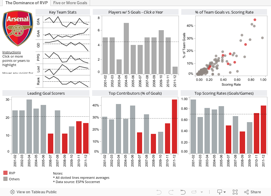
The URL to your dashboard will have a link similar to this: http://public.tableausoftware.com/views/ArsenalPerformance/TheDominanceofRVP
All you have to do to get an image of the dashboard is to add “.png” to the end of the URL. My URL now looks like: http://public.tableausoftware.com/views/ArsenalPerformance/TheDominanceofRVP.png and here’s the resulting image.

This is a nice static snapshot, but your user, let’s see she’s a saleswoman, wants this in PowerPoint (she doesn’t want to have to go to Tableau Server) and she wants PowerPoint to always reflect the latest data. An example might be a sales report that you published on Tableau Server that refreshes weekly on Sunday night. The saleswoman wants to open PowerPoint every Monday and have it reflect the latest data.
Here’s how you do it (Windows only):
Step 1 – From the PowerPoint ribbon, choose Insert –> Image.

Step 2 – Paste the link to the image in the File name box and click the triangle next to the Open button.

Step 3 – The Open button might gray out for a few seconds while the image is retrieved and you may be prompted to login to Tableau Server. Go ahead and do so.

Step 4 – Choose Insert and Link when the menu appears.

That’s it! You now have an embedded, dynamically updating image from your Tableau Server inside PowerPoint. Of course, you now need to save the PowerPoint file.
When your saleswoman opens the PowerPoint file, she’ll be prompted with a security warning. She needs to choose Enable Content.

Another security warning may appear, and she should choose Yes at this message. She should NOT check the “Do not ask me…” message because that setting extends beyond this specific file.

The image now reflects the latest data on Tableau Server. Try it yourself by opening the PPT file used for this blog post here.
Reminder: This works for Windows only. PowerPoint on Mac does not have the same embed functionality (that I could find). Also, when you open the PPT file on a Mac, your are not given the prompt to Enable External Images and the image will not update dynamically.
If anyone knows how to do this in PowerPoint on a Mac, please let me know. That’s really what I need.
October 24, 2012
A panther on the prowl. Finding Nelson Demille.
On Tuesday, October 16th, one of my favorite novelists, Nelson Demille, published The Panther. I’ve read many of Demille’s books, including two of my favorites, Up Country and Wild Fire. I read Up Country after I was in Vietnam back in 2004 and Wild Fire just a few weeks ago. Wild Fire was particularly interesting given the current political climate in the United States and the state of hostility by some towards the Middle East.
Demille is currently on a book tour and he’s sticking to the NE part of the US, unfortunately. I created this viz on the train home last night so that you could go see him in person, buy his book (by clicking on the book cover), and send me a signed copy.
Thanks in advance!

Question: The bubbles are a simple calculated field that compares the date of the event to the current date (if today() > [Date] THEN 'Yes' else 'No' end), however when published, Tableau does not evaluate the expression and the bubble colors are not updating automatically. Has anyone seen this?
October 12, 2012
Stacked area chart vs. Line chart – The great debate
Let’s start with how area charts and line charts are typically used:
Area chart - Area charts are used to represent cumulated totals using numbers or percentages (stacked area charts in this case) over time.
Line chart - A line chart is often used to visualize a trend in data over intervals of time – a time series – thus the line is often drawn chronologically.
* Source: Wikipedia
After reading these, one might suggest that an area chart provides the best of both worlds. Consider this area chart:

First impressions are often something like: “This is perfect! It shows me both the trends and the contribution.” However, it doesn’t show the trends as well as one might suspect. Why?
- Our eyes tend to focus on the tops of each line, leading to misinterpreting the patterns.
- It’s nearly impossible for us to translate the width of each color (i.e., the actual value) into an accurate trend. This is because the pattern of each color is influenced by the colors below it.
The only values that can be effectively interpreted are the West (gray area) and the total (top of the blue line).
Try this exercise.
Looking at the East and without scrolling down in this blog post, take one minute (using a timer) and try to draw the trend for the East only. In other words, if the chart was only the East, what would the pattern look like? Give it a shot, it’ll prove a point.
Here’s what the East looks like:

If you were able to draw this accurately in under a minute, then you’re likely some incredible genius, and good for you.
In every data visualization class I teach I use this exercise. I have yet to see anyone get close.
So that brings us to another question. What’s the best way to display the pattern for each region AND show the total. I recommend this:

Now you get the best of both worlds:
- You can see the trends for each region.
- You can see the total.
I accomplished this in Tableau with one table calc - TOTAL(SUM([Sales])) – and created a dual-axis chart by placing Total Sales on the secondary axis and synchronizing them. Download the Tableau workbook here.
I can’t recommend enough the exercise I outlined above. Sometimes asking the person you’re working with to draw the second area will prove your point for you.
Hopefully this will give you some ammunition next time you need to argue against stacked area charts.
P.S. If you’re curious to see the two charts together, here you go. Very different stories, wouldn’t you say?

September 26, 2012
Embedding the coolest WMS server ever into Tableau
Last Wednesday, Matthew Dawson-Paver, a Business Planning Performance Analyst at Skype asked on Tableau’s LinkedIn group: How can you connect Tableau to NASA's Blue Marble WMS servers?
Mel Stephenson pointed him to the NASA Earth Observations WMS. And I must say, this is quite possibly the coolest WMS I’ve seen.
http://neowms.sci.gsfc.nasa.gov/wms/wms?
Some of the text in the remainder of this post borrows from Tableau’s KB article on Mapping Data with WMS, focused on how to add and use a WMS server.
Add a WMS server
You can add or import a WMS server.
Step 1: Select Map > Background Maps > WMS Servers.

Step 2: In the WMS Server Connections dialog box, click Add.

Step 3: In the Add WMS Server Connection dialog box, type or paste the URL of the WMS server.

This is the WMS server link to enter: http://neowms.sci.gsfc.nasa.gov/wms/wms?
Step 4: When finished, click OK.
The URL for the WMS appears in the WMS Server Connections dialog box.

And a link to this WMS server is added to the Background Maps sub-menu.

Step 5: Choose the WMS server from the Background Maps sub-menu
Step 6: Double-click on a geographic field in your dimensions list (e.g., State in the Superstore Sales sample data) to build the initial map.
Step 7: Choose the layer you’re interested in from the Map Options and you can see some crazy cool maps.

This example is zip codes in the Superstore Sales data in the West region with Land Surface Temperature [Day] (8 day) as the layer.
Play around with it; I guarantee you’ll have fun!
Download the sample workbook here.
September 19, 2012
Using lines with unequal intervals can mislead: ESPN reached 50,000 episodes Of SportsCenter
From Sports Chart of the Day:
ESPN aired the 50,000th episode of SportsCenter last night, an incredible accomplishment for the self-proclaimed Worldwide Leader. That works out to roughly 1,500 episodes a year for the the 33 years of ESPN's existence. But as we can see below, those 50,000 episodes have not been distributed evenly.
Followed by this chart:

I’ll give you a couple of minutes to figure out what’s wrong…
Give up?
Cork Gaines is using a line to connect uneven intervals. While it looks like a steady increase, was it really? Were there the same number of episodes every month between Sept 1979 and December 1998? I highly doubt it.
I recreated the data in Excel, and low and behold, when I build a line chart with these six data points, it looks identical to Cork’s.

Clearly Cork used Excel to create the chart. And clearly he didn’t know that he should not use a line to connect unequal intervals of time.
There are a few basic guidelines for line charts (Stephen Few):
- Lines should only be used to connect values along an interval scale (with a couple of exceptions).
- Intervals should be equal in size.
- Lines should only directly connect values in adjacent intervals.
Cork’s chart breaks all three guidelines.
The best way to represent time-series data with unequal intervals of time is with a bar chart.

September 17, 2012
Tableau Tip: Adding a moving reference line for “today”
Picture a sales chart like this that represents your actual + forecasted sales:

It’s difficult to see where today is in this chart, so you’d like to see it as a reference line on your time axis. And you want it to be dynamic so that it moves automatically every day. Ultimately, you want a chart like this and when you look at the chart again in a month, the reference line should be no whatever day that is, October 18 for example.

Step 1: Build the view so that the date field is on the Column shelf and the measure is on the Rows shelf. Right-click on your date pill and choose Exact Date.

Step 2: Create a calculated field to get today’s date.

Step 3: Add the Today field to the Level of Details shelf. Right-click on the pill and choose Exact Date. The pill will turn green, indicating it’s a continuous dimension.

Step 4: Right-click on the x-axis (i.e., time) and choose Add Reference Line.

Step 5: Because the Today field is on the Level of Detail shelf, we can use it as a Reference Line. Set up the reference line with these settings (format the line as you wish).

That’s it. The chart looks like this:

If you don’t believe that it works, change the clock on your computer. Of course, change the clock back when you’re done.
Download the sample workbook here.
-------------------------------
Dan Murray left a great, incredibly useful comment to enhance the chart even more by color-coding actual and forecasted sales.
Step 1: Create a calculated field to determine whether Order Date is less today.

This results in a True/False dimension.
Step 2: Drag the Actual/Forecast dimension onto the color shelf.

Now you have a clear indication of where actuals stop and forecast starts, split exactly by the reference line.

Thanks Dan!
September 15, 2012
Tableau Tip: Adding an “All” filter option to a string parameter
I always was under the assumption that you could not have an “All” option in a parameter to make it act like a compact list filter, but I was wrong.
I was working with a n00b Tableau user at work answering his questions. He was building a tag analysis dashboard and was using a parameter that listed all of the tags, but then had an “All” option at the top. I completely changed the discussion and asked how he did it, and it’s so simple.
Step 1: Add the field you want to filter to the Rows shelf. I’m only doing this so that you can see how it works along the way. I’m using Sub-Category.
Step 2: Right-click on the field you want to use as a filter and choose Create Parameter. The advantage of right-clicking on the field you want to build the parameter on is that the list of values is pre-populated. Add (All) to the list of values. I use the format (All) so that the parameter looks like a compact list filter. I then rearranged the order so that (All) is at the top of the list.

Step 3: Right-click on the parameter and choose “Show Parameter Control”. It should pop up on the right side of the view.
Step 4: In order to use the parameter as a filter, you have to create a calculated field.
Essentially what happens is that if the user picks (All) there’s nothing to filter, so it shows all sub-categories. Iff the user picks a sub-category, then that is passed to the filter.

Step 5: Drag the Sub-Category filter to the Filters shelf and select the True option.

That’s it! To see it in action, pick something from your parameter, then change it back to (All). So super cool!
Literally about 1 minute of work. I know I’m going to use this technique many, many times now. Thanks to the n00b that showed me the light! I love learning new tricks.
Download the sample Tableau workbook here.
September 13, 2012
Tableau Tip: Exporting data from a dashboard on Tableau Server (or Public)
A request was made for a project I’m working on to allow the user/interactor to export the data on the dashboard into an Excel file from a dashboard that resides on Tableau Server.I totally over complicated this request and was convinced that it couldn’t be done. I was trying to create a URL link to export the data, but then I suddenly remembered that scrawny export button on Tableau Server and Tableau Public.
Consider this dashboard that resides on Tableau Public:

When you first click on it, it very well may look like this, where the Data and Crosstab options are disabled.

The trick is to click on the chart that has the data you want to export. You can’t export all of the data for the entire dashboard at the same time, but you can export the data for a single chart or table.
Once you click on a chart, you’ll see a light gray border appear around the chart and now when you click on the export link, the Data and Crosstab options are enabled.

Way too simple!
NOTES:
- The Data option displays a web page which shows a table of the data. You then have to click on the export link.
- If you want to directly download the data, click on the Crosstab option and you’ll get a nice clean CSV file.


