February 4, 2025
How to Exclude Reference Lines from Grand Totals in Tableau

Ever added a reference line to your Tableau visualization, only to see it appear in the grand total row, even when it doesn’t make sense?
If your grand total uses a different aggregation than your main data (e.g., SUM vs. AVG), the reference line can be misleading.
Unfortunately, Tableau doesn’t offer a simple way to exclude it—but there’s a trick to removing it while keeping your totals visible.
In the video below, I’ll walk you through the step-by-step solution to remove reference lines from grand totals.
Want to become an advanced Tableau user?
Unlock your full potential with Next-Level Tableau, the ultimate training program for Tableau users. Gain access to expert-led tutorials, live sessions, and a supportive community designed to help you master advanced skills, create stunning dashboards, and achieve your career goals.
Learn more and take your Tableau skills to the next level today at nextleveltableau.com.
Unsure? Sign up for my free course at starter.nextleveltableau.com.

March 16, 2023
How to Dynamically Resize Marks in Tableau

In this video, I show you how to resize marks (in this case circles) dependent on how many marks are in the view. For example, if all possible marks are in the view (100%), the circles should be small. If only 10% of possible marks are in the view, the circles should be large.
I show how to do this on a map, but it can be extended to scatter plots, box plots, dot plots, jittered bar chart, and more.

February 4, 2015
Tableau Tip Tuesday: Display the Total on Top of Stacked Bars (without Using the Secondary Axis)

To display the total for each year on top of the stacked bars, follow these steps.
Step 1: Change the mark type for the left axis to Gantt.

Step 2: Right-click on the Sales pill and add a Running Total Quick Table Calculation
Step 3: Change the Compute Using to Department. The view should now look like this:

Step 4: Create a calculated field that returns the negative Sales.

Step 5: Add this new calculated field to the Size shelf for the Sales axis.

The viz should now look like a stacked bar chart.

Step 6: Create a calculated field to return the running total of sales, but only return it for the top bar.

Step 7: Drag this new calculated field onto the Label shelf for the Sales axis.
Step 8: Change the Compute Using to Department.
That's it! The view will now look like a stacked bar chart with the total of each year on the top.

Download the Tableau workbook here.
October 12, 2012
Stacked area chart vs. Line chart – The great debate
Let’s start with how area charts and line charts are typically used:
Area chart - Area charts are used to represent cumulated totals using numbers or percentages (stacked area charts in this case) over time.
Line chart - A line chart is often used to visualize a trend in data over intervals of time – a time series – thus the line is often drawn chronologically.
* Source: Wikipedia
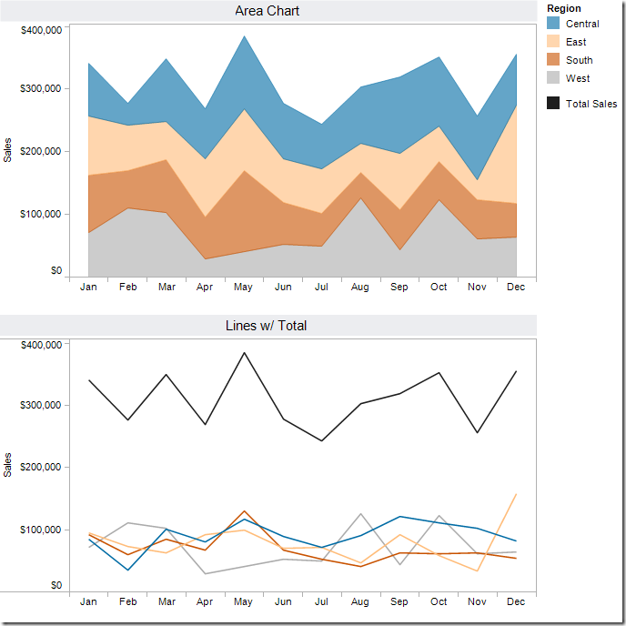
After reading these, one might suggest that an area chart provides the best of both worlds. Consider this area chart:

First impressions are often something like: “This is perfect! It shows me both the trends and the contribution.” However, it doesn’t show the trends as well as one might suspect. Why?
- Our eyes tend to focus on the tops of each line, leading to misinterpreting the patterns.
- It’s nearly impossible for us to translate the width of each color (i.e., the actual value) into an accurate trend. This is because the pattern of each color is influenced by the colors below it.
The only values that can be effectively interpreted are the West (gray area) and the total (top of the blue line).
Try this exercise.
Looking at the East and without scrolling down in this blog post, take one minute (using a timer) and try to draw the trend for the East only. In other words, if the chart was only the East, what would the pattern look like? Give it a shot, it’ll prove a point.
Here’s what the East looks like:

If you were able to draw this accurately in under a minute, then you’re likely some incredible genius, and good for you.
In every data visualization class I teach I use this exercise. I have yet to see anyone get close.
So that brings us to another question. What’s the best way to display the pattern for each region AND show the total. I recommend this:

Now you get the best of both worlds:
- You can see the trends for each region.
- You can see the total.
I accomplished this in Tableau with one table calc - TOTAL(SUM([Sales])) – and created a dual-axis chart by placing Total Sales on the secondary axis and synchronizing them. Download the Tableau workbook here.
I can’t recommend enough the exercise I outlined above. Sometimes asking the person you’re working with to draw the second area will prove your point for you.
Hopefully this will give you some ammunition next time you need to argue against stacked area charts.
P.S. If you’re curious to see the two charts together, here you go. Very different stories, wouldn’t you say?
July 27, 2012
Tableau Tip: Using the TOTAL function to summarize dimensions
One of the great benefits of working with brilliant people is that you get challenging questions. When those questions are about Tableau, I’m nearly always convinced that what the person is trying to do can be done.
Wednesday was another great example. Assume you have a table that measures sales by year by customer. You’re only interested in customers that have more than $35,000 in sales per year.

And you don’t care who the customers are, just how many. Restating the question: How many customers have bought over $35,000 of products in a year and what was the total value of those sales? This is a simple question, but it wasn’t as easy to do in Tableau as I thought.
My initial thought was to simply change the Customers field to a distinct count, but that didn’t work because my individual customers are no longer listed. Ok, so I need all of the customers, but I don’t want to see them. Basically I’m looking for one row for each year. Each row will list year, # of customers over $35K, and total sales for those customers.
Here’s how to do it. I’m going to assume that you are starting with a view like this.

Step 1 – Create a calculated field to count all of the customers in the view (note that I’m working with an Excel data source, so COUNTD is only available if I make it an extract).

Step 2 – Drop the Customer Count measure onto the data area. You will see the Customer Count field appear in the Measure Values shelf.
Step 3 – Right-click on the Customer Count measure in the Measure Values shelf and choose Edit Table Calculation.
- From the Compute Using list, choose Advanced…
- Move the Year of Order Date and Customer fields to the right and click OK.
- On the Table Calculation window, change the Restarting every option to Year of Order Date and click OK.


Your view should now look like this. Notice how the Customer Count field shows the same total number of Customers in each row for each year.

Step 4 – Create a calculated field to total all of the sales in the view

Step 5 – Drop the Total Sales measure onto the data area. You will see the Total Sales field appear in the Measure Values shelf.
Step 6 – Right-click on the Total Sales measure in the Measure Values shelf and choose Edit Table Calculation.
- From the Compute Using list, choose Advanced…
- Move the Year of Order Date and Customer fields to the right and click OK.
- On the Table Calculation window, change the Restarting every option to Year of Order Date and click OK.


Your view should now look like this. Notice how the Total Sales field now shows to total sales by year on each row.

Step 7 – Drop the Number of Records measure onto the data area. You will see the Number of Records field appear in the Measure Values shelf.
Step 8 – Right-click on the Number of Records measure in the Measure Values shelf and change the aggregation from Sum to Average.
Step 9 – Right-click on the Number of Records measure in the Measure Values shelf and choose Add Table Calculation.
- Change the Calculation Type to Running Total.
- From the Running Along list, choose Advanced…
- Move the Year of Order Date and Customer fields to the right and click OK.
- On the Table Calculation window, change the Restarting every option to Year of Order Date and click OK.


Your view should now look like this. Notice the running total we’ve added and how it restarts every year. What we’re doing here is simply counting the number of rows in each pane.

Step 10 – Cleanup time!
- Right-click on the Number of Records pill and choose Filter. Change the filter to be At Most 1. This will now keep only the first row in each year.
Notice how our Customer Count and Total Sales fields didn’t change. This is because we still have the Customers dimension in the view. - Drag the Number of Records pill off of the Measure Values shelf. Be sure to keep it on the filter shelf though.
Note: Steps 7 to 10.1 could all be combined into one step if we put the Number of Records field in the filter immediately. I didn’t do that because I wanted to demonstrate how we’re leveraging the running totals calculation in this example. - Move the Customers dimension from the Row shelf to the Level of Detail shelf.
- Remove Sum of Sales from the view. It’s no longer relevant.
- Right click on the two headers for the measures and rename them (Edit Alias).


I have a sneaking suspicion that I’m overlooking a very simple way to do this, so if I am, please let me know. Either way, this works.
Download the workbook here.
December 16, 2011
Is it possible to share 101.4% of Facebook? Chart of the Day thinks so!
There's a bad stomach bug going around this part of town and I think I might know part of the reason why. Today, my good friends over at Chart of the Day published this pinwheel pie chart and I think the filling might be bad, because the pie sure looks ugly.

Here are some of the problems with this chart:
- IT'S A PIE CHART!
- Colors are re-used, or maybe they are so similar it's hard to tell they're different
- The slices are not in order, making it even hard to look up the values (notice how Microsoft is listed ahead of Peter Thiel and some others)
- The dollar amounts are based on their portion of $100B, yet they total up to $101,350,000,000.
- Correspondingly, the percentages add up to 101.4%. How can you have more than 100% of a total?
To highlight the differences, I created the following charts with Tableau.

What I attempted to do here was show the Stated % Share (gray bar) from the pie chart compared to the "Restated % Share" (black bar). I calculated the Restated % Share with the following formula:
SUM([Stated $ Value])/TOTAL(SUM([Stated $ Value]))
NOTE: A special thank you to Marc Reuter (@tableaujedi) for enlightening the ATUG crowd today with some Jedi magic and for showing how to use the TOTAL function. I had never used it before (and didn't know about it either), but I find it totally awesome! It'll be so useful!
Basically, I'm taking the value stated on the pie chart and dividing it by the total value of the pie chart. This gives you the Restated % Share. The label is the difference between the Restated % Share and the Stated % Share.
The chart on the right represents the % variance number (as identified by the label on the left) multiplied by $100B (the estimated total value of Facebook).
If I were one of these shareholders, I'd be a bit concerned about the math. This isn't chump change! In the end, Chart of the Day may have made a $1.35B miscalculation. Oops!
Download the Tableau workbook here and you will see the original and restated data like this:






