May 31, 2021
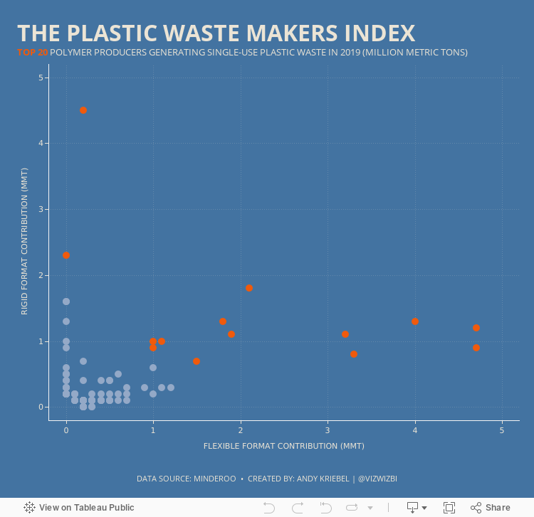
#MakeoverMonday 2021 Week 22: The Plastic Waste Makers Index

May 25, 2021
How to Create a Marginal Histogram


May 24, 2021
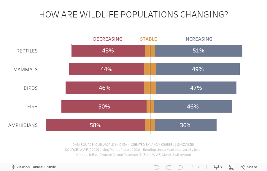
#MakeoverMonday 2021 Week 21 - How are wildlife populations changing?

May 20, 2021
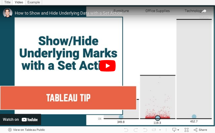
How to Show and Hide Underlying Data with a Set Action

May 19, 2021
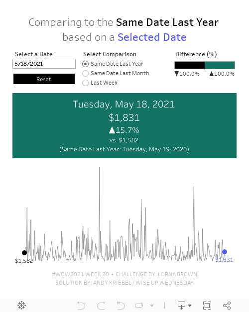
#WOW2021 Week 20: Can you compare Same Day to a Selected Date?

Wow! This workout will really test your knowledge of table calcs. The challenge comes from Lorna; view the requirements here.
The main purpose of this challenge is to get familiar with dates and parameters. Fortunately, every Wednesday I host what we call "Wise Up Wednesday" during lunch for my colleagues at The Information Lab and The Data School. We needed all of our brain power for this one. For us, the toughest part wasn't writing the calculations themselves. Rather, it was the logic required for the calculations.
From Lorna:
What if you want to compare a date you choose to the same DAY. For example, Tuesday 18th May 2021, would compare to Tuesday 19th May 2020 for the previous year, and Tuesday 20th April for the previous month. The reason you would want to do this is to compare the Tuesday to Tuesday.
This is where the logic gets tricky. We approached the solution by taking one version at a time, meaning we started by creating the calcs for the same day last year before we went onto the other two scenarios.
We got the in the end. I'd recommend building everything as a table, then change it into a chart later. It's much easier to follow what you calcs are doing.
Good luck! Here's our solution:
May 17, 2021
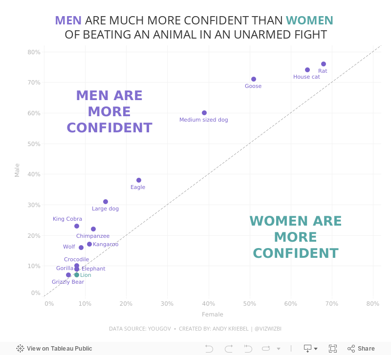
#MakeoverMonday Week 20 - Humans vs Animals

WatchMeViz
Visualization
Designing for Mobile First - Sample Mobile Sales Dashboard

May 12, 2021
How to Create a Time Series Drilldown with a Set Action


May 11, 2021
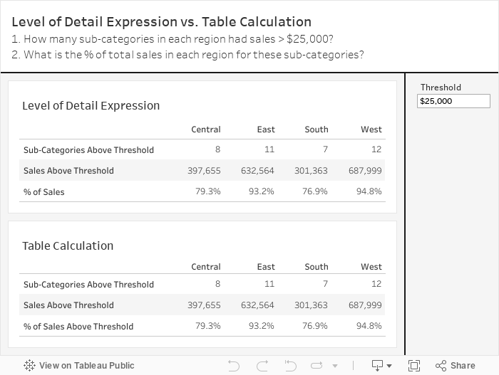
Threshold Analysis - Level of Detail Expressions vs. Table Calculations
DS22 is nearing the end of their training and today was a bit of a refresher. One of the questions I wanted them to answer was how many sub-categories in each region had sales above $40,000?
We then expanded that to include (1) the sales for those sub-categories and (2) the % of sales those sub-categories make up of the region sales. They were to complete this using LODs.
As they worked on the task, I thought that this, for sure, could be done with table calculations. This is perfect for the Data School Gym.
If you know me, you know I love table calculations. And if you know Lorna Brown, you'll know she HATES table calculations. So this is your Data School Gym challenge Lorna.
Of course, everyone is welcome at the Data School Gym. It's actually not that hard and is a good way to help you learn about LODs vs. table calcs.
I'm not too fussed about making it look exactly the same. The point is to see if you can create the identical tables. Enjoy!

May 10, 2021
#MakeoverMonday 2021 Week 19 - The Cost of 1GB of Mobile Data in Every Country
WatchMeViz
Visualization

May 4, 2021
How to Create a Layered Hex Map with a Spatial File

In this tip, I show you how to use a spatial file to overlap hexagons on a map. This technique is much simpler, looks better, and is easier to maintain.
Typically when you want to create an overlapping hex map, you will use a template that has x/y coordinates for the rows and columns, hex shapes, then try to pack them together until they look just right. But then you put them into a dashboard and the sizes need to be adjusted again. What a pain!
Watch this tip to see the simple way to create layered hex maps.
RESOURCE: Hex map template via Joshua Milligan here

May 3, 2021
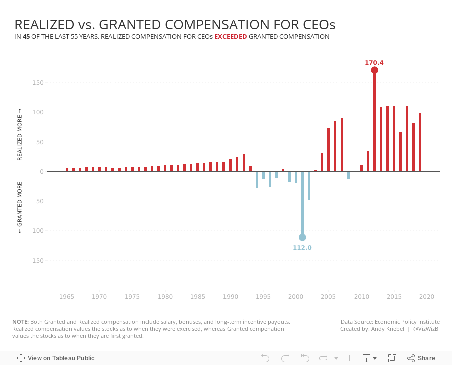
#MakeoverMonday 2021 Week 18 - Realized vs. Granted Compensation for CEOs

- Line Chart
- Stepped Lines
- Variance to baseline
- Win/Loss chart
- Comet Chart
- Gantt Chart
- Bar chart w/ reference line
- Connected scatter plot
- Slope Graph
- Circle Timeline
- Heatmap
- Data Set - https://data.world/makeovermonday/2021w18
- Chart chooser - https://datavizproject.com/