August 30, 2024
How to Create a Win/Loss Sparkline

Check out the workbook here.
March 8, 2024
Visualizing Time Series Data in Tableau
Last night I was invited to speak at the Chicago Tableau User Group about visualizing time series data. Other than spatial data, time series data is my favorite to visualize.
There seem to be endless methods for making time series data useful for analysis. Check out this video for 60ish ways to visualize time.
I had a 20 minute slot to present and, of course, I ran over time. I seem to do this with every session I run lately. Be it training for Next-Level Tableau, presenting at events, or running a livestream, I get into a groove and don't want to stop.
I was able to create 14 vizzes in 20+ minutes. I added an extra in this workbook to make the dashboard format nicely.
Click on the image below to download the workbook and dissect it. Get the data here to follow along.
Have fun!

March 5, 2024
11 Steps to Create KPIs & Sparklines in the Same Sheet in Tableau

Want to cut the number of sheets you need in your KPI dashboard in half? These 11 simple steps will get much closer.
Steal the calcs to speed up your work.
P.S. If you like tips like this, remember to follow me on LinkedIn so you're notified about everyting I post. Content curated just for you, 3 times daily.
July 4, 2023
Create 10 ACTIONABLE & IMPACTFUL KPIs in Tableau

What is a KPI?
KPIs are measurable values that indicate how well a business is performing in achieving its key objectives and goals. They provide a clear and concise snapshot of critical areas within a business.
KPIs help to:
Monitor progress
Identify areas of improvement
Make data-driven decisions
In order to do this, KPIs must be tailored to specific goals and strategies.
Making KPIs Actionable
Here are 8 suggestions to ensure that KPIs are actionable and impactful.
Align with business objectives
Focus on relevance and simplicity
Set measurable targets
Collect accurate and timely data
Visualize your KPIs
Regularly review and update
Add context
Drill down
Actionable KPIs are vital for measuring performance and achieving results. You can drive your business forward by aligning data with goals and simplifying and visualizing KPIs effectively
Read more about KPIs in my newsletter here. Sign up so you don't miss any future newsletters at andykriebel.com.
⏬ DOWNLOAD the data, and starter and solution workbooks here. I would appreciate your support to continue making videos for you.
August 4, 2021
#MakeoverMonday Week 31 - Bicycle Collisions in London

- Final Viz - https://bit.ly/mm2021w31
- London Shapefiles - https://data.london.gov.uk/dataset/statistical-gis-boundary-files-london
- Data set - https://data.world/makeovermonday/2021w31
- Original Visualization - https://bikedata.cyclestreets.net/collisions/
- Watch Me Viz - https://youtu.be/ZpuX4TLqBxQ
May 17, 2021
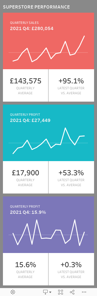
Designing for Mobile First - Sample Mobile Sales Dashboard

March 29, 2021
#MakeoverMonday Week 13 - UK Trade With the EU Since the Brexit Referendum
I must admit I got a bit stuck with this week's dataset. It was very straightforward and I didn't like how anything turned out. With some ideas from the live audience on YouTube, I started comparing exports, imports and the trade balance. I then thought about a trick I had taught the Data School about using a timeline to filter.
Great, that's it! Wrong! The layout I had in my head was all wrong. I had to move some things around and then getting everything to line up took ages! Why or why isn't formatting easier???
Then, after creating the BANs, someone suggested that it would be good to show a zoomed in version of the line chart for the dates selected. I added those as sparklines with each BAN and it turned out so much better.
Check out and download the viz here.

March 16, 2021
Mastering Containers in Tableau (Part 2) - Sales Performance Dashboard

March 1, 2021
#MakeoverMonday Week 9 - Seats Held by Women in National Parliaments in the EU


- Clear title
- Line chart is a good choice for a time series
- There are too many colors.
- What's the focus?
- The legend takes up a lot of space.
- The chart ratio is too flat.
- Overall, it's confusing and harder than necessary to find patterns.

November 16, 2020
#MakeoverMonday Week 46: The Growth of Internet Ad Spend - 2020 vs 2012
Thanks for attending #WatchMeViz (link) for #MakeoverMonday Week 46. I enjoy the commentary and ideas you provide along the way. I hope you're learning something as well.
The topic this week was the switch in advertising revenue to the internet.
In the video, I first reviewed the initial visualization and talked about what works and what does. I then iterated through 17 different methods for visualizing the data, before settling on the one below which was inspired by Ellen Blackburn's viz about eligible free school meals and educational attainment (link)
RESOURCES
- Data Set - https://data.world/makeovermonday/2020w46
- Chart Guide - https://chart.guide/

November 10, 2020
How I Use Layout Containers (Part 1) - Social Media KPI Dashboard


November 9, 2020
Dashboard Templates - Example 1: Customer Service Dashboard
As part of the training at The Data School, we're often tasked by clients to build industry specific dashboards and/or dashboards that can be used as templates for their organization. Of course what the client can ask for is often much more broad. From a dashboarding perspective, we tend to have the freedom to create what we think works best for their data. This them, in turn, helps create a sort of "brand" for their dashboards internally.
That got me thinking about common use cases for dashboards, dashboards that would likely span industries and companies and could serve as templates for others. In this series, I'll be posting templates that I have been building based on the data and sample dashboards from Excel Dashboard School.
Let me make it clear that I am in no way criticizing the work they have created. My intent is to build an alternative method for displaying the data as a template in Tableau. The data and templates they have provided are the starting point for my work. I want to thank them for being so kind and sharing their work.
TOPIC
Customer Service Dashboard
RESOURCES
- Dashboard Overview - https://exceldashboardschool.com/customer-service-dashboard/
- Data and Interactive Dashboard - https://cdnspeed-exceldashboardsc.netdna-ssl.com/wp-content/uploads/2017/08/080_CSD_final.zip
DASHBOARD TEMPLATE

August 13, 2020
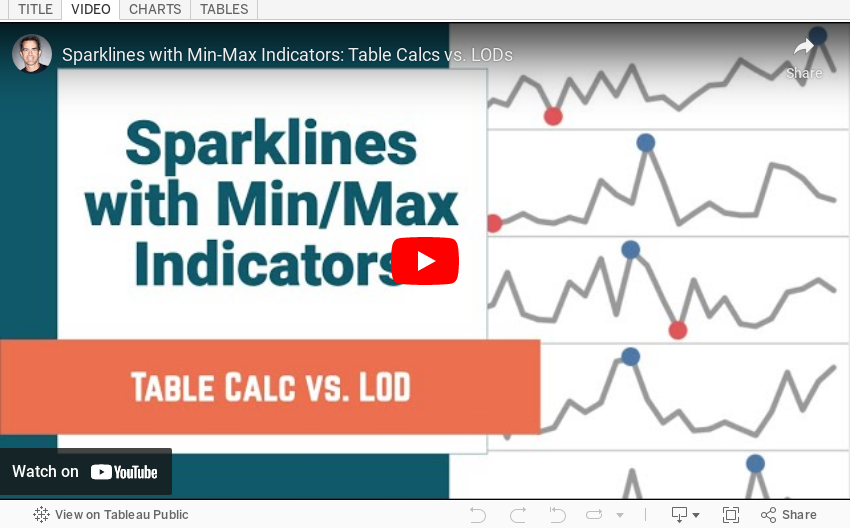
Sparklines with Min-Max Indicators: Table Calcs vs. LODs

In this tip, I show you how to add circles on a sparkline at the minimum and maximum values for each line. I detail how to create them with both Table Calculations and Level of Detail Expressions and the benefits of each.
January 28, 2020
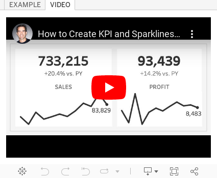
#TableauTipTuesday - How to Create KPIs and Sparklines in a Single Worksheet

December 2, 2018
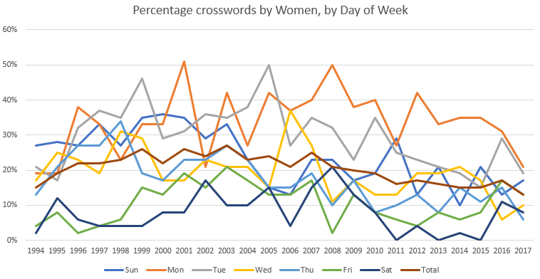
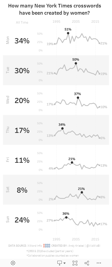
Makeover Monday: How many New York Times crosswords have been created by women?

What works well?
- The title explains what the chart is displaying.
- The x-axis and y-axis are easy to understand.
- Excluding 1993 and 2018 since they are partial years.
- The chart has the proper height-to-width ratio.
What could be improved?
- The title could be a bit more informative. Something like "Over the last 24 years, there have been only three weekdays where women has constructed at least 50% of the crosswords."
- There are too many colors, making the chart distracting and the lines hard to follow.
What I did
- Separated the days into separate charts so the trends for each weekday would be easier to follow
- Created sparklines and highlighted the high point for each weekday
- Labeled the values for 1994 and 2017 for context
- Included a BAN for the overall percentage for each weekday
- Created a mobile layout
- Shaded every other row to distinguish the weekdays and help guide the eye across the chart
July 20, 2017
Visualizing a Profit & Loss Statement
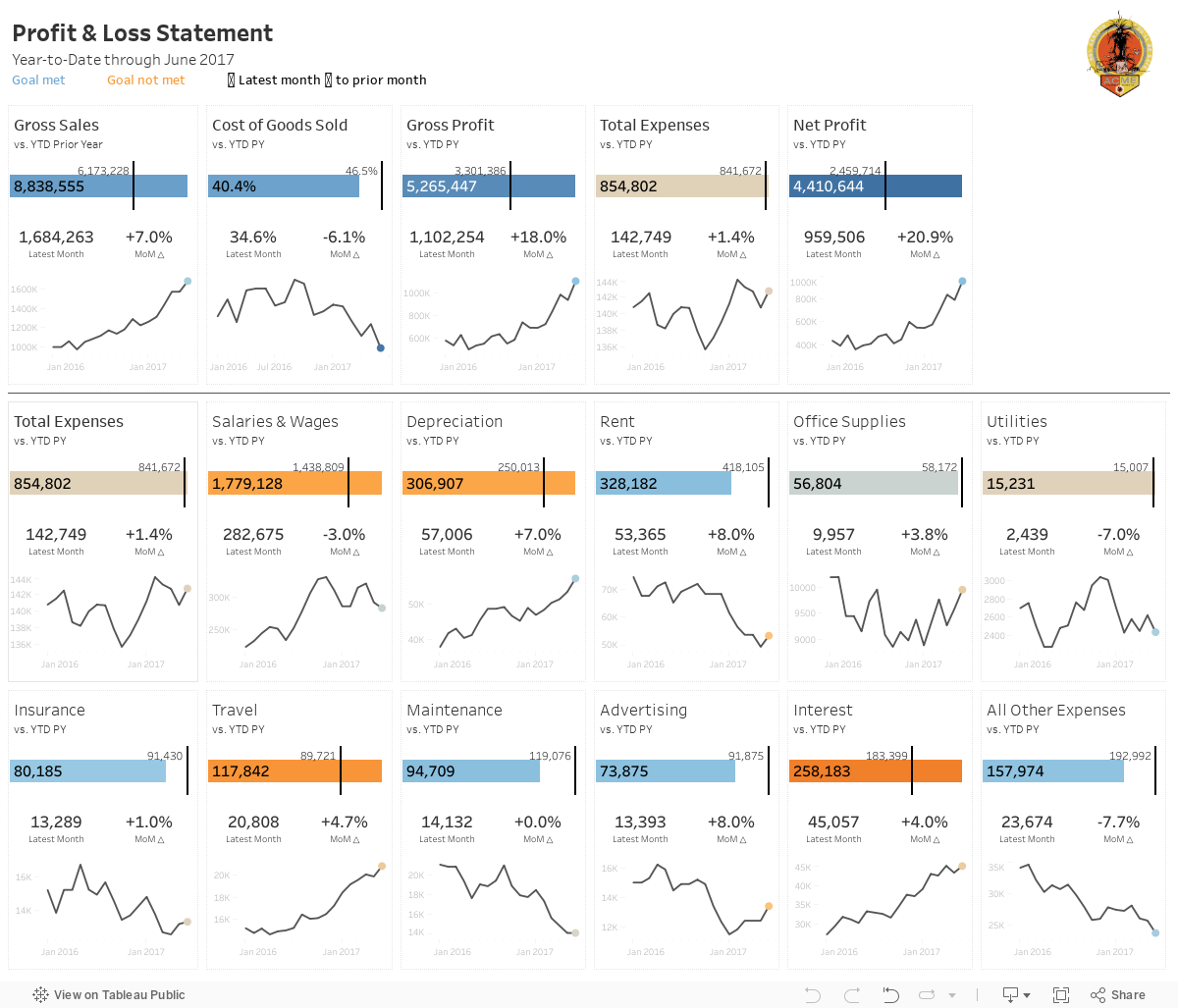
In the true Tableau spirit, I'd like to share it with everyone. The overall design is very similar to the Income Statement with a few differences/enhancements:
- The top section serves as a summary with the idea being to give a quick overview.
- The bottom section (below the line) are all of the expense categories, which could obviously change based on what a company tracks.
- I included BANs for the latest month and the change to prior month.
- There's no budget, so the sparklines simply show the raw values.
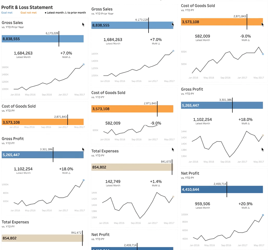
- The mobile version only shows the summary section as I couldn't fit all of the expenses within the 4000 pixel height limit and really, who's going to scroll that far anyway?
Ok, so now that you know how to read the viz, here's the full version. Click on the image for the interactive version (or if you're on mobile you will automatically see the mobile version). Scroll a bit farther down for a gif of the mobile version in action.
VIDEO OF MOBILE VERSION
June 19, 2017
Makeover Monday: Is America Improving Its Ozone Air Quality?
The EPA website also contained some basic reporting, which is the focus for this week's makeover.
What works well?
- Simple layout. It's easy to see you have days within months going left to right and years going down.
- Colors match the official EPA colors for the AQI categories
- Including the ranges we know what constitutes a good reading vs. a bad reading
- The title tells me what I'm looking. Including the date range is a nice touch too.
- Using a strip plot along with the colors helps reveal seasonal patterns
- Including the source in the footer
What could be improved?
- Make the colors color-blind friendly
- It's difficult to see how a month has changed across the years.
- I can't hover to see the values.
- It says each “tile” represents one day of the year and is color-coded based on the AQI level for that day, but I think it's actually showing the max measurement for each day. It should be more clear what they are representing.
- There's very little context. How does one county compare to others? How does one county compare to the national average?
What were my goals?
- Last year I challenged The Data Duo to visualise an almost identical data set. Pooja created a pretty amazing viz (of course), so I wanted to pick some parts off of it. Particularly, the State selectors on each site and the dot plot.
- I wanted to understand how each month changed across the years, which is pretty much exactly what a cycle plot was created for. I used a trend line instead of an average though because that seemed to show the patterns better.
- I wanted to add context for comparisons to the national average and to the state average (which appears when you click on a state).
- I wanted to use color-blind friendly colors.
- I wanted a small sparkline-type chart to show how things have changed since 1990.
December 26, 2016
Makeover Monday: How Much Has the Cost of Christmas Dinner Really Risen?

Well, this is it! 52 weeks of Makeover Monday under our belts. Thank you for an incredible year and for participating in this amazing project.
In case you missed it, Makeover Monday will continue in 2017. Eva Murray and I have big plans in store for everyone. If you ever have questions, comments or feedback, give us a tweet.
Ok, so onto week 52. The BBC published an article early in December about the cost of Christmas dinner in the UK with this blaring headline:
Christmas dinner costs 'rise 14%'
Inside the article were these basic charts:


Fortunately, Andy C was able to locate the data on BBC Github. Let’s review the charts.
What works well?
- A line chart is a good choice for showing change over time.
- The line chart uses about a 3x2 ratio which doesn’t distort the shape too much given the axis is zoomed in.
- The bar charts work fine for comparing the two years.
What doesn’t work well?
- The line chart has smoothed curves, which lead you to believe there were changes throughout the year, but the data is only at the yearly level. This could be misleading.
- What food are included? The data on Github doesn’t match the data in the chart? How are we to know what they consider to be the Christmas foods?
- There’s no logical sort to the bar chart. It’s neither sorted by 2015 nor 2016. I can’t make out how it’s sorted.
- The bar chart doesn’t include all foods they have data for, so why did they only show these foods? Are these the foods that comprise the line chart? We have no way of knowing.
- Were the Christmas themed colors in the bar chart intentional? If so, I get why they did it, but it won’t work for their colour-blind readers.
- The title of the bar chart indicates it’s about the price change, but they make the reader do the change maths in their head. Why not just show the change?
- Why are they comparing 2016 to 2015 and not a different year? That seems a bit shortsighted and sensationalist to me.
For my version, I thought it was important to:
- Indicate when the peak price occurred
- Show the entire time period to get a better sense for the rate of change
- Indicate whether the 2016 price has increased or decreased compared to 2006
- Sort the products by the 2016 price
- Show the rate of change and the latest price
- Optimise the view for mobile
Given these ideas above, here is my last Makeover Monday for 2016. I’m looking forward to continuing this project with Eva in 2017.






