January 19, 2022
Social Connectedness in the United States

NOTE: The insights you see in this post are based on an article by The Upshot from September 2018. Some of the insights and use cases demonstrated are the same and are shown in Tableau for demonstration purposes.
----------------------------
When I first saw the map that The Upshot created in How Connected Is Your Community to Everywhere Else in America? I was blow away by the simplicity of the map and how easy it is to understand the relationships of people in the United States via their Facebook friendships. The first thing you need to understand is the metric "Social Connectedness Index". You can access the data I used via the same link.
Here's the formula Facebook uses to calculate the index:

From Facebook:
Social Connectednessi,j measures the relative probability of a Facebook friendship link between a given Facebook user in location i and a user in location j. Put differently, if this measure is twice as large, a Facebook user in i is about twice as likely to be connected with a given Facebook user in j.
In each dataset, we scale the measure to have a fixed maximum value (by dividing the original measure by the maximum and multiplying by 1,000,000,000) and the lowest possible value of 1. We also round the measure to the nearest integer.
I was not able to match the color scale in The Upshot exactly, so instead I used a table calculation that ranks each County in the U.S. compared to the County selected by the user.

Close enough for me!
The data has columns for the State/County of the user and for State/County of the friend. To ensure that I was only looking at friends for the County selected, I used Parameter Actions to filter the user to the County and State selected. The rank calculation then only uses the SCI for the friends.
Now let's look through some of the use cases as described in The Upshot.
DISTANCE IS MOST IMPORTANT

STATE LINES ARE BOUNDARIES

MIGRATION PATTERNS


PHYSICAL BOUNDARIES


November 10, 2020
How I Use Layout Containers (Part 1) - Social Media KPI Dashboard


November 20, 2017
Makeover Monday: Snapchat is tops with American teens
The original viz comes to us from Business Insider:

What works well?
- Catchy title that quickly tells the story of the viz
- Bar charts are simple to understand and they show the pattern well
- Sorting the apps by the most recent value
- Including the axis, otherwise we wouldn't know what the labels mean on the top of the bars
What could be improved?
- The fading colors across the time periods are unnecessary. Include a time axis instead.
- Change the numbers above each bar to percentages
- The color legend doesn't match any of the bar charts and should be removed.
My Ideas
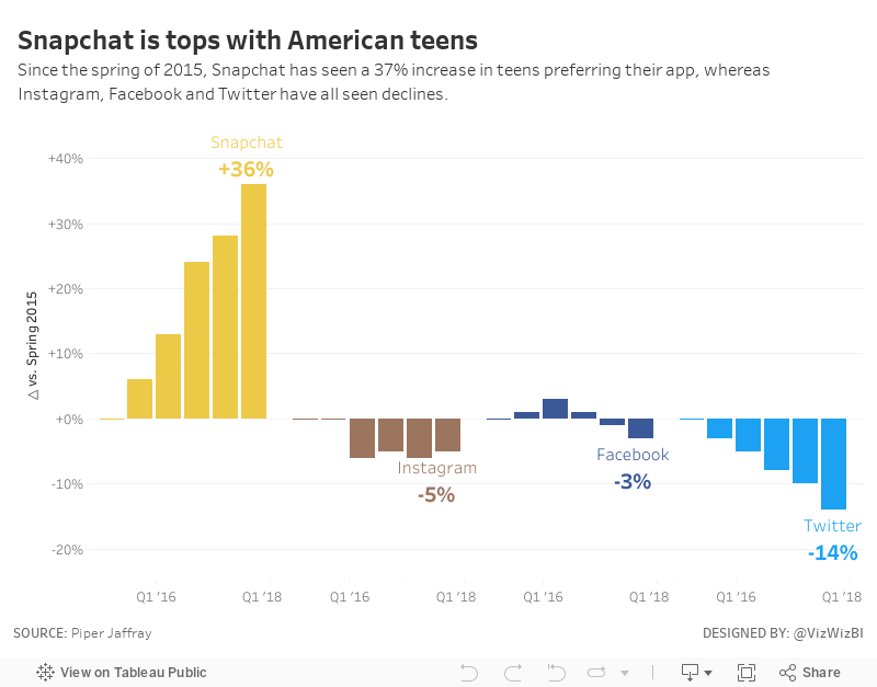
This tells the story simply, but also doesn't show enough of the change over time. Next, I took the original and turned it into a line chart, labeling only the start and the end and also changing the colors to match the official colors of each app.
I think the line charts help make the change and trends much more obvious than the bar charts in the original. From there, I decided to look at the change since the starting period (spring 2015) to make the growth or decline of each app easier to understand. And with that, here's my Makeover Monday week 47.
September 6, 2015
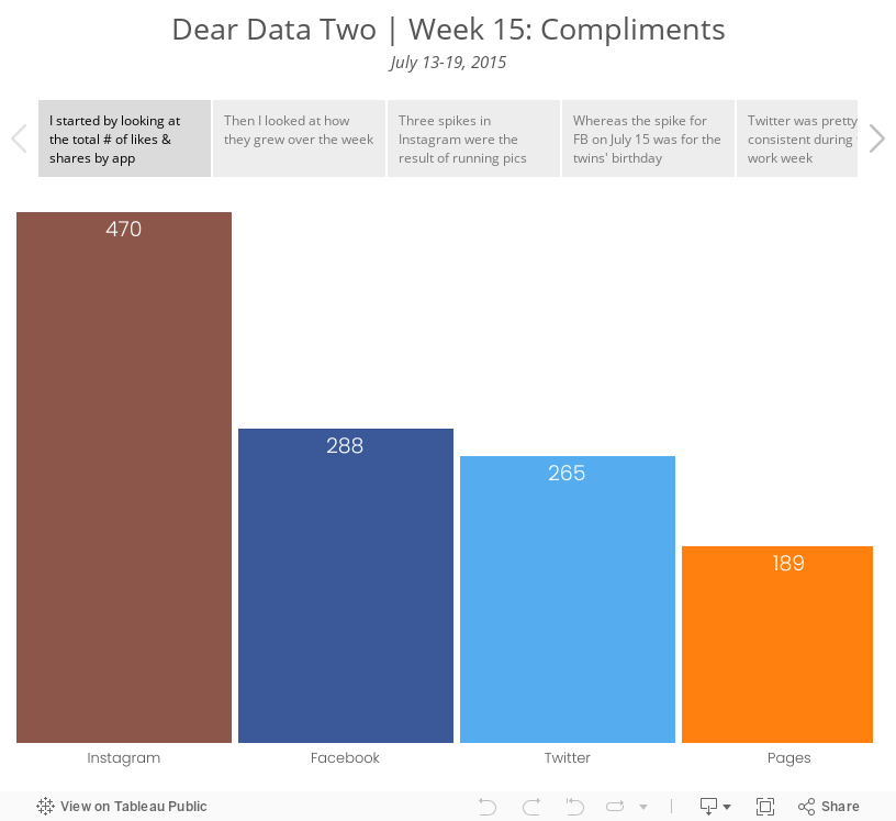
Dear Data Two | Week 15: Compliments

March 23, 2015
Makeover Monday: Who’s Really Using Social Media in 2015?

Wow! That's quite a bit to digest. So much going on, from the donut/pie charts, to all of the annotations, to the sizing of the pies by overall growth. This infographic has it all.
I recreated the data in Excel, which you can download here, and decided to build a couple of different alternatives because the design choices depend on the question that's trying to be answered. This first version aims to show which social networks are predicted to grow the most in each demographic.

Looking at the data this way, it's clear that Facebook will continue to see the largest growth across all ages. This view also makes the following obvious:
- Younger people are using Instagram
- Older age groups are using Pinterest
- Twitter is a middle of the road platform everywhere, which you could spin as a more diverse audience
The second alternative takes the pie charts and converts them all into more organized bar charts. The question being answered here is how is each app doing?
There's a selector at the top right where you can pick the view you want to see:
- The spread of growth across each app separately
- The growth estimates for each app

Looking at the data this way allows you to compare within a single app, compare to the total and compare across apps. Which version do you prefer? What would you do differently?
Download the Tableau workbook here (requires Tableau 9).






