January 19, 2022
Social Connectedness in the United States

NOTE: The insights you see in this post are based on an article by The Upshot from September 2018. Some of the insights and use cases demonstrated are the same and are shown in Tableau for demonstration purposes.
----------------------------
When I first saw the map that The Upshot created in How Connected Is Your Community to Everywhere Else in America? I was blow away by the simplicity of the map and how easy it is to understand the relationships of people in the United States via their Facebook friendships. The first thing you need to understand is the metric "Social Connectedness Index". You can access the data I used via the same link.
Here's the formula Facebook uses to calculate the index:

From Facebook:
Social Connectednessi,j measures the relative probability of a Facebook friendship link between a given Facebook user in location i and a user in location j. Put differently, if this measure is twice as large, a Facebook user in i is about twice as likely to be connected with a given Facebook user in j.
In each dataset, we scale the measure to have a fixed maximum value (by dividing the original measure by the maximum and multiplying by 1,000,000,000) and the lowest possible value of 1. We also round the measure to the nearest integer.
I was not able to match the color scale in The Upshot exactly, so instead I used a table calculation that ranks each County in the U.S. compared to the County selected by the user.

Close enough for me!
The data has columns for the State/County of the user and for State/County of the friend. To ensure that I was only looking at friends for the County selected, I used Parameter Actions to filter the user to the County and State selected. The rank calculation then only uses the SCI for the friends.
Now let's look through some of the use cases as described in The Upshot.
DISTANCE IS MOST IMPORTANT

STATE LINES ARE BOUNDARIES

MIGRATION PATTERNS


PHYSICAL BOUNDARIES


October 11, 2015
Dear Data Two | Week 25: Friends

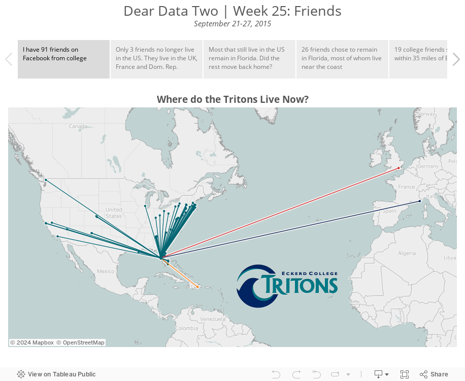
I had a good idea in mind for what I wanted to do and I started by looking at all of my Facebook friends, the idea being that I wanted to create a map of where they all live. Unfortunately Facebook does not make it easy to get this information. The data preparation was going to take way too long, so I opted for looking at where my college friends Facebook live.
I entered all of their names and current locations in a spreadsheet and then added a second row for each person that was the location of our college, the awesome Eckerd College in St. Petersburg, Florida. Don’t look at pictures of my college; you’ll get way too jealous.
I then took all of the locations and ran them through batch geocoder to generate lat/long values for each person. This allowed me to calculate the distance each friend has moved away since college. Duplicating the rows also allowed me to create lines connecting Eckerd College to each person.
For the postcard, there’s no way I could have drawn a dot for every person, so I aggregated some locations together and used size to represent each person or group of people. I intended to use shapes as well, as you can see on the front of the postcard, but I forgot once I got into drawing the card. Chalk another victory up for the design medium.