May 4, 2023
Tableau Techniques for Top Notch Spatial Analytics

MEMBERSHIP PROGRAM
January 25, 2022
How to Calculate the Distance Between Two Points
November 4, 2019
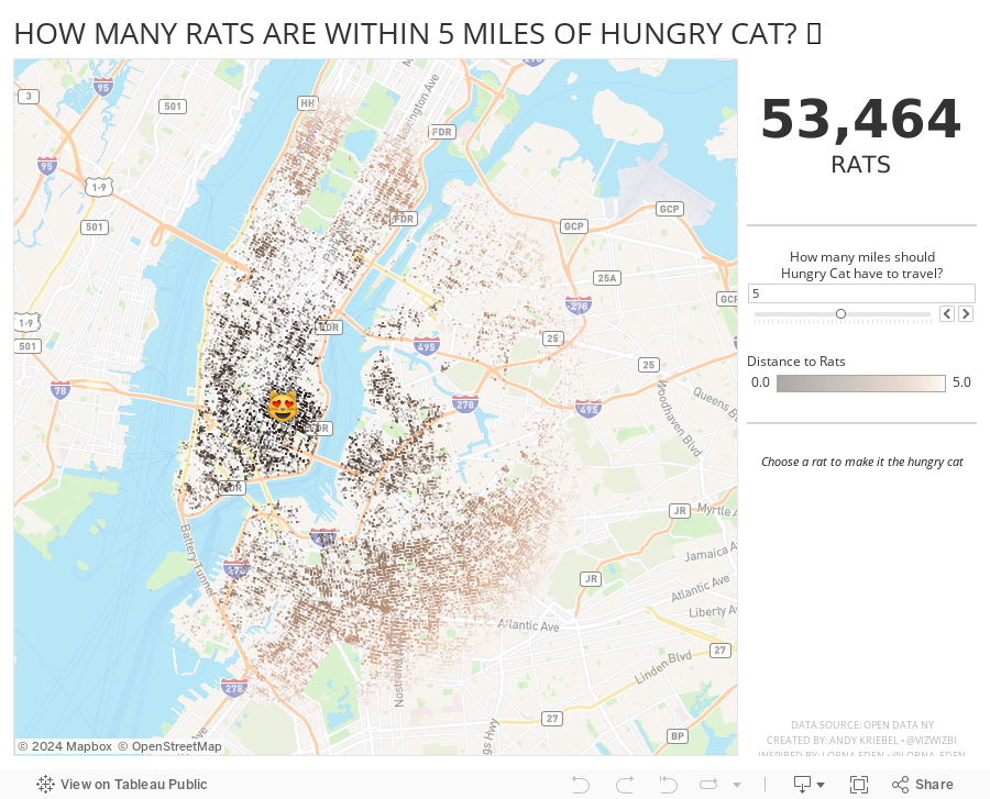
How Many Rats Are Near Hungry Cat?

And right after I taught this class to DS16, Lorna Eden posted the Workout Wednesday week 43 challenge. In this challenge, you had to find all casinos within X miles of a casino you click on. This required using the new DISTANCE function that came into Tableau 2019.3.1.
So, why not practice this technique more, but with rats? Instead of clicking on a casino, you can click on a rat to make it the Hungry Cat and find all rats within X miles of the cat. Silly, yes, and fun to practice too. The rats all have names too.
Lastly, I wanted to resize the dots based on the number of rats in the view. I used this blog post from The Data School, except I used an LOD instead of a table calc.
Enjoy! Find the rats near you.
July 9, 2018
Makeover Monday: Have volcanoes nearest to a tectonic plate erupted more recently?


What works well?
- Including a description for how to interpret the chart
- Ordering the volcanoes from front to back according to elevation above sea level
- Coloring by the number of eruptions since 1893
- Excellent tooltips
What could be improved?
- Where is sea level? Some of the volcanoes are below sea level. You can't really size by negative feet below sea level.
- There's no explanation for why some of the volcanoes have labels.
- Make it more clear where the based of the volcano starts. I assume it's at the bottom of the viz.
- Include reasoning for why 1893 is when the counting of the eruptions starts.
What I did


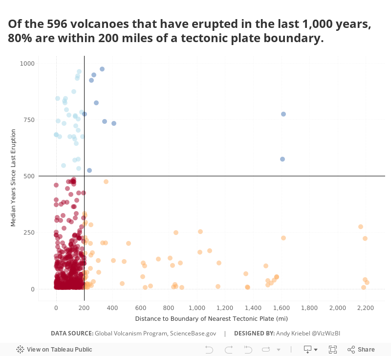
I had to start all over, so this time I decided to look at how far each volcano was from the boundary of the nearest tectonic plate. Again, Alteryx to the rescue!

Once I had the data I needed, I created a few calculation to help me create a simple quadrant chart that clearly show that the nearer a volcano is to a boundary of a tectonic plate, the more recently it erupted. All of that totally makes sense given what we learned about geology in school.
October 11, 2015
Dear Data Two | Week 25: Friends

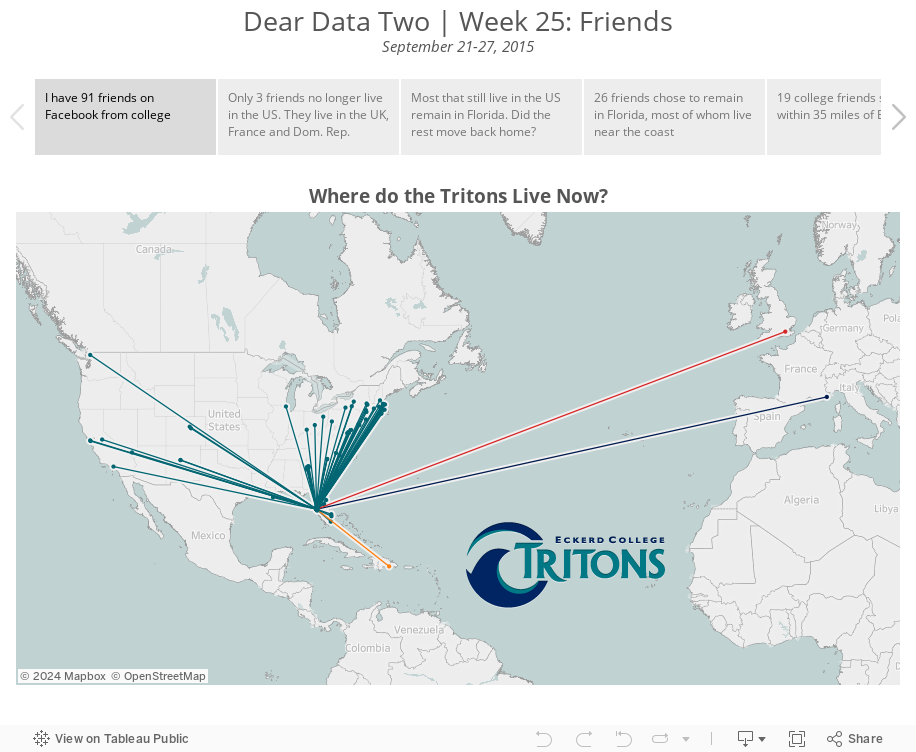
I had a good idea in mind for what I wanted to do and I started by looking at all of my Facebook friends, the idea being that I wanted to create a map of where they all live. Unfortunately Facebook does not make it easy to get this information. The data preparation was going to take way too long, so I opted for looking at where my college friends Facebook live.
I entered all of their names and current locations in a spreadsheet and then added a second row for each person that was the location of our college, the awesome Eckerd College in St. Petersburg, Florida. Don’t look at pictures of my college; you’ll get way too jealous.
I then took all of the locations and ran them through batch geocoder to generate lat/long values for each person. This allowed me to calculate the distance each friend has moved away since college. Duplicating the rows also allowed me to create lines connecting Eckerd College to each person.
For the postcard, there’s no way I could have drawn a dot for every person, so I aggregated some locations together and used size to represent each person or group of people. I intended to use shapes as well, as you can see on the front of the postcard, but I forgot once I got into drawing the card. Chalk another victory up for the design medium.
August 19, 2012
Tableau Tip: Create hub & spoke diagrams using the Path shelf
I’m in constant learning mode with Tableau. I don’t think a day has gone by when I haven’t learned something. I love the Tableau community because everyone freely shares ideas from which they hope others borrow. This technique of from-to patterns is no exception; it’s definitely not a new topic I’m covering here. But I do like documenting the processes I follow, which is more or less why I started this blog in the first place.
Paths are not a feature I use often, so in my inevitable quest for all things Tableau, I decided to find some data that would provide a good learning experience. The data for this post comes from the Bureau of Transportation Statistics.
Here’s a sample of the data.

Each origin airport/destination airport combination is represented as one row in the spreadsheet. This is great, but in order to use Tableau’s Path functionality, you need to have two records for each origin/destination combination. The first for the starting point, and the second for the ending point.
You can accomplish this quite easily through Custom SQL. The example below contains all the columns I need from the spreadsheet.
- Those before the red box are inherent in the spreadsheet.
- The SQL inside the red box is for the fields I have to add to make the paths work.
- You must specify the path. In this case, 1 is the starting point, 2 the ending point.
- I added additional latitude and longitude fields to capture the starting and ending points. That is, I use the origin lat/long when my path = 1 and the destination lat/long when my path = 2.
- I included a concatenated string for the route, which I will use on the Level of Detail shelf.
- Union the SQL for path 1 to itself, but change the path to 2 and change the lat/long to the destination lat/long. Notice that the Route calculation stays to same.

In Tableau, all you have to do is:
- Double-click on both Latitude and Longitude to draw the map
- Add Route to the Level of Detail shelf
- Change the Mark Type to line
- Add the Path Order dimension to the Path shelf

You now have a giant mess of lines all over the place that represent every single route in the data. That’s all you need to do.
The trick is that you need to write the custom SQL in order to have your data in a usable format.
I wanted to take the viz a bit farther though, so I created this interactive version on Tableau Public.

I included:
- Filters options for Origin Airport, Destination Airport, and Airline (I chose ATL as my initial view since it’s the world’s busiest airport)
- Colors to indicate the length of the route
- Clicking on a color highlights the routes in the selected flight range and also highlights the destination airports on the bottom map
- A map of the number of passengers that flew to each destination, indicated by the size of the bubble
- Custom tooltips, which include the great-circle distance calculation
This is a pretty fun viz to interact with. Choose all origin airports and you see all of the routes. Choose the airport you most frequently fly from. Choose your preferred airline. The three New York airports are particularly interesting (EWR, LGA, JFK).
There are lots of other data elements that could be included, but I haven’t gotten to. Think about adding options to color the bubbles and lines by things like frequency of delays, average ticket price, etc.
Wouldn’t this be really cool to do with your friend networks on Facebook? Oh wait, we did that in a recent hack-a-thon.
January 5, 2012
Tableau Tip: Calculating the distance between two points
Naturally I want to do this in Tableau, but I since I hadn’t done this before I turned to the Tableau Forum and found this great step-by-step tutorial.
TIP: For those of you that may be new to Tableau, I would highly recommend that you use the forum if you’re approaching something you’ve never done before. You’ll often find that someone has already done something similar and it’ll save you a lot of time versus re-inventing the work yourself.
Tableau has outlined this as a 22 step process, but they go through it in extreme detail. Note that your data source MUST have latitude and longitude available in this example. Here’s a slimmed down version for you (some of this is taken directly from the article):
- Connect to your data source, select Single Table, then select Custom SQL
- Create an inner join on a second instance of the table where the locations from the two instances are not equal (refer to the SQL script in the detailed instructions)
- Click OK, then Extract the data. For me, I’m looking at 7271 stores, so the self join will result in about 50M records. Leverage the power of Tableau’s data extracts!
- Double-click your latitude and longitude fields to start building the map. You may need to set the geographic role of the fields if you don’t have them named Latitude and Longitude.
- Use the Great Circle Distance formula by creating a calculated field named Distance (or the name of your choice)
The formula is:3959 * ACOS
(
SIN(RADIANS([Lat])) * SIN(RADIANS([Lat2])) +
COS(RADIANS([Lat])) * COS(RADIANS([Lat2])) * COS(RADIANS([Long2]) - RADIANS([Long]))
)
NOTE: To calculate miles, use 3959 as the first number. For kilometers, use 6371 as the first number (thanks to Shawn Wallwork for the comment) - On the Marks card, in the list, select Line. This will create lines between all locations on the map. Start with only a couple locations if you have a huge dataset, otherwise it could take some time to draw all of the lines.

From this point, you can perform tons of different analysis. One example would be to drag Distance onto the Color shelf and the Label shelf on the Marks card to color code and label the distances between each point on the map.
Think about how you could blend other data source. For me, I might have home zip codes for employees in another data source and I want to see all stores within a certain radius of each employee. The possibilities are almost endless!
You can find a sample workbook for how all of this is done here. I know I’ll be using this technique over and over again.






