Showing posts with label open data. Show all posts
November 25, 2019
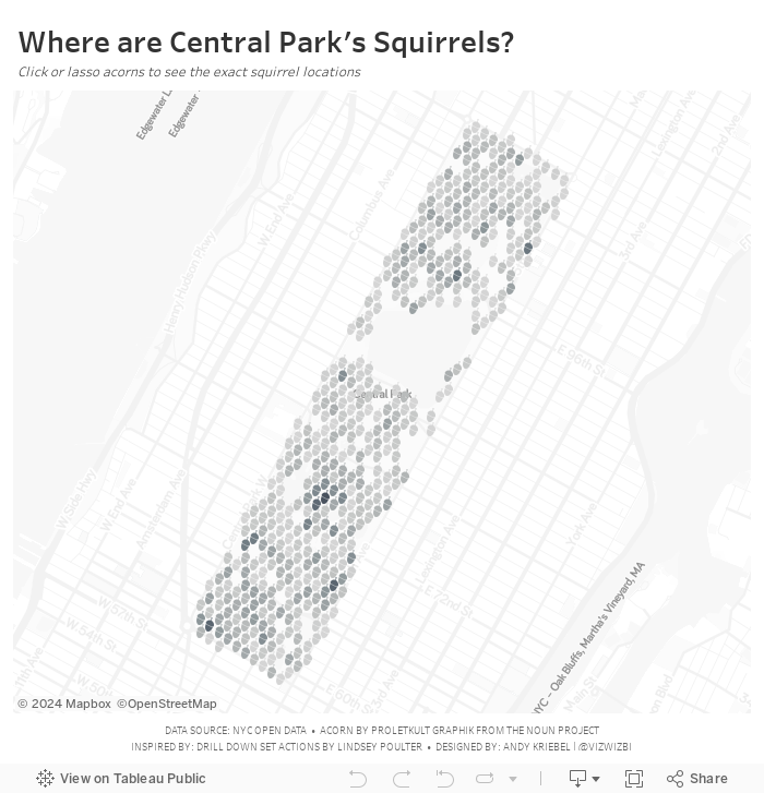
#MakeoverMonday: Where are the squirrels of Central Park?
animals
,
central park
,
location
,
new york
,
new york city
,
NYC
,
open data
,
squirrels
,
survey
,
time series
No comments

Let's have a look at the original viz:

What works well?
- A map is a good way to represent the location of the squirrels.
- Showing the details on the map, like the ponds in the park and the roads around the park, help provide context.
- The dots are easy to see against the background.
- The title and description help explain the data.
What could be improved?
- There are some red dots. What do those mean?
- It would be interesting to see when the squirrels are spotted. Are there more in the winter? How do their habits change?
And here's my makeover. Enjoy!
November 4, 2019
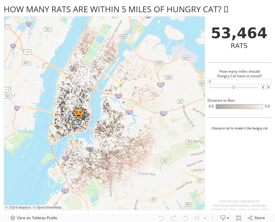
How Many Rats Are Near Hungry Cat?
action
,
distance
,
new york city
,
open data
,
rats
,
spatial
,
Workout Wednesday
No comments

And right after I taught this class to DS16, Lorna Eden posted the Workout Wednesday week 43 challenge. In this challenge, you had to find all casinos within X miles of a casino you click on. This required using the new DISTANCE function that came into Tableau 2019.3.1.
So, why not practice this technique more, but with rats? Instead of clicking on a casino, you can click on a rat to make it the Hungry Cat and find all rats within X miles of the cat. Silly, yes, and fun to practice too. The rats all have names too.
Lastly, I wanted to resize the dots based on the number of rats in the view. I used this blog post from The Data School, except I used an LOD instead of a table calc.
Enjoy! Find the rats near you.
September 30, 2019
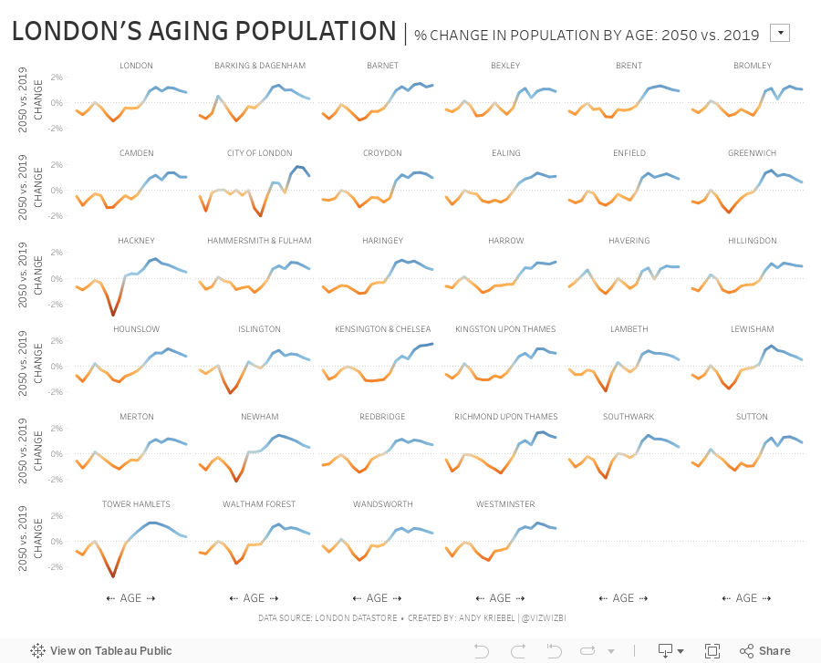
#MakeoverMonday: London's Aging Population
forecast
,
London
,
Makeover Monday
,
open data
,
population
,
projection
,
united kingdom
No comments

 |
| SOURCE: London Datastore |
What works well?
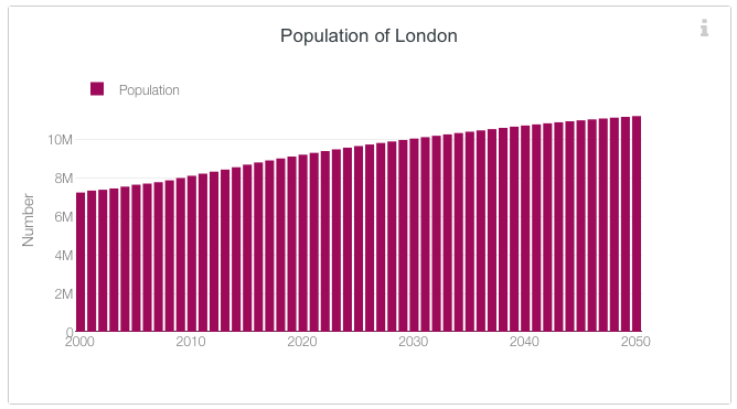
- It's a simple bar chart, which is very easy to read.
- Uses a single color; we often see the bars double encoded with the same value as the length of the bar.
- The axis starts at zero.
- Simple, clear axis labels
What could be improved?
- I think a line chart would be even easier to read.
- The title says "Population of London" but it's really the projected population plus the past population; some clarification would be good.
- The legend isn't needed.
- The y-axis title could either be removed or changed. "Number" doesn't mean a whole lot.
For my makeover, I was interested in comparing the distribution of the population by age for one year compared to the distribution of the population in 2050. For example, what was % of the population for 45 year olds for 2018 and 2050, then compare those two values. This then shows how the population distribution will change.
March 11, 2019
#MakeoverMonday: Has Philadelphia recovered from the Great Recession?
Makeover Monday
,
marginal histogram
,
mortgage
,
open data
,
philadelphia
,
real estate
No comments


What works well?
- Consistency of colors
- Simple design
- Using an area chart with a bold line at the top
- Bar chart is sorted
- Interactive actions
- Automatic proportional brushing
What could be improved?
- Reduce the outline of the zip codes on the map
- Remove the background from the map
- Add a dashboard title
- Change the chart titles to be more meaningful
And here's my makeover. Click to interact.
February 22, 2019
Where are New York's Parking Meters?
density
,
map
,
Mapbox
,
new york city
,
open data
,
parking
No comments

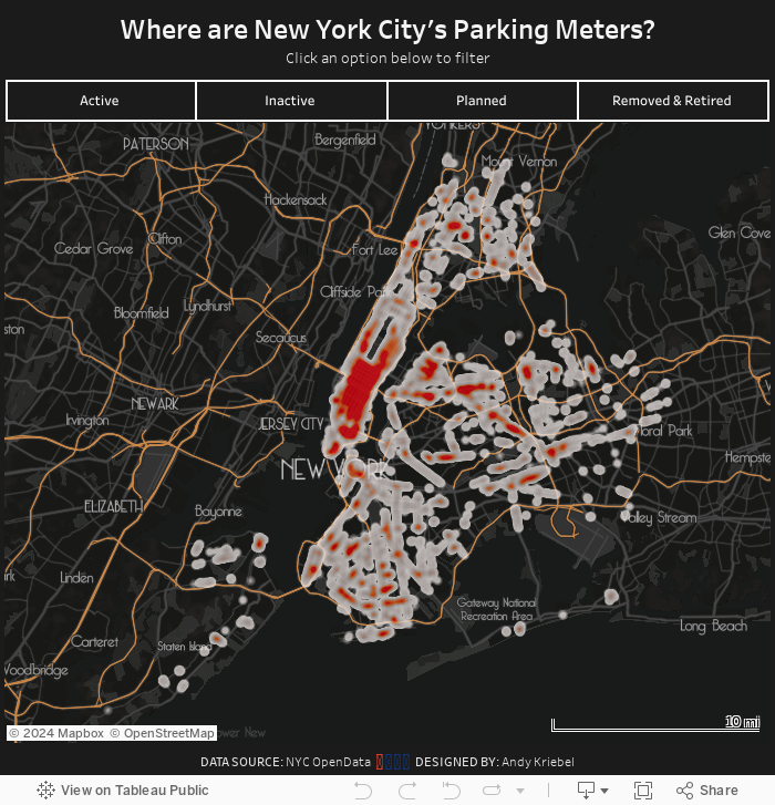
Their map is impossible to read with some many big dots overlapping each other. This also makes it hard to see the concentration of parking meters. My assumption going in was that you'd see way more in Manhattan.
All I really did was create a map, plot each point, and change the mark type to Density. From there it was formatting:
- Using a custom mapbox map, which I customized based on the mapbox template Metropolis.
- Play around with lots of colors, then intensity and opacity of each of those colors, before settling on a choice.
I probably could have done this process for days and days without ever finding a "perfect" solution for the formatting, so I decided it's good enough and wanted to get it published. Enjoy!
July 1, 2018
Makeover Monday: Where are New York's rats?
Alteryx
,
boroughs
,
frequency
,
heat map
,
Jowanza Joseph
,
line chart
,
Makeover Monday
,
new york city
,
open data
,
rats
,
tableau
,
tile grid map
No comments

The original article by Jowanza Joseph contains several fantastic visualization, most which look like they were created in R. For this week's makeover, we need to try to make this visualization better:

What works well?
- Simple title that tells us what the data is about and the time period
- Axes are clearly labeled
- Including light gridlines for context that aren't distracting
- Including every sighting as a dot for context; it's interesting how these show cyclical patterns
- Including an average line which confidence bands to show the overall pattern
- Excellent color choices; the purple really works well again the grey background
What could be improved?
- Include an explanation of what the line represents
- Include the data source and author's name
- Remove the word "Date" from the x-axis. That's implied by the title and the year labels.
What I did
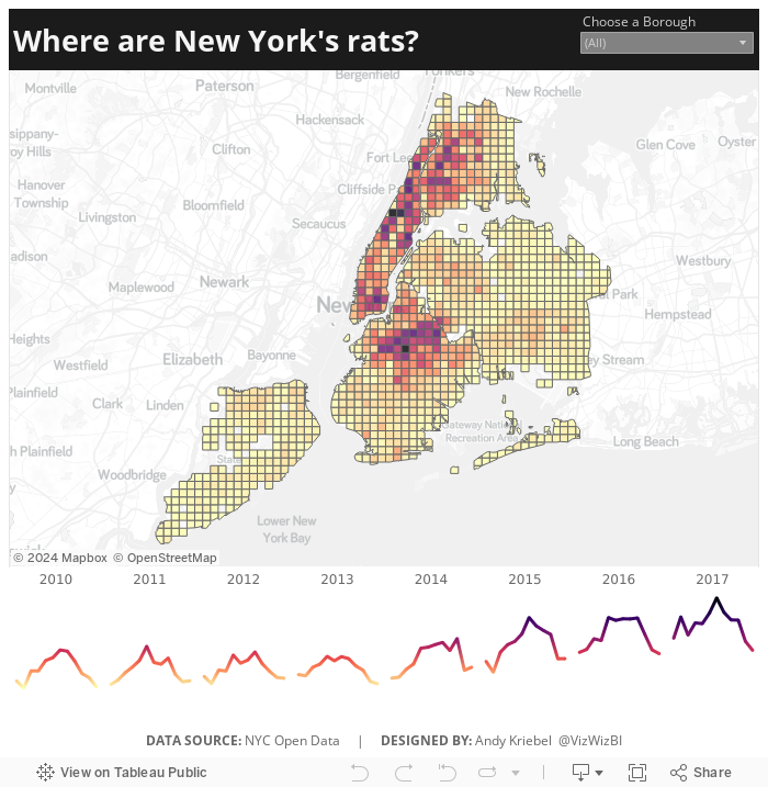
- We were doing Alteryx spatial training this week at The Data School this week, so I wanted to do something using the locations of the rats, but not a simple dot of where each sighting occurred.
- I wanted to use Alteryx as I'm working to improve my skills in that area.
- I create a tile grid map using Alteryx for London crimes last year and wanted to do that again, as I need to practice techniques several times to reinforce them.
- Create the tile grid map so every 1/2 mile and have them cut off at a Borough's edge
- Create a simple, minimalist map and line chart in Tableau
- Use the Magma color palette as I really like how it works as a heat map
Alteryx Workflow

The workflow is pretty simple. It takes the individual sightings, converts them to spatial points, assigns them to a 1/2 mile grid based on shape files available for each borough, then I export it as a shape file.
Tableau Visualization
In Tableau, it's simply a matter of double clicking on the spatial object, adding the borough and grid ID to give it the right level of detail, adding color by number of sightings, creating a line chart, adding a borough filter, and cleaning up the tooltips.
Because all of the heavy work was done in Alteryx, it takes about 10 minutes to create the visualization in Tableau, most of that time being formatting. With that, here's my Makeover Monday week 27 about rat sightings in New York City.
April 21, 2017
Five Years of Parking Violations in Philadelphia
#VizHawks
,
Amarendranath
,
Corey Jones
,
dashboard
,
Eagles
,
Eva Murray
,
interactivity
,
open data
,
parameter
,
parking
,
philadelphia
,
St. Joseph's University
,
violations
3 comments
Tuesday evening, Eva and I were invited by Amarendranath to participate in an event at St. Joseph's University in Philadelphia (my hometown) where we got to introduce them to Makeover Monday, watch Corey Jones give a great Tableau demo in which he introduced them to their challenge.
The data comes from the City of Philadelphia and was provided in a packaged workbook. This was sent to Eva and I as well, but the extract was painfully slow for me. I promised everyone I would create my own viz and the performance had to be addressed. I knew Exasol would give me the performance I was needing, so I created a workflow in Alteryx to take the CSV and upload it to Exasol. The great thing about throwing the data into Exasol is that I don't have to do any performance tuning. Exasol figures all of that out for you.
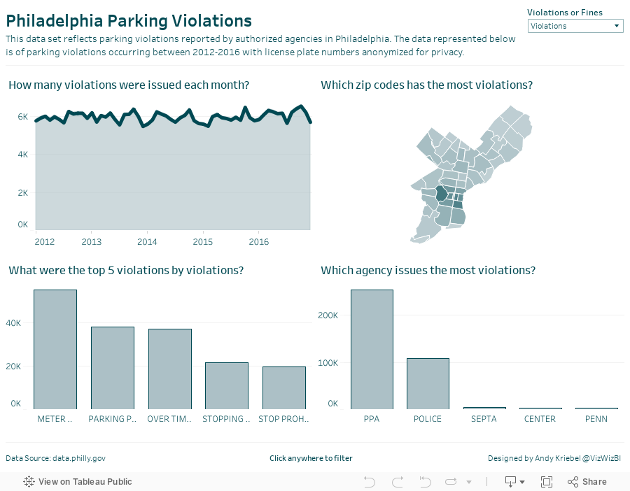
Now I was cooking with gas! I explored time series, types of violations, where violations occur, etc. to get a feel for the data. Next I went to back to the city's website and had a peek at their dashboard and thought it wasn't too bad. The major issue I see with it is filtering performance. I decided to build the same view in Tableau with a few changes:

How can you visualize 7.4 million parking violations in Philadelphia?
The data comes from the City of Philadelphia and was provided in a packaged workbook. This was sent to Eva and I as well, but the extract was painfully slow for me. I promised everyone I would create my own viz and the performance had to be addressed. I knew Exasol would give me the performance I was needing, so I created a workflow in Alteryx to take the CSV and upload it to Exasol. The great thing about throwing the data into Exasol is that I don't have to do any performance tuning. Exasol figures all of that out for you.
Now I was cooking with gas! I explored time series, types of violations, where violations occur, etc. to get a feel for the data. Next I went to back to the city's website and had a peek at their dashboard and thought it wasn't too bad. The major issue I see with it is filtering performance. I decided to build the same view in Tableau with a few changes:
- Create an aggregated extract that only includes the fields I need and aggregates to the monthly level. This significantly reduces the data for publishing to Tableau Public and makes the user experience better.
- Since the Eagles are my favorite NFL team, I changed the color scheme to use their official colors.
- I made the chart titles more informative by putting them in question form.
- I added an option for the user to switch between the number of violations and the amount of the fines.
All of this took about 30 minutes (primarily because the dashboard design was already done for me). Thanks Corey and Amarendranath for the opportunity to meet the team and participate! Let's do it again soon.
Subscribe to:
Posts
(
Atom
)






