Showing posts with label parking. Show all posts
February 22, 2019
Where are New York's Parking Meters?
density
,
map
,
Mapbox
,
new york city
,
open data
,
parking
No comments

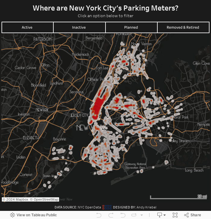
Their map is impossible to read with some many big dots overlapping each other. This also makes it hard to see the concentration of parking meters. My assumption going in was that you'd see way more in Manhattan.
All I really did was create a map, plot each point, and change the mark type to Density. From there it was formatting:
- Using a custom mapbox map, which I customized based on the mapbox template Metropolis.
- Play around with lots of colors, then intensity and opacity of each of those colors, before settling on a choice.
I probably could have done this process for days and days without ever finding a "perfect" solution for the formatting, so I decided it's good enough and wanted to get it published. Enjoy!
April 21, 2017
Five Years of Parking Violations in Philadelphia
#VizHawks
,
Amarendranath
,
Corey Jones
,
dashboard
,
Eagles
,
Eva Murray
,
interactivity
,
open data
,
parameter
,
parking
,
philadelphia
,
St. Joseph's University
,
violations
3 comments
Tuesday evening, Eva and I were invited by Amarendranath to participate in an event at St. Joseph's University in Philadelphia (my hometown) where we got to introduce them to Makeover Monday, watch Corey Jones give a great Tableau demo in which he introduced them to their challenge.
The data comes from the City of Philadelphia and was provided in a packaged workbook. This was sent to Eva and I as well, but the extract was painfully slow for me. I promised everyone I would create my own viz and the performance had to be addressed. I knew Exasol would give me the performance I was needing, so I created a workflow in Alteryx to take the CSV and upload it to Exasol. The great thing about throwing the data into Exasol is that I don't have to do any performance tuning. Exasol figures all of that out for you.
Now I was cooking with gas! I explored time series, types of violations, where violations occur, etc. to get a feel for the data. Next I went to back to the city's website and had a peek at their dashboard and thought it wasn't too bad. The major issue I see with it is filtering performance. I decided to build the same view in Tableau with a few changes:
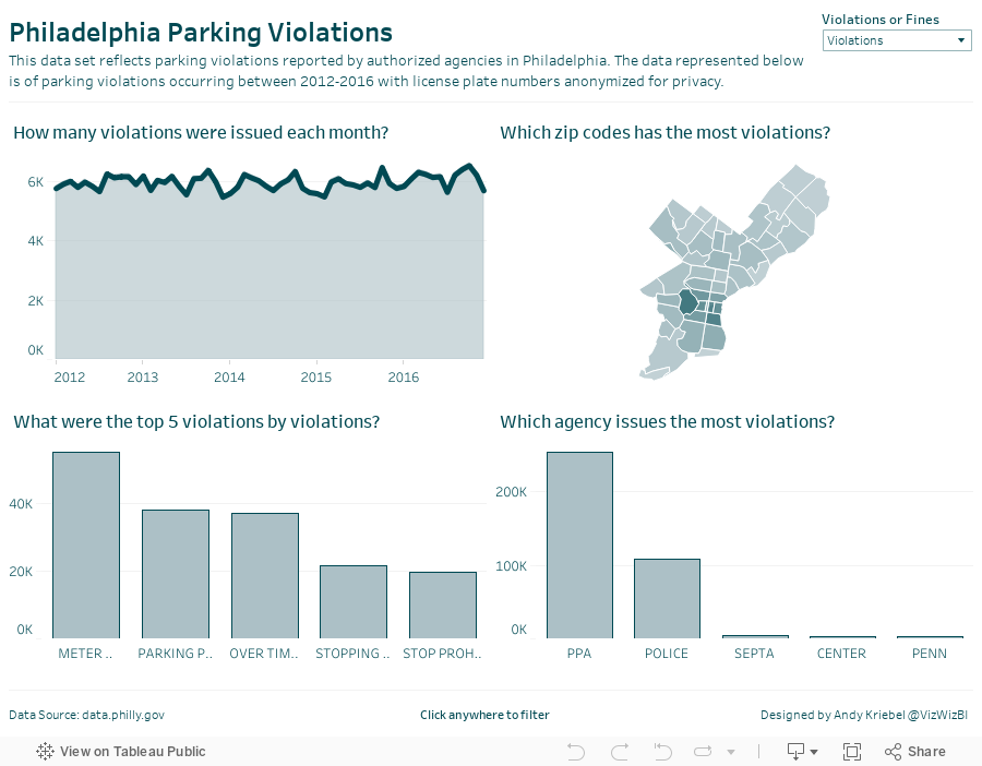

How can you visualize 7.4 million parking violations in Philadelphia?
The data comes from the City of Philadelphia and was provided in a packaged workbook. This was sent to Eva and I as well, but the extract was painfully slow for me. I promised everyone I would create my own viz and the performance had to be addressed. I knew Exasol would give me the performance I was needing, so I created a workflow in Alteryx to take the CSV and upload it to Exasol. The great thing about throwing the data into Exasol is that I don't have to do any performance tuning. Exasol figures all of that out for you.
Now I was cooking with gas! I explored time series, types of violations, where violations occur, etc. to get a feel for the data. Next I went to back to the city's website and had a peek at their dashboard and thought it wasn't too bad. The major issue I see with it is filtering performance. I decided to build the same view in Tableau with a few changes:
- Create an aggregated extract that only includes the fields I need and aggregates to the monthly level. This significantly reduces the data for publishing to Tableau Public and makes the user experience better.
- Since the Eagles are my favorite NFL team, I changed the color scheme to use their official colors.
- I made the chart titles more informative by putting them in question form.
- I added an option for the user to switch between the number of violations and the amount of the fines.
All of this took about 30 minutes (primarily because the dashboard design was already done for me). Thanks Corey and Amarendranath for the opportunity to meet the team and participate! Let's do it again soon.
Subscribe to:
Posts
(
Atom
)






