November 22, 2022
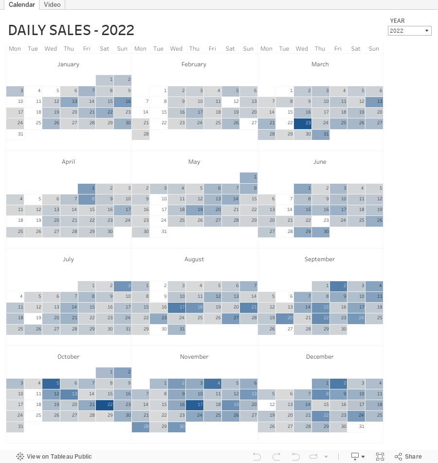
How to Create a Full Year Calendar Heatmap in Tableau

Calendar heatmaps are a great way to visualize time-series data over an entire calendar year. Individual days are shaded on a light-to-dark gradient based on a measure that has been added to the visualization.
Creating a heatmap for a single month in Tableau is pretty straightforward. It gets a bit more complicated when you want to view an entire year at once. In this tip, I going to show you, step-by-step, how to create a full year calendar heatmap in Tableau. The workbook is below this video to download.
#MakeoverMonday Week 47 - Worldwide Railroad Infrastructure Quality Rankings

- Recreating the original bar chart
- How to create a bump chart
- How to use a diverging color palette and alias country names
- How to create a ranked dot plot
- How to use parameter actions to sort the view
- How to use a filter action to remove the highlighting
November 17, 2022
How to Create a 3 Level Scatterplot Drilldown
If you want to drilldown multiple levels in a scatterplot, this tip is for you. In this tip, I show you have to create a 3 level drilldown with a scatterplot.
Naturally after I showed how to create a 3 level bar chart drilldown, someone immediately asked how to do it with a scatterplot. Unlike the bar chart drilldown, the scatterplot will only show you marks for the current level.
For example:
- When I’m at the highest level, I see only regions.
- When I drill down one level, I only see States within the Region selected
- When I drill down one more level, I only see postal codes that are within the region and state I selected.
This example shows you how to drill down from Region to State to Postal Code. To use this for yourself:
- Download the workbook
- Copy all of the calculations into your workbook
- Swap out the dimensions
Note that you will need to recreate the sets and set actions. This will work with any combination of 3 dimensions.
November 14, 2022
#MakeoverMonday Week 46 - The Cost of Cocaine & Heroin

Quite the interesting topic this week. I get an email from The Economist regularly and there was an article about the wholesale price of cocaine. That led me down a rabbit whole and I found the data, but also for heroin and also for retail prices.
On Watch Me Viz, I stuck with simple lines charts that compared the price for a country to the overall price for all of the countries in the data set. I allow the user to choose a drug and a country.
I then wanted to show how to Dynamic Zone Visibility feature works (if you haven't seen it, be sure to watch it back). In the end, a simple dashboard that compares the measures in two ways, allows for some filtering, looks good, and that's it.
Check out the dashboard below the video.
November 10, 2022
How to Add Hundreds of Custom Color Palettes
Tableau comes with some great color palettes that have been designed to work well together. And you can add your own custom color palettes by making a couple of simple changes to the preferences.tps file that comes with Tableau Desktop. For example, you may have a color palette that matches your company’s brand.
In this video I show you how to add 3 different types of color palettes to Tableau:
- Categorical
- Sequential
- Diverging
November 8, 2022
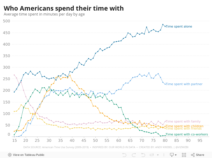
#MakeoverMonday Week 45 - Who Americans Spend Their Time With

November 4, 2022
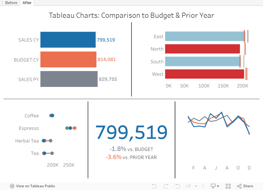
Tableau Charts: Comparison to Budget & Prior Year
Are you looking for ways to improve how you visualize comparisons between 2 to 3 performance measurements in Tableau?
In many performance monitoring dashboards, you need to make comparison of actual values to budget or target. In this video, I will show you effective ways of making these comparisons.
I will also show you how to compare your performance to prior year (PY) to see if performance is improving year over year.
One thing you'll notice in these examples is the consistent use of color. Make sure your metrics use the same colour throughout your dashboards, reports and worksheets. The colors should be easy to differentiate.
I have 4 designs that you can apply to make any comparison look better and easier to understand.
Download the workbook for a bonus 5th chart type that compares these three metrics over time.
November 1, 2022
#MakeoverMonday Week 44 - Fundraising vs. Spending by Members of the 117th Congress

The midterm elections in the US are next week. If you're able to vote, please do. Democracy is at stake.
This week's data was about fundraising, spending and debt by people currently in Congress. If you missed #WatchMeViz, I showed 16 different ways to visualize this data set. Hopefully they give you a bit of inspiration for creating your own.
Catch up with the show below. In the end, I went with a bar chart that compares funds raised vs. spent by State. I also have a gantt bar to show the difference between the two. I have a tutorial of that chart here.
Below this video is an image of the dashboard I created. Click on it to see the interactive version on Tableau Public.


