November 8, 2022
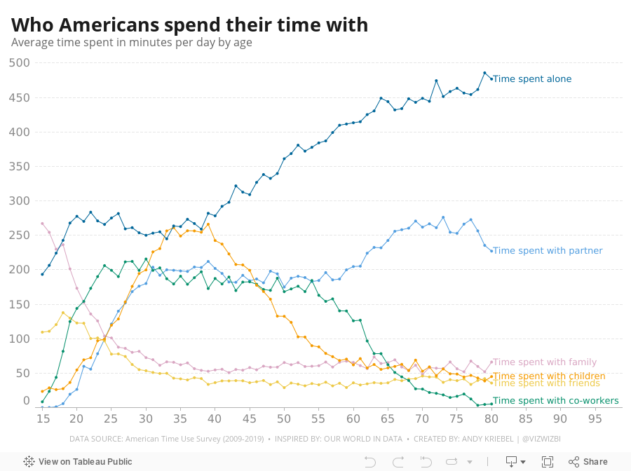
#MakeoverMonday Week 45 - Who Americans Spend Their Time With

September 5, 2022
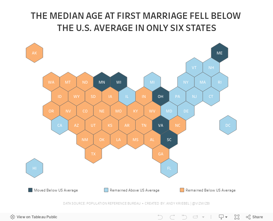
#MakeoverMonday 2022 Week 36 - Median Age at First Marriage in America

This was a relatively simple data set and I was able to build quite a few vizzes during Watch Me Viz. I ended up with something more complex that it needed to be, but it was fun figuring out how to create the calculations.
Here's how it works:
- Compare the median age at first marriage of each state to the US average for 2006-2010
- Compare the median age at first marriage of each state to the US average for 2015-2019
- Check whether the State
- Stayed above the US average in both time periods
- Stayed below the US average in both time periods
- Moved from below the US average to above the US average
- Moved from above the US average to below the US average
July 12, 2021
#MakeoverMonday 2021 Week 28 - COVID Vaccination Rates by Ethnicity and Age in England

June 7, 2021
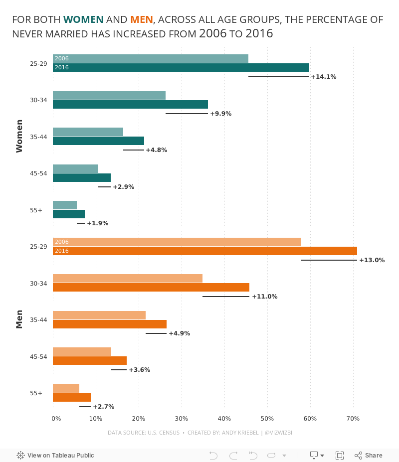
#MakeoverMonday 2021 Week 23: The Percentage of Never Married is on the Rise

- Final Viz (and below)
- Preferences file (all of my custom color palettes)
- How to Create a Combination Bar Chart & Candlestick Chart
November 19, 2020
Pregnancy, Birth, and Abortion Rates in America

With Amy Coney Barrett being sped through the confirmation process of the US Senate before the 2020 Election (as hypocritical as it was) to become the 9th justice on the Supreme Court, there is now a conservative stranglehold on the judicial branch of government.
Justice Barrett deflected all questions about her stance on abortion during the confirmation process and it has raised lots of speculation that Roe v. Wade will be overturned. Yeah, you know, because the government should control a woman's body, yet there is nothing similar for men. Like, why doesn't a man get castrated if he accidentally impregnates a woman? Blasphemy they say; hypocritical I say.
I wonder if any of the anti-abortion Justice or Congresspeople have ever considered their stance if their daughter had an unplanned pregnancy. What is she got raped and pregnant? I bet their tune would change.
Anyway, my political and social views aside, this made me think about abortion rates in America. Since Roe v. Wade, abortion rates in the US have plummeted.

November 4, 2018
Makeover Monday: America's Aging Population

The original visualization is from the US Census Bureau:

What works well?
- The title above the charts tells us the insights in the data. This is a very effective technique.
- The colors work well together.
- Labels for the ages are well-placed and colored to represent the lines
- Labeling the start and end of the lines
- Hiding the axis but still leaving the axis title
- Including the note about the 2016 data
What could be improved?
- Remove the title at the very top, the entire blue section
- Make the footer less prominent; it's competing with the viz for attention when it should be secondary
- Kill the bar chart; it looks strange have axis labels for every five years, but then only showing the data for a set of years
- Remove the dots on the lines except for the start, end and where the lines cross
- Remove the vignette shading behind the charts
What I did
- I like the idea behind the line chart, so I used that as my starting point.
- I pivoted the data by age, then created age groups that match the original (under 18 and 65+).
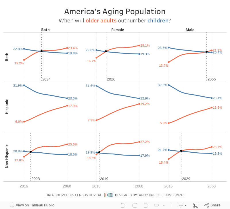
- I wanted to compare ages and origins for the two age groups to see if the crossing of the populations is consistent (spoiler, it's not).
- I wanted to add focus to the year the lines cross. I did that by adding a black dot on that year and by including a reference line.
- I kept the labeling of the start and end of each line.
- While the population in total gradually shifts towards the older generation, the split between hispanic and non-hispanic does not follow the same pattern.
- Older hispanics will likely outnumber hispanic children between 2070 and 2075, whereas non-hispanic older people will outnumber non-hispanic children much sooner.
- The female population is shifting much more quickly to the older generation than males.