Showing posts with label marriage. Show all posts
September 5, 2022
#MakeoverMonday 2022 Week 36 - Median Age at First Marriage in America
age
,
bar chart
,
color
,
connected scatterplot
,
hex map
,
level of detail
,
LOD
,
Makeover Monday
,
marriage
,
reference line
,
scatter plot
,
table calculation
,
tableau
,
tadpole chart
,
USA
No comments

This was a relatively simple data set and I was able to build quite a few vizzes during Watch Me Viz. I ended up with something more complex that it needed to be, but it was fun figuring out how to create the calculations.
Here's how it works:
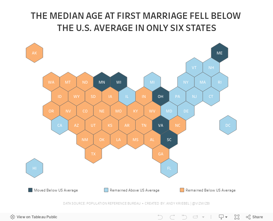
- Compare the median age at first marriage of each state to the US average for 2006-2010
- Compare the median age at first marriage of each state to the US average for 2015-2019
- Check whether the State
- Stayed above the US average in both time periods
- Stayed below the US average in both time periods
- Moved from below the US average to above the US average
- Moved from above the US average to below the US average
Got it? Yes, it a bit confusing. In the end, we were able to highlight 6 states that moved above the US average to below the US average. All others stayed the same. What does this mean from an analytical perspective? Probably nothing, but it looks better than the original.
Check out the viz below the video or here.
June 7, 2021
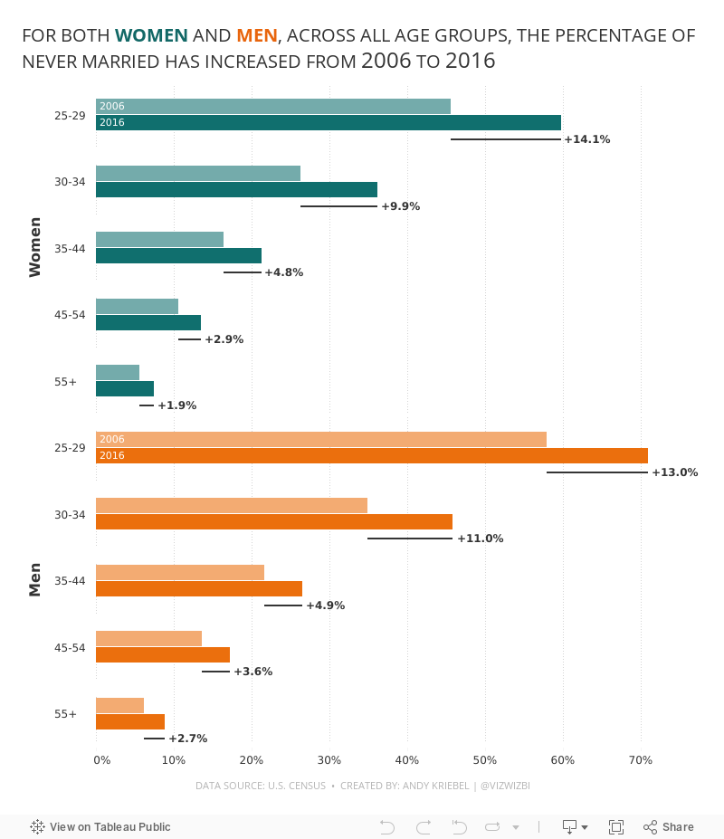
#MakeoverMonday 2021 Week 23: The Percentage of Never Married is on the Rise
age
,
bar chart
,
bar in bar
,
butterfly chart
,
candlestick chart
,
charts
,
dumbbell
,
gender
,
graphs
,
Makeover Monday
,
marriage
,
population pyramid
,
slope graph
,
time
,
tip
,
tutorial
,
WatchMeViz
,
year
No comments

Resources:
- Final Viz (and below)
- Preferences file (all of my custom color palettes)
- How to Create a Combination Bar Chart & Candlestick Chart
December 29, 2015
Dear Data Two | Week 36: Indecision
anxiety
,
bar chart
,
circles
,
color
,
Dear Data Two
,
lollipop
,
marriage
,
shapes
,
stress
2 comments

- Who I was with?
- What stress level did it introduce?
- What was the major topic?
- How long will it take to resolve?
- Was it resolved by the end of the week?
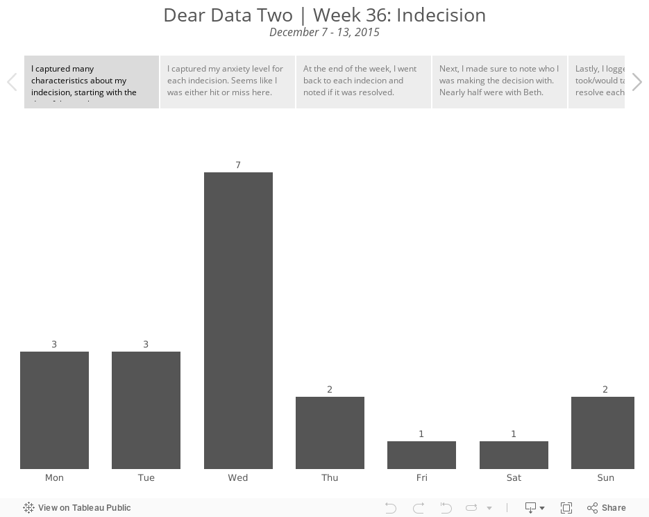
I'd never really thought much about my indecision before, so this proved to be quite an interesting exercise for learning more about what goes through my head. For the week, I logged a total of 19 indecisions. Of those 19:
- There was an even split (42%) between low and high anxiety levels. To me, that means that my decisions were either simple or hard, which doesn't surprise me as I'm a pretty much black or white kind of person.
- I was able to resolve 68% of my indecisions. I take that as a good sign that I follow up on things and try to not let things pester me for too long.
- As for who I was with, nearly half of the indecisions I logged were with my wife. That didn't strike me as unusual because it's really just a sign of a married couple making decisions together.
- 79% of my indecisions took days or less to ultimately resolve.
Ok, so what does all of this mean? Is there anything particular about the decisions I make with Beth?
The short answer is yes. 7 of the 9 records that include my wife I considered to be high stress decisions. But on the flip side, we were able to resolve 6 of the 9. That's a sign of a strong marriage, right? And those 3 that we didn't resolve? Well, those all had to do with money. And money is typically always the hardest thing to work out in a marriage. To me, this means we're normal.
As for the postcard, I wanted to create something similar to Giorgia's postcard for the week, with the swirls and all. And I also wanted to see if I could create the same effect in Tableau. I was able to get really close in Tableau.

Lastly, here is my entire Tableau analysis, plus my postcard. Enjoy!
November 6, 2010
What is a reverse time-series line chart with a non-zero axis?
I never knew such a chart existed, but alas I found one, and I hope it becomes extinct! Occasionally I scan through Many Eyes visualizations for ideas and/or blog inspiration. Let's review this simple line chart of Estimated Median Age at First Marriage. Click on the image below to get started.
When I first saw this I thought "Wow! What a huge variance over the years!" But then I looked a bit closer and saw that:

When I first saw this I thought "Wow! What a huge variance over the years!" But then I looked a bit closer and saw that:
- The years are backwards. A time-series line chart should nearly always start with the oldest time period on the left. I can't even think of a way to interpret time backwards. Maybe the DeLorean from Back to the Future could help.
- The Y axis does not start at zero. This creates a misleading variance. It appears there has been a 700% variance from highest to lowest, but really it's only 35%.
- The Y axis should be rounded to a whole number; this is unnecessary precision.
- I find myself having to refer back to the legend to remind myself which sex is represented by which color. They are way too close in hue. Why not use blue for men and pink for women?
- The Years on the X axis are at an angle and squished together. If you must show all of the years, the turn them a full 90 degrees. In the end though, I believe the purpose of the chart is to show a trend, so I don't need to see all of the years, just enough so that I know it's a regular interval.
- One more thing. It's very subtle. This is NOT a regular interval after all. Between 1890 and 1940, there is only one measure per decade. Only beginning in 1947 is there data for every year. I would only display 1947-2003.
Subscribe to:
Posts
(
Atom
)






