June 7, 2021
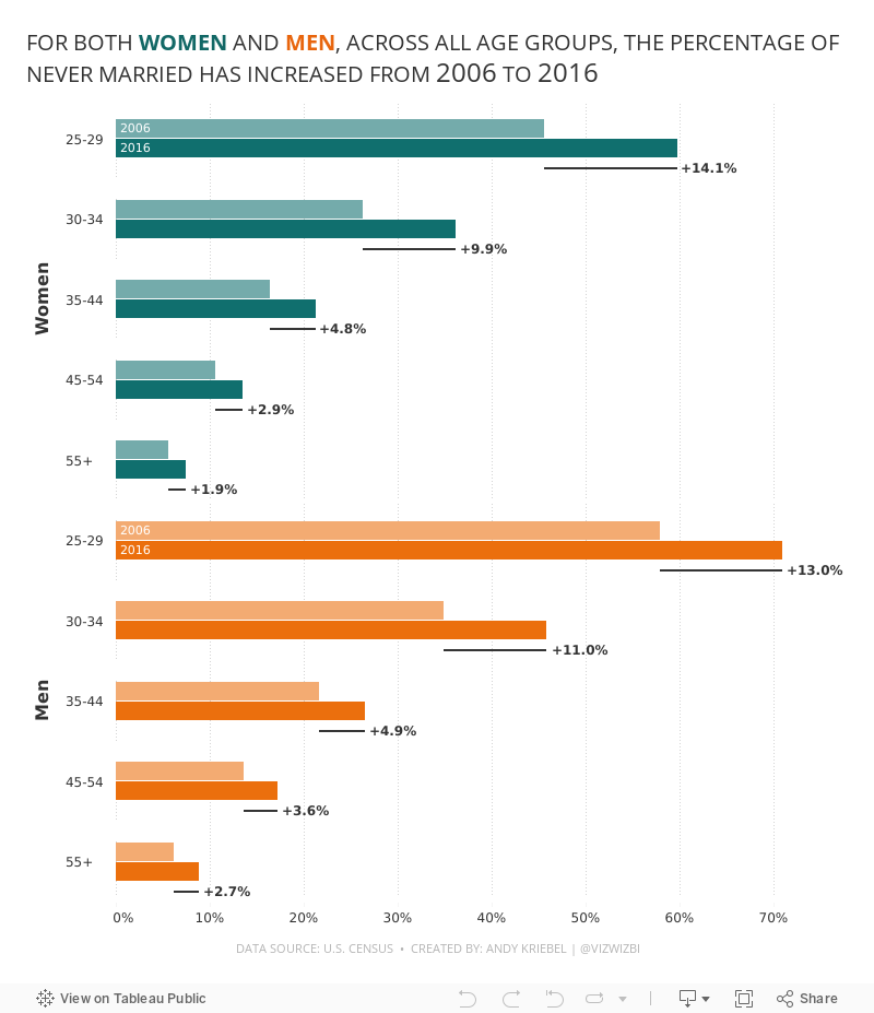
#MakeoverMonday 2021 Week 23: The Percentage of Never Married is on the Rise

- Final Viz (and below)
- Preferences file (all of my custom color palettes)
- How to Create a Combination Bar Chart & Candlestick Chart
September 25, 2020
#WorkoutWednesday 2020 Week 3: Orders by Day and Time
As time permits, I'm going back through some of the Workout Wednesday challenges that I've yet to complete. I'm starting with those that will help me most as a teacher to impart what I learn on those that I have the pleasure to train at The Data School.
For week 3, Lorna Brown challenged us to create a viz that shows the number of orders by hour of the day that allows the user to swap between day of the month and weekday.
In her solution, she chose to create two sheets, one for the day of the month and another for weekdays. I didn't know that when I tackled the challenge so I proceeded down the route of doing it all in one sheet. Success!
I did a couple things differently than Lorna:
- I combined the order date and time into a string calculation and then used the DATEPARSE function to make it a date/time field.
- The size of my circles depends on the option selected in the parameter. For day of the month, the size is the number of orders. For weekday, I have them set to a fixed size. I chose to make them a fixed size because otherwise the circles become way too big for the view.
- I used only one sheet.
- I am not showing a tooltip when there are no orders.

May 15, 2016
Makeover Monday: How warm is Earth becoming?

There was a lot of chatter on Twitter last week about this terrific visualisation by Ed Hawkins:
Spiralling global temperatures from 1850-2016 (full animation) https://t.co/YETC5HkmTr pic.twitter.com/Ypci717AHq
— Ed Hawkins (@ed_hawkins) May 9, 2016
The beauty of this visualisation is in the animation. However, without the animation, it kind of fails to tell the story. Let’s dig a bit deeper.
What works well?
- There is a clear title.
- The background circles provide helpful context.
- Including the month labels makes it easier to understand what you’re seeing.
- The year in the middle helps tell the story.
- The animation is compelling.
- It has a nice color scheme that works well on a black background.
What could be improved?
- While the title is clear, it could be more eye-catching, like a news headline.
- If you see this as a static image, you lose the sense of change.
- You can’t compare any time periods. All you know is 2016 is the warmest.
- There’s no explanation about what the numbers represent. Though I do see in the Twitter post a link to additional information.
- The color scale has nothing to do with the temperature change, which I assumed it did until I read hte additional information. The colors actually represent the years. That doesn’t add much value. I think coloring by the temperature change would be more impactful.
So, this data set is actually incredibly simple. All we have is one record per month, the temperature, and the confidence intervals.
The first thing I wanted to do was rebuild the radial chart. This wasn’t nearly as easy as I thought. This post by Jonathan Trajkovic was very helpful, but it wasn’t designed for months. I’ll record how I did made it for a future Tableau Tip Tuesday.
 |
| Click the image for the interactive version |
This radial chart is basically the same as the original, however I can’t make it “play”on Tableau Public and I also changed the color to be the median temperature difference. Really, I only built this to see if I could. It’s not any more useful than the original.
Next, I took the radial chart and flattened it out.
 |
| Click the image for the interactive version |
This doesn’t make the understanding all that much easier because I can’t tell which years are which. Maybe I should switch the color legend back to years?
 |
| Click the image for the interactive version |
Oh wow! What a difference! Now I can easily see the distinction between the older and more recent years. I think this is much, much better than the original, especially in static format. I wanted to keep iterating though.
Whenever I’m working with time-based data, I like to build either calendar heatmaps or heatmaps by year and month. Here’s what this data set looks like as a heatmap:
 |
| Click the image for the interactive version |
The heatmap makes the series of lines even easier to understand. It’s super easy to see the gradual temperature change over time. This is pretty compelling, yet I wanted to keep going. Was there a better way to tell the story?
Next I looked at the 10-year average, that is, a 120 month moving average of the median temperature change. I then overlaid the confidence intervals.
 |
| Click the image for the interactive version |
Lastly, I took the 10-year moving average view and replaced the monthly confidence intervals for the monthly values while keeping the overall 10-year average. This is my submission for Makeover Monday. In this view, I like how I can see the drastic monthly fluctuations but still have the overall context. Including a reference line at zero helps emphasize the dramatic change since about 1984.
I also included a strip plot under the graph that shows the average median temperature difference for the entire year. This brings back a bit of the heatmap view above.
In the end, another fun week with a simple data set that provides lots and lots of options. Which one do you like best?
UPDATE: This week has been a fascinating exercise in iterating. That’s the beauty of Tableau. I can get another idea and build it quickly. After seeing some of the submission for this week, I thought a jitter plot might work well. Thoughts?
 |
| Click the image for the interactive version |
December 4, 2015
Dear Data Two | Week 30: Time Alone

This was the first time I ever remember consciously thinking about my state of “being alone” and what being alone means. I always thought that I was alone more than I apparently am. In this week, I was alone 44% of the time, and what really surprised me is that I was alone the most on a Saturday, which is when I normally spend a lot of time with the kids. Perhaps this isn’t a representative week of my life due to our family holiday. If you don’t count sleeping as time alone, then I spent very, very little time alone in this week. I really do enjoy being around people though.
As for the data collection, I created a spreadsheet for each hour of each day and recorded whether I was alone or not. I defined “alone” as being either:
- By myself
- Around others but not interacting with them
- In an “alone” state of mind
From there, I recorded what I was doing during each hour. I then looked at Stefanie’s postcard because I wanted to emulate what she did in Tableau before creating my own postcard.
September 8, 2015
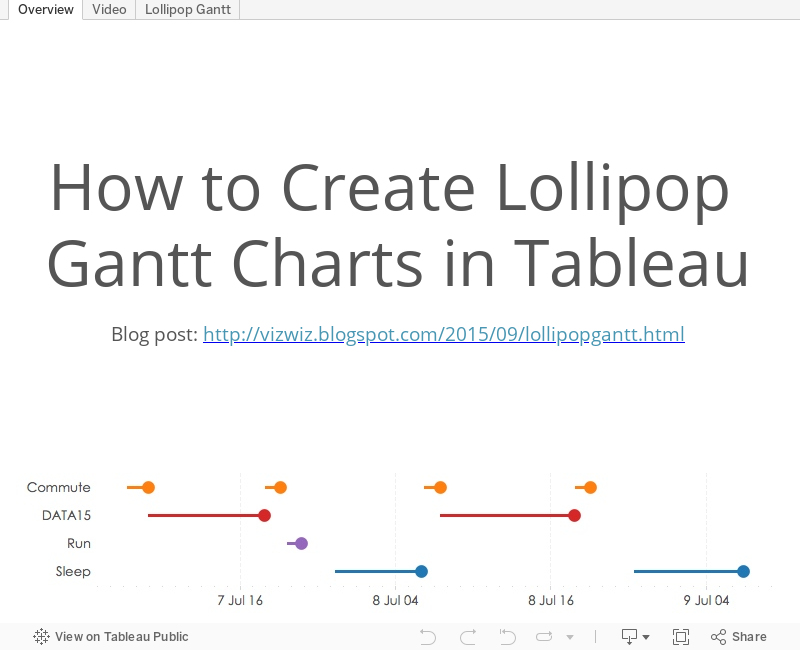
Tableau Tip Tuesday: How to Create Lollipop Gantt Charts

August 7, 2015
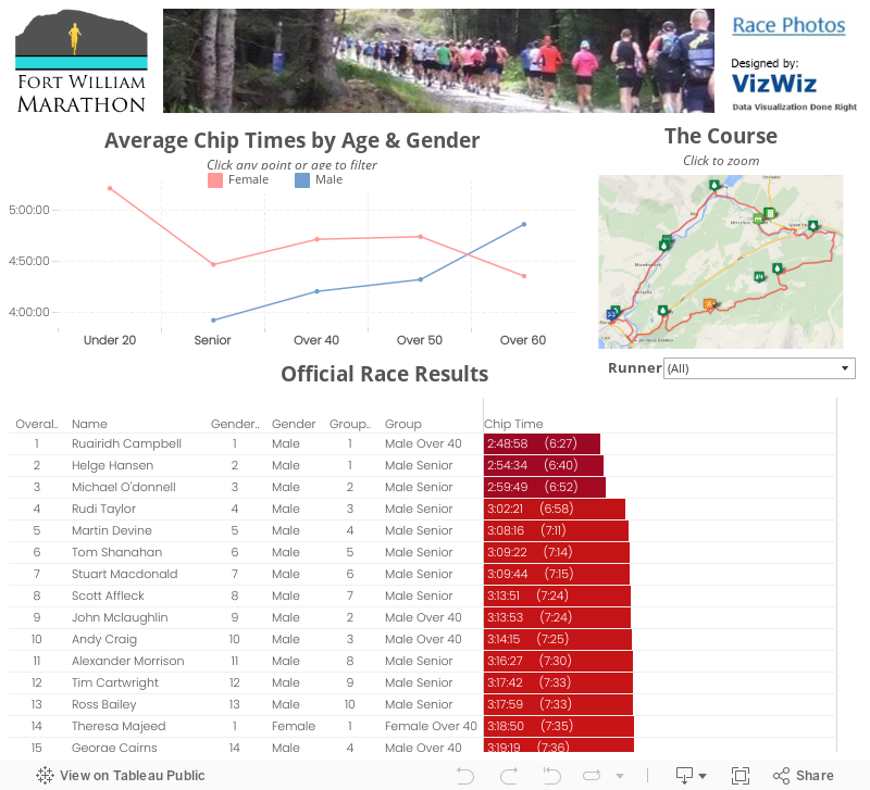
Fort William Marathon: Race Recap & Visualised Results
 |
| I met Hairy Coo on my shakeout run Saturday. Quite the nice guy! |
 |
| Really happy with my result, especially with how much I stopped |
 |
| Finishers medal that I'll cherish forever |
 |
| Nothing beats your kids cheering you on and waiting for you at the finish |
For a first marathon, many people told me I was crazy for choosing this course, but I wouldn't trade it for anything. It was incredibly well organized, small, and the setting was second to none. Seriously, how often do you get to run in the Scottish Highlands?
March 27, 2015
An Analysis of My Commute on Facebook's Dublin/Castro Valley Shuttle
- I’ve been riding the Facebook shuttle to work for almost a year.
- I’ve been tracking my commute time via Swarm check-ins.
- I decided to drive to work yesterday for my last day.
- I got my first ever speed ticket on my way to work.
Anyway, here is my analysis of my commute to work on the shuttle. There are filters for the time of the commute and the schedule. Use the drop down to select various displays: the default is a calendar view and the other views are various dot plots.
Click on the image for the interactive version.
.png)
December 15, 2014
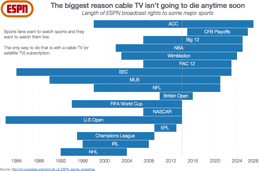
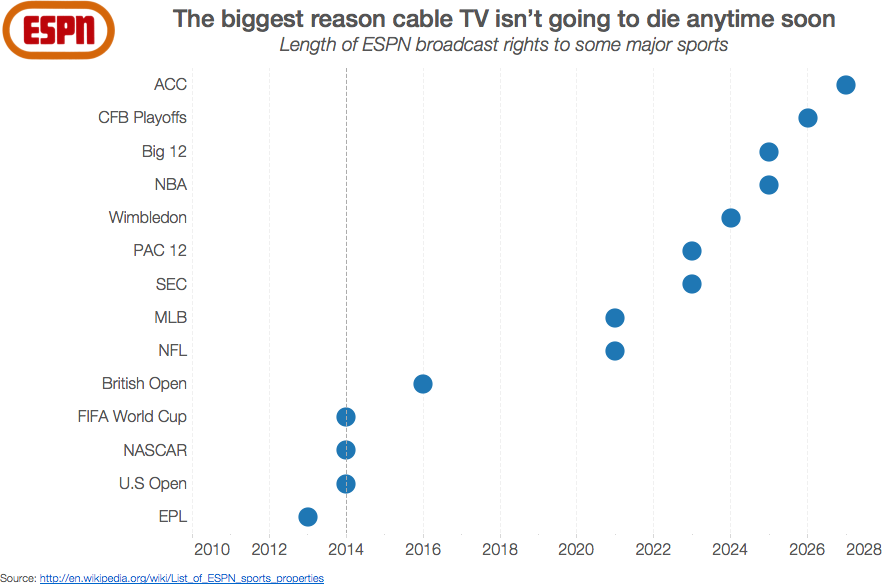
Makeover Monday: ESPN is biggest reason cable TV isn’t going to die anytime soon
Consider this simple bar chart by Cork Gaines of Business Insider:

Seems simple enough, right? Simple, yes. But is it 100% truthful? No.
- I'm not convinced the data is accurate. The rights listed on wikipedia don't align, but you shouldn't assume wikipedia is 100% accurate either.
- The very first bar bugs me. How can you bucket a bunch of sports into NCAA when each sport has a separate contract?
- Using a bar chart assumes that all of these contracts started in 2010, which is not the case.
- This chart shows that the college football playoff contract started in 2010, yet the CFB playoffs don't start until 2015. This is clearly wrong.
May 8, 2013
Done is better then perfect
I was going through files on my laptop this morning and stumbled upon this picture I had captured back in December. I can’t recall where I found it, it may have been here, so apologies to the creator in advance for not giving proper credit.

Many of the projects I work on are prototypes, which makes this “law” especially true for me. And this is one of our mantras at Facebook, basically get stuff done.
Keep this in mind for your next project. I can guarantee you that any project you’ve ever worked on is not perfect and any project you will ever work on will not be perfect, so don’t waste your time trying to be perfect. Good enough is perfectly acceptable and helps you move onto to other projects where you can continue to make an impact. Focus on impact, not perfection.
And yes, I did intentionally use improper grammar in my title.
February 20, 2012
How to Create a Two-Panel Column Chart in Tableau (and save lots of time compared to Excel)
I love Jon Peltier’s Tech Blog. He always has great tips for getting things done in Excel and his recent post “Easy Two-Panel Column Chart in Excel” is no exception. In this post Jon walks you through how to create this chart in Excel:

Seems pretty straight forward, right? Well not exactly. I wouldn’t exactly call this technique easy. In Jon’s post, I quickly counted about 13 steps (I think there are more; I lost count as I recreated the chart), but there are many clicks for each of these steps. It took me a bit over five minutes to create it the first time, but this included flipping back and forth between Excel and the instructions. I suspect it would take two minutes or less once you use this technique a few times. Again, let me emphasize that this is a great technique for Excel.
One big drawback for this technique though is that you are forced to hard code the scales. What happens if your data changes? You’d need to go back into each axis and reset them. Kind of a pain if you ask me. I’m sure I’d forget at some point too.
Also, I don’t like how the axis scales are not on the same side of the chart.
How many clicks it would take to create the same chart in Tableau? Step-by-step, here are the instructions (with click counts in parentheses):
1. Drag the Month dimension onto the Column shelf (1 click)

2. Hold the CTRL key and choose both the Primary and Secondary measures, then drag them onto the Rows shelf (3 clicks)

Two steps/Four clicks and we’re already 95% of the way done.
3. Drag the Measure Names dimension onto the Color shelf (1 click)

That’s it! Five clicks and we’ve created a two-panel column chart in Tableau. I timed myself and it took five seconds to create this chart. Of course, you need to spend the money on a copy of Tableau.
In summary, let’s assume:
- It takes two minutes to get the chart exactly as you want it in Excel (but you still have to fix the scales every time you change the data)
- It take 30 seconds on Tableau (though I can’t see how it could take that long and you DON”T need to update the scales each time)
- This gives you a 75% time reduction in creating just this one chart
Think about all of the time you would save if you did EVERY chart in Tableau. This makes the ROI story for Tableau pretty simple if you ask me.






