June 13, 2012
Are you considering relocating to another country? Maybe one of these cities is a good fit.
Timely that Mercer published its World Cost of Living Survey yesterday (12 June 2012) as I’ll be moving to San Francisco soon for a super cool data viz opportunity with Facebook. I thought for sure that San Francisco would be in the top 50 (we had some serious sticker shock look at houses out there!!), but it’s not.
Select data was released by the Guardian. They posted this infographic (click to enlarge), but I found it a bit difficult to circumnavigate. It’s challenging to find patterns and compare the data. For me, there’s too much information in one view. It’s good for an overview and to print, but challenging for analysis.
Note that the data is a subset of countries; it does not represent the top 50.
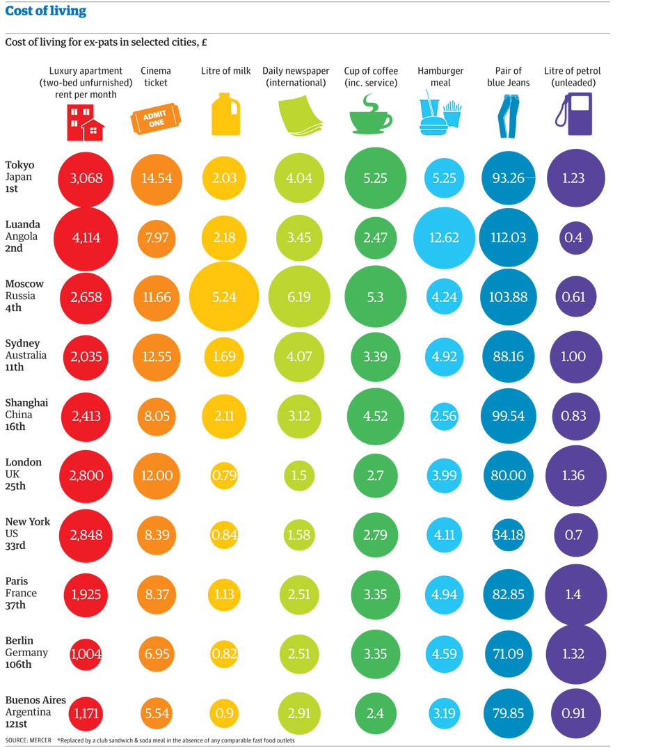
I downloaded the data and built this simple viz in Tableau.

I wanted to be able to compare countries and two expenditures simultaneously, so I used Tableau’s parameters feature to allow you to choose the what you want to compare.
I intentionally included both a map and scatterplot so that you have multiple methods for comparing the data. Click on a country on the map or a circle in the scatterplot to highlight the country. Hover over a circle for more information.
The 2nd tab is a reproduction of the infographic the Guardian produced. It’s for reference only. I doubt you can glean much insight from it.
There are some expenditures that I would have expected to correlate highly that don’t. Blue jeans vs. cinema is a good example of this. Or a cup of coffee and a newspaper. Don’t those two go hand in hand?
June 8, 2012
Donut charts are worse than pie charts: Have no fear! There are many alternatives.
Ironically enough, donut charts are basically pie charts with a hole in the middle, leaving you with even less information to fill your brain.
Donut charts are used to display data in rings, where each ring represents a data series. Each ring is a distinct category. Yes, there are examples of donuts within donuts (here is a particularly horrific example from Dundas).
Once again, Nielsen provides another example to pick on review. At least their consistent in their ineffectiveness, right?

Pie charts can be effective, rarely, but I don’t see why you would ever use a donut chart over a pie chart. Let’s look at some alternatives to Nielsen’s infographic.
Alternative 1 – Pie Chart

Grade = F
- It’s a pie chart
- It’s a pie chart
- It’s a pie chart
Alternative 2 – Bar chart by Device by Category

Grade = C
- Comparisons between Devices is difficult
- Data is sorted by frequency of using the Device, making it harder to see the winners and losers
- The coloring by Category is distracting
Alternative 3 – Bar chart by Category by Device

Grade = B
- Easy to compare devices, which was the point of the article
- Labels removed since the exact values are not all that important and distract from comparing the size of the bars
- Devices are sorted by frequency within each Category, making it easy to see the winners and losers in each Category
- The colors neatly segment the data
Alternative 4 – Heat Map

Grade = A
- Easy to compare all of the data at once, whether you want to look vertically, horizontally or both.
- A heat map makes it clear that people use their computers at home to watch video most frequently and that people watch a LOT of video, independent of the device.
- The colors are impactful and provide rich meaning, while not overwhelming your eyes.
Alternative 5 – Highlight Table

Grade = A+
- You get all of the benefits of the heat map, but you also get the values, providing additional detail.
These are only five of the many possible alternatives. Download the Tableau workbook here.
Would you use any of these charts to visualize this data? Why or why not? What other alternatives would you find effective?
June 7, 2012
Create a global filter in Tableau across multiple data sources in eight simple steps
Global filters in Tableau are often one of your best friends, especially when building interactive dashboards that span multiple worksheets. However, if you have multiple data sources and multiple worksheets, global filters do not apply to all of your worksheets.
Yes, you can use actions, but this can easily become confusing for the user when switching worksheets. But wouldn’t it be great to have a global filter work across all of the data sources? Use this technique and you’ll get what you always hoped for.
In this example, assume you have three disparate data sources each with its own dashboard.


There is also a dimension named Location in all of the data sources. Note that this dimension does not have to be named the same in every data source for this technique to work.

At this point, if I add the Location dimension to the Sales worksheets and set it to a global filter, the filter will not get applied to the Shipping and Capacity dashboards because they are not from the same data source.
To make a “global filter” apply to all of the dashboards/worksheets, follow these steps.
Step 1 – Drag the Location dimension onto the filter shelf of one worksheet for each data source and choose the Use All option.

Step 2 – Make the Location field a Global filter on each data source

Remember, you must repeat steps 1 & 2 for one sheet of each data source.
Step 3 – Create a parameter named Location (or any name you’d like) with the following settings.

Of course, your list of values will need to be relevant to your data.
Step 4 – Create a calculated field that will determine if the Location dimension equals the value chosen in the Location parameter.

Step 5 – Copy/Paste this formula across all of the data sources. You should now have the Location Flag calculated field in the Dimensions list of each data source.
Step 6 - Drag the Location Flag dimension onto the filter shelf of one worksheet for each data source and choose True.

Step 7 – Make the Location Flag a Global filter on each data source
Step 8 – Show the Location parameter in each dashboard and place it on the dashboard wherever you prefer.

The Location parameter now acts like a Compact List quick filter. Your final workbook should look like this:

Choose a different Location, then flip to another tab. You will see the dashboard update based on the new Location. Change it back if you don’t believe me.
In this example, I did not want to allow the user to pick “All” as an option in the Location parameter. Instead I wanted them to be forced to pick only one Area. You could include an All option through a few more calculated fields.
June 4, 2012
Career PGA Tour Wins: Removing the Ugliness from Sports Chart of the Day
Unless you live on another planet, you’ve heard of this Tiger Woods character that is a pretty decent golfer. Many thought Tiger had gone extinct, but he roared back into the spotlight yesterday by winning the Memorial Tournament.
The tournament will be remembered for this shot, described by no other than Jack Nicklaus as “the greatest shot” he’s ever seen.
As is typical, Sports Chart of the Day was on the spot to report the story with this horrible bar chart, which is unfortunately also typical.

It drives me absolutely crazy that again and again they make horrible, unnecessary color choices. I suppose the green is in reference to grass, but what about the peach color? At least they have the bars in descending order for a change.
I cleaned it up by removing the background color, improving the clarity of the font, and highlighting the active players, which you have to hunt for in their chart.
Coloring the bars for active players really makes Tiger’s dominance over his present-day peers stand out. Tiger has one less win than Phil and Vijay combined, yet he has played only 17 years on tour compared to their combined 38. It’s merely a matter of time before Tiger overtakes Sam Snead, especially if he builds on the momentum from his play this weekend.
Data courtesy of Wikipedia


