September 29, 2017
Announcing the #RunData17 routes
Data17
,
Las Vegas
,
routes
,
RunData17
,
running
,
Tableau Conference
,
TC17
No comments

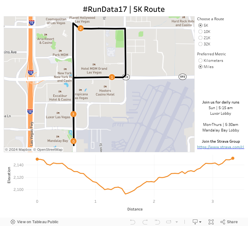
Given the conference is significantly larger this year, I bet we can double it! There are 5K, 10K and 21K options and all different paces. Want to go set a land speed record? Go for it! Want to walk? That's fine too! The point is to get out and start your day the right way...with a run!
The run start and end at the Mandalay Bay lobby. We'll start at 5:30am, so get there a few minutes early to sign a waiver and for a group photo.
To help you, I've created this dashboard so you know the routes. It's mobile friendly too!
I hope to see you in Vegas!
London Bus Routes - The Benefits of Linear Geometries in Tableau 10.4
bus
,
linear geometry
,
linestring
,
London
,
map
,
Mapbox
,
public transportation
,
routes
,
Tableau 10.4
,
TfL
No comments
- Plot each bus stop and connect the dots, or
- Create a single line for the entire path
What are the benefits of each?
Plotting Each Bus Stop
This method, which uses the Path shelf to connect the bus stops, allows you to indicate the name of each bus stop along the route. However, the drawback is that Tableau has to draw each bus stop. For London bus routes, this means drawing 28,270 marks then connecting each of those dots for the respective route.
Using Linear Geometry
This method, which creates a mark represented as a line for each bus route, results in only 736 marks (one for each route). That means you'll be significant performance gains. The drawback is that you lose the detail of each bus stop.
Which should you use?
It depends on the granularity you need. If plotting each point is important, the go with method A. If aggregating to the route is ok, then go with method B.
For this use case, I wanted to test both options. First, I went to the TFL website to download the data of every stop for every bus route (requires an account). The data comes as a CSV with eastings and northings, so I turned to my friend Alteryx for converting these into shapefiles.

I used this tip by Rob Suddaby from when he was in The Data School to convert the Eastings and Northings into a spatial object. From there it's simple to create either the linestrings for the entire route or points for each stop.
A quick Mapbox map added for context and we're done! One additional twist I added was to size the bus routes on the map based on the number of routes selected. This only works on the map with each individual stop. I'll be sharing this tip during my TC session in Vegas.
Have a play...enjoy!

September 27, 2017
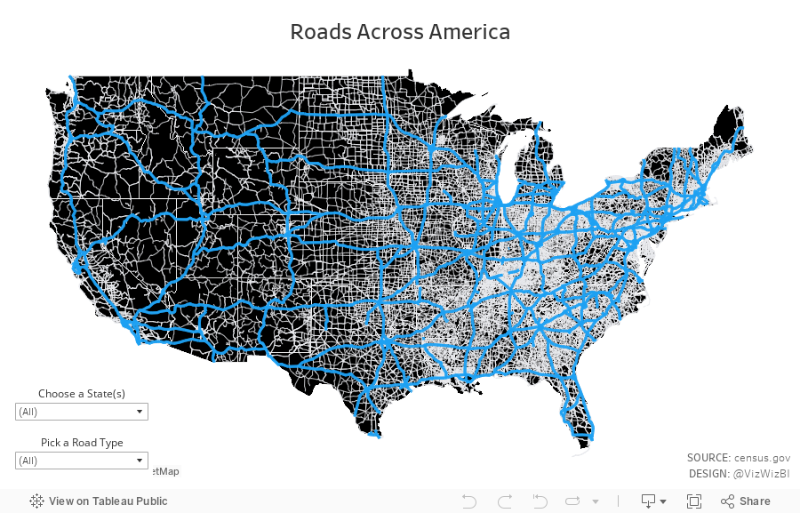
Roads Across America - Tableau 10.4 Linear Geometries
Tableau 10.4 came out this week and with it support for linear geometry shapefiles. This feature makes visualizing routing data so much easier and faster. You no longer have to plot each point, change the mark type to line and play a game of connect the dots. Now, connect directly to your shapefiles and you're done!Of course, I had to play with it. I went to the US Census website and downloaded shapefiles for every primary and secondary road for each State. With a couple clicks, I had an incredible map showing all of these roads. I wanted to highlight interstates, so I made them blue. 62,000 roads plotted with only a couple of clicks. Amazing!
Have a play with it yourself below! I'm excited about what boxes are now opened with this new capability.
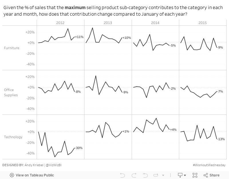
Workout Wednesday: Are the contributions of top sellers increasing throughout the year?
This week we delve into some tricky calculations for Workout Wednesday week 39. My goal for this analysis was to understand:- How much the maximum selling product sub-category accounts for in a given month.
- How much that contribution has changed throughout the year.
The idea being that you would hope that irrespective of WHICH sub-category is the top selling, the contribution of the top selling product would remain steady. It's generally not good for one sub-category to account for too much in sales because then it could be a sign that you need to diversify. (Correct me if I'm wrong please).
Requirements:
- The line chart shows how the contribution of the top selling sub-category within each month has changed since January. That means you'll need to first figure out the value of the top selling category, then figure out the contribution of that sub-category within each month, then figure out how that contribution has changed compared to January within each year.
- Label the ends of each line. The label need to be right-justified horizontally and center-justified vertically. The label MUST NOT overlap the line at all.
- Match the format of my numbers.
- Match the tooltips.
- Match the title (easy peasy, just write what I wrote).
- Product categories are listed down the left.
- Years and Months are listed across the view.
- Month labels are hidden.
Download the data here.
If you have any questions, let me know. Please tweet a picture of your attempt, include a link to the viz on Tableau Public and be sure to tag @EmmaWhyte and @VizWizBI.
Good luck!!
September 26, 2017
Tableau Zen Master Webinar Series

Have you ever wanted to learn from a Zen Master for free? Well here's your chance.
Join us for The Information Lab Europe Tableau Zen Master Webinar Series with me, Chris Love and Craig Bloodworth. We'll be sharing our love for Tableau in three webinars starting in October.
Sign up here:
Part I: My 20 Favorite Tableau Tips
Presenter: Andy Kriebel
Date: Oct 17, 2017 9:00 AM BST
Register: https://attendee.gotowebinar.com/register/3519156674736335618
Part II: Advanced Charting with Unions
Presenter: Chris Love
Date: Nov 10, 2017 9:00 AM GMT
Register: https://attendee.gotowebinar.com/register/5166142629772726786
Part III: The Future of Mapping in Tableau
Presenter: Craig Bloodworth
Date: Dec 05, 2017 9:00 AM GMT
Register: https://attendee.gotowebinar.com/register/2448374186282591490
After registering, you will receive a confirmation email containing information about joining the webinar.
September 25, 2017
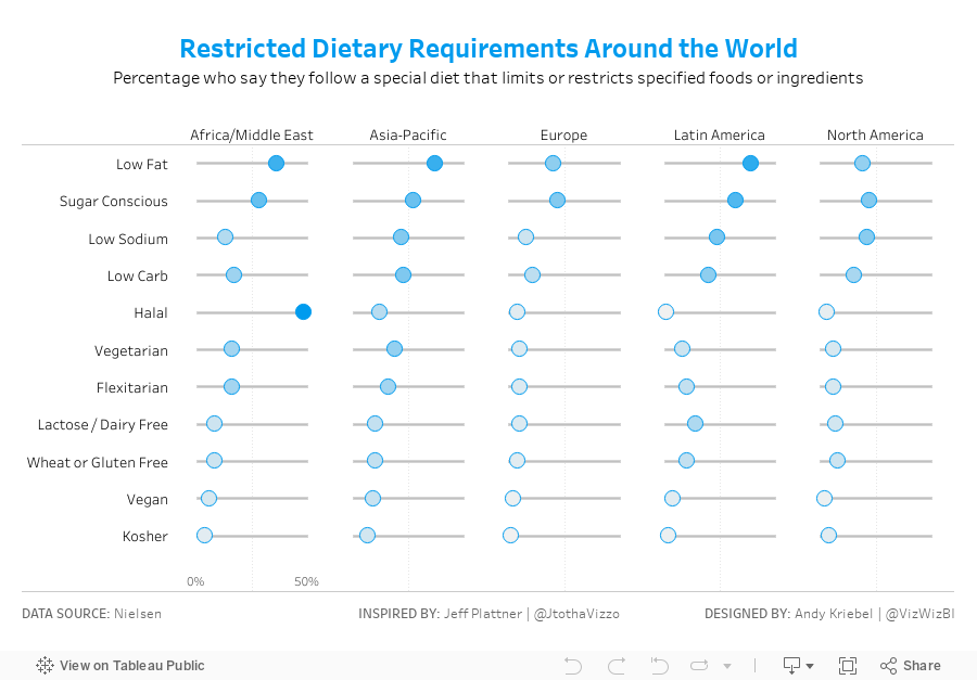
Makeover Monday: Restricted Dietary Requirements Around the World | Dot Plot Edition
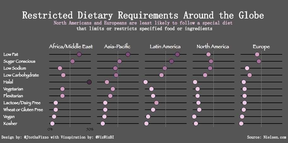
Jeff used this video from my Tableau Tip Tuesday series to create his dot plot. I love how clean his design is and I hadn't built something like this in a while so I thought I'd give it a go. I chose a color scheme that matches the Nielsen colors, but otherwise, it's pretty much identical.
Thanks for the inspiration Jeff!!
September 24, 2017
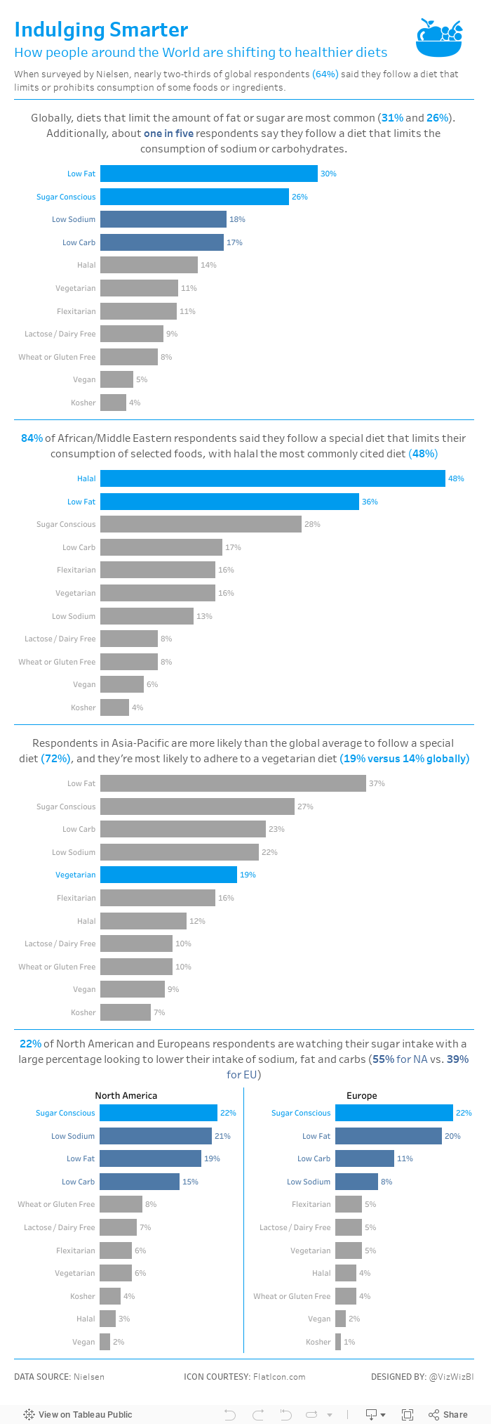
Makeover Monday: Restricted Dietary Requirements Around the Globe
arc
,
bar chart
,
curve
,
diet
,
Makeover Monday
,
narrative
,
story
,
vegan
,
vegetarian
No comments

What works well?
- Consistent ordering of the countries within each diet type
- Colors are easy to distinguish from one another
- Arcs, while not best practice, are engaging and capture your attention
- Subtitle that explains what the viz is about
What could be improved?
- Comparing the length of arc is difficult, especially across diet types.
- The icons are not needed since each diet is already labeled.
- The story in the data is lost as it's not included along with the charts.
My goals
- Simplify the visualisation; bar charts are a good place to start.
- Turn the text from the previous page that explains the findings into a story of some sort, probably long form and not story points.
- Remove the icons
With those goals in mind, here's my Makeover Monday week 39.
September 23, 2017
Vizspiration: Chicago Taxi Trips from Near North Side
Chicago
,
gantt
,
inspiration
,
reviz
,
Suraj Shah
,
taxi
No comments

With his permission, I wanted to try to remake his viz with a different data set. On the last day for DS6 at The Data School, they had a two hour task of creating a viz with the Chicago Taxi data that we used for MM week 6. I figured this might be a perfect data set to give it a go.
I don't like mine nearly as much as Suraj's. It sure was fun creating it though. It took me about 45 min total. There's nothing very complicated about the viz itself, and it's probably this simplicity that I like the most.
Thanks Suraj for the inspiration!! Click on the image below for the interactive version.
September 20, 2017
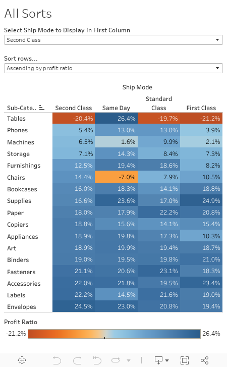
Workout Wednesday: (It Takes) All Sorts
calculated field
,
heat map
,
highlight table
,
parameter
,
profit ratio
,
sort
,
sorting
,
Workout Wednesday
1 comment
Oh Emma thought she was being sneaky today in the week 38 challenge. We had a similar challenge last year for the Data School Gym. For this week, given the EU Superstore data set, you have to meet these requirements (read the full details on Emma's blog):- Create the highlight table showing profit ratio by ship mode and sub-category.
- The columns should be sorted by the ship mode selected in the drop down first, followed by the remaining ship modes sorted descending by their overall profit ratio.
- The Product Subcategories should be sorted ascending or descending (depending on end user selection) of the profit ratios for the selected ship mode.
For me, the last requirement was the trickiest part. In the end, I had to create two parameters and three calculations.
Good luck!
September 18, 2017
Makeover Monday: A Day at the Races
exercise
,
Makeover Monday
,
map
,
Mapbox
,
marathon
,
running
5 comments
Given there's also the #FitData17 challenge we thought we'd give everyone some data to play with.
I'm going to be making over my results from Strava.

What works well?
- Of course no run is good without a map.
- Including a breakdown of my pace for each mile
- Showing a timeline along the bottom and allowing me to customize the metrics
What could be improved?
- There are no markers on the map to show me where I started, ended nor any mile markers along the way.
- The table shows me my pace, but it doesn't add any value because I can't see all of the miles at the same time making spotting trends impossible.
- The line chart has three separate metrics showing, yet only one axis. It doesn't make sense to overlap three metrics.
What I wanted to learn?
- Is my 3:25 goal for Frankfurt achievable?
- Is there anything interesting in the heart rate data?
- I want to be able to compare the key metrics across the two races.
- Is hitting "the wall" avoidable?
I must admit that I need to dig into this data further in order to be able to answer these questions. However, time is running out on the day and I won't have time to look at it more tomorrow, so I'm starting with a viz that does some simple comparisons. It'll have to do for now and it certainly improves upon the original.
Click on the image for the interactive version.
Click on the image for the interactive version.
| Click on the image for the interactive version |
September 13, 2017
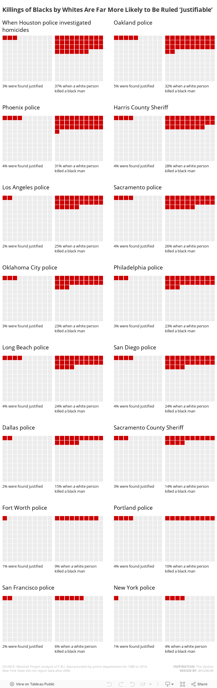
Workout Wednesday: Killings of Blacks by Whites Are Far More Likely to Be Ruled 'Justifiable'
caption
,
containers
,
layout
,
text box
,
The Upshot
,
waffle chart
,
Workout Wednesday
No comments
Requirements:
- Dashboard size is 750x2350.
- Make sure you credit the data source and credit The Upshot for inspiration as I have.
- Match my title.
- For each city, there should be two waffle charts. The first should show the overall percentage of justified killings. The second waffle chart should show the percentage justified when a white person killed a black.
- Match the text under each waffle chart. Note that the text must be in the same worksheet and the percentage displayed must be based on a calculation.
- The text above each pair of charts should span across the two waffle charts for that city.
- There should be a 20 pixel buffer between each row of charts.
- There should be a 20 pixel buffer between cities that are on the same row.
- Use hex code #CC0000 to represent the percentage justified and use #ECECEC to represent the unjustified killings.
- Match the layout exactly for the text boxes.
- Match the tooltips.
- Everything MUST be tiled; no floating elements allowed.
- I used the Benton Sans font, but that won't render on Tableau Public, so use whatever font you wish. Benton Sans helped me get the word wrapping and spacing just like The Upshot had it.
Data sources:
By the end of this exercise, you should be much more familiar with layout containers. Personally, I love containers because I know how to manipulate them well. Hopefully you'll feel the same by the end.
Make sure you tag @VizWizBI, @EmmaWhyte and @TheUpshot (for their inspiration) when you tweet your final work. Also include a link to your dashboard.
Lastly, this is not particularly difficult, there are no crazy calculations, it's more a tedious exercise. Have fun!
September 11, 2017
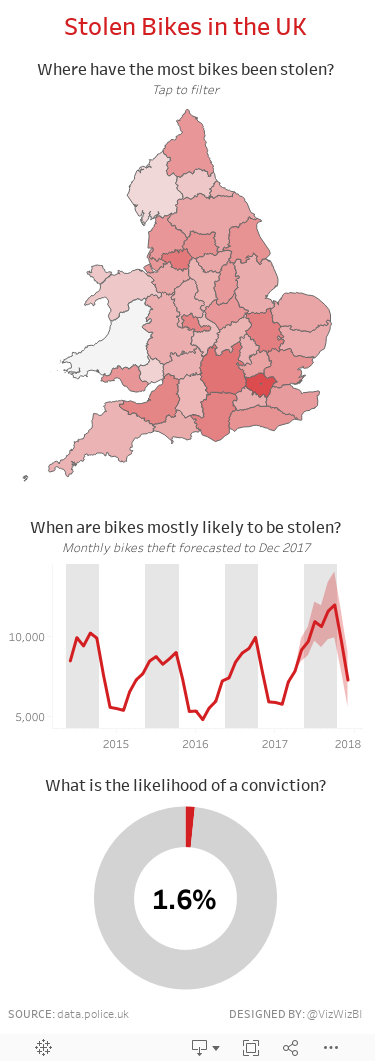
Makeover Monday: Stolen Bikes in the UK
bicycles
,
crime
,
cycling
,
Makeover Monday
,
theft
,
UK
,
united kingdom
2 comments
For this week's makeover, we're looking at the page where you can search a specific postcode. Given I ride to work, I naturally entered our work postcode and got this visualisation.

What works well?
- The search feature and map are very engaging. I wanted to zoom all the way in to work.
- The result set is within a mile of the postcode I entered, providing context and relevancy.
- The map is easy to use. Click on a marker and you get a bit of information about the incident.
- Using a map shows the volume of stolen bikes well.
- The table and tabs provide a simple way for me to lookup information.
What could be improved?
- Clicking on one of the numbers on the map doesn't then drill into each of those incidents.
- The Last 6 Months tab doesn't show trends well.
- The Worst Locations tab isn't very useful if you not very knowledgable about the area.
- All of the tables would be more impactful as charts.
Questions I want to answer
- What are the worst areas in the UK?
- Is bike theft increasing or decreasing overall and in specific areas?
- Are there as few positive outcomes as it seems?
- Where should I avoid locking up my bike?
- Is there any seasonality in the data? My hypothesis is that the number of bikes stolen would reduce in the winter months.
To answer the first question, I downloaded the police force boundaries from data.police.uk and merged all of the KML files together with Alteryx and output the result as a single shapefile.

From there, I blended the shapefiles with the bike theft data to create a map showing the log scale of bike thefts by police force. I chose a log scale because London is a crazy outlier.
With the questions in mind above, here's my Makeover Monday week 37 which I've optimized for mobile consumption.
September 7, 2017
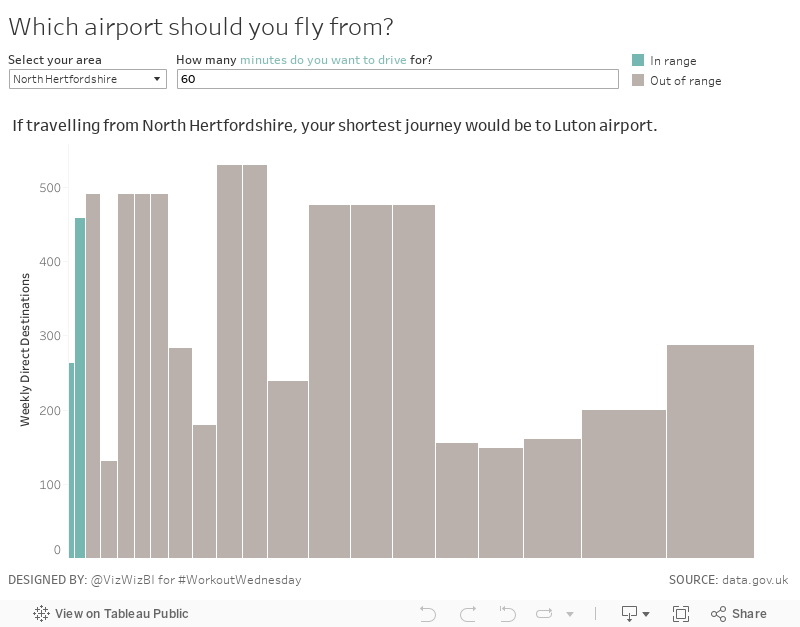
Workout Wednesday: Which airport should you fly from?
airport
,
skyline chart
,
table calc
,
UK
,
united kingdom
,
variable width bar chart
,
Workout Wednesday
No comments
What were the sneaky bits for me?
- Creating a measure for the variable width bars
- Using a table calc to return the airport with the shortest drive time (Emma did this as a separate sheet, whereas I did includes this in the title of my variable width bar chart
- Using a data source filter to filter the airports
Another fun challenge in the books! Thanks Emma!!
September 5, 2017
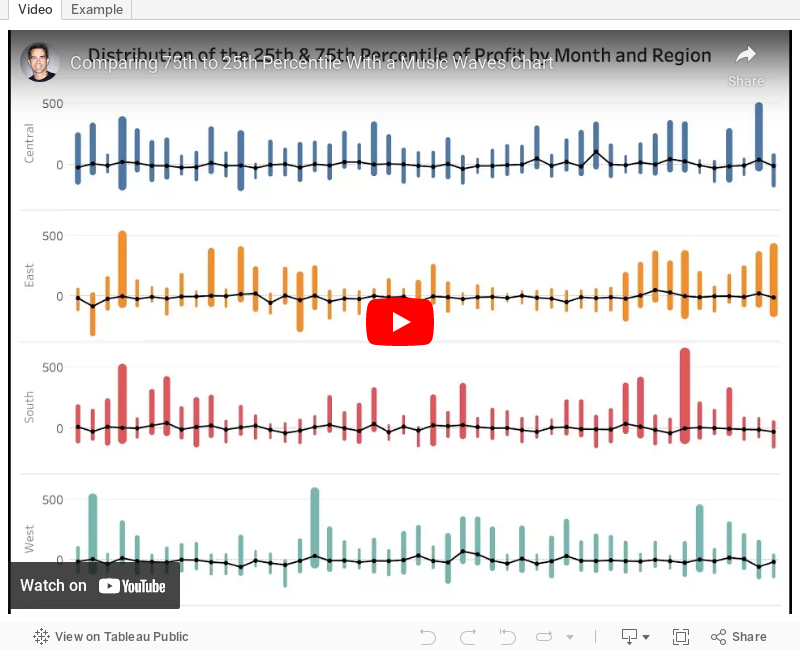
Tableau Tip Tuesday: Comparing 75th to 25th Percentile With a Music Waves Chart
- Create percentile calcs and place them on the same axis.
- The date field must be discrete.
- Use Measure Names on the Path shelf.
There are some other subtleties that you'll pick up on the video as well. Enjoy!
September 4, 2017
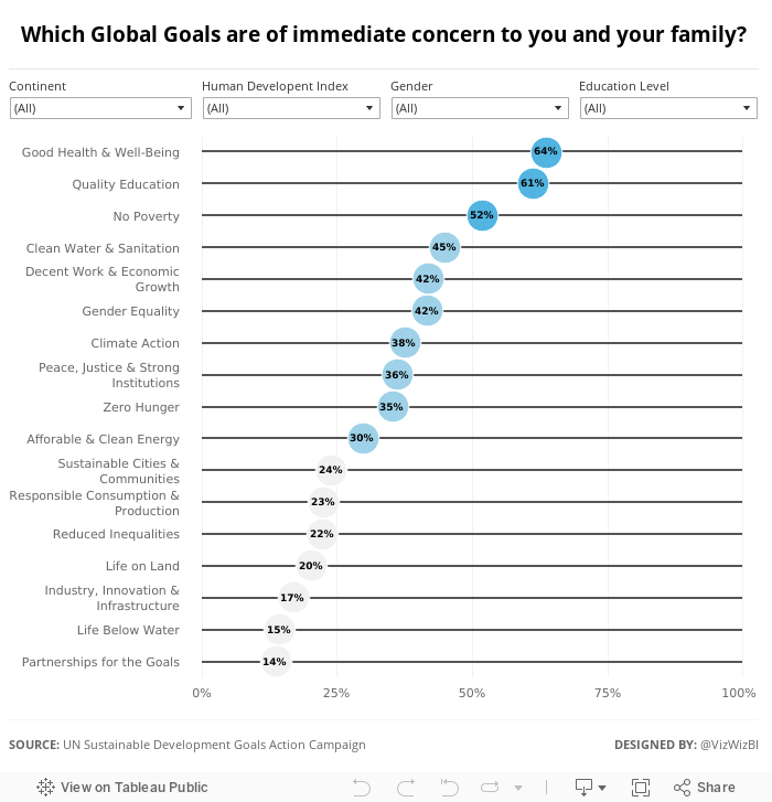
Makeover Monday: Which UN Sustainable Development Goals Are of Most Immediate Concern?
Let's have a look at the original viz:

What works well?
- Nice interactivity with the icons at the top
- Easy to see the breakdown by demographics
- Simple filtering
- Neatly organized
- Labeling the boxes on highlight
- Ordering the icons by goal
What could be improved?
- Way too many colors
- You eye goes all the way across making it look like all of the demographics are connected
- Seems very busy
I wanted to keep the visualisation very simple, start with an overview, and allow the user to pick what they want to see. I ended up with this simple dot plot. I also used Device Designer to create a mobile version which will render if you're seeing this on your phone.
Subscribe to:
Posts
(
Atom
)


