Showing posts with label TfL. Show all posts
December 17, 2019
#TableauTipTuesday: How to Use Level of Detail Expressions to Find the Bounding Rectangle of a Line
boundaries
,
bus
,
latitude
,
level of detail
,
LOD
,
LOD calc
,
London
,
longitude
,
makepoint
,
route
,
spatial
,
Tableau Tip Tuesday
,
TfL
No comments
In this tip, I show you how to use level of detail expressions to find the boundaries of a line and turn it into a square by finding the ratio of each point on the line to the width and the height.
Note: A couple of the calculations were backwards in the video, so download the workbook to ensure you have them correct.
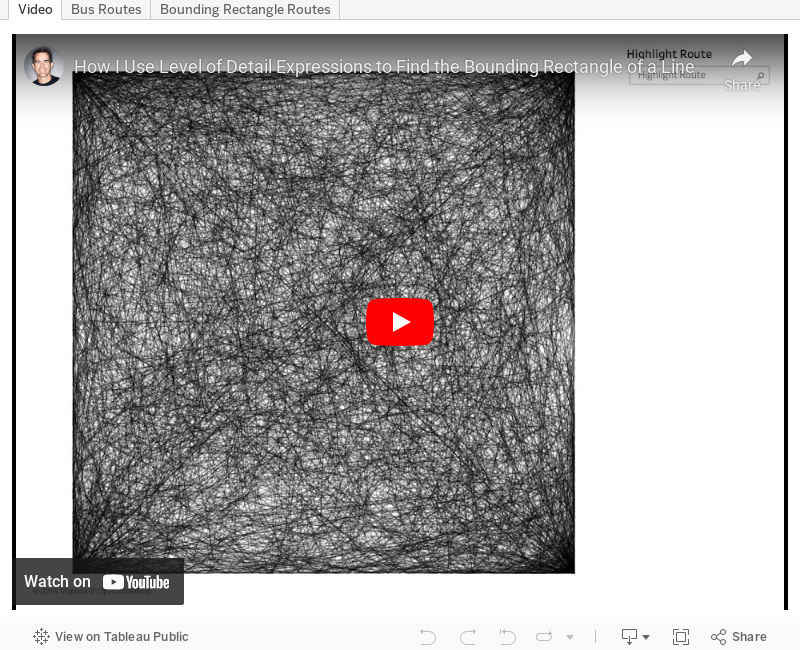

Note: A couple of the calculations were backwards in the video, so download the workbook to ensure you have them correct.
December 17, 2018
Makeover Monday: London Bus Safety Performance
bus
,
KPI
,
Makeover Monday
,
performance
,
safety
,
TfL
,
transport for london
No comments

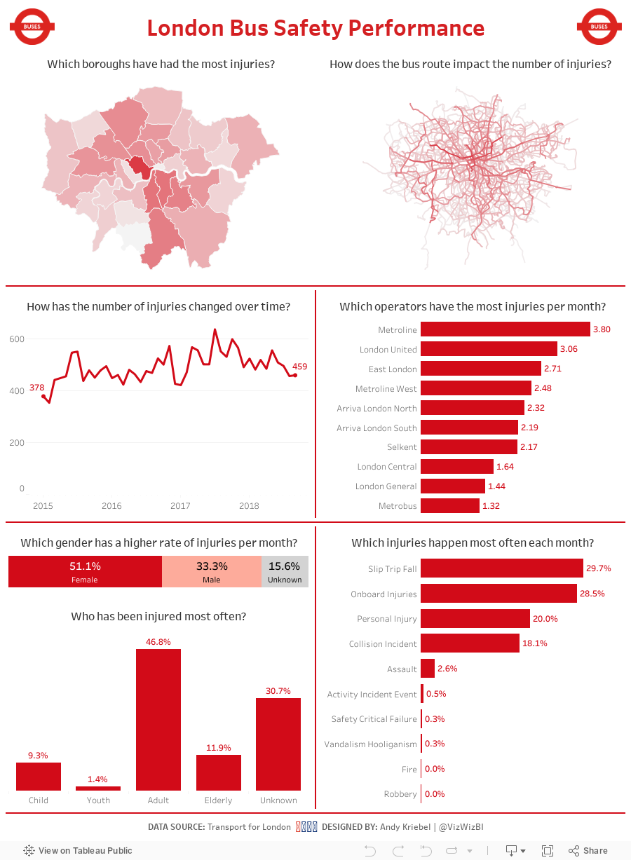
So, to get back at them, I gathered all of the bus injury data from Transport for London and gave it to all of you, the Makeover Monday Community, to help make their scorecards better. What does the scorecard look like now?
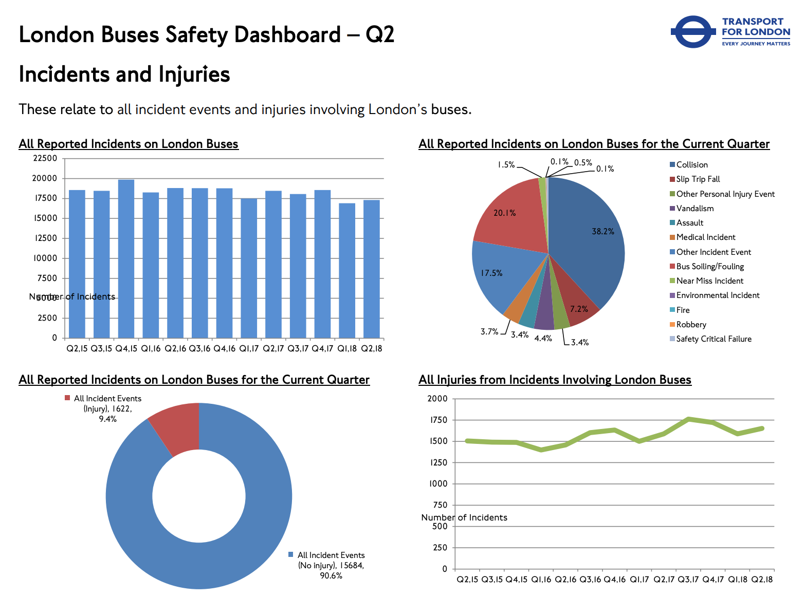
What works well?
- The line charts are easy to understand.
- All charts have good titles.
- The donut chart is clear and simple.
- The colors work well together (except the pie).
What could be improved?
- The pie chart could be made into a bar chart.
- The charts could use more context.
- The data is horribly delayed (it's December 17th as I write this and the data only goes through June).
What I did
- Give the user an opportunity to explore the data; every chart has action filters
- Use TfL colors
- Provide context on some of the charts, like injuries per month
With that, here's my Makeover Monday week 51.
June 26, 2018
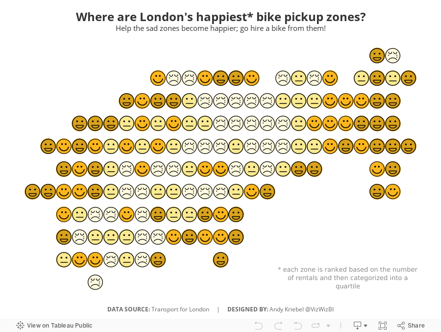
Makeover Monday: Where are London's happiest bike pickup zones?
bicycles
,
cycle hire
,
cycling
,
happiness
,
Makeover Monday
,
santander
,
TfL
,
transport for london
No comments

I created a viz last year about American happiness, so decided to use a similar theme. What I did was group stations together based on their location. It takes two calculations:

You then makes the continuous dimensions and place them on the appropriate shelves (Round Lon on Columns and Round Lat on Rows).
I then created a calculation that ranks each "zone" by the number cycle hires and then places them into percentiles. I then take the percentiles and break them up into happiness quartiles.

I set the Location Happiness to discrete, placed it on the Shapes shelf and applied my emoticon shapes. I then duplicated the Round Lat field on the Rows shelf and moved the Location Happiness field to color, changed the shape to circle, moved the marks to the back and assigned colors.
Simple! I like how this turned out.
June 25, 2018
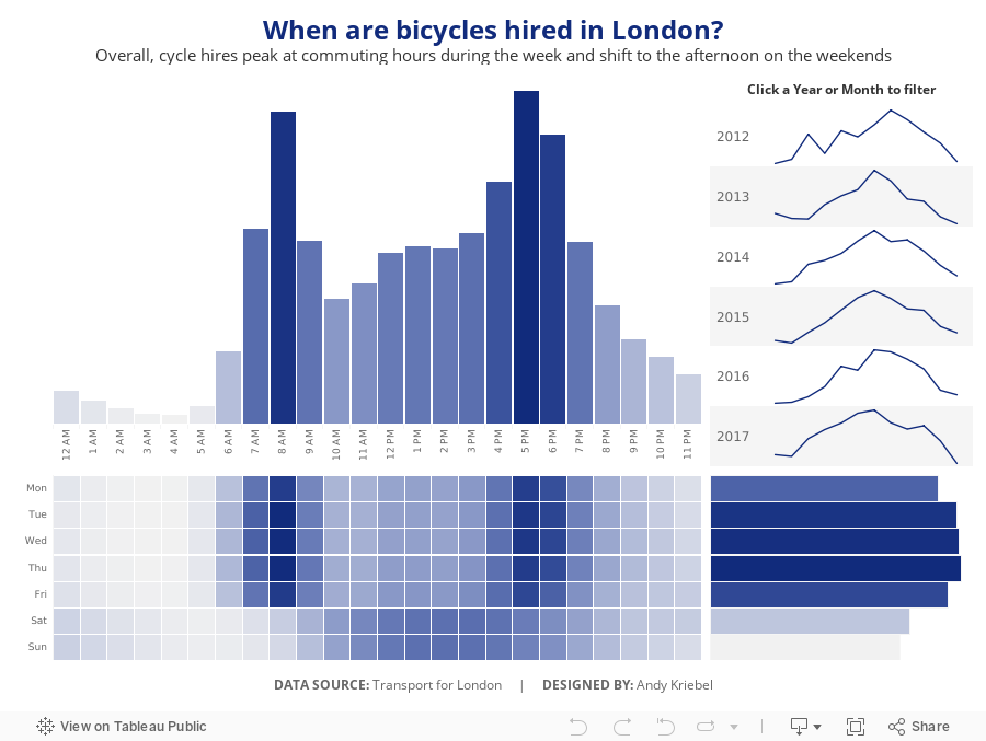
Makeover Monday: When are bicycles hired in London?
bicycles
,
cycling
,
London
,
Makeover Monday
,
TfL
,
transporation
,
transport for london
No comments

I asked Eva to use data from Transport for London's open API about their cycle hire scheme. Data is available back to 2012 and I offered to prep it for her and upload it to Exasol...all 50M+ bike hires worth. I love the weeks when we get to use Exasol because I can ask and answer questions on massive data sets without any performance constraints.
The visualization to makeover this week comes from Sophie Sparks:
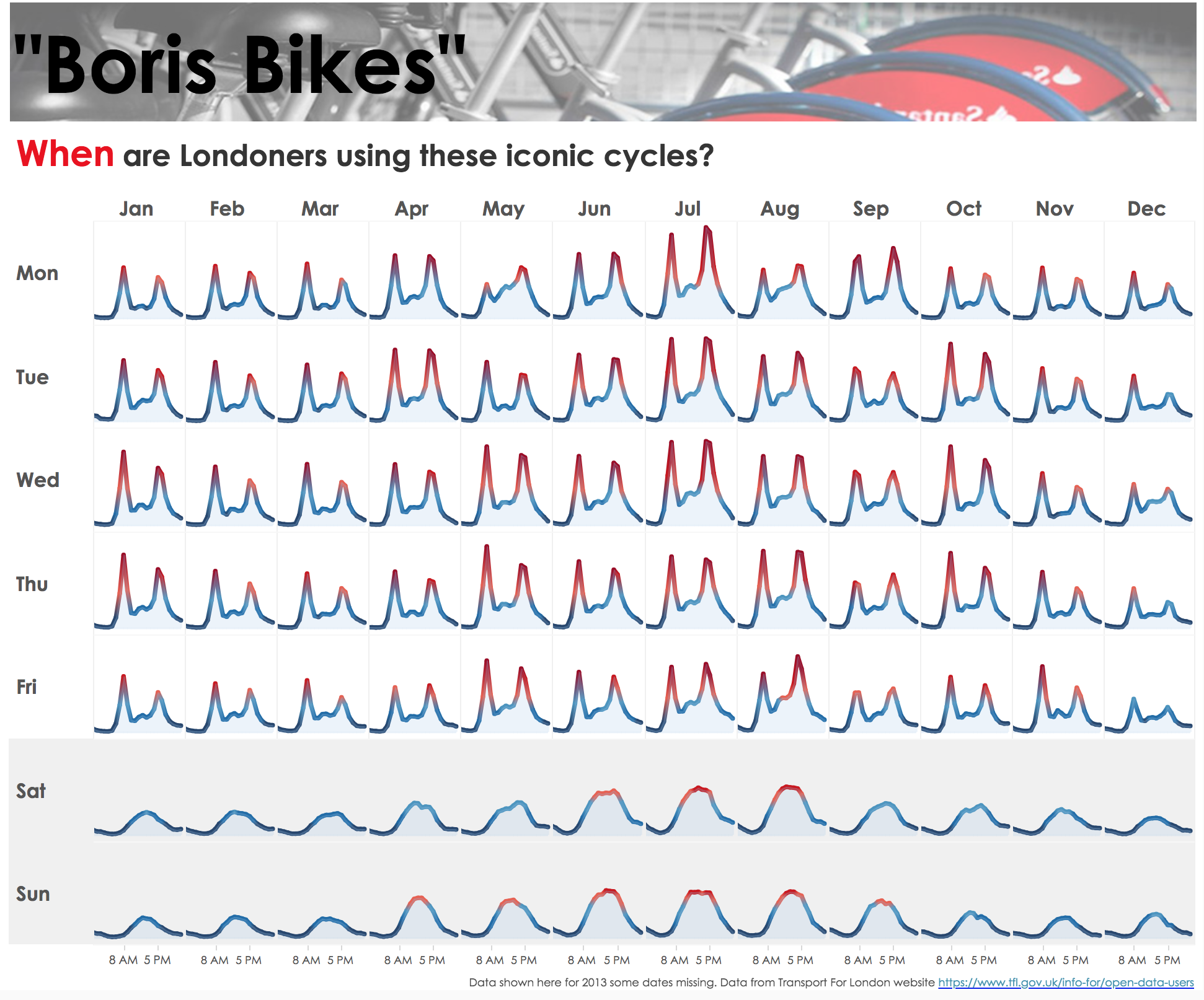
What works well?
- The small multiple layout works great or showing cyclical patterns (see what I did there?).
- The diverging color scale helps accentuate the peak periods.
- The shading under the lines makes the viz feel more full and complete.
- Shading the weekends helps separate them from the rest of the weekdays.
- Putting the word When in red in the title to match the peak period.
What could be improved?
- I would remove the section at the top that says "Boris Bikes" and the image.
- Include some sort of insight as a subtitle.
- There's no indication of what the y-axis means. I assume it's the number of bikes hired, but it could just as easily be something else.
What I did
- First, I rebuilt Sophie's viz because I like it.
- I wanted to focus on the weekday and hourly patterns in the data.
- Use the TFL blue as a single color for the viz.
- Provide some interactivity so that people could see when the peaks and troughs in the data are for a specific year or month.
Click on the image for the interactive version.
September 29, 2017
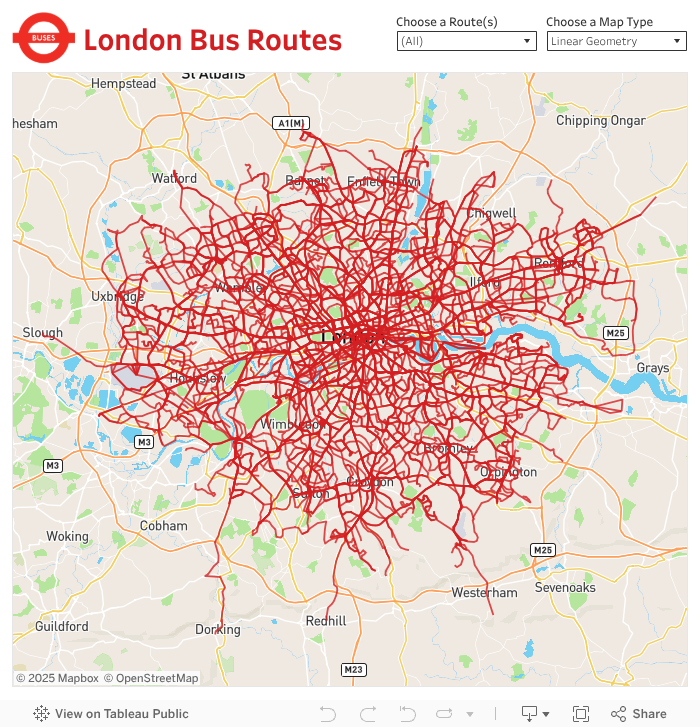
London Bus Routes - The Benefits of Linear Geometries in Tableau 10.4
bus
,
linear geometry
,
linestring
,
London
,
map
,
Mapbox
,
public transportation
,
routes
,
Tableau 10.4
,
TfL
No comments
- Plot each bus stop and connect the dots, or
- Create a single line for the entire path
What are the benefits of each?
Plotting Each Bus Stop
This method, which uses the Path shelf to connect the bus stops, allows you to indicate the name of each bus stop along the route. However, the drawback is that Tableau has to draw each bus stop. For London bus routes, this means drawing 28,270 marks then connecting each of those dots for the respective route.
Using Linear Geometry
This method, which creates a mark represented as a line for each bus route, results in only 736 marks (one for each route). That means you'll be significant performance gains. The drawback is that you lose the detail of each bus stop.
Which should you use?
It depends on the granularity you need. If plotting each point is important, the go with method A. If aggregating to the route is ok, then go with method B.
For this use case, I wanted to test both options. First, I went to the TFL website to download the data of every stop for every bus route (requires an account). The data comes as a CSV with eastings and northings, so I turned to my friend Alteryx for converting these into shapefiles.

I used this tip by Rob Suddaby from when he was in The Data School to convert the Eastings and Northings into a spatial object. From there it's simple to create either the linestrings for the entire route or points for each stop.
A quick Mapbox map added for context and we're done! One additional twist I added was to size the bus routes on the map based on the number of routes selected. This only works on the map with each individual stop. I'll be sharing this tip during my TC session in Vegas.
Have a play...enjoy!
September 25, 2015
Tableau Tip: Sizing Dashboards | Transport for London Bikes: Where & When Were They Installed?

Bonus tip today. This tip started with a request for feedback from The Information Lab’s head honcho Tom Brown. Tom is getting ready to demo a dashboard to a customer and we noticed that he was using automatic sizing on the dashboard he created. This is generally not recommended because Tableau will re-size the dashboard depending on the device size, which can cause your dashboard to not look as you intended.
Below is a dashboard I created for the Transport for London bike scheme. Watch the video on how to get your dashboards to be the “perfect” size. In this video, I used James Dunkerley’s Web Data Connector, which you can find here.
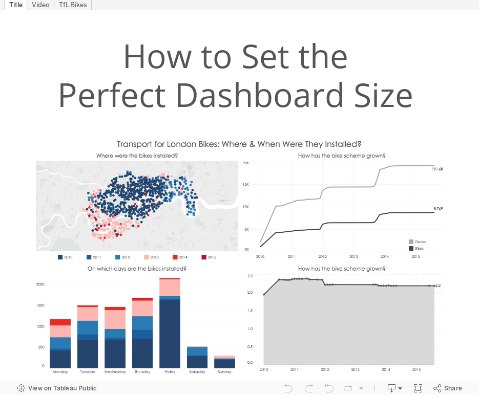
Below is a dashboard I created for the Transport for London bike scheme. Watch the video on how to get your dashboards to be the “perfect” size. In this video, I used James Dunkerley’s Web Data Connector, which you can find here.
Subscribe to:
Posts
(
Atom
)


