Showing posts with label happiness. Show all posts
June 26, 2018
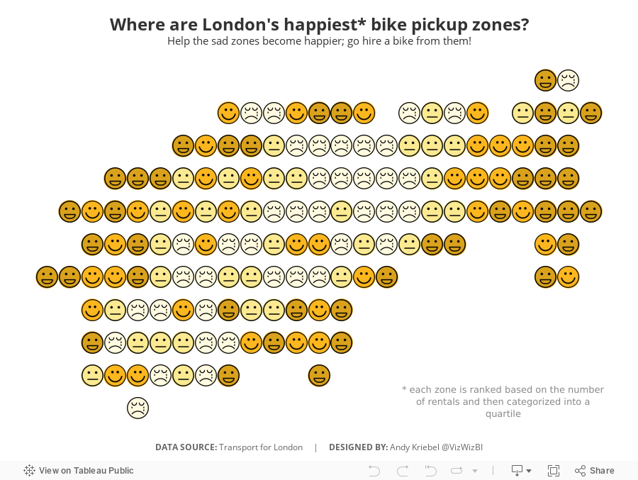
Makeover Monday: Where are London's happiest bike pickup zones?
bicycles
,
cycle hire
,
cycling
,
happiness
,
Makeover Monday
,
santander
,
TfL
,
transport for london
No comments

I created a viz last year about American happiness, so decided to use a similar theme. What I did was group stations together based on their location. It takes two calculations:

You then makes the continuous dimensions and place them on the appropriate shelves (Round Lon on Columns and Round Lat on Rows).
I then created a calculation that ranks each "zone" by the number cycle hires and then places them into percentiles. I then take the percentiles and break them up into happiness quartiles.

I set the Location Happiness to discrete, placed it on the Shapes shelf and applied my emoticon shapes. I then duplicated the Round Lat field on the Rows shelf and moved the Location Happiness field to color, changed the shape to circle, moved the marks to the back and assigned colors.
Simple! I like how this turned out.
October 31, 2017
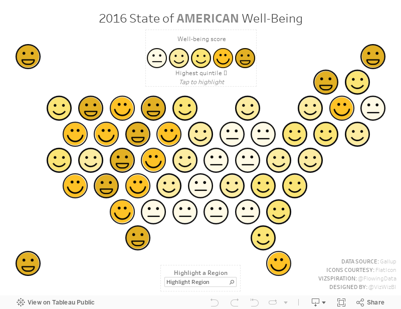
Mapping American Happiness
America
,
emoticons
,
FlowingData
,
happiness
,
map
,
smile
,
United States
6 comments

Being inspired by this viz, I wanted to see if I could recreate it in Tableau. In particular, I wanted to make it interactive by allowing the user to:
- Hover over the legend to highlight the States in each quintile
- Highlight an entire region (as an alternative to Nathan's dotted lines dividing the regions)
- View detail in the tooltip
- See a custom mobile version
With this, here's my vizspiration about American happiness.
December 1, 2010
Tableau: The perfect blend of productivity, happiness and features
Today I attended the Information Management webinar “The End of BI as We Know It: A fresh look at what business analytics means for today's organizations” and Mark Madsen from Third Nature presented a fabulous slide that I just had to share. For any of you that use Tableau, I know you’ll agree with where Tableau sits in my mind. (Note that I added Tableau to the chart, not Mark. I’d hate to get him in trouble.)

UPDATE (12/1): I have posted the presentation from the webinar - http://bit.ly/eo2waR
UPDATE (12/2): The webinar recording is now available - http://bit.ly/gvE8b3
Subscribe to:
Posts
(
Atom
)


