Showing posts with label cycling. Show all posts
August 4, 2021
#MakeoverMonday Week 31 - Bicycle Collisions in London
accidents
,
BAN
,
bar chart
,
bicycles
,
collisions
,
cycle plot
,
cycling
,
heat map
,
line chart
,
LOD
,
London
,
Makeover Monday
,
map
,
map layers
,
sparkline
,
time series
No comments

Resources:
- Final Viz - https://bit.ly/mm2021w31
- London Shapefiles - https://data.london.gov.uk/dataset/statistical-gis-boundary-files-london
- Data set - https://data.world/makeovermonday/2021w31
- Original Visualization - https://bikedata.cyclestreets.net/collisions/
- Watch Me Viz - https://youtu.be/ZpuX4TLqBxQ
January 3, 2021
#MakeoverMonday Week 1: Quiet Streets & Clean Air - Americans Are Getting Outdoors
air quality
,
bicycles
,
comparison
,
covid
,
cycling
,
line chart
,
Makeover Monday
,
pedestrians
,
rails to trails
,
variance
,
walking
,
year over year
No comments

Back in March 2020 when COVID lockdown started in the UK, the streets were amazingly empty, the air got fresher and I saw more and more people outside. You could hear birds chirping on streets you never would have before. And we could ride our bikes right down the middle of the road since there were no cars. The lack of cars was glorious! (COVID isn't of course).
For 2021, #MakeoverMonday gets started with a simple graphic that compares pedestrian and bicycle counter stats for 2019 and 2020 at 31 counters across America. The data is collected by the Rails to Trails Conservancy, and you can learn more about the data here.
ORIGINAL VISUALIZATION

WHAT WORKS WELL?
- A line chart is a good choice for time series data.
- The colors are easy to distinguish.
- The grid lines help guide the eye across the view.
WHAT COULD BE IMPROVED?
- Include a more impactful or descriptive title. What is it about?
- Why are thee weeks missing on the x-axis yet the lines go the full year (or appear to)?
- The lines could be labeled directly so that you don't have to refer to the color legend to know which lines represents which year.
MY MAKEOVER
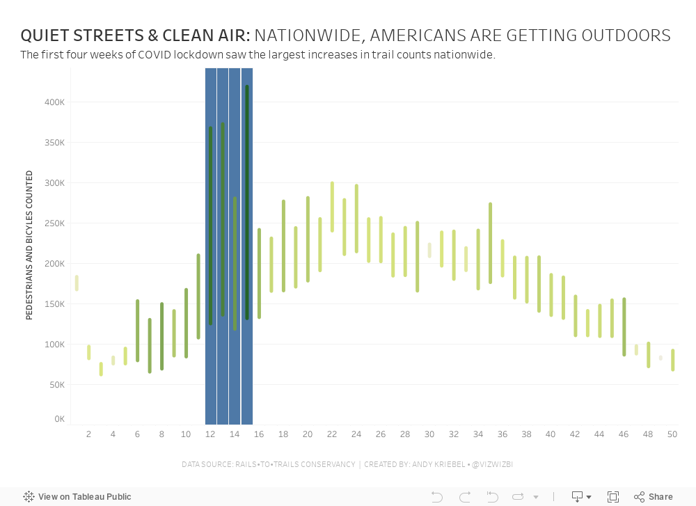
October 14, 2019
#MakeoverMonday: Ironman World Championship Medalists
champions
,
championship
,
cycling
,
Hawaii
,
ironman
,
medals
,
running
,
sports
,
swimming
,
triathlon
No comments

The viz to makeover is a simple table from Wikipedia:

What works well?
- The years are listed in order from most recent to oldest.
- Table can be sorted
- Including separate columns for each medal
- Including links to each athlete
What could be improved?
- I'm not convinced that both the flag and country abbreviations are necessary; one is probably enough.
- Some of the athletes have red text and some have blue. I couldn't find anything on the page that explained this.
- Comparing athletes across years is difficult because of the precision of the times/
What I did
After exploring the data for a few minutes, I remembered that Rody Zakovich created an incredible viz about the Winter Olympics (check it out here) and I've been wanting to emulate it. This data set proved perfect for it. This is the beauty of Tableau Public; you can download workbooks, see how someone created their work, and use it to help create your own.
Here's my viz for Makeover Monday week 42 (click on the image for the interactive version).
February 25, 2019
Makeover Monday: The Economic Value of the Bicycle Industry in the UK
bicycles
,
cycling
,
Makeover Monday
,
sqw
,
UK
,
united kingdom
No comments

Here's the original chart:

What works well?
- Using a line chart for representing data over time
- Minimal use of color
- Y-axis is properly labeled
- Including the sources
What could be improved?
- The x-axis label is completely wrong.
- The title needs to be more specific. As a standalone chart, we have no idea if this is about a country, a store, whatever.
- Don't include all of the axis ticks between each of the quarters.
- Remove the diamonds as markers for each point.
- Change the units of measure on the y-axis to thousands.
My goals
- Create something that's easy to understand.
- Stick with the minimal use of color.
- See if the change between periods is important. If so, what is changing and why?
- Is there seasonality? If so, how is that seasonality changing?
- Consider other metrics, like value added per bike. How does that change through time? What do the changes mean?
With those goals in mind, here is my Makeover Monday week 9 2019. I made value added per bike the primary focus of my viz to help explain that the downturn in the cycling industry is due to volume, not value added per bike.
February 20, 2019
Improving Upon Strava Activity Summaries: RIDE IT London Osterley Sportive
A few weeks ago, I voluntold Luke Stoughton (Head of Data School Recruitment and good friend of mine) to join me for a 52 mile cycling sportive hosted by Evans, a UK-based chain of cycling shops. Now, there's one thing to keep in mind...Luke had only ridden up to about 20 miles on a single ride. He WAS NOT happy with me, but he went anyway.
Coach Carl joined us as well, so I met him at a train station on the way and we rode the rest of the way to the start at Osterley House, an incredibly beautiful National Trust park and house. We met Luke there and headed off on our trek, stopping at two feed stops (I ate about eight pieces of cake at the second), peddling up three steep hills (they weren't that bad, but Luke hated it and threatened me), before looping back to the start and hitting the pub for a couple well deserved refreshments.
Along the way, I was thinking about how I could visualize the data. Strava does a decent job (see my ride here) and I thought I'd use that as a basis for my viz. My goals:

Coach Carl joined us as well, so I met him at a train station on the way and we rode the rest of the way to the start at Osterley House, an incredibly beautiful National Trust park and house. We met Luke there and headed off on our trek, stopping at two feed stops (I ate about eight pieces of cake at the second), peddling up three steep hills (they weren't that bad, but Luke hated it and threatened me), before looping back to the start and hitting the pub for a couple well deserved refreshments.
Along the way, I was thinking about how I could visualize the data. Strava does a decent job (see my ride here) and I thought I'd use that as a basis for my viz. My goals:
- Use a Mapbox map background as similar as I could to the Strava map (which is proprietary).
- Use the Strava colors (I found the hex codes in their brand guidelines and added them to my preferences file).
- Prep the data in Alteryx. There is a web data connector, but I like being able to create my own row level calculations and extract only the data I'm interested in. Plus it gives me an excuse to practice Alteryx more.
- I like how the elevation timeline, but for me it's lacking context by not including speed. I decided to keep its wide and short style while creating a dual-axis chart to overlay speed on top of the elevation.
- I included key moments as viz in tooltips. Hover over the gold ribbon (fastest speed) to see a picture of Luke and Carl speeding down the hill. That was fun! You can also see a selfie of us at the end.
- Include interactivity like Strava. Basically link the map to the chart and vice versa.
- Include speed and elevation on each point.
- Everyone loves a good BAN! FYI, Strava calculations elevation climb differently.
This isn't anything complicated and I think it's a viz that provides ever so slightly more context than Strava. Click on the image below for the interactive version.
June 26, 2018
Makeover Monday: Where are London's happiest bike pickup zones?
bicycles
,
cycle hire
,
cycling
,
happiness
,
Makeover Monday
,
santander
,
TfL
,
transport for london
No comments

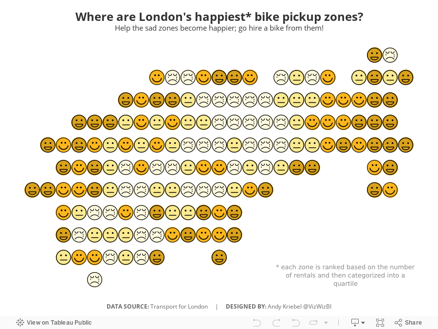
I created a viz last year about American happiness, so decided to use a similar theme. What I did was group stations together based on their location. It takes two calculations:

You then makes the continuous dimensions and place them on the appropriate shelves (Round Lon on Columns and Round Lat on Rows).
I then created a calculation that ranks each "zone" by the number cycle hires and then places them into percentiles. I then take the percentiles and break them up into happiness quartiles.

I set the Location Happiness to discrete, placed it on the Shapes shelf and applied my emoticon shapes. I then duplicated the Round Lat field on the Rows shelf and moved the Location Happiness field to color, changed the shape to circle, moved the marks to the back and assigned colors.
Simple! I like how this turned out.
June 25, 2018
Makeover Monday: When are bicycles hired in London?
bicycles
,
cycling
,
London
,
Makeover Monday
,
TfL
,
transporation
,
transport for london
No comments

I asked Eva to use data from Transport for London's open API about their cycle hire scheme. Data is available back to 2012 and I offered to prep it for her and upload it to Exasol...all 50M+ bike hires worth. I love the weeks when we get to use Exasol because I can ask and answer questions on massive data sets without any performance constraints.
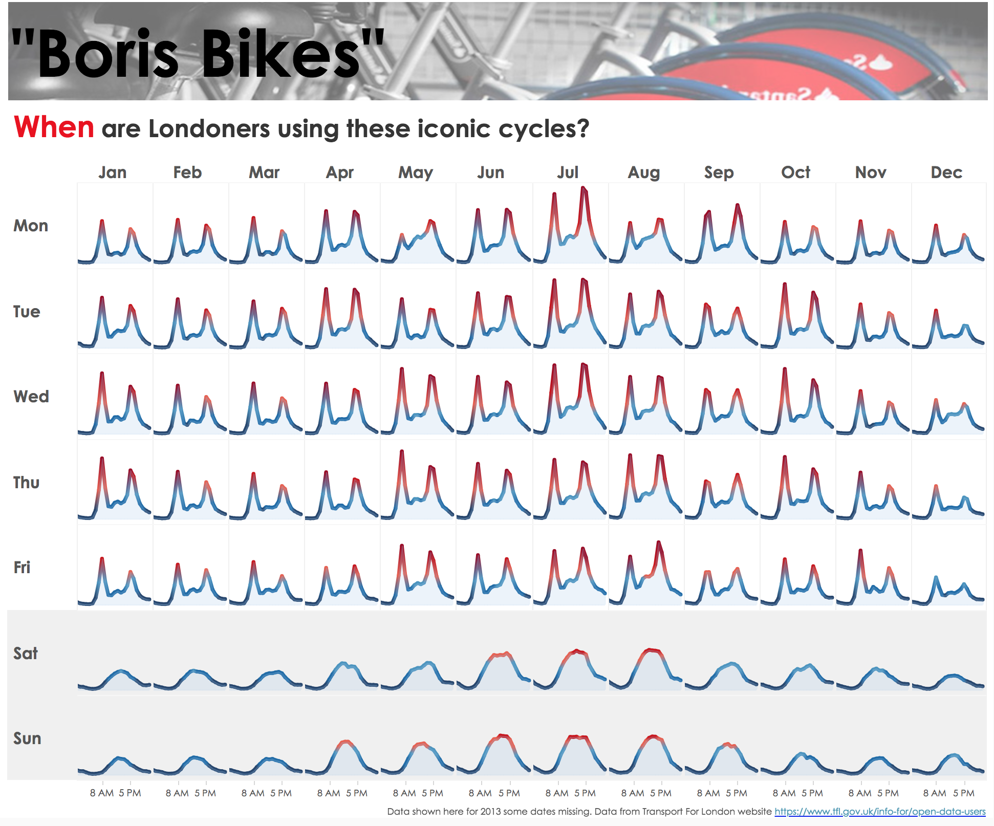
The visualization to makeover this week comes from Sophie Sparks:
What works well?
- The small multiple layout works great or showing cyclical patterns (see what I did there?).
- The diverging color scale helps accentuate the peak periods.
- The shading under the lines makes the viz feel more full and complete.
- Shading the weekends helps separate them from the rest of the weekdays.
- Putting the word When in red in the title to match the peak period.
What could be improved?
- I would remove the section at the top that says "Boris Bikes" and the image.
- Include some sort of insight as a subtitle.
- There's no indication of what the y-axis means. I assume it's the number of bikes hired, but it could just as easily be something else.
What I did
- First, I rebuilt Sophie's viz because I like it.
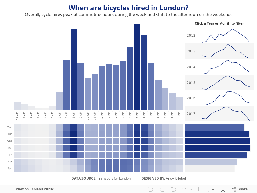
- I wanted to focus on the weekday and hourly patterns in the data.
- Use the TFL blue as a single color for the viz.
- Provide some interactivity so that people could see when the peaks and troughs in the data are for a specific year or month.
Click on the image for the interactive version.
September 11, 2017
Makeover Monday: Stolen Bikes in the UK
bicycles
,
crime
,
cycling
,
Makeover Monday
,
theft
,
UK
,
united kingdom
2 comments
For this week's makeover, we're looking at the page where you can search a specific postcode. Given I ride to work, I naturally entered our work postcode and got this visualisation.

What works well?
- The search feature and map are very engaging. I wanted to zoom all the way in to work.
- The result set is within a mile of the postcode I entered, providing context and relevancy.
- The map is easy to use. Click on a marker and you get a bit of information about the incident.
- Using a map shows the volume of stolen bikes well.
- The table and tabs provide a simple way for me to lookup information.
What could be improved?
- Clicking on one of the numbers on the map doesn't then drill into each of those incidents.
- The Last 6 Months tab doesn't show trends well.
- The Worst Locations tab isn't very useful if you not very knowledgable about the area.
- All of the tables would be more impactful as charts.
Questions I want to answer
- What are the worst areas in the UK?
- Is bike theft increasing or decreasing overall and in specific areas?
- Are there as few positive outcomes as it seems?
- Where should I avoid locking up my bike?
- Is there any seasonality in the data? My hypothesis is that the number of bikes stolen would reduce in the winter months.
To answer the first question, I downloaded the police force boundaries from data.police.uk and merged all of the KML files together with Alteryx and output the result as a single shapefile.

From there, I blended the shapefiles with the bike theft data to create a map showing the log scale of bike thefts by police force. I chose a log scale because London is a crazy outlier.
With the questions in mind above, here's my Makeover Monday week 37 which I've optimized for mobile consumption.

July 10, 2017
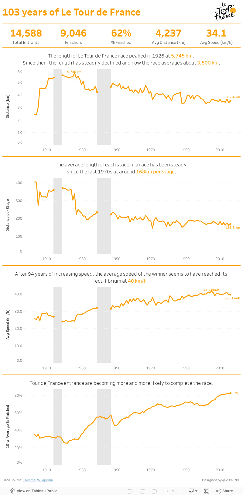
Makeover Monday: The History of Le Tour de France
If you're particularly bored, here's a recording of my screen for the whole hour.
Ok, still awake? Hopefully you enjoyed my Spotify playlist at least. This week's viz that we're reviewing is knomea.

What works well?
- Clear titles
- Line chart is easy to understand
What could be improved?
- Don't use dual axis area charts and not make it clear which is which
- The dual axis chart implies correlation when there may or may not be any.
- Why the blue background? This makes me think it means something.
- Labeling the axis every 33 years is a bit odd (pun intended)
- The connected lines make it look like race occurred during the World Wars.
- Tell more of a story. When I ask "so what?", I can't answer it.
I'm pressed on time, so here's my Makeover Monday week 28. Enjoy!
Subscribe to:
Posts
(
Atom
)






